Welcome

Taidg Cremin Photography

Vivian Maier
Maier was born on the 1st February 1926 in New York. She took over 150,000 photos in her lifetime. In around 1956, Maier decided to switch to colour photography. This gave her photos a more refined look. At the beginning of her photography career , Maier took close up shots of New York civilians. As she began her  coloured work, objects such as newspapers and items in bins replaced the civilian photos. Her work shows a variety of thoughts and emotions , from joy to fear. Maier took various shots of a range of people. Upper class citizens to paupers.  
Maier was a nanny for around 4 decades while taking photos secretly. Her work varies from abstract to candid photography. From looking at Maier's contact sheet, it seems she was very conservative when taking photos, typically only taking one photo per scene. As camera reels were limited,only when she found something really interesting, she only took several photos of scenes that she thought was really interesting. 


14Nov

When doing this shoot for 'street photography' we had a section of text with a brief description of ideas for a shoot. On the brief we had 'shadows' which could be interpreted and portrayed in different ways.                                                                                            

Light Trails image
I have decided to use light trails as my main focus. However, unlike most light trail photographers, i want the light trails to be a minor detail in my image. Rut Blees Luxemburg does this by subtlety using light trails in her image while having various other focal points. I want to achieve this same effect in my work. Having depth in a image can create an atmosphere    


Light Trails Final Edit imageLight Trails Final Edit imageLight Trails Final Edit image
From the feedback i have received on the first prototype, i would like to

My plan for my final edit is to create a cube with a collage of light trails. I started by building the cube with a net and made it out of paper. For my final edit, i plan to make it out of something robust, either plastic or wood. I could also experiment with a variety of different shapes to make the light trails stand out.
Cube 1 In Writing  image

After experimenting with a variety of locations, exposure levels and editing equipment, i believe i have enhanced my images that i have displayed on my final piece. I have chosen to make my preferred images larger than the others, which makes them stand out more. I wanted my final piece to have a collage of what i thought were my best images.

Most of my images only had slight adjustments which included editing the brightness and curve levels. I thought the editing made each image look more refined and i chose specific points to edit for different reasons. Either to make something brighter or to dim the frame of the image.

If i was to make my final piece again, i would think about what would make my images look individual as well as a collection of images. I could possibly display my images in a more meaningful way which would make the viewer be more engaged. For some of my images, I would like to keep the viewer engaged by having various different aspects rather than one focal point. The composition for the images is vital for this to be effective.

As my first large project , I believe this went successfully as i wanted to display my images in a unique way. Although some images were not exactly what I planned , I still believe this project went well.


Related Study

Introduction

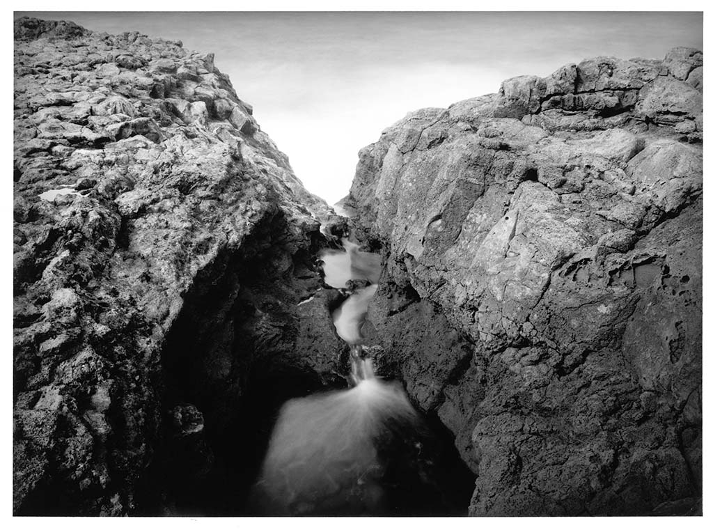
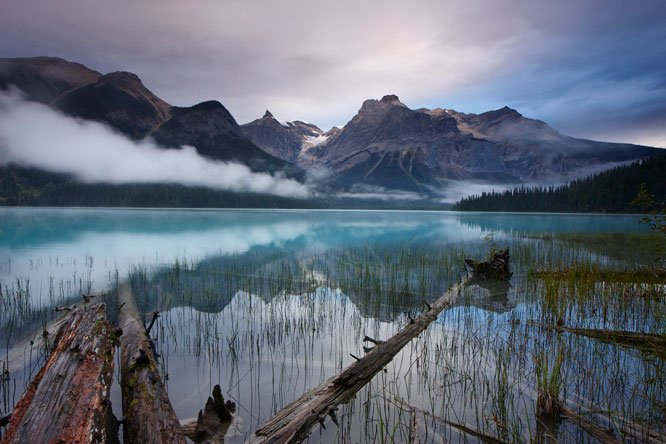
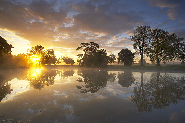
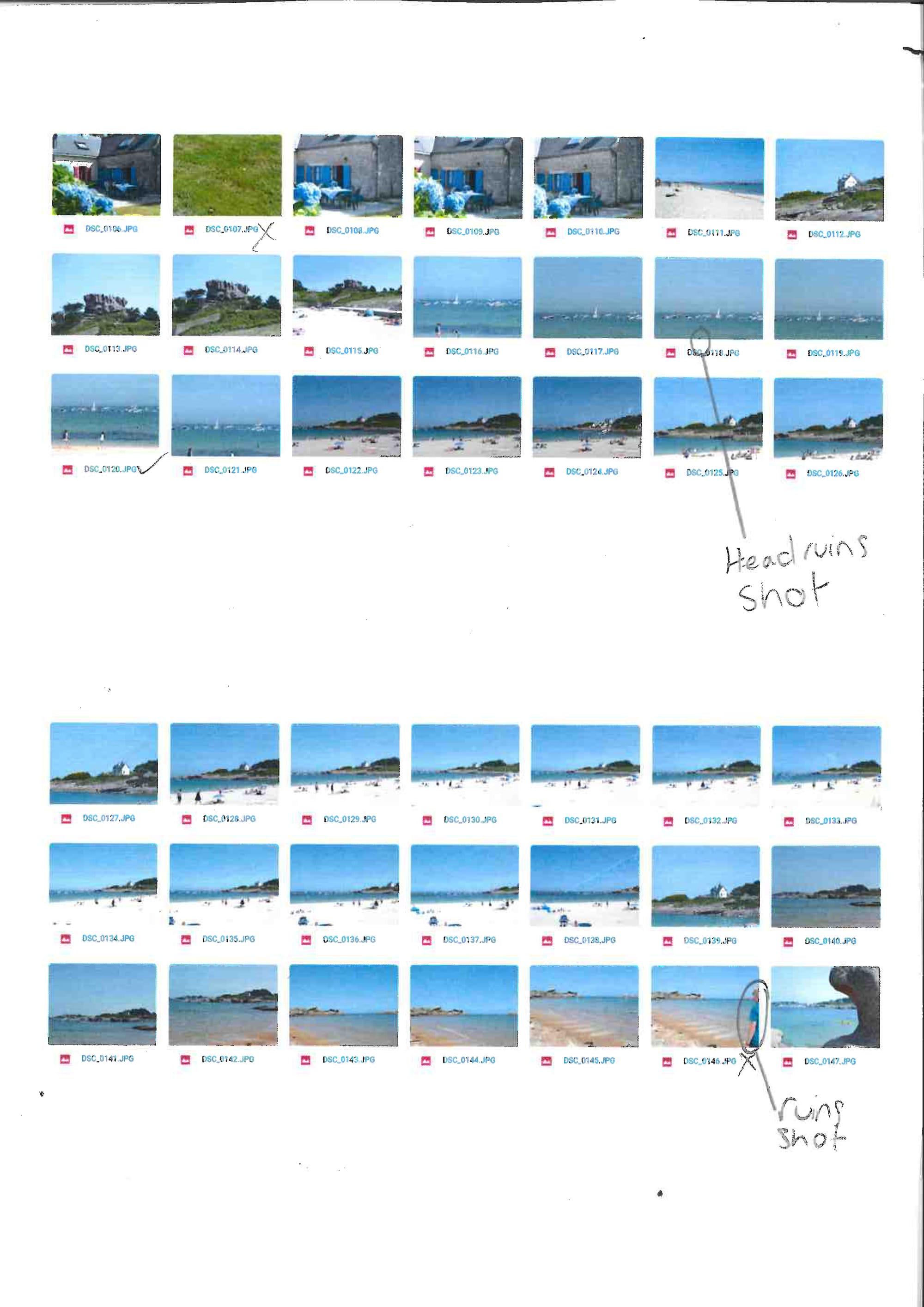
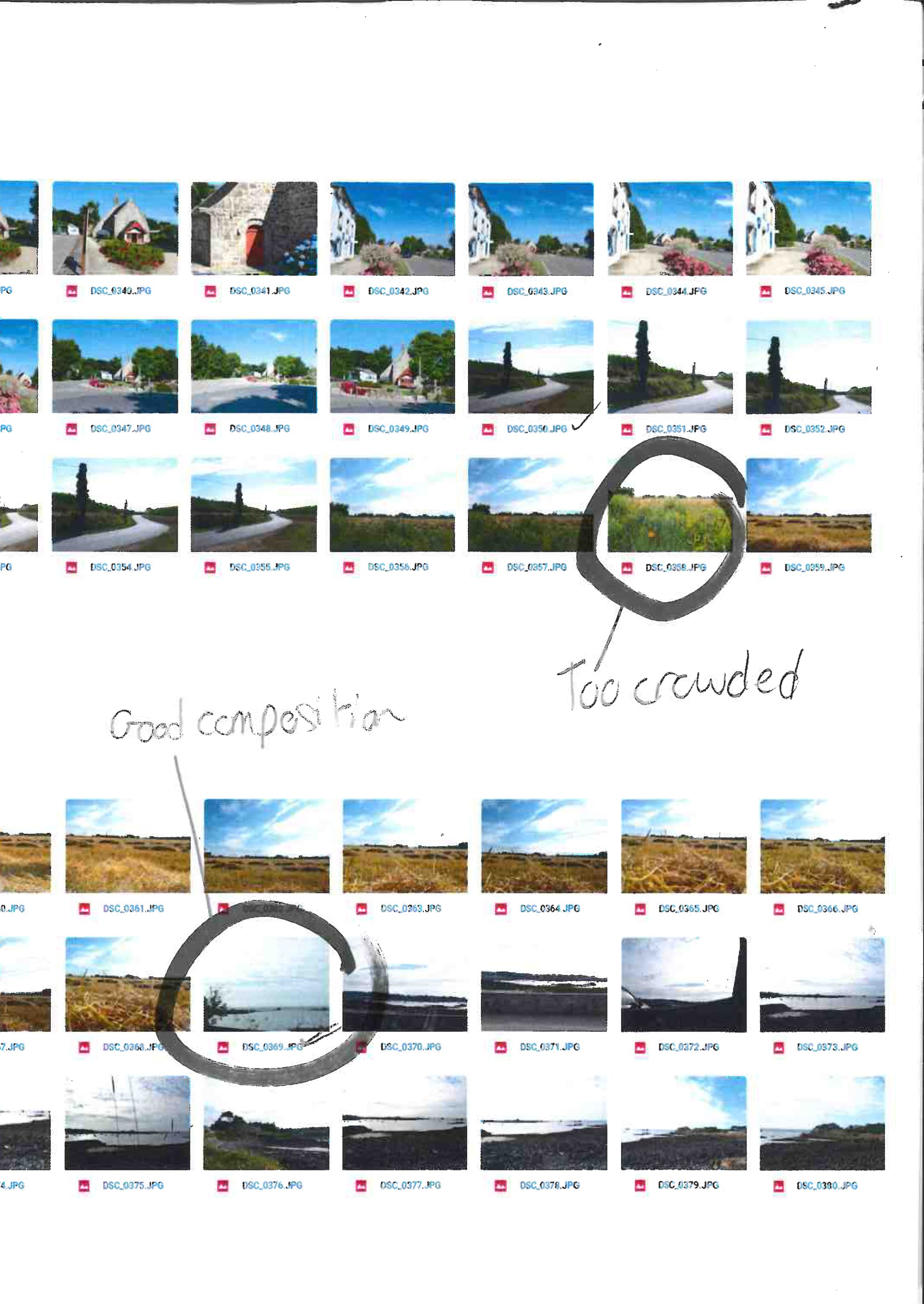
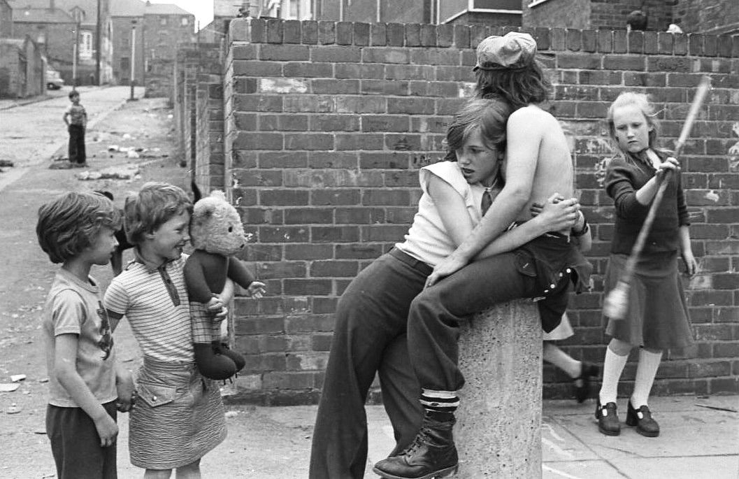
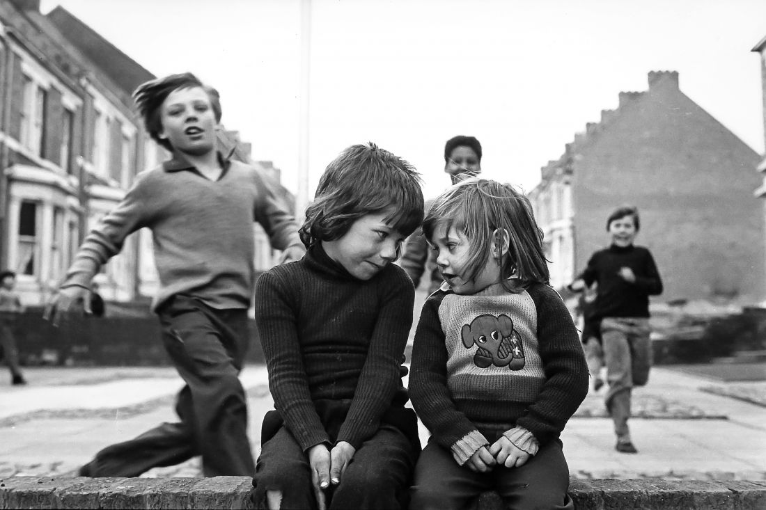
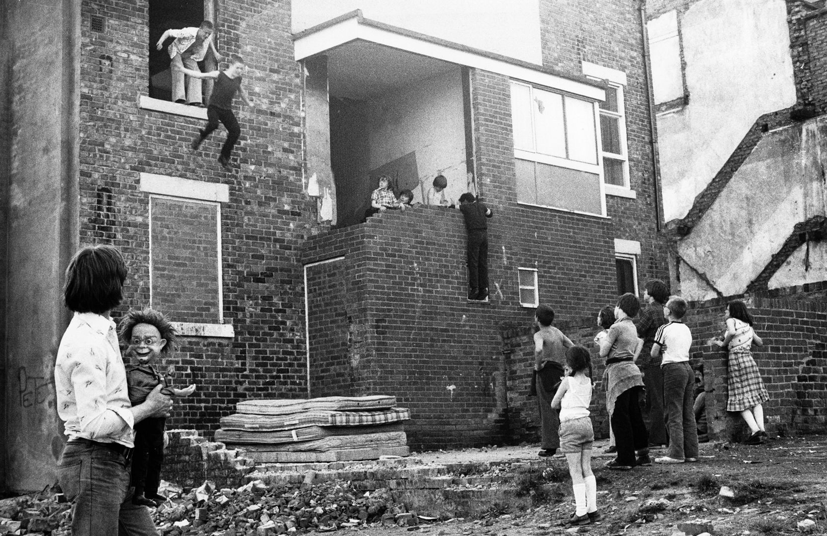
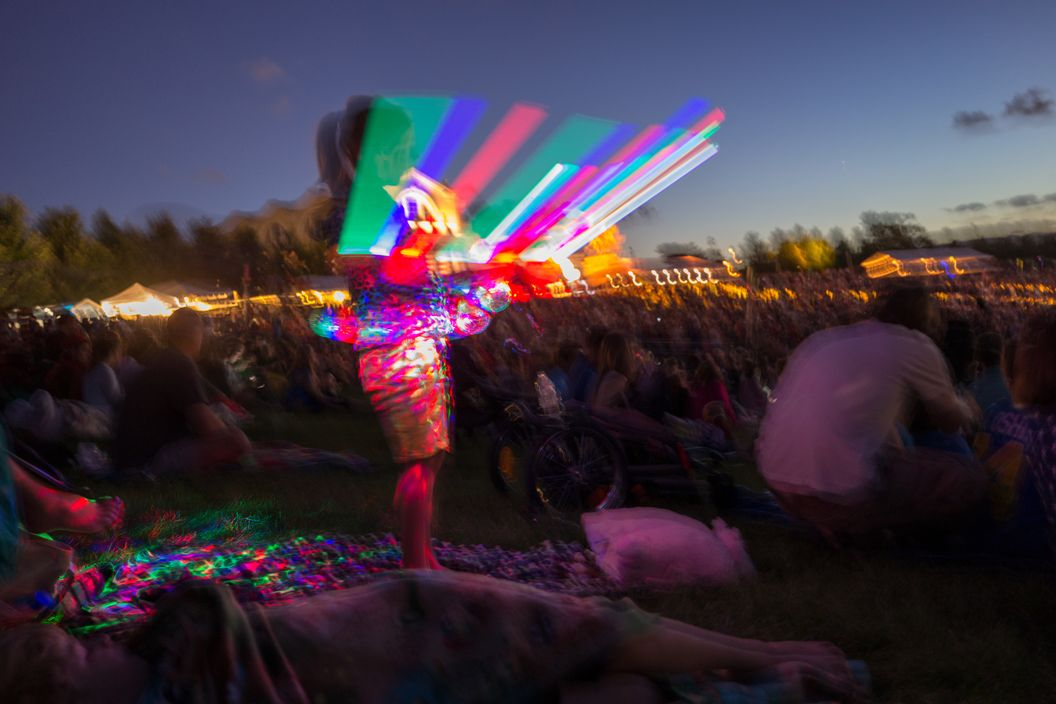
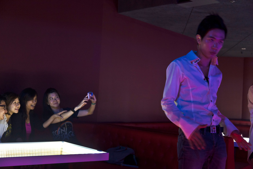
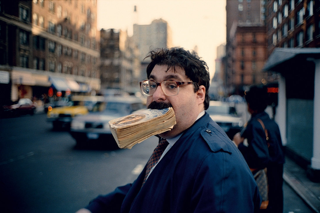
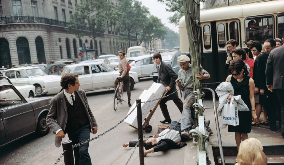
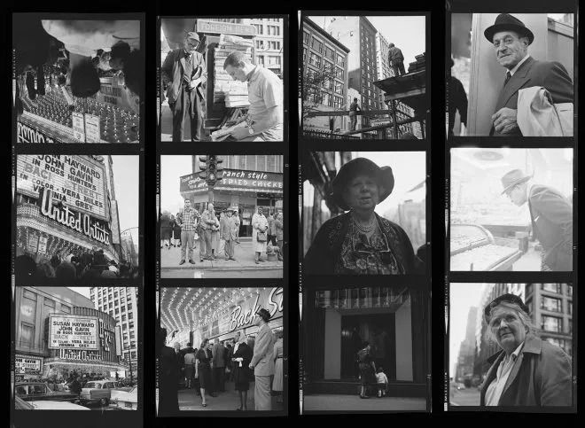
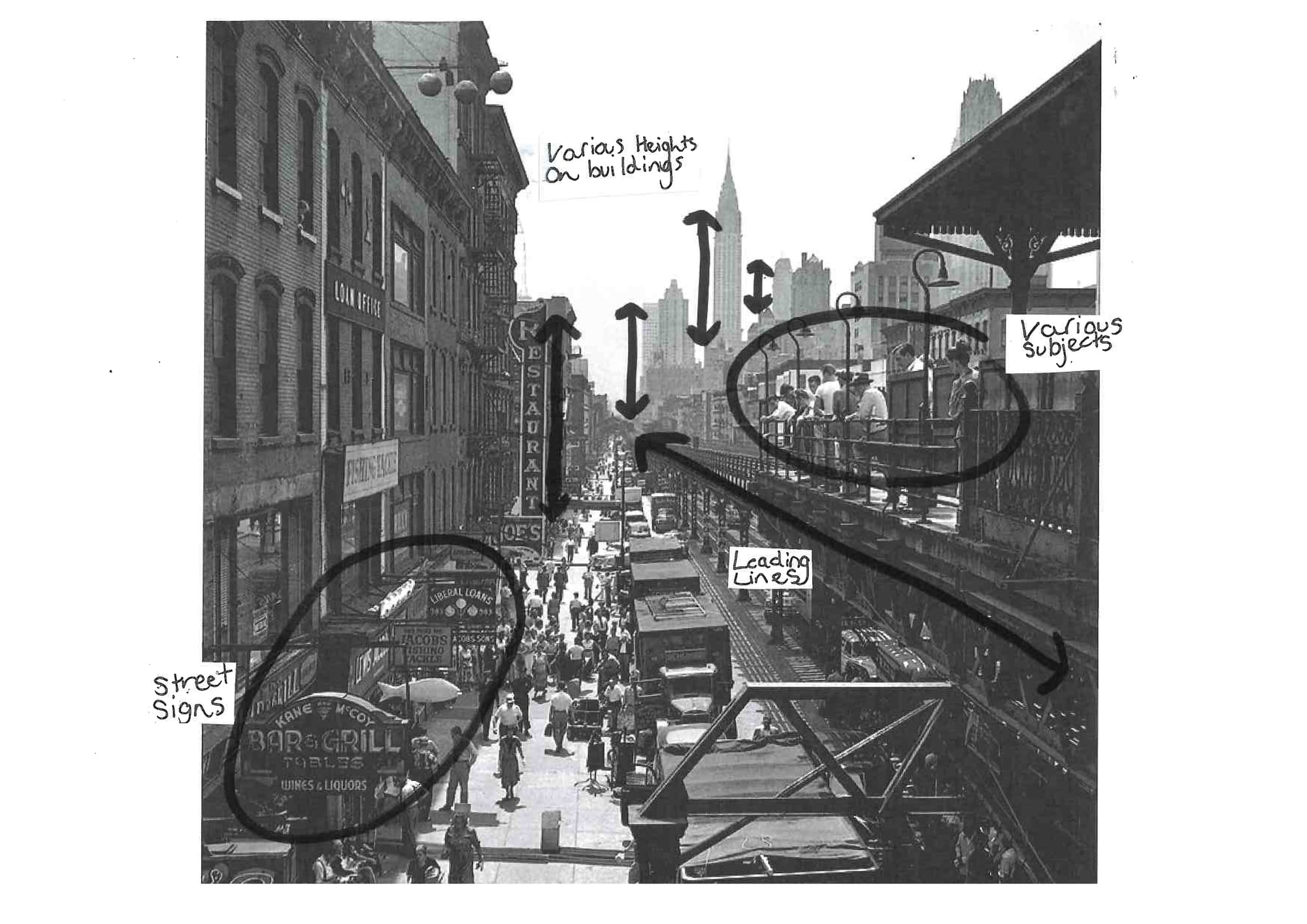
As a photographer I am fascinated by the camera's ability to tell complex and personal stories that transport the viewer into a different place and time.I have decided to research into James Ravilious and Joshua Thomas Cooper for my personal study. Both of these photographers have similar photography styles as both are shooting black and white photos. However, the way the images have been presented are vastly different. By researching both of these photographers, I would like to understand in more detail the effects of black and white photography to an image. I will seek to improve my camera ability by shooting in manual mode.


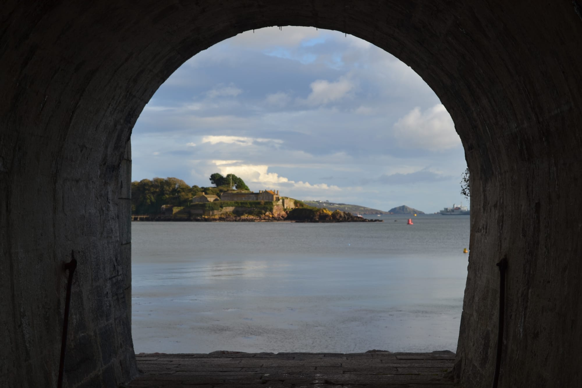
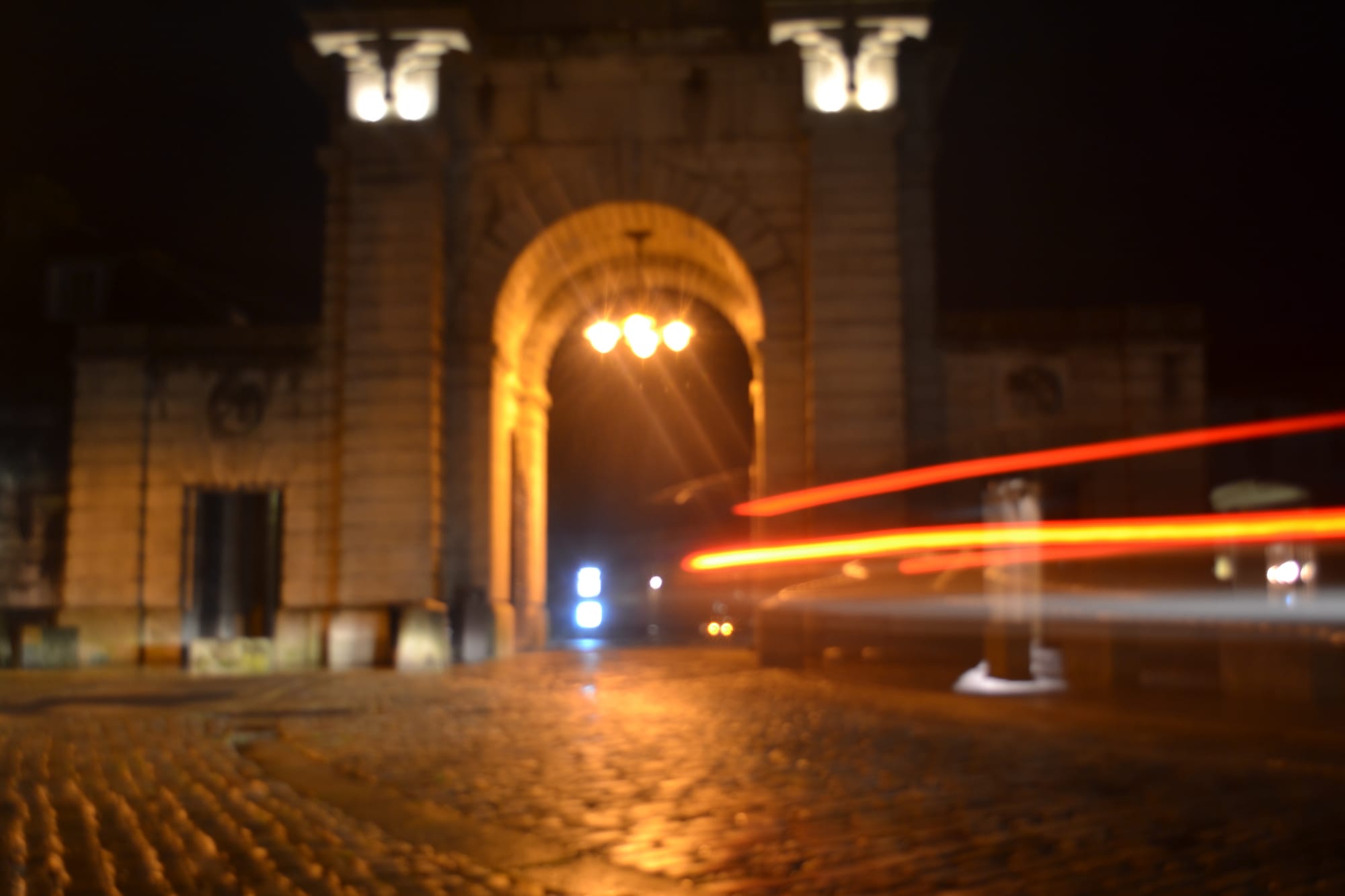
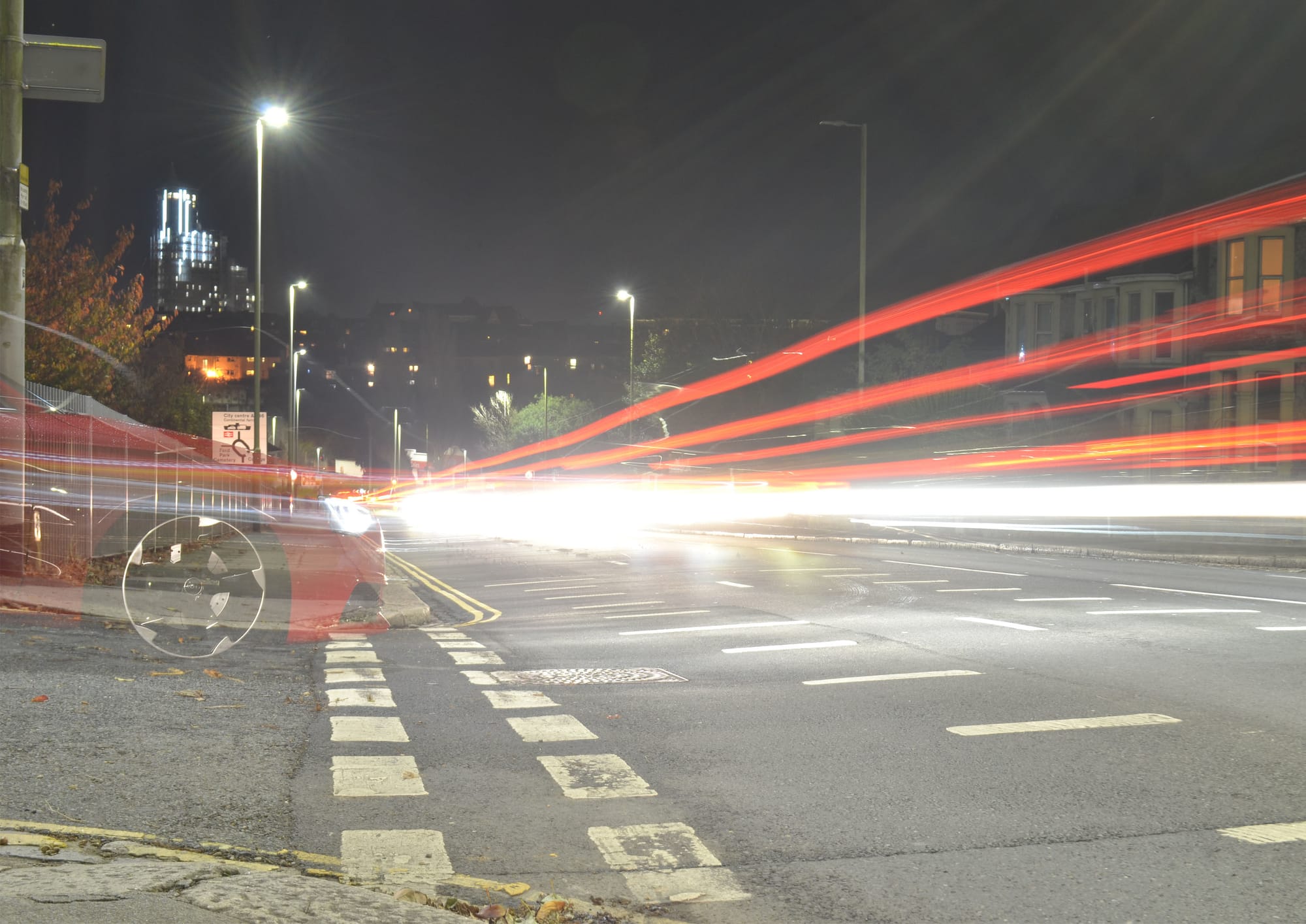
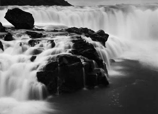
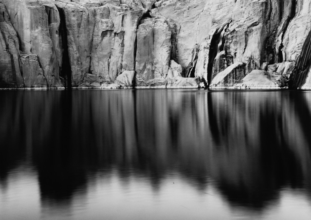
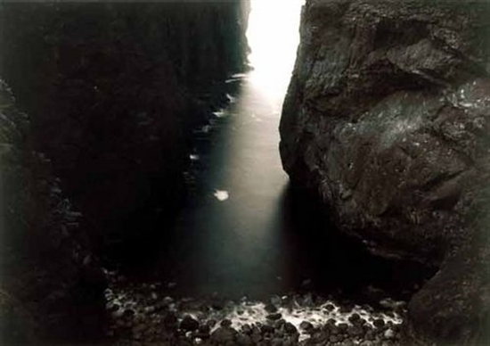
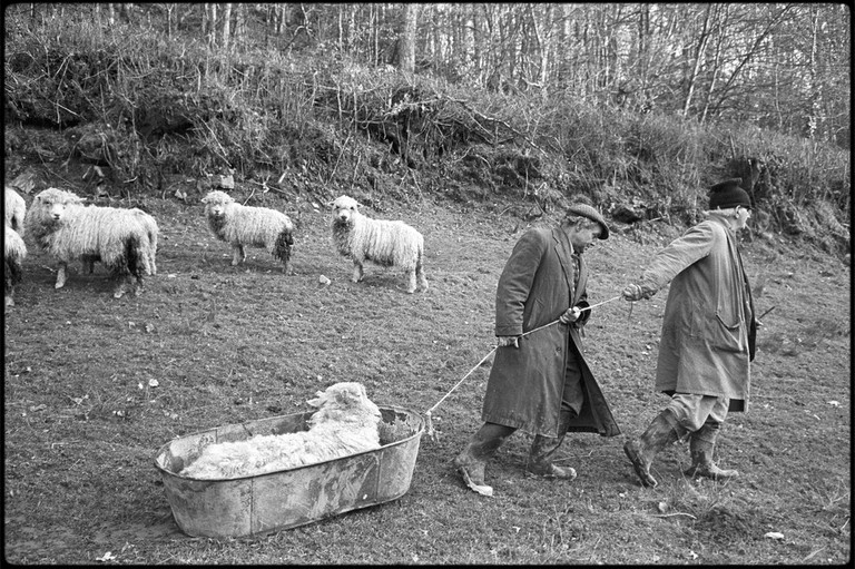
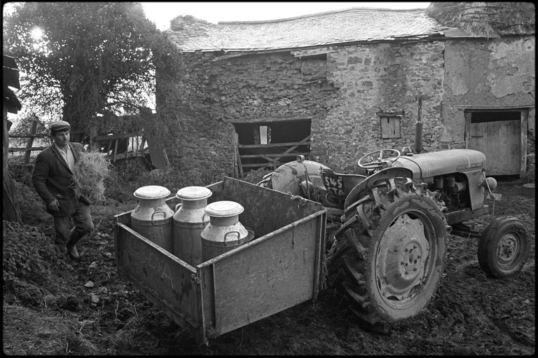
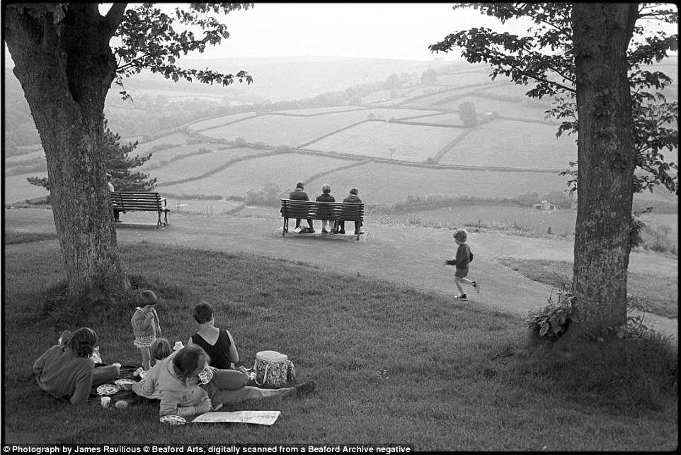
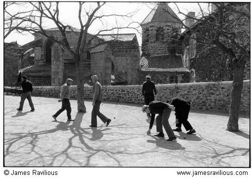
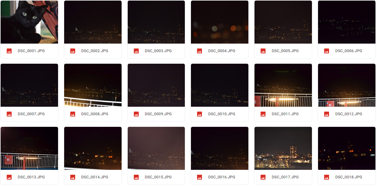
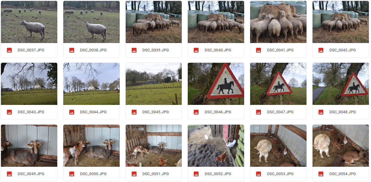
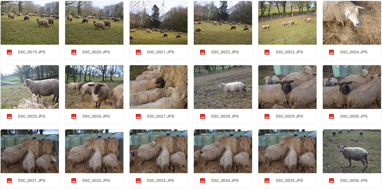
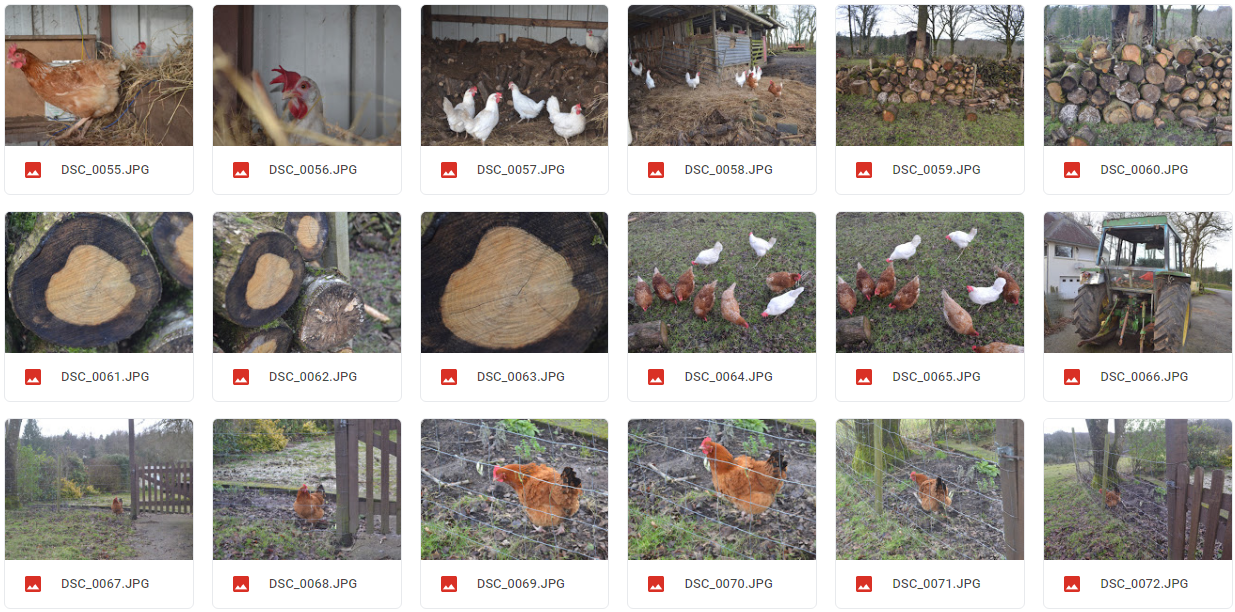
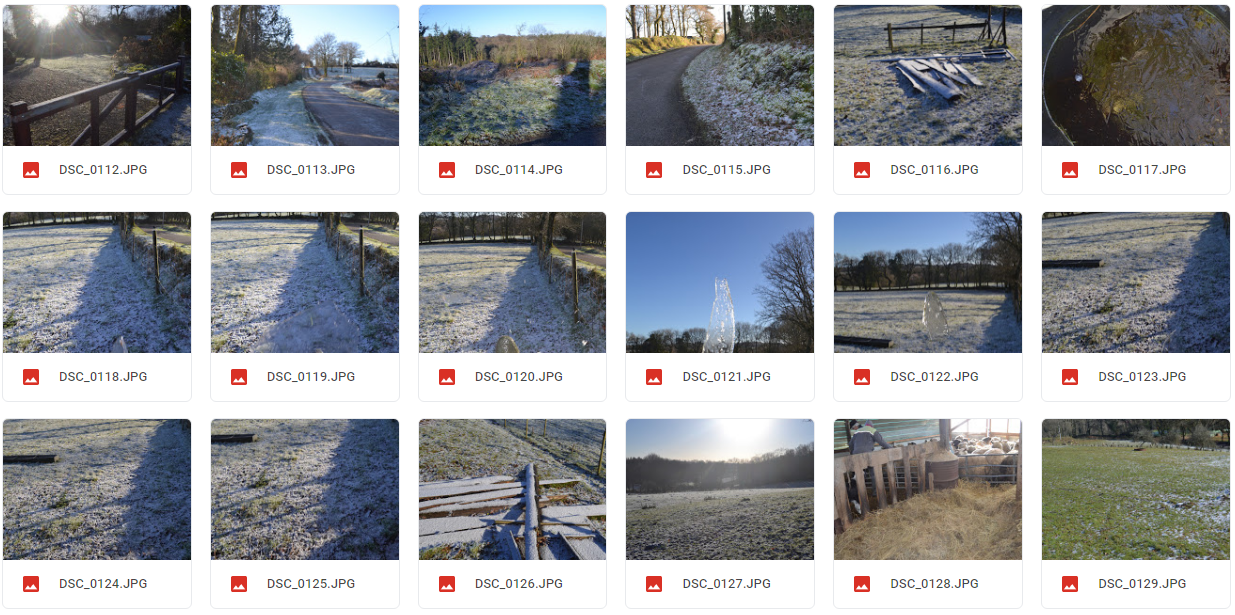
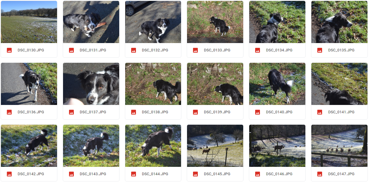
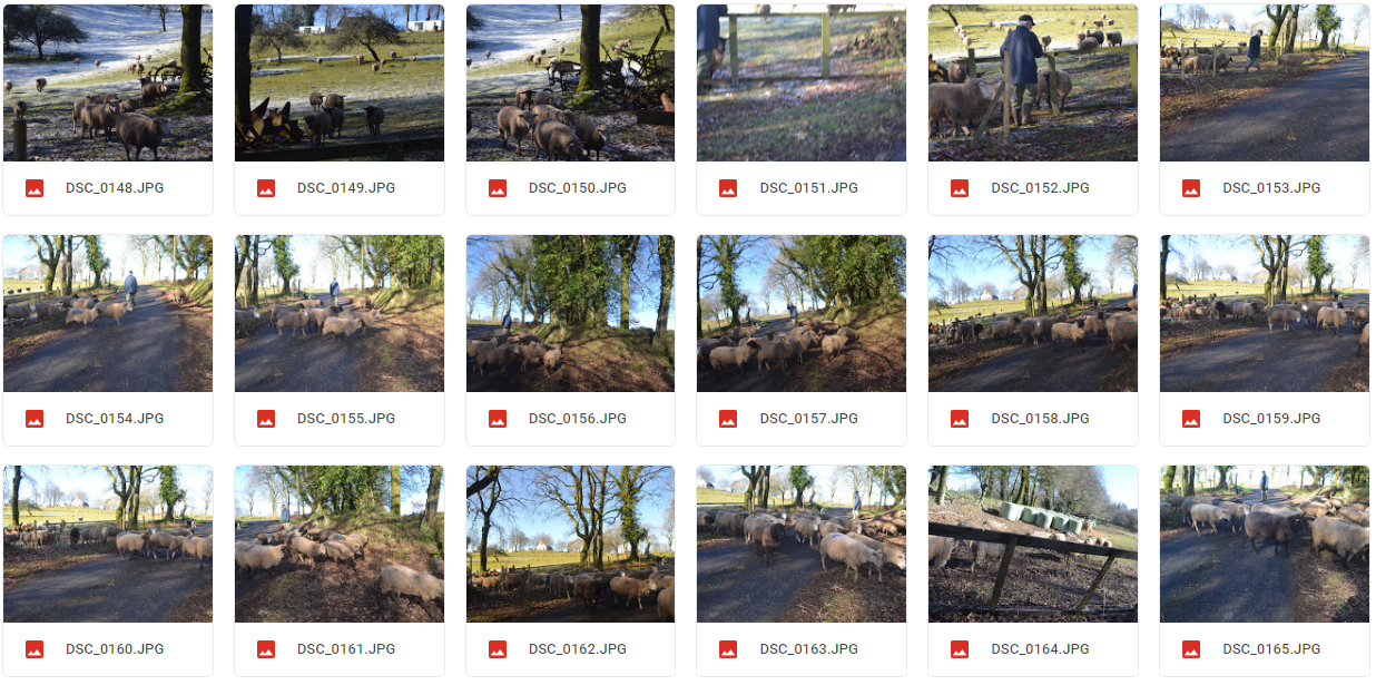
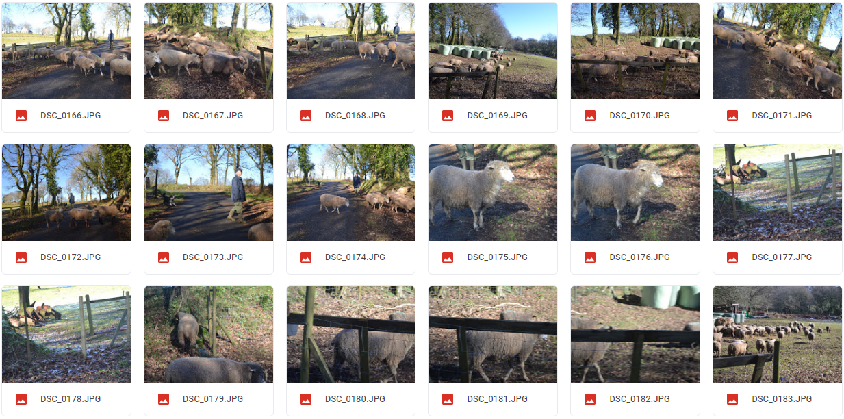
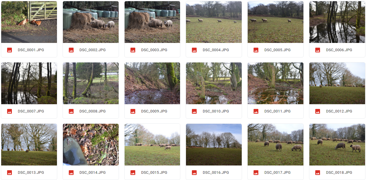
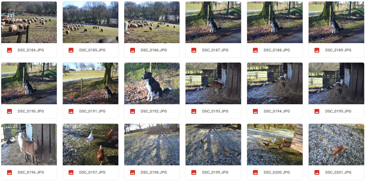
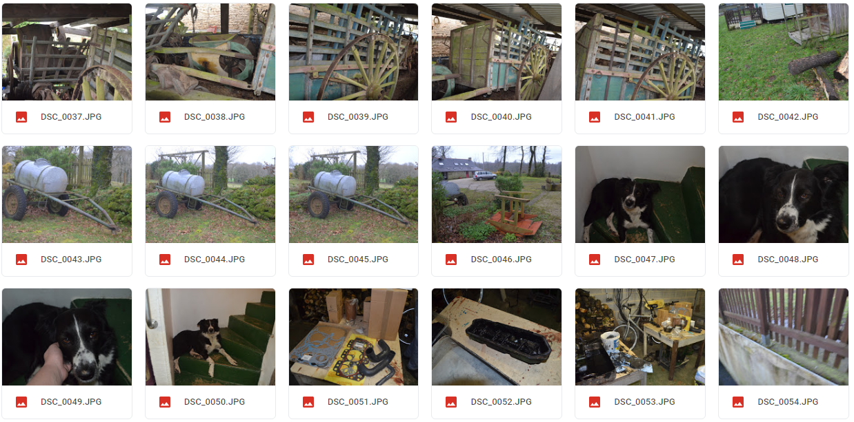
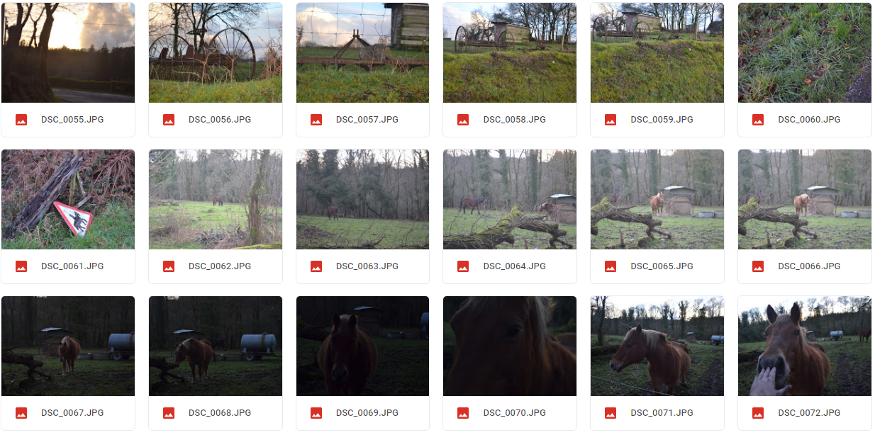
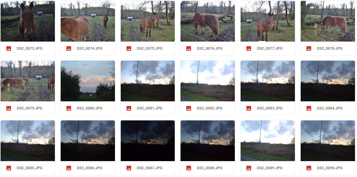
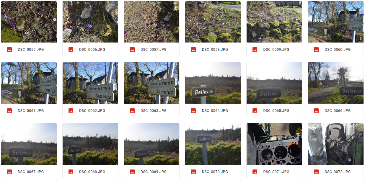
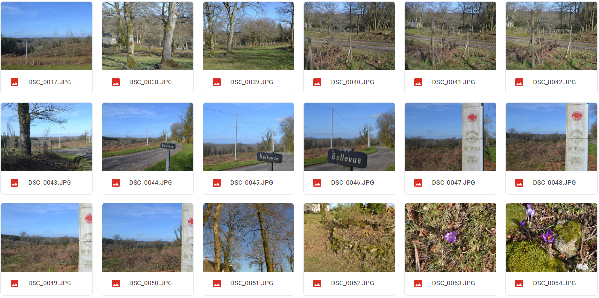
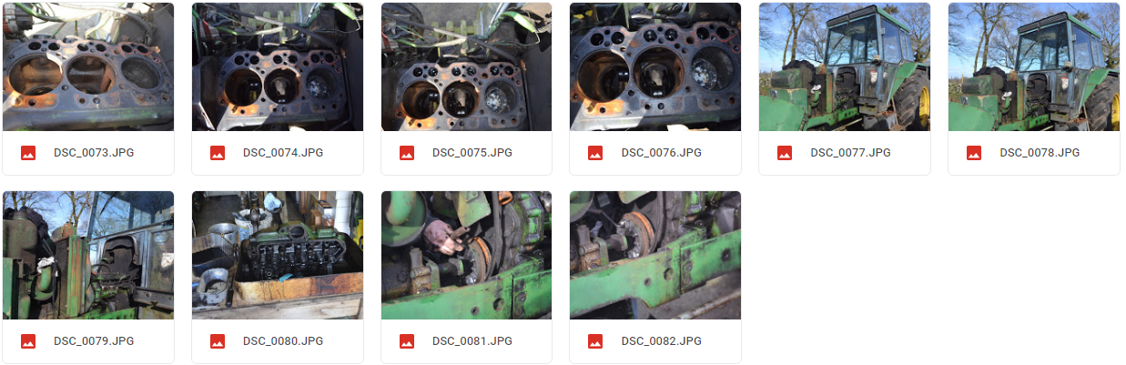
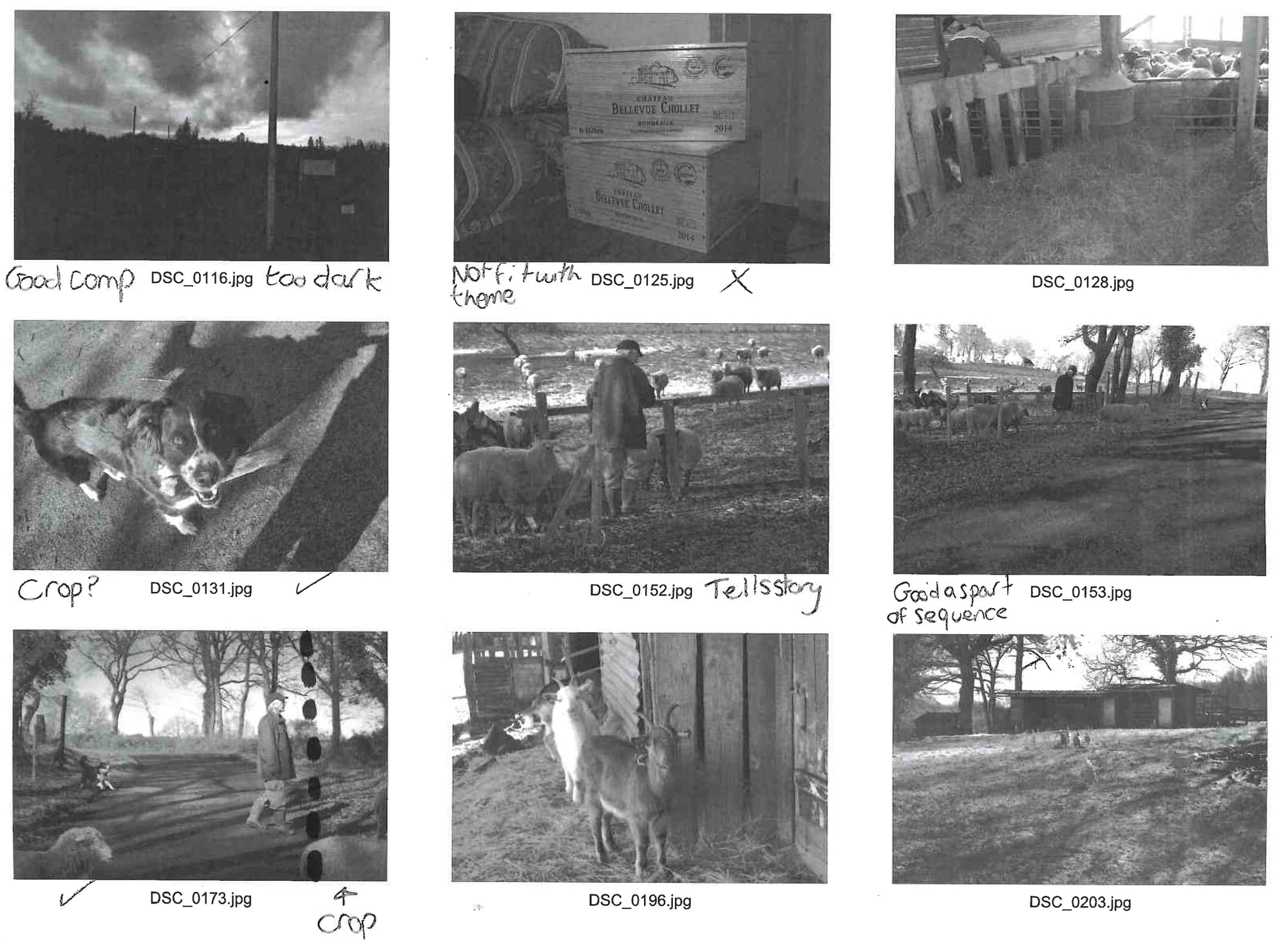
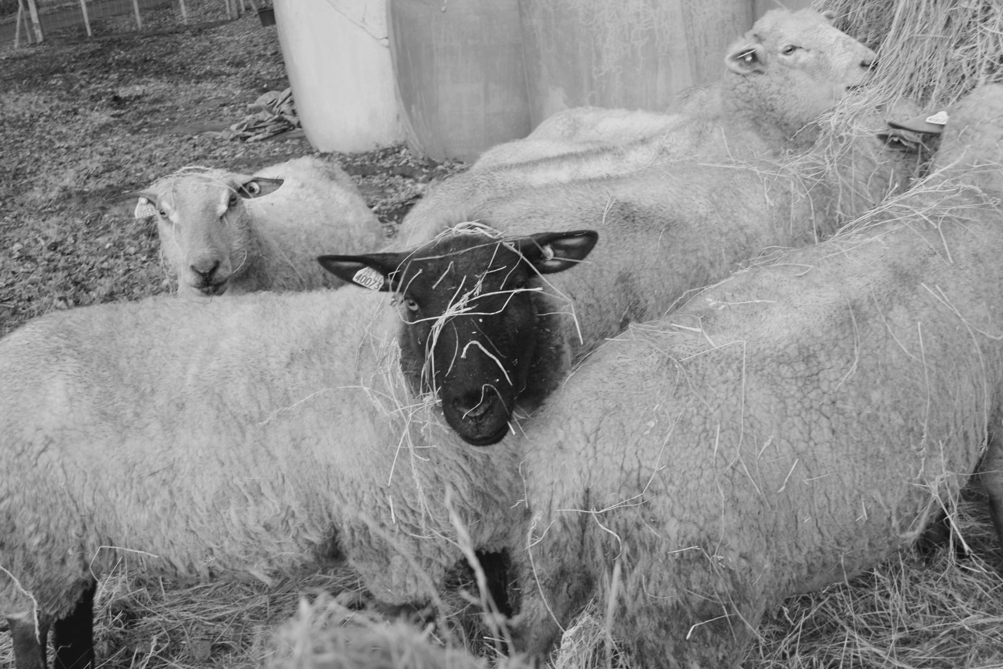
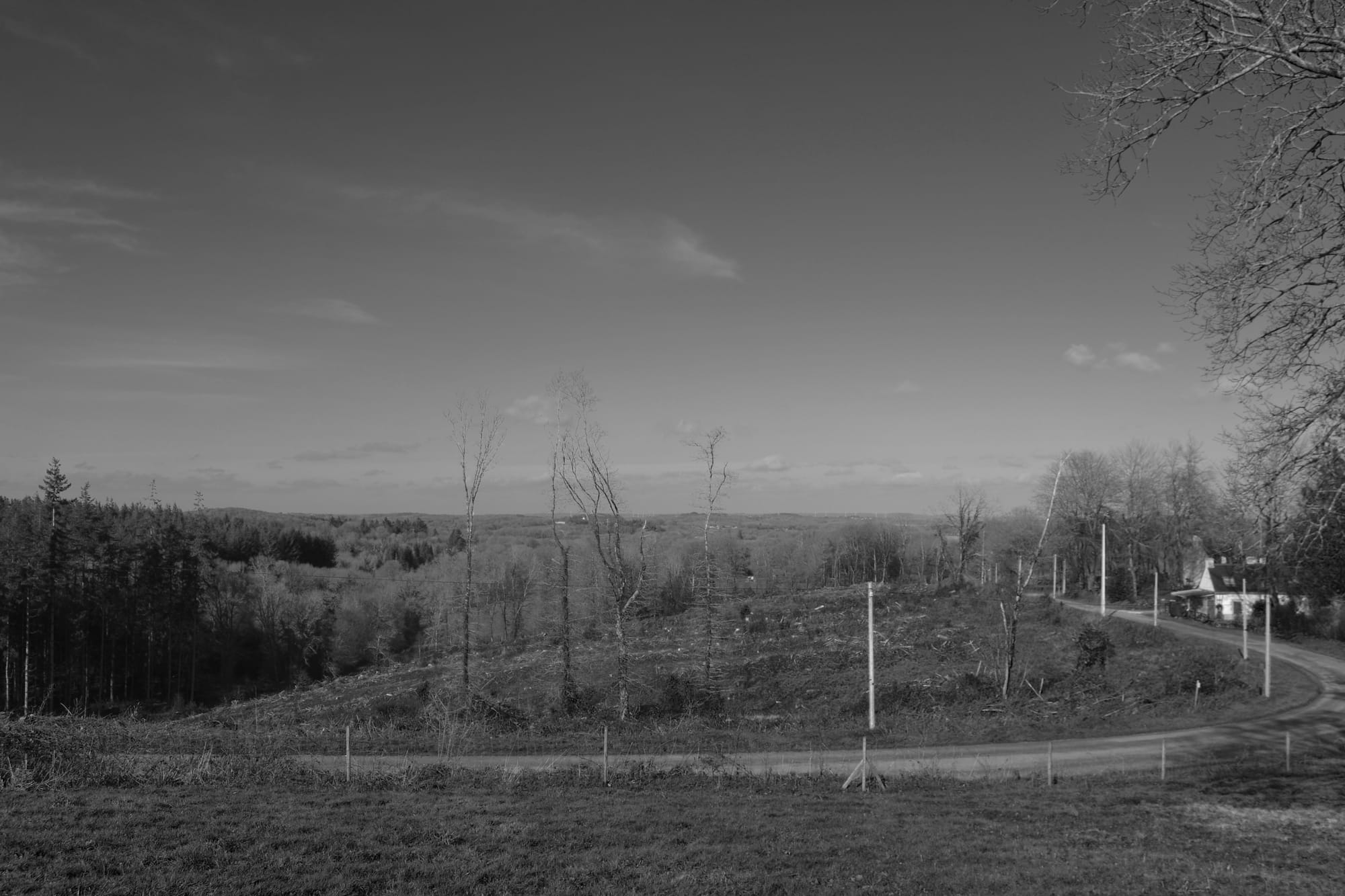
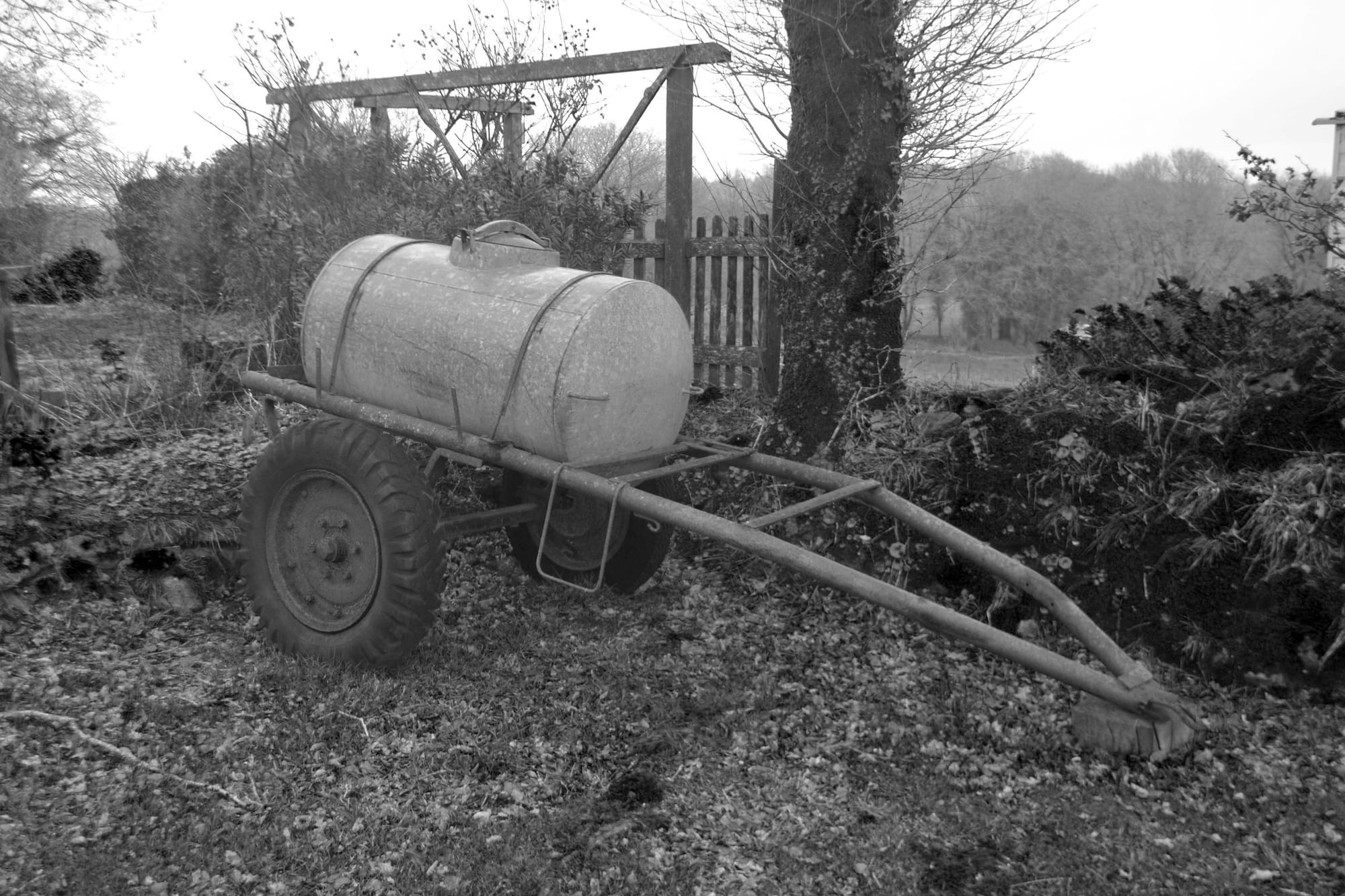
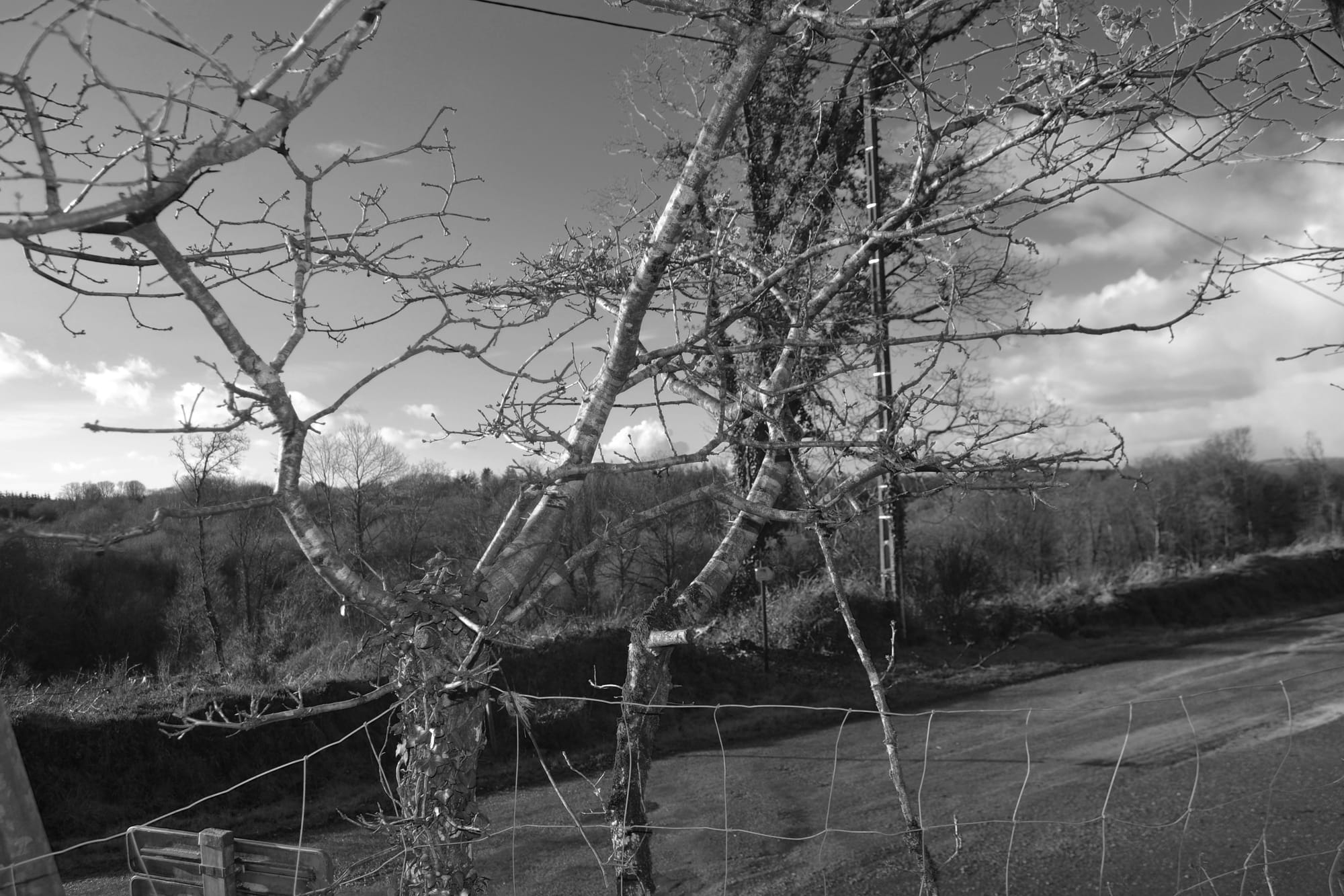
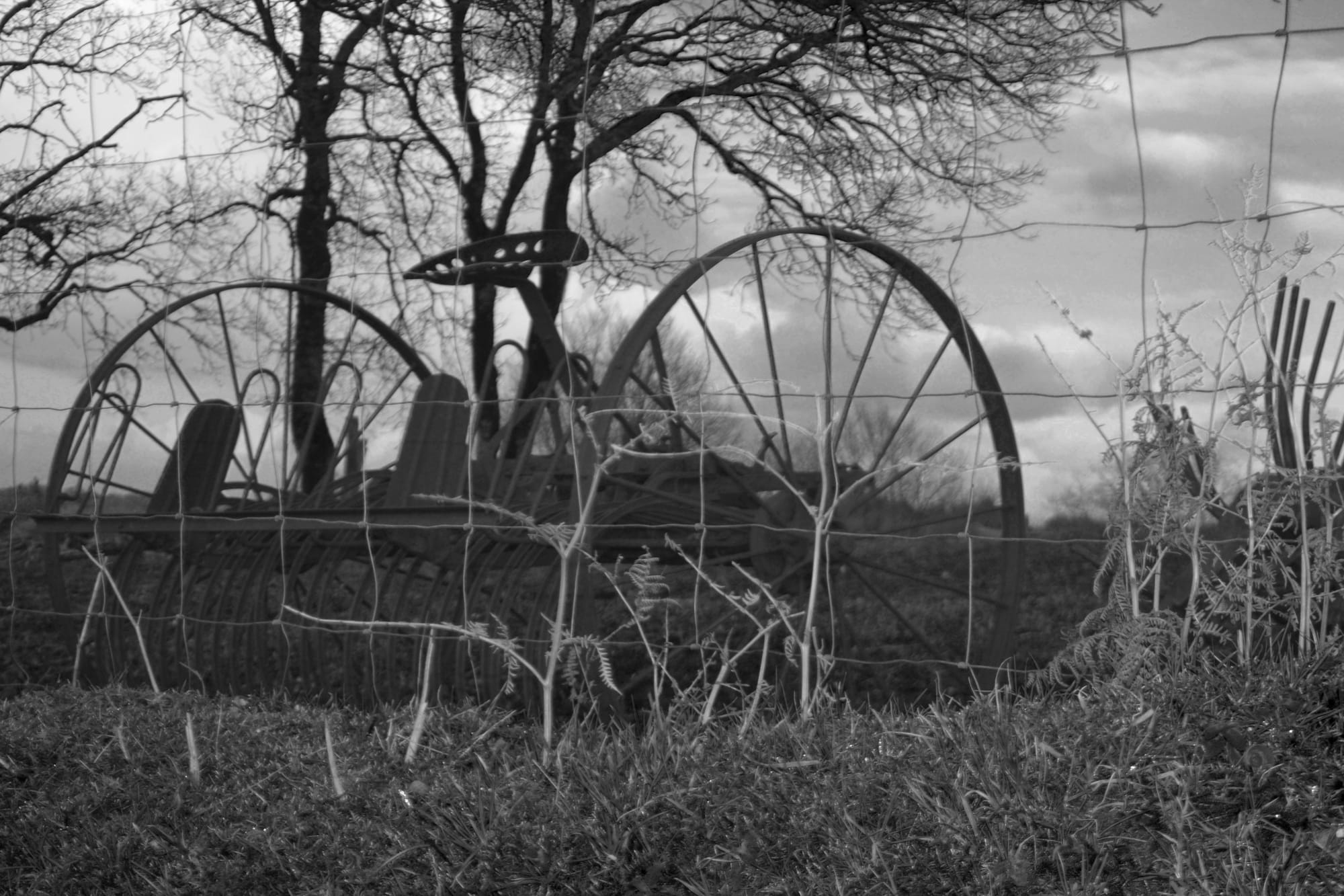
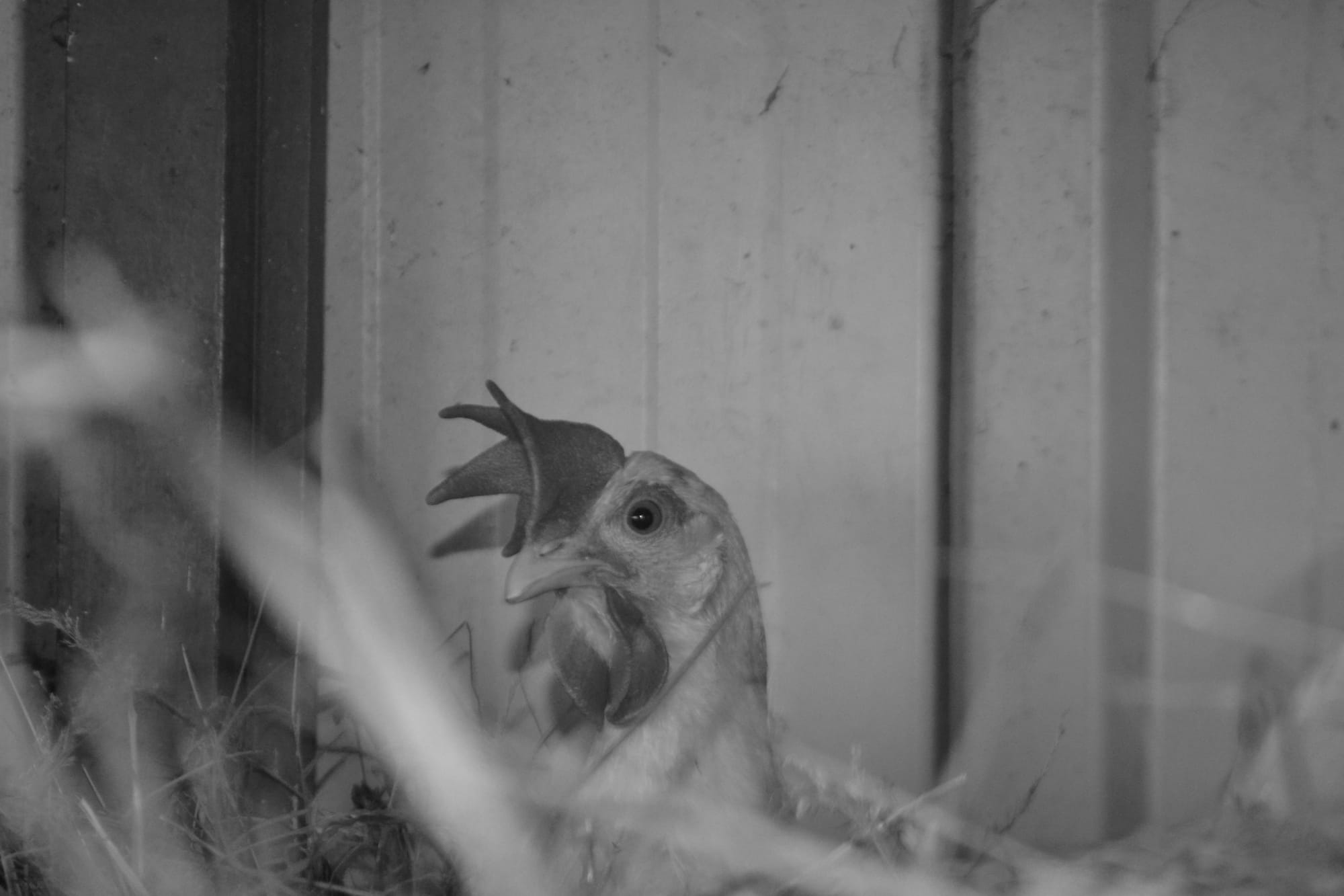
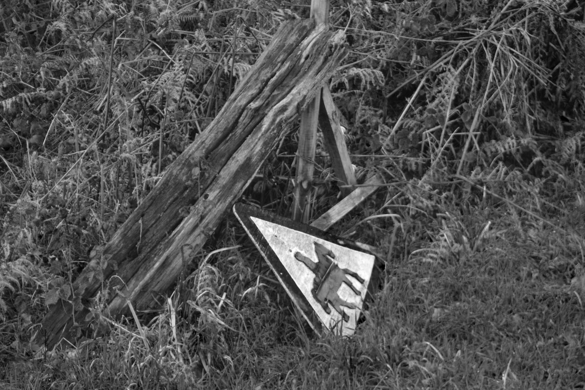
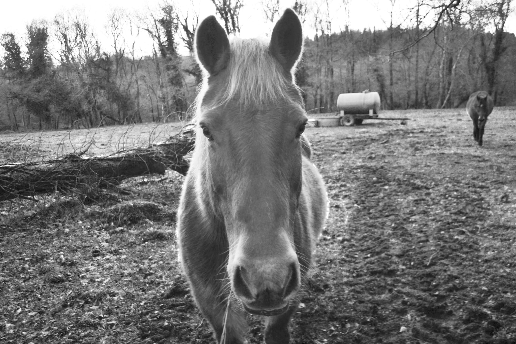
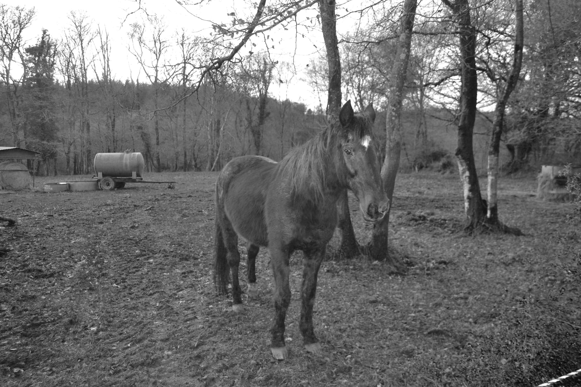
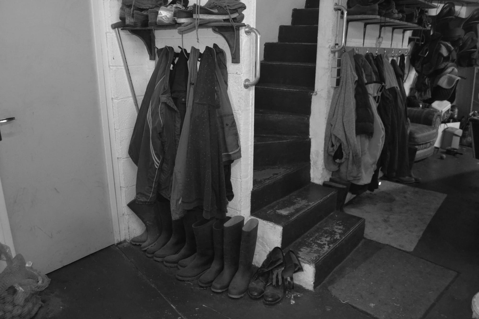
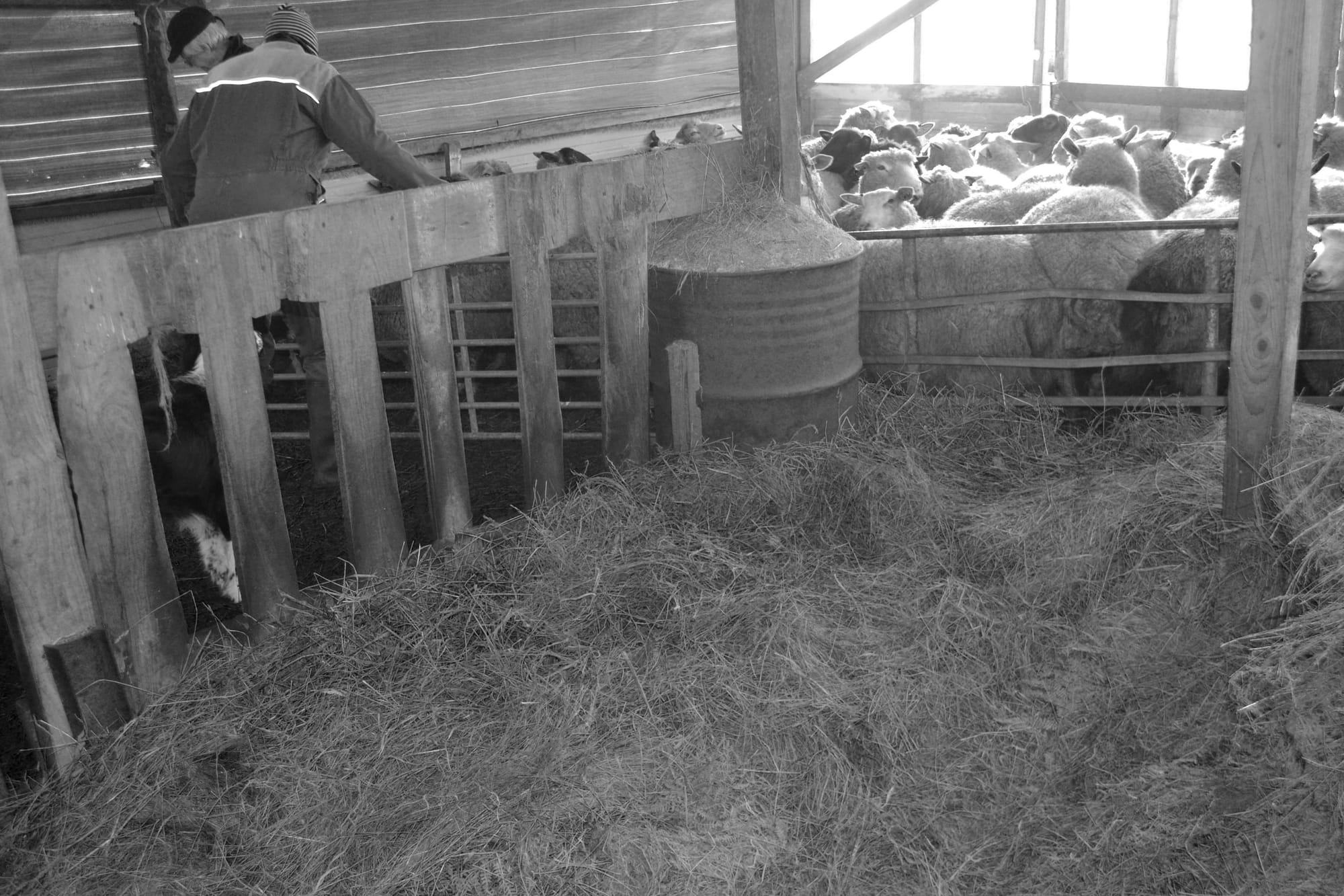
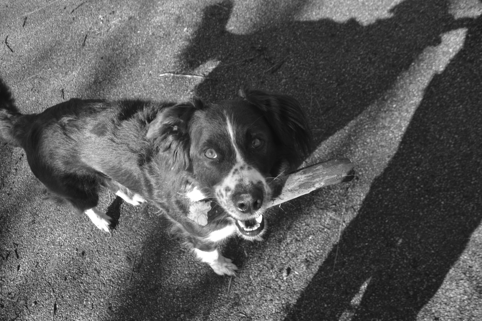
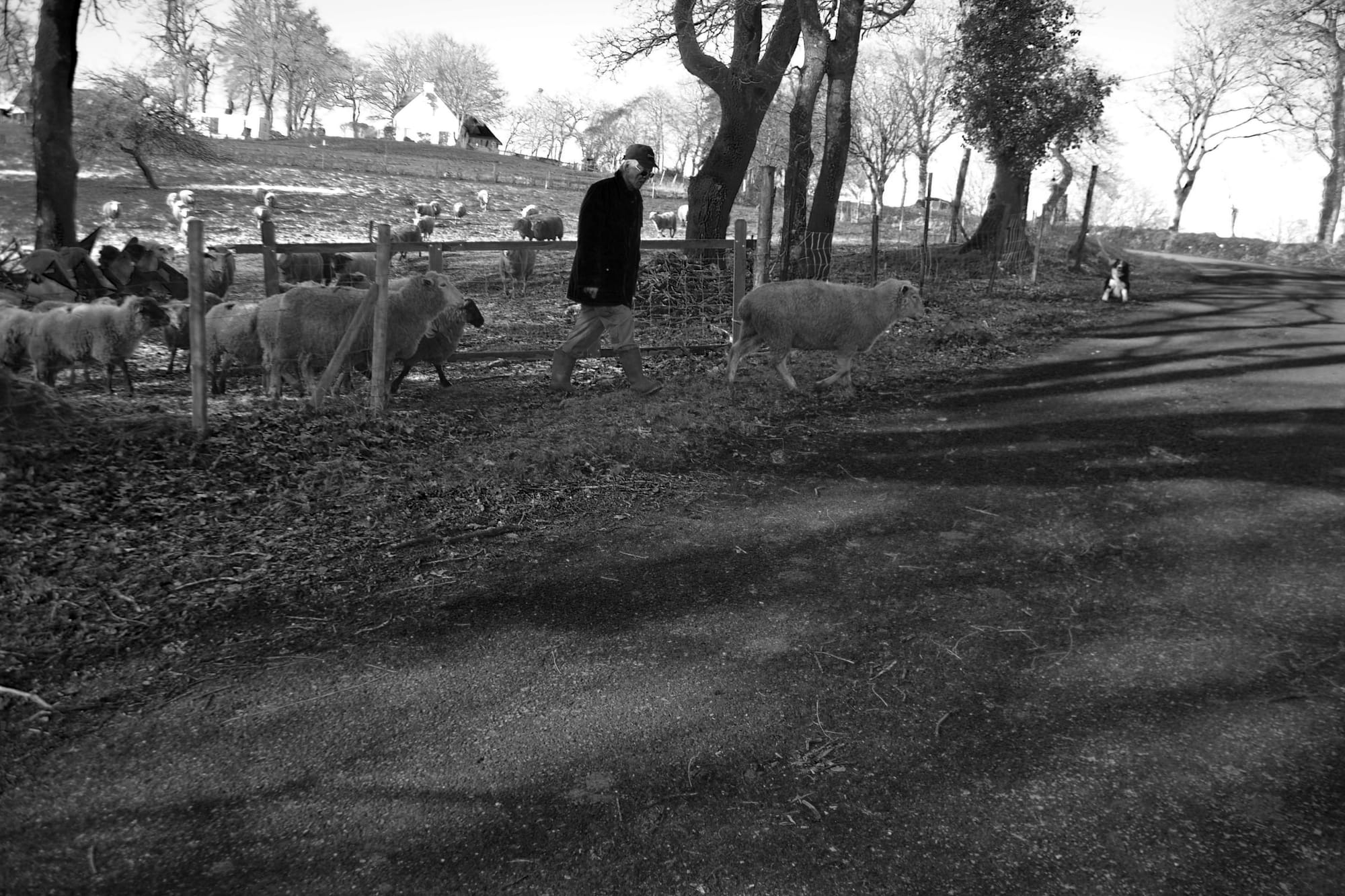
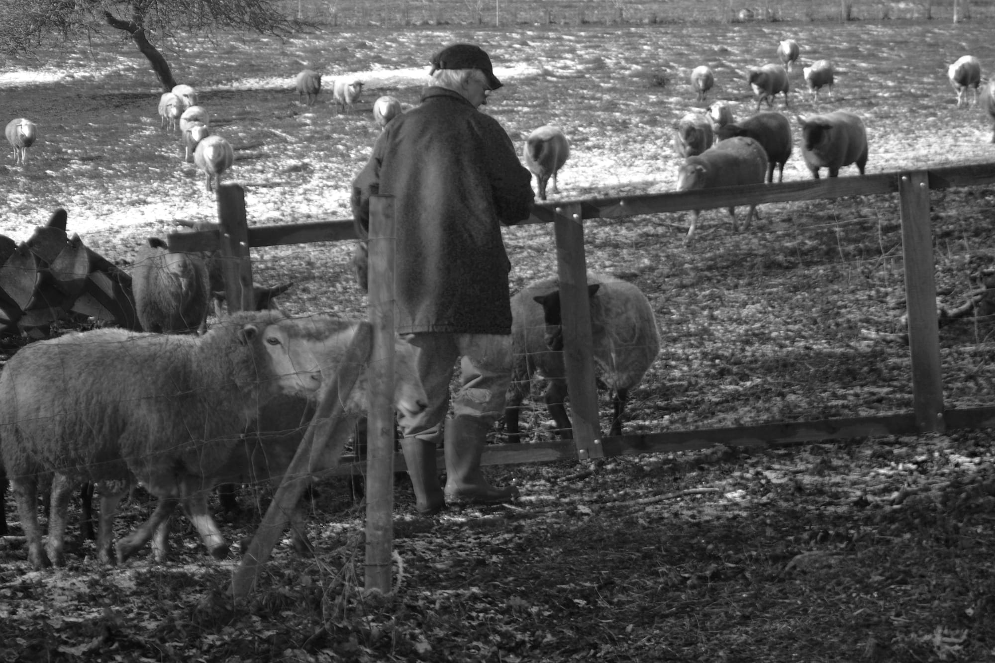
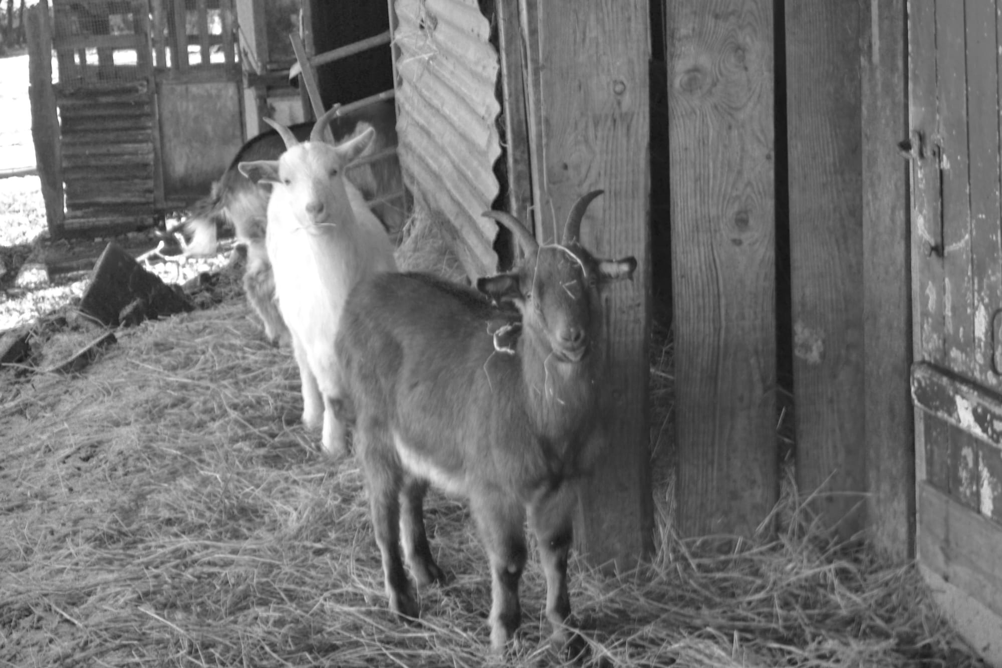
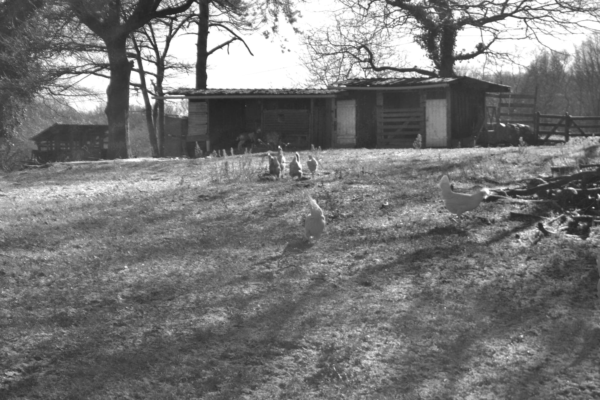
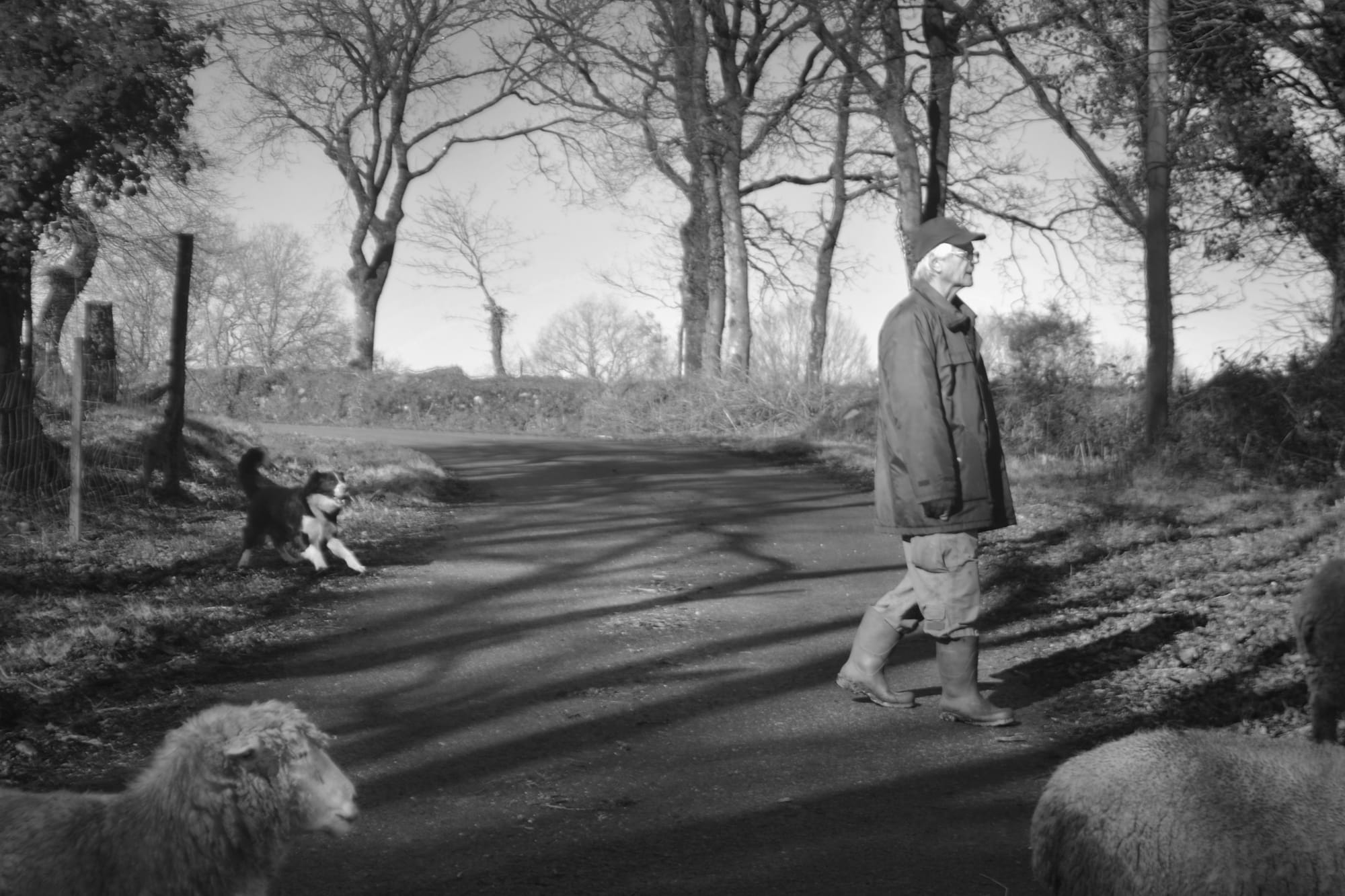
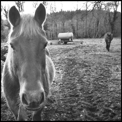
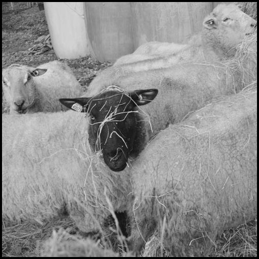
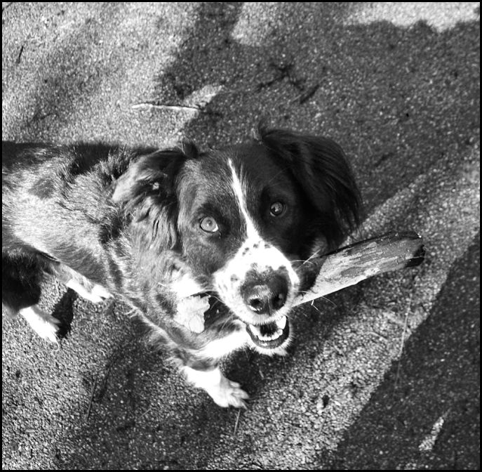
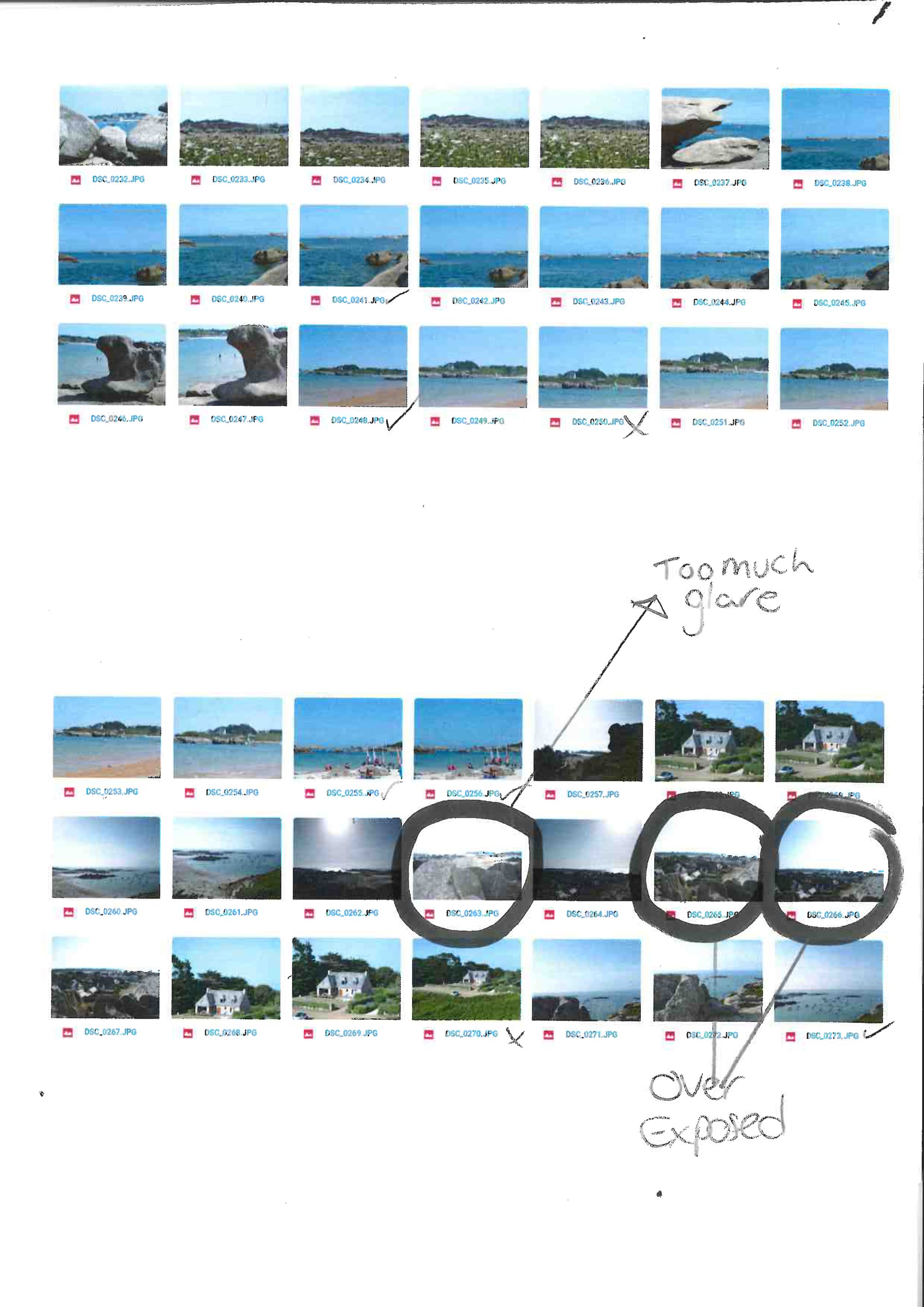
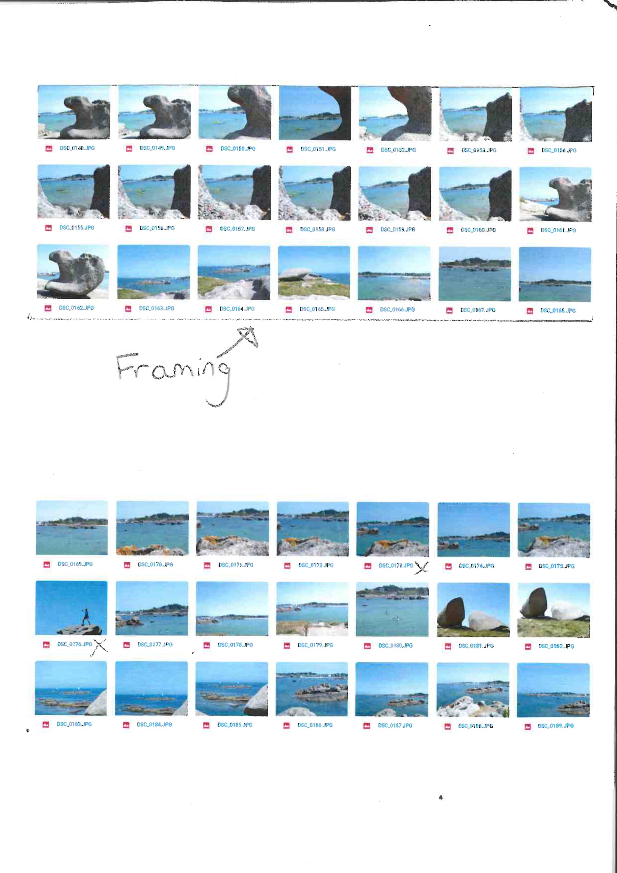
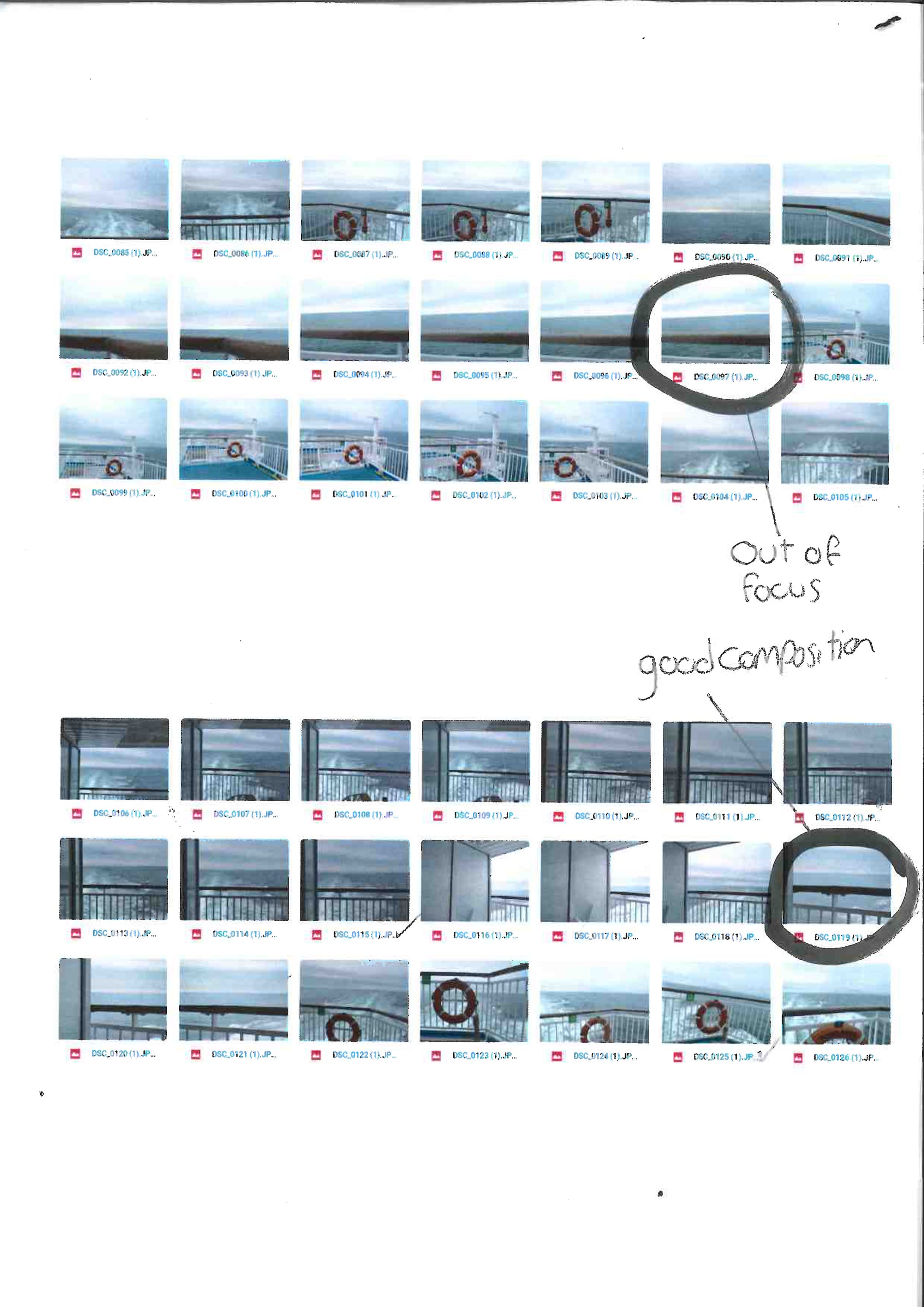
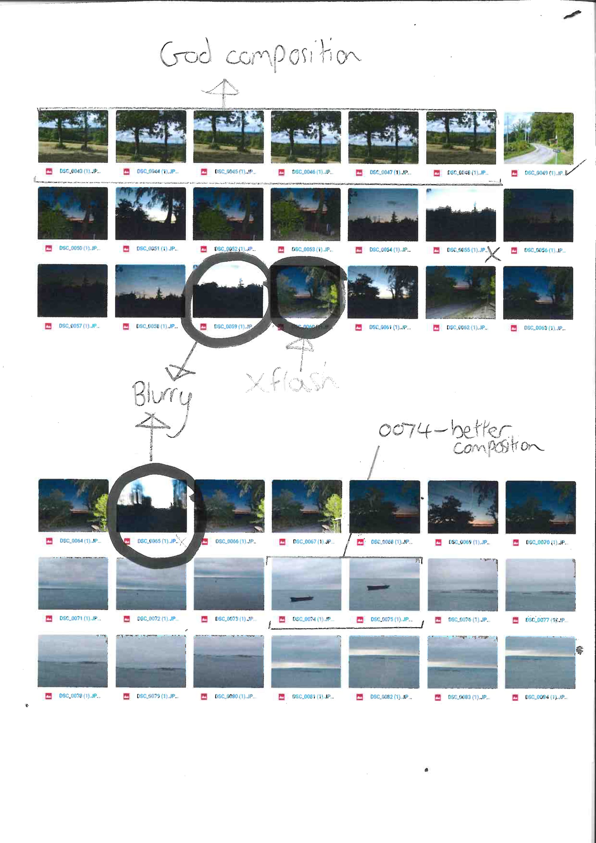
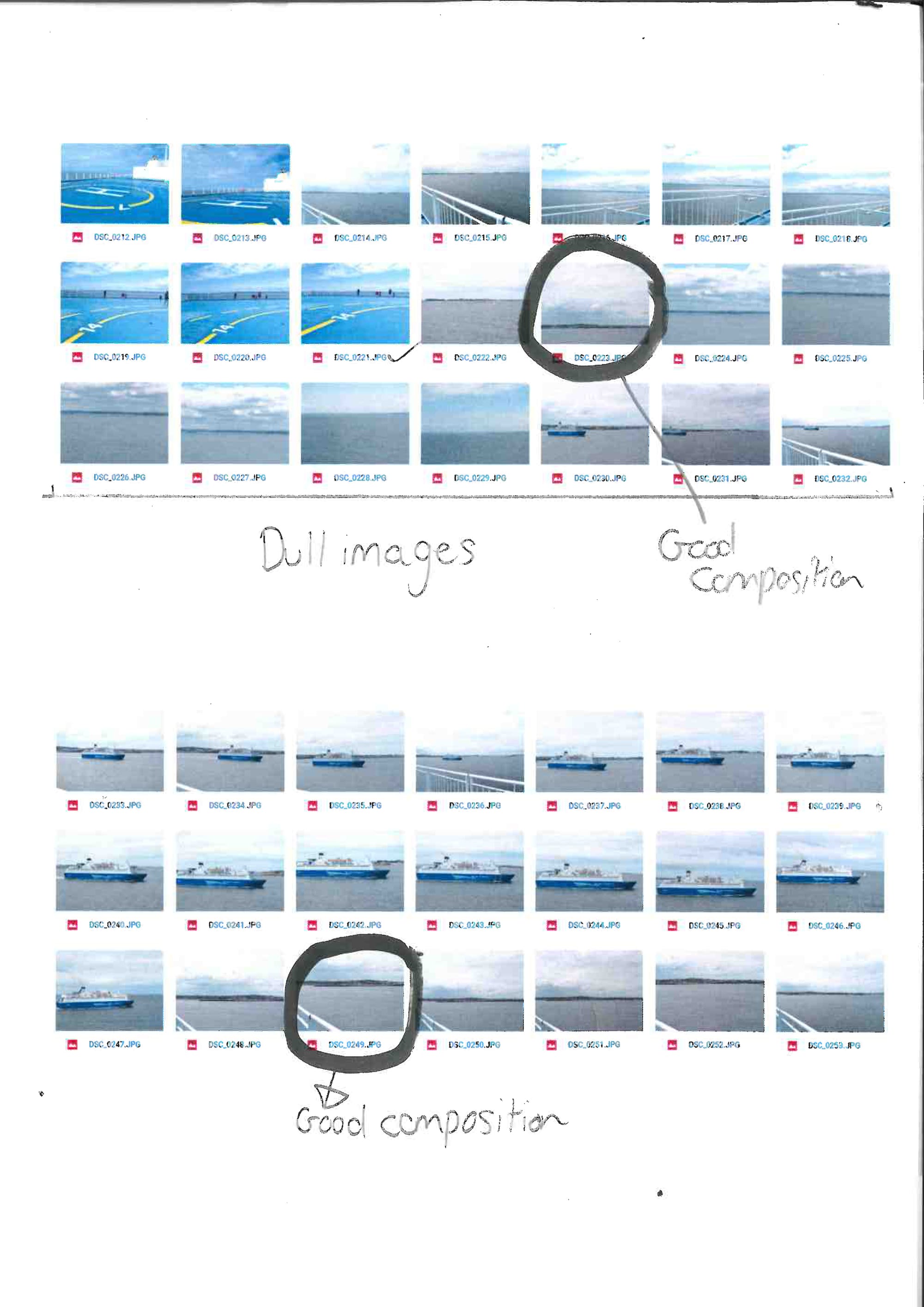
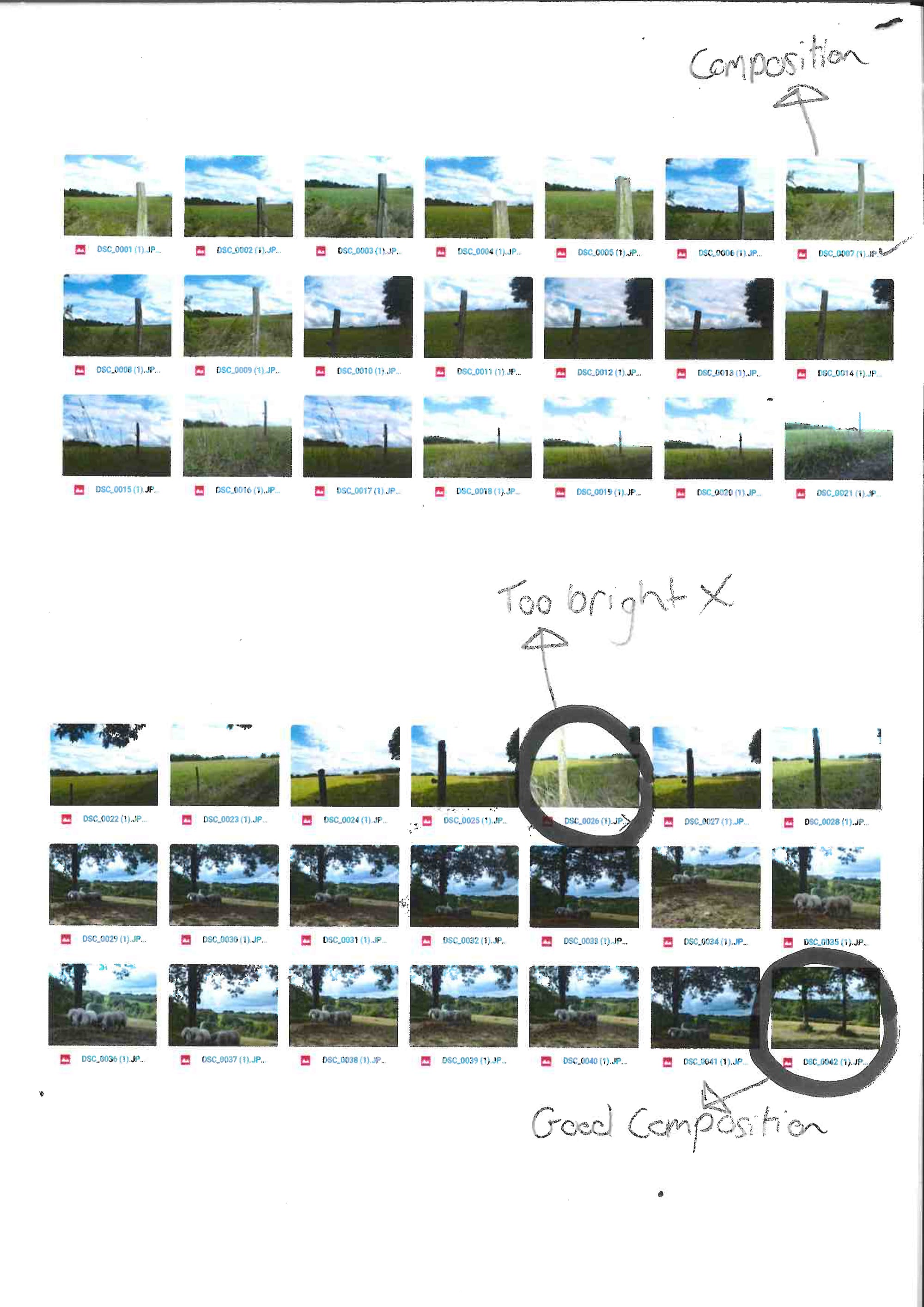
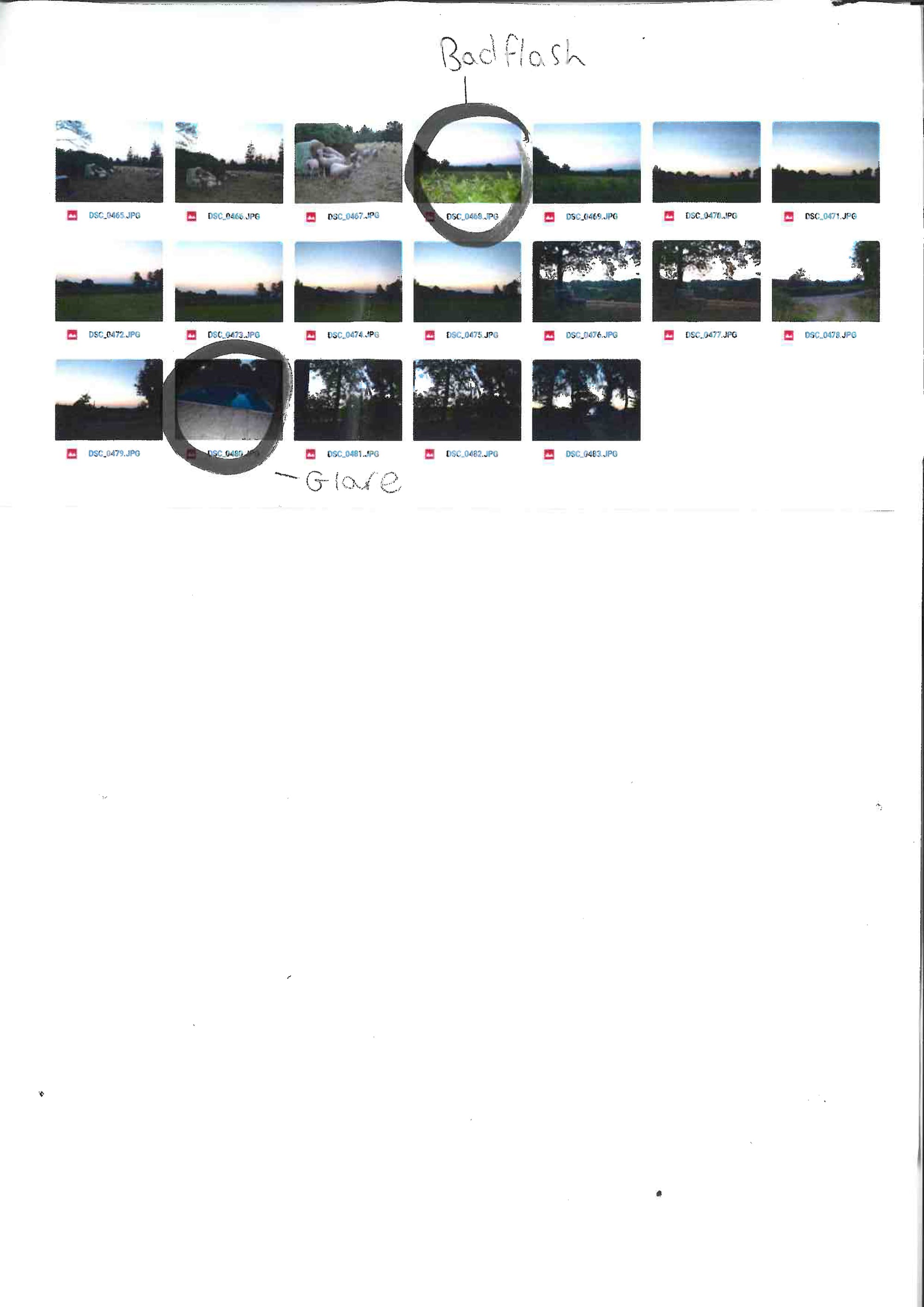
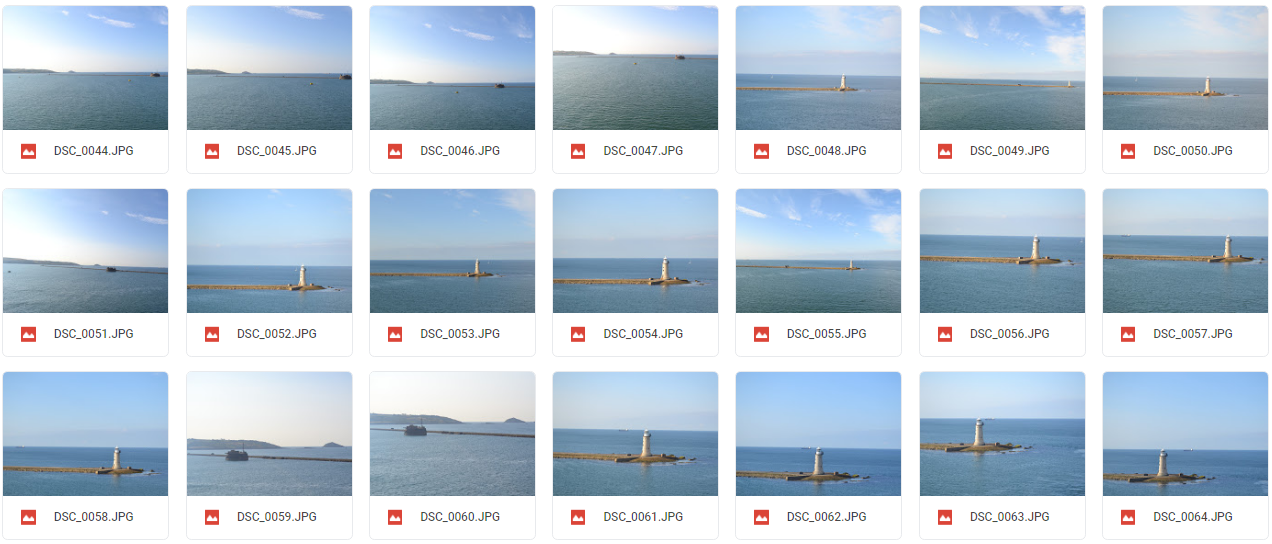
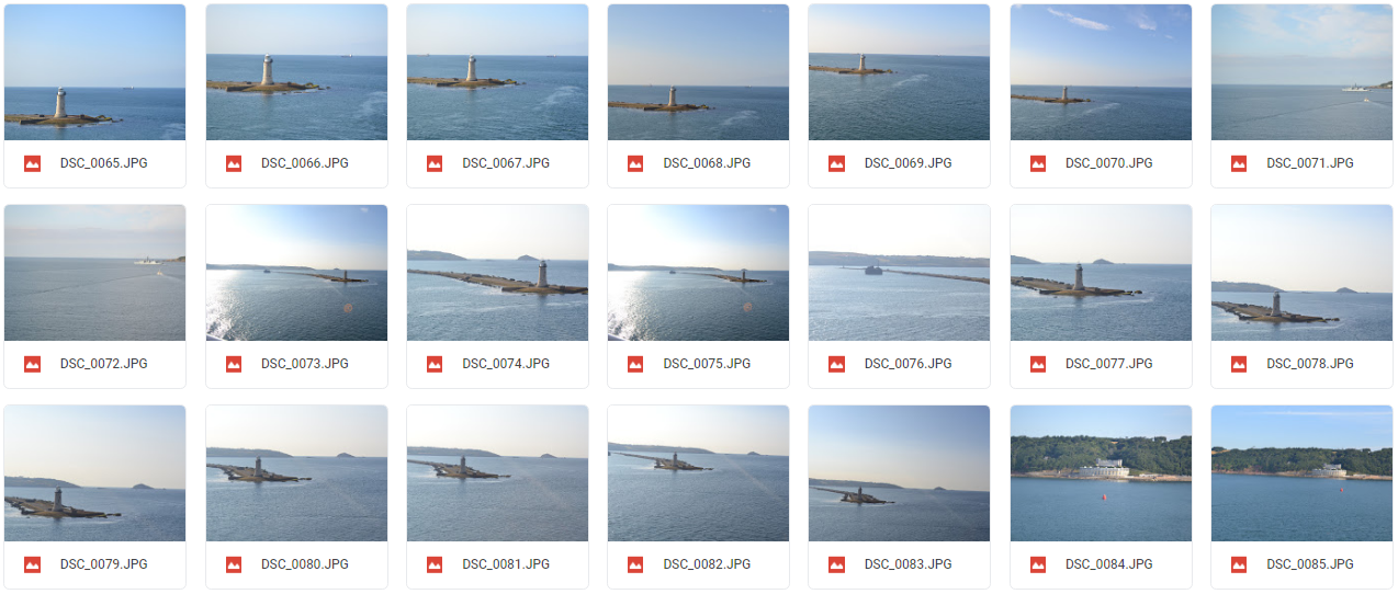
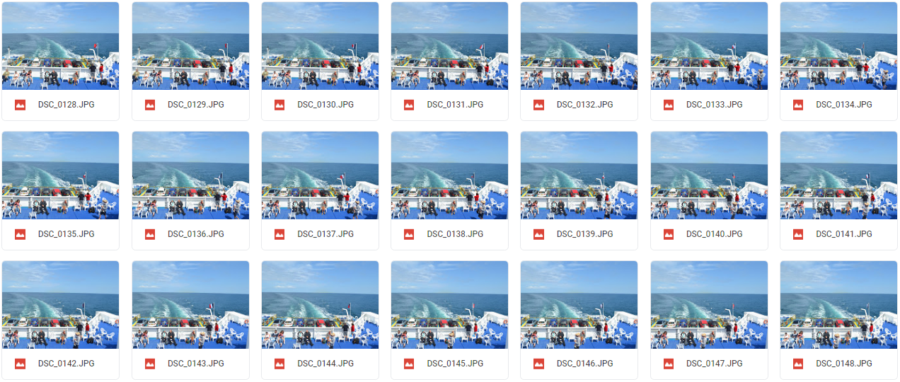
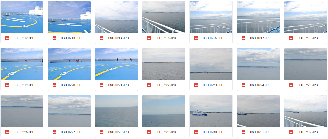
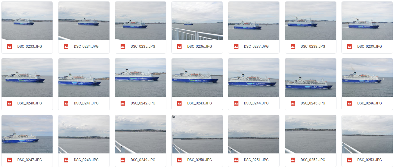
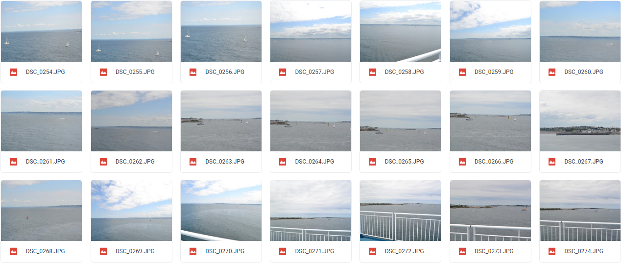
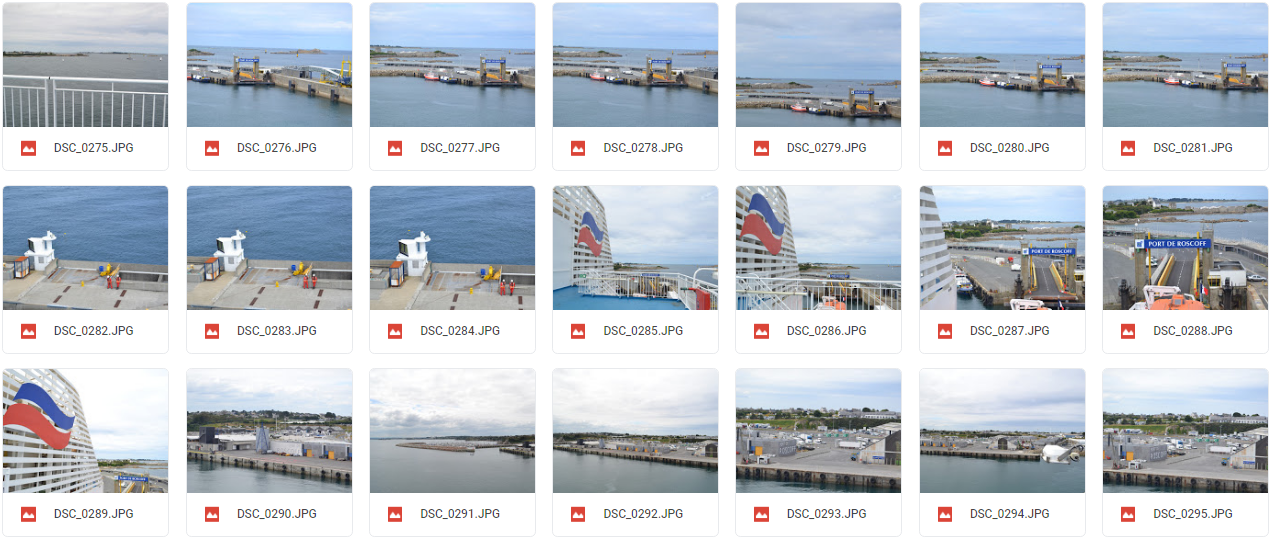
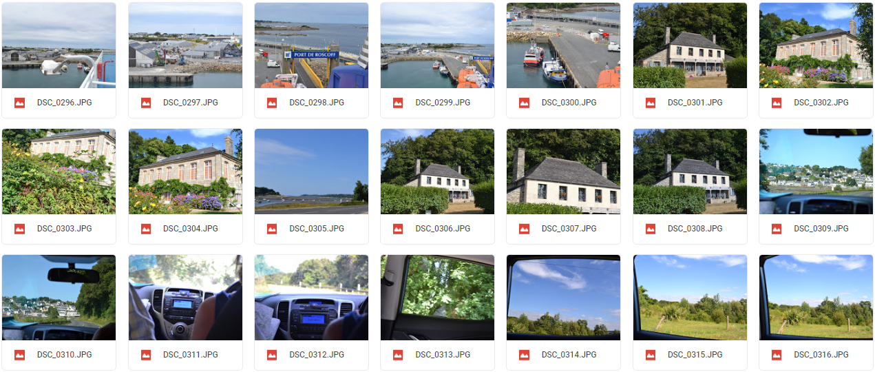
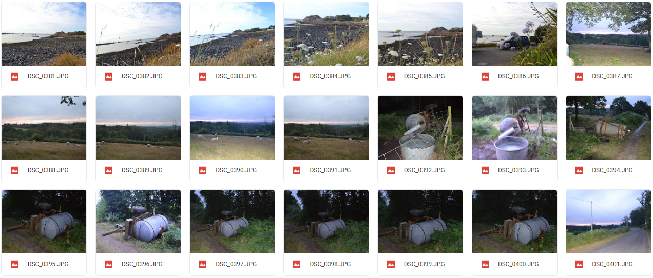
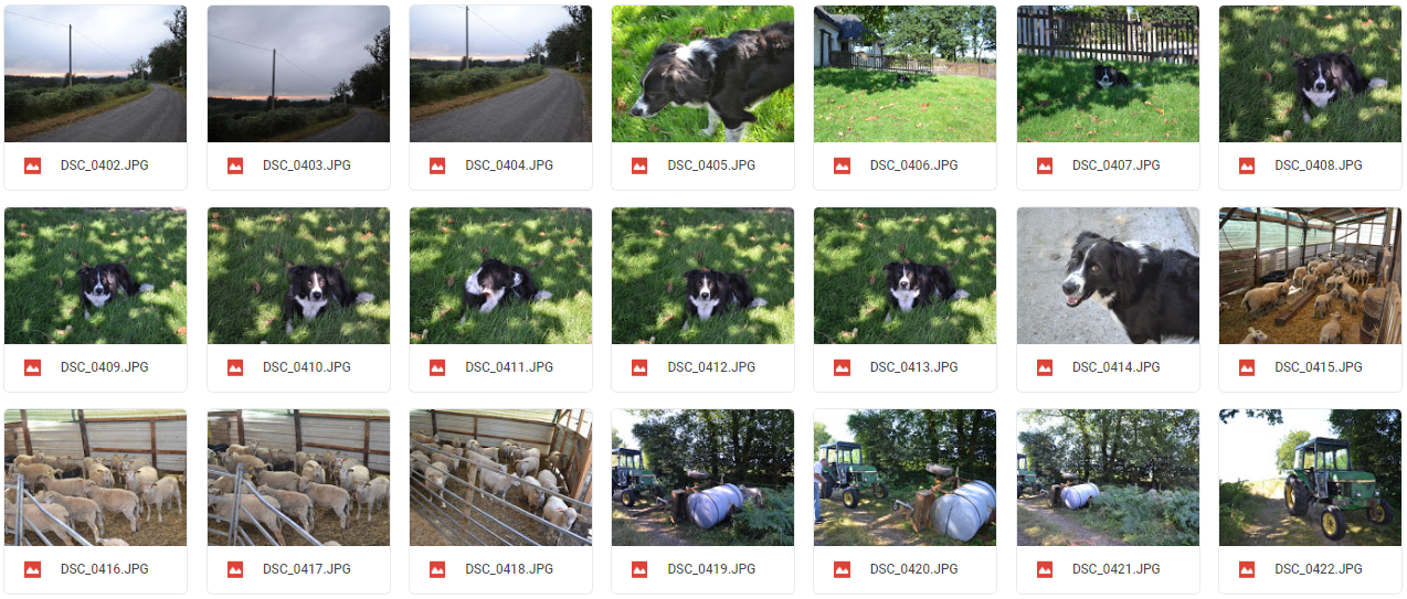
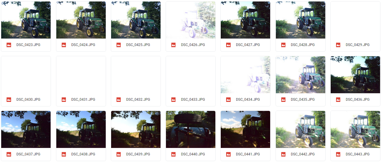
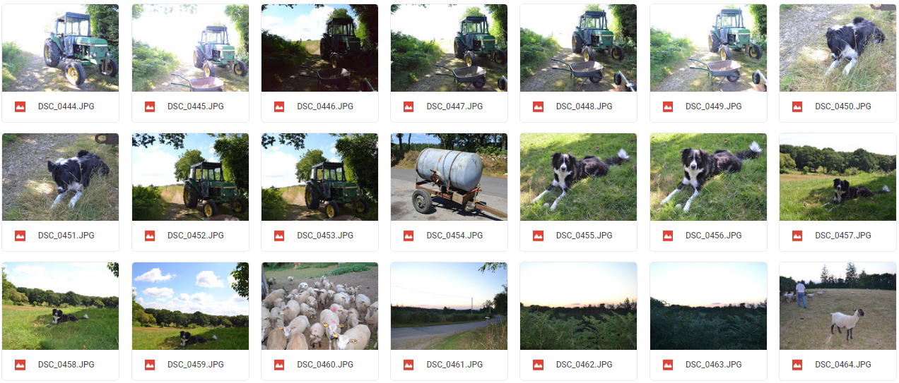
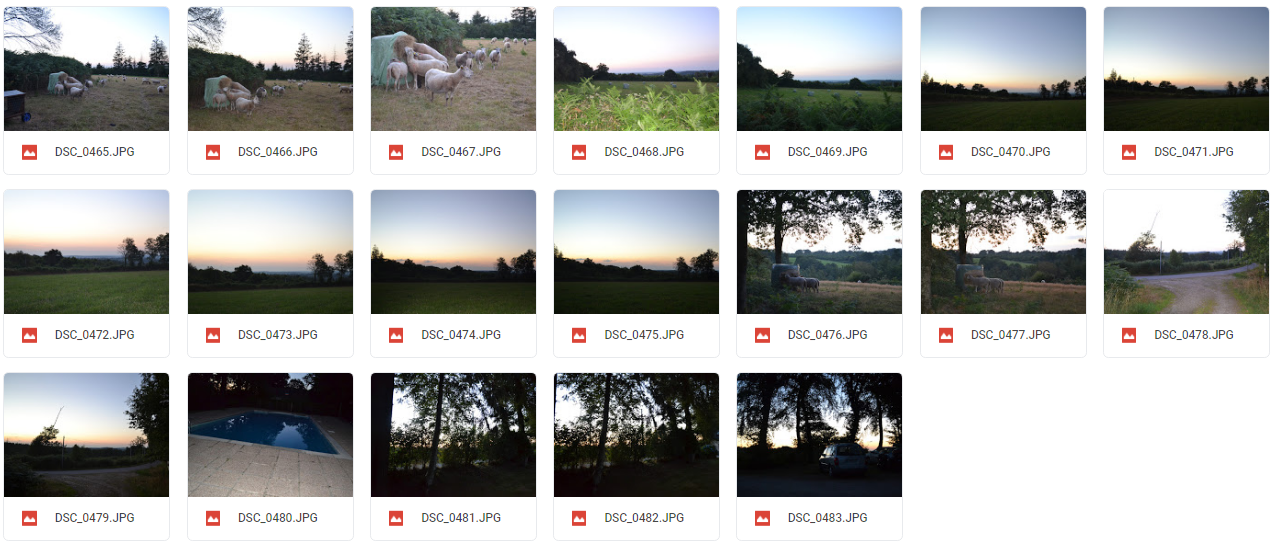
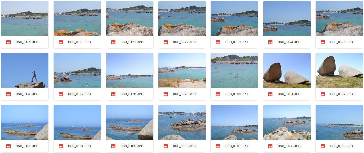
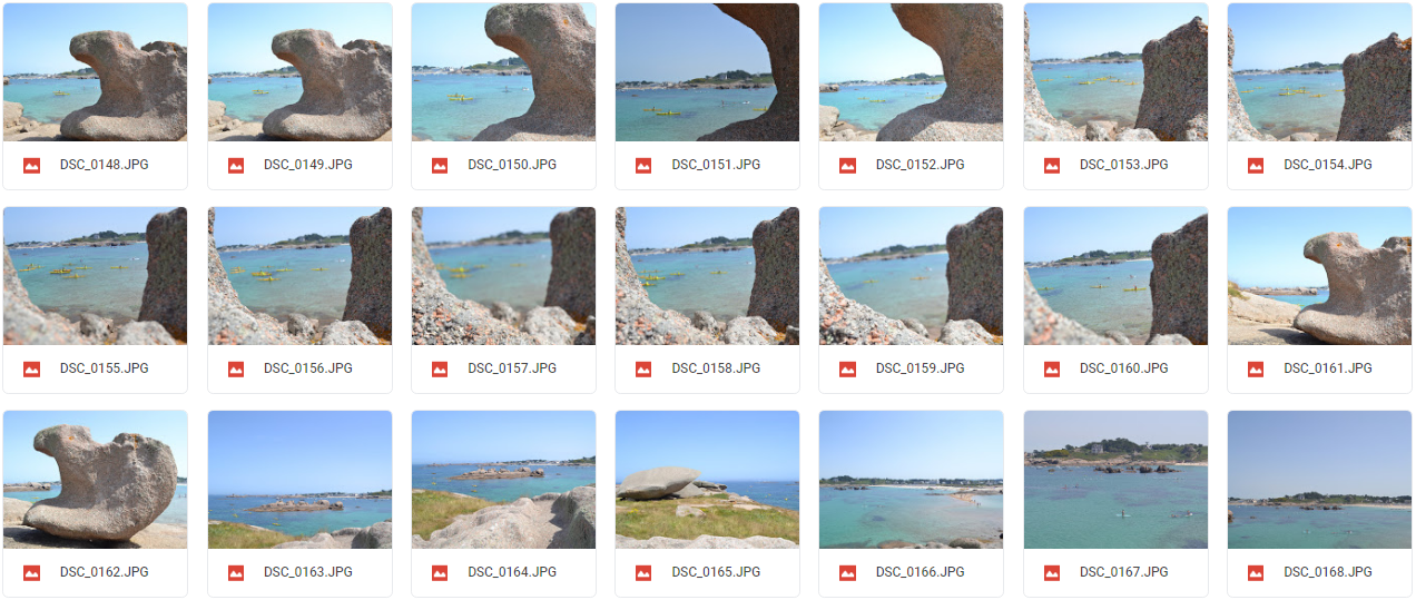
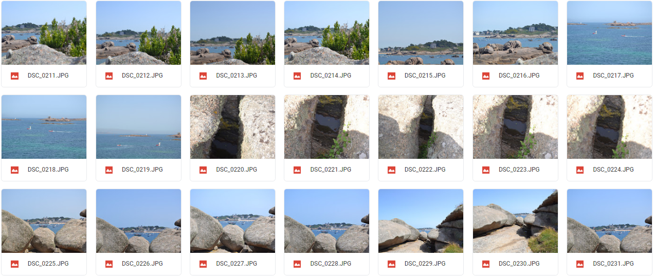
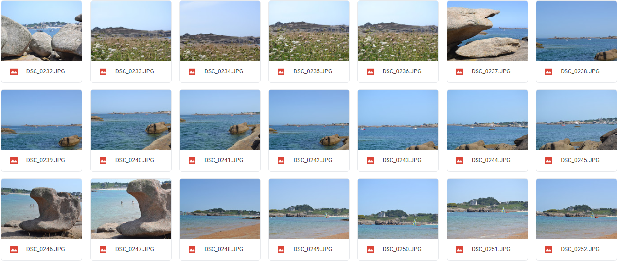
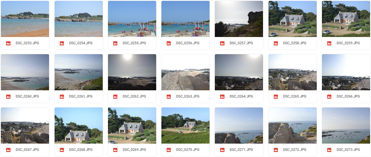
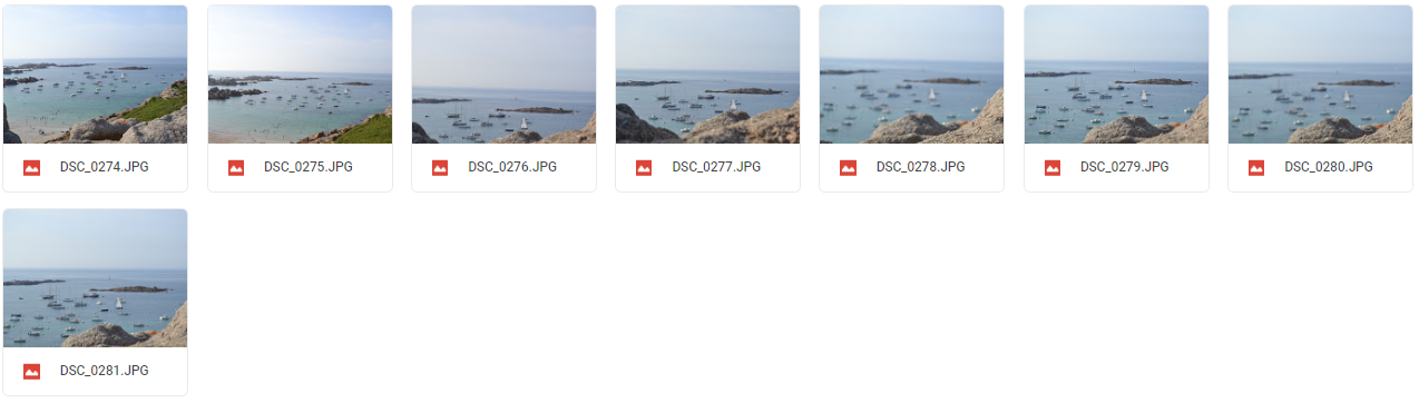
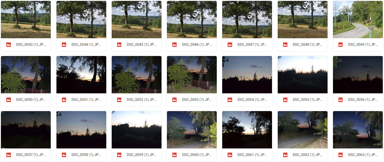
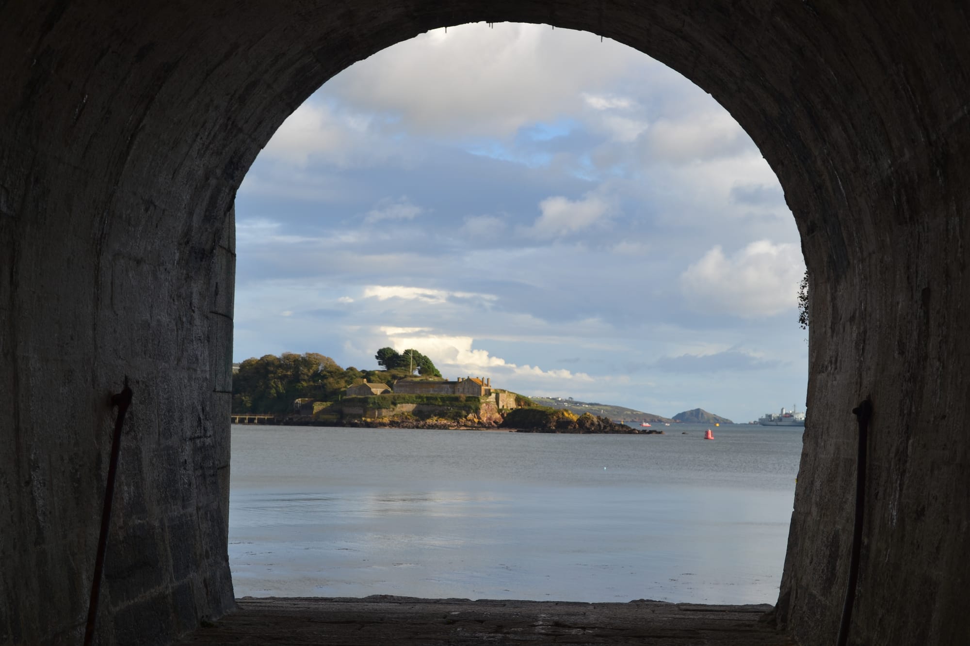
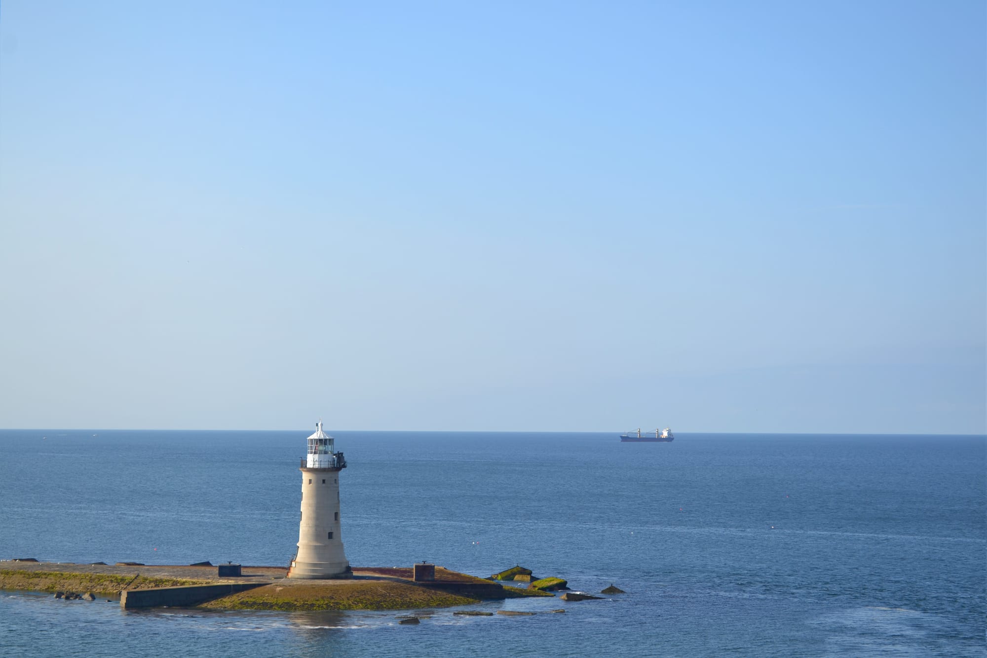
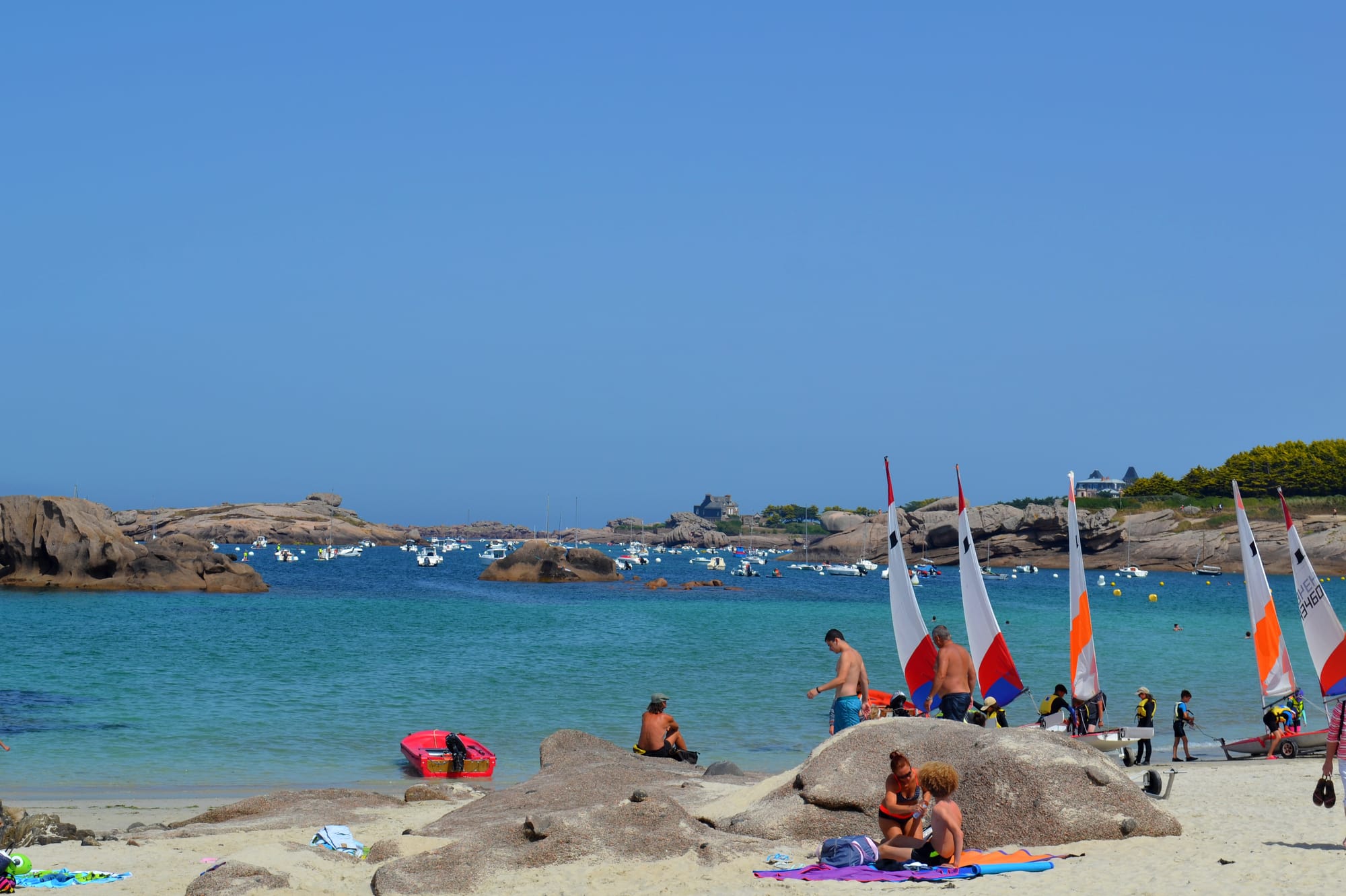
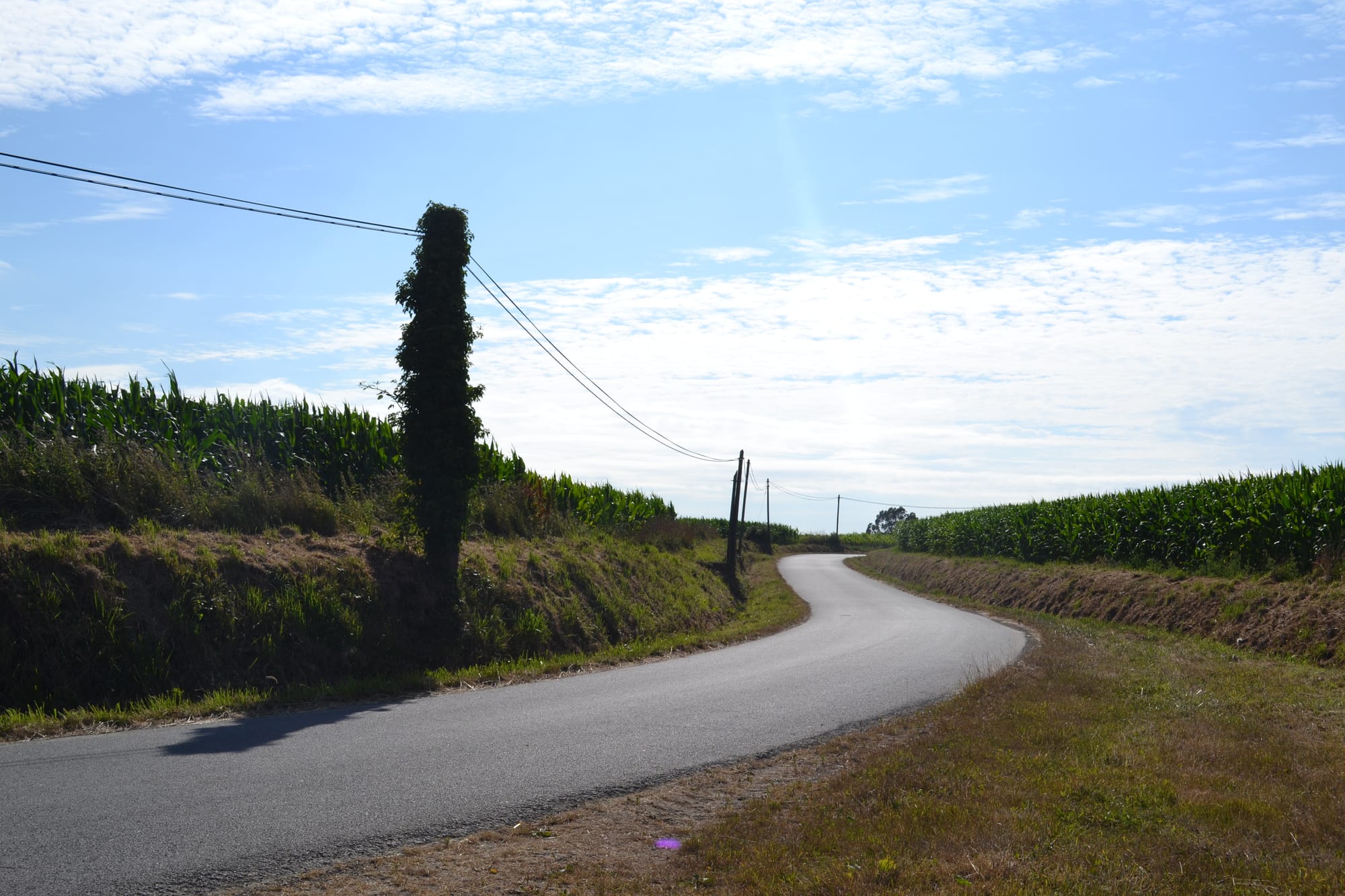
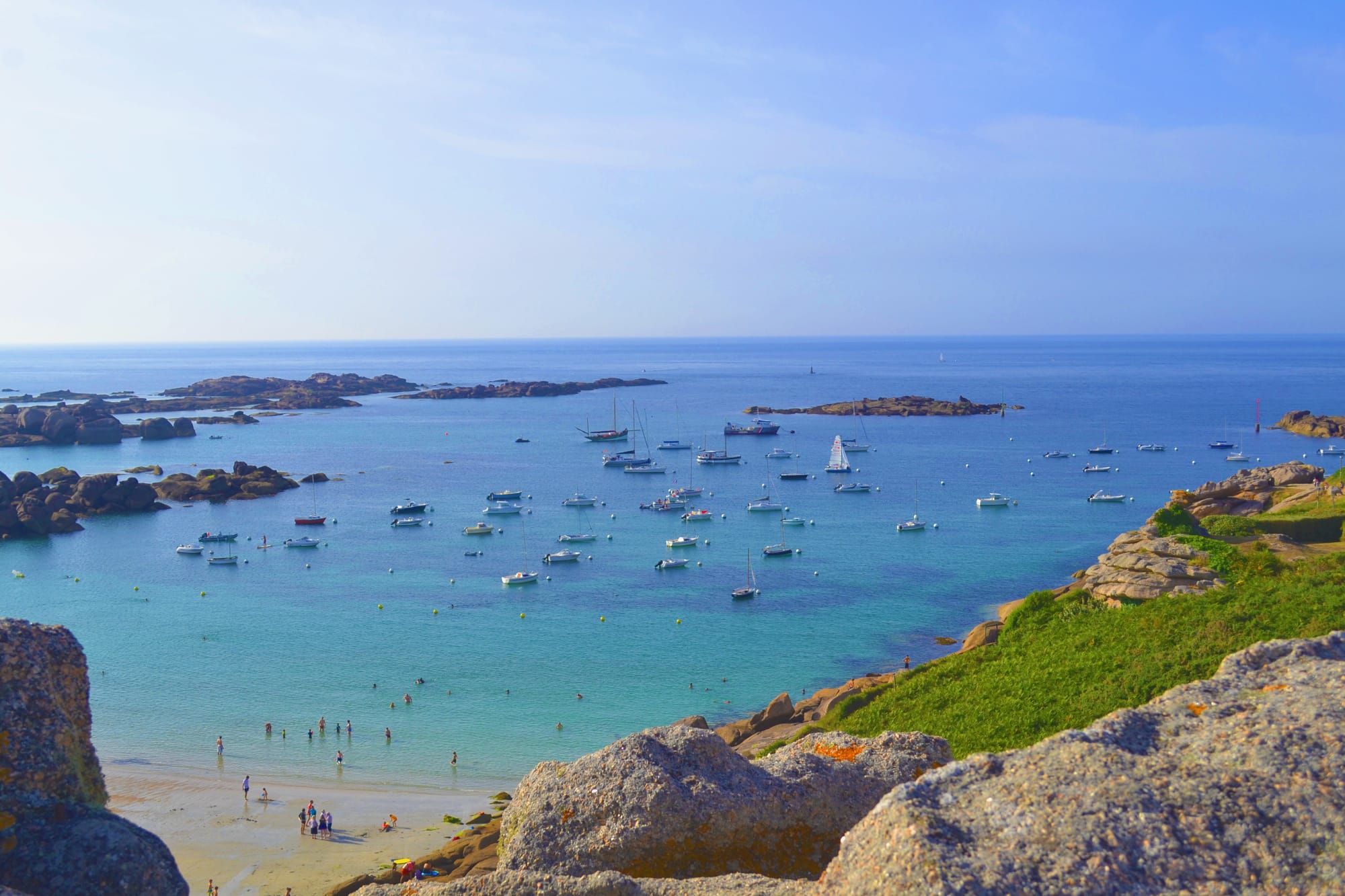
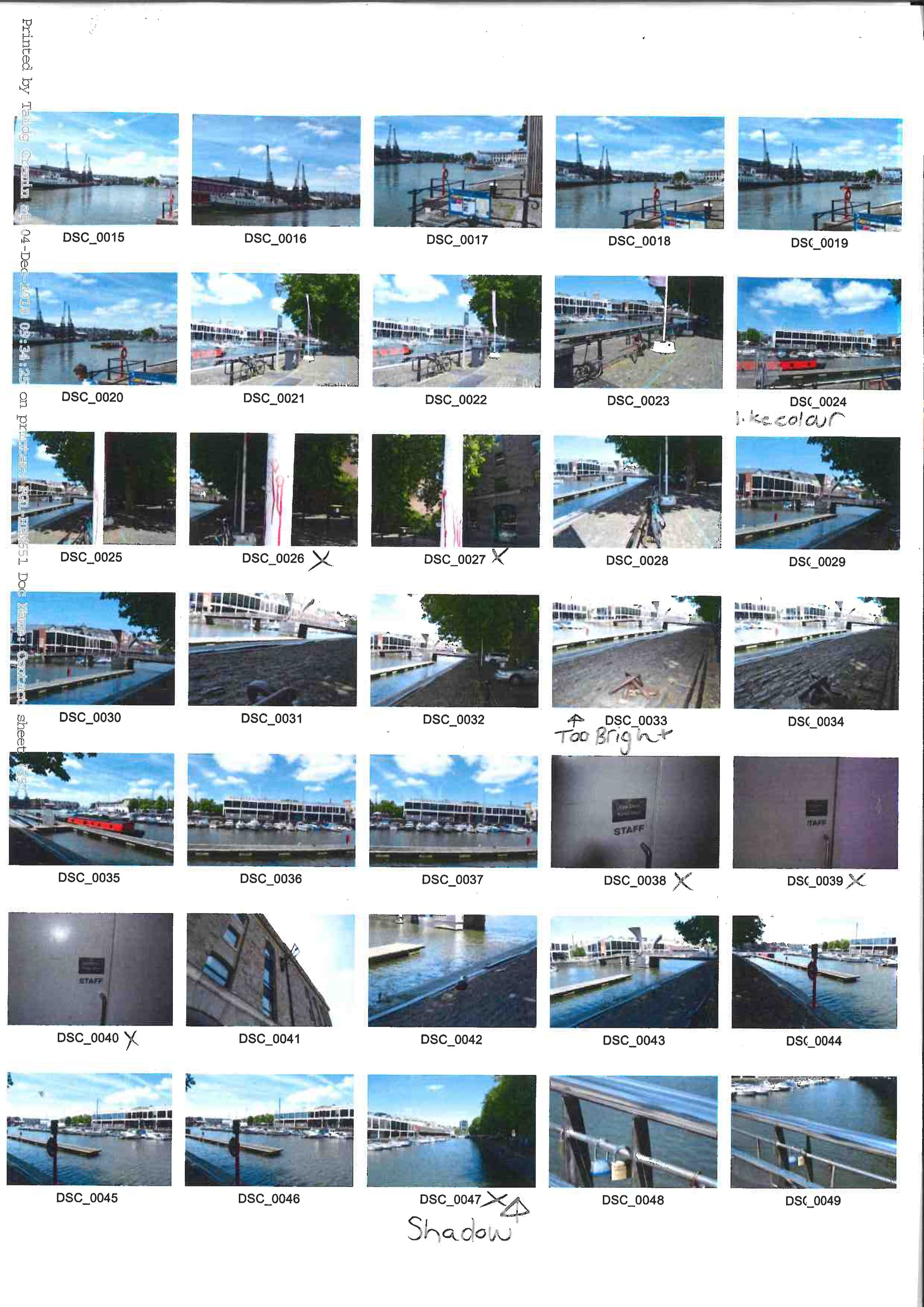
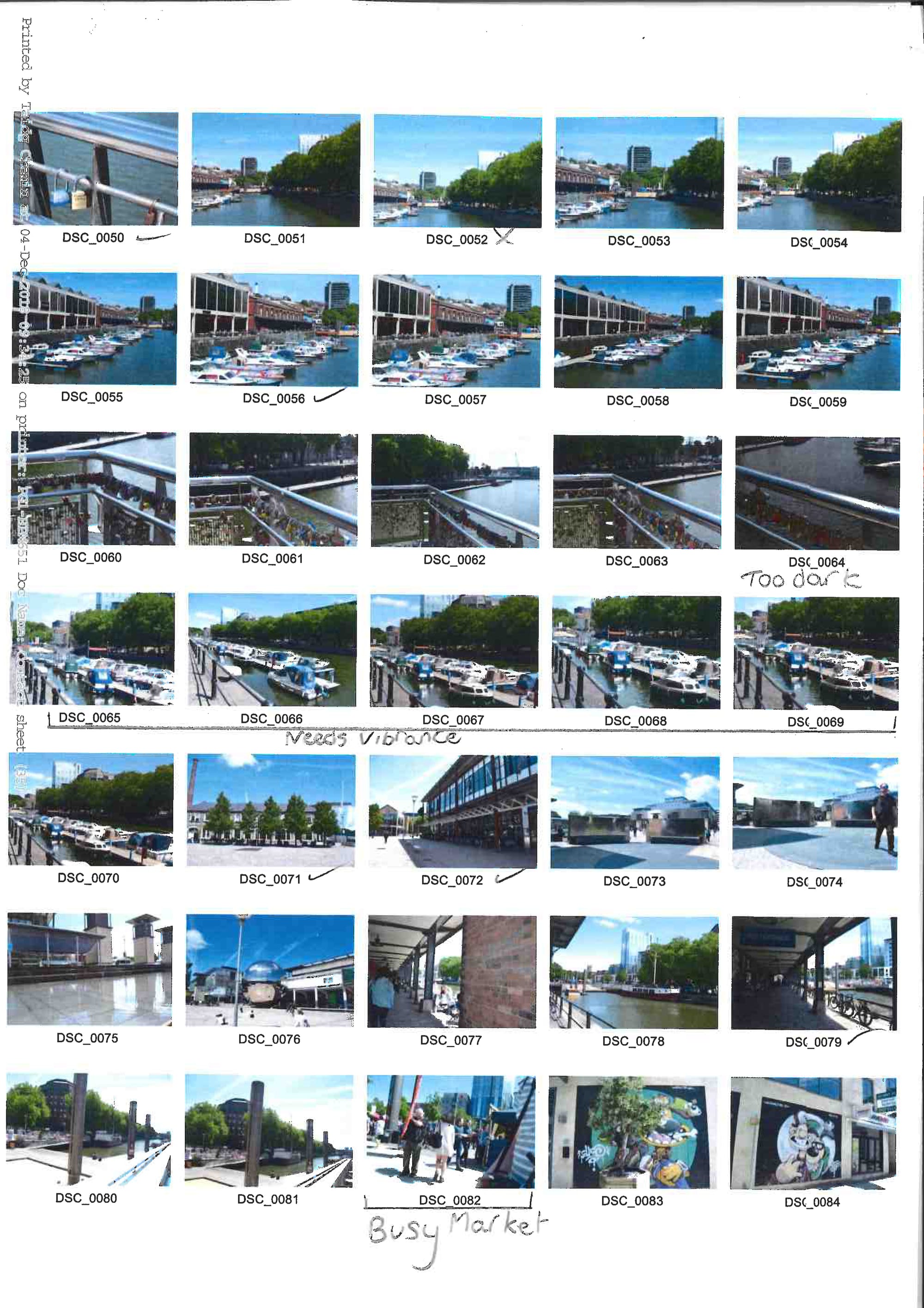
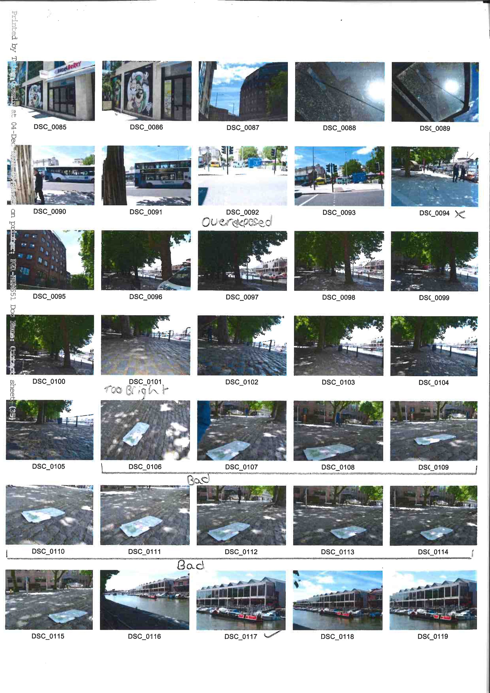
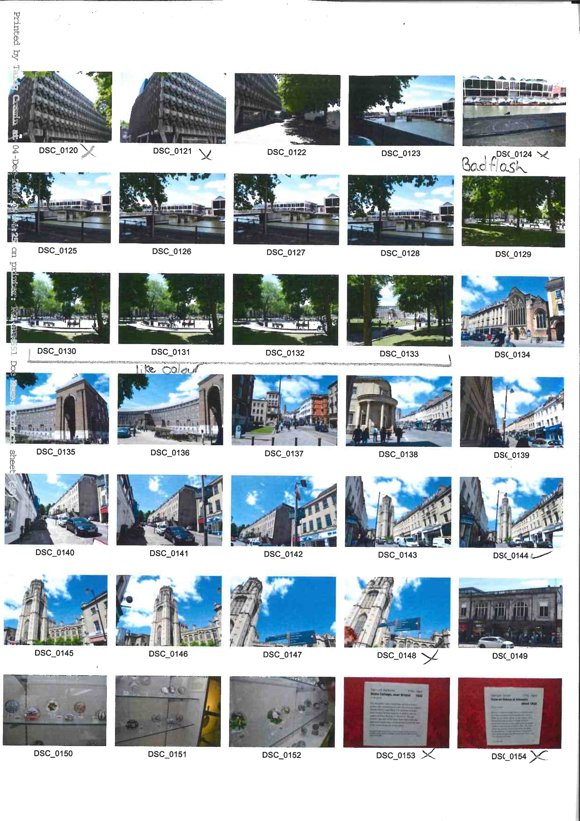
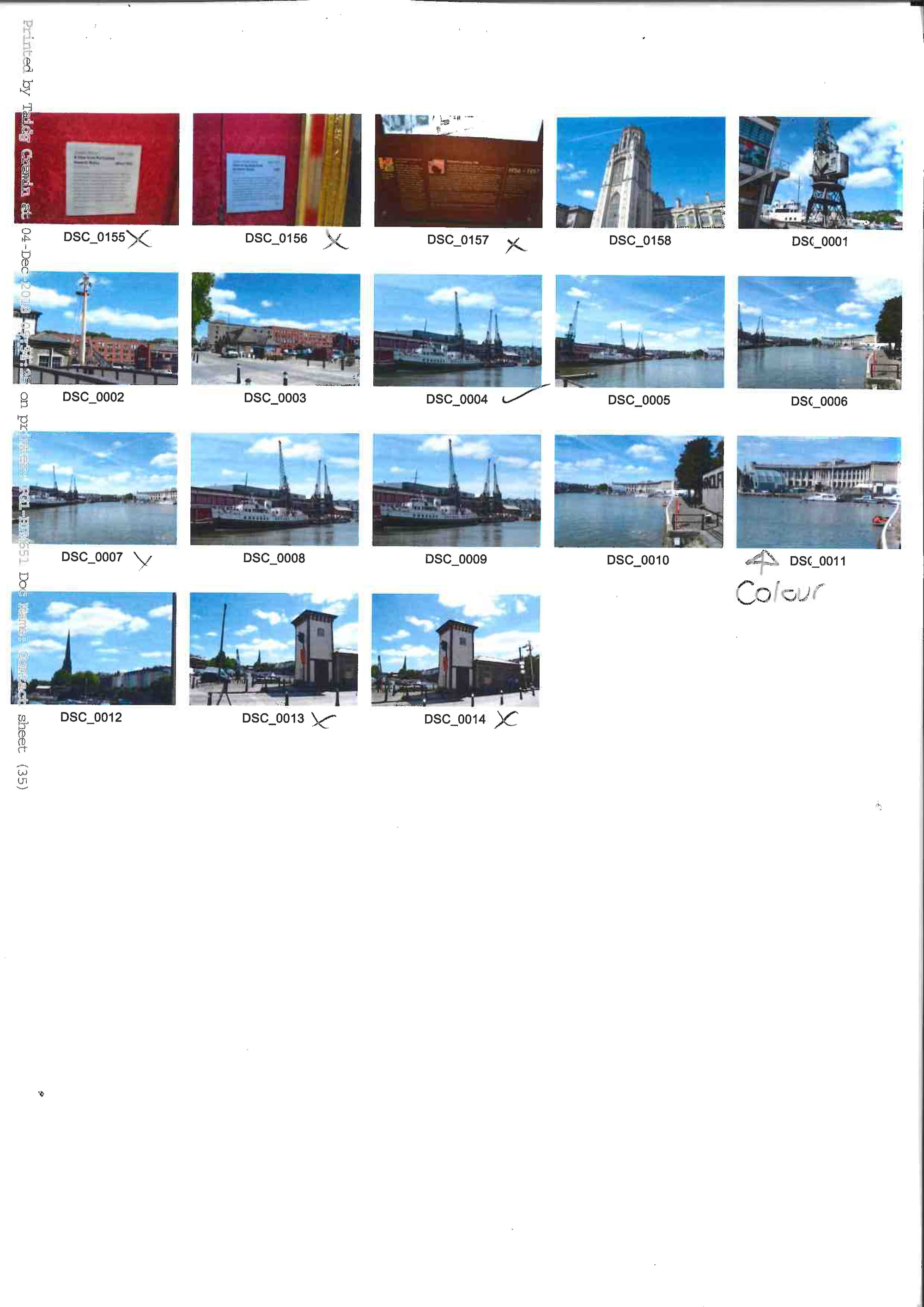
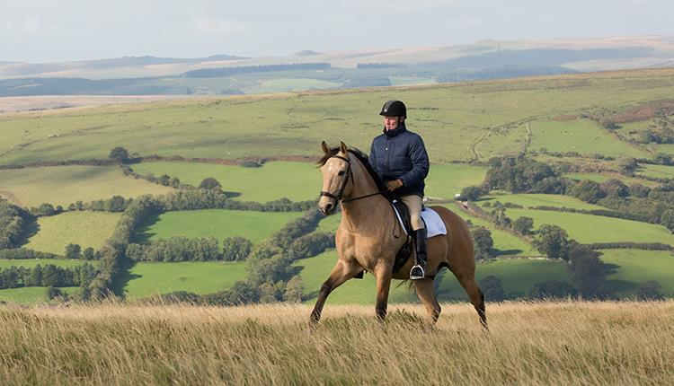
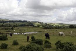
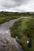
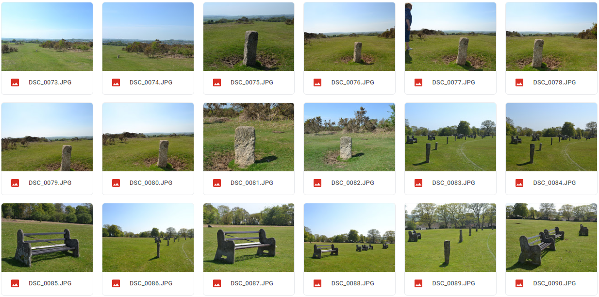
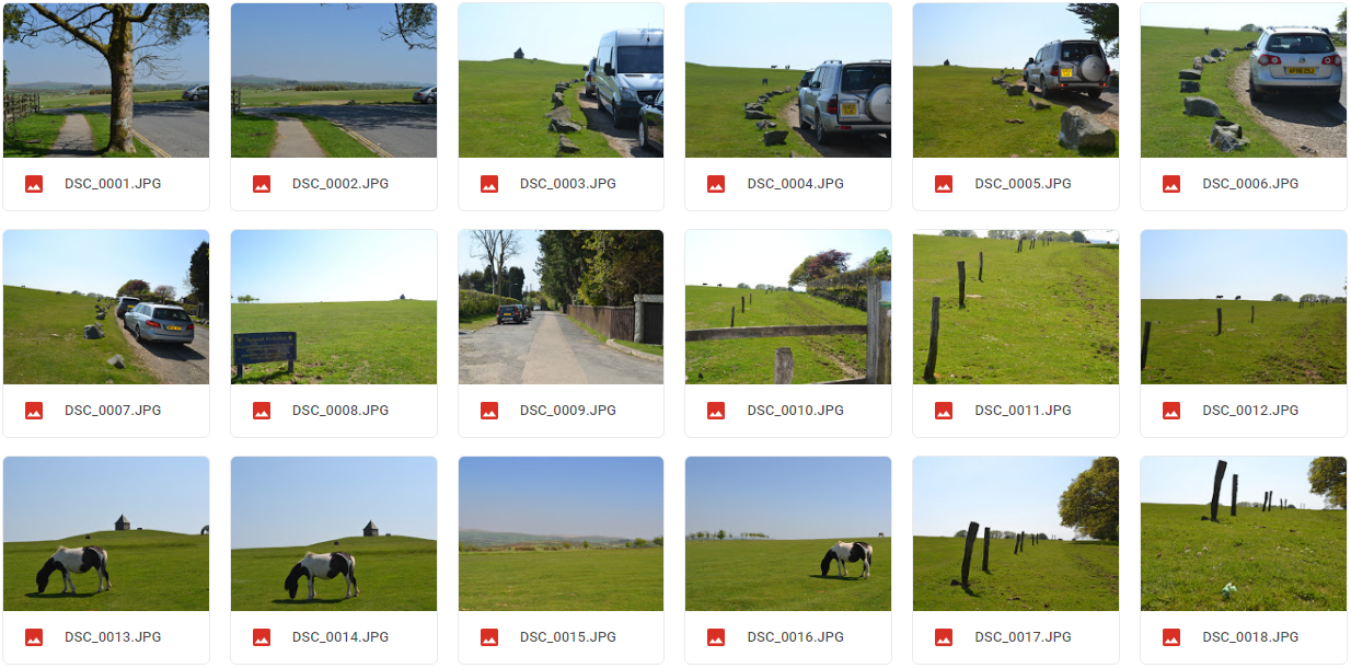
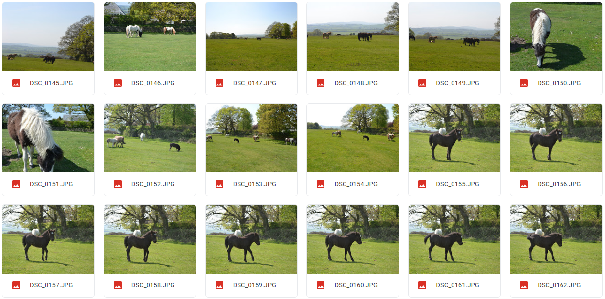
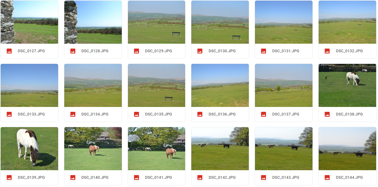
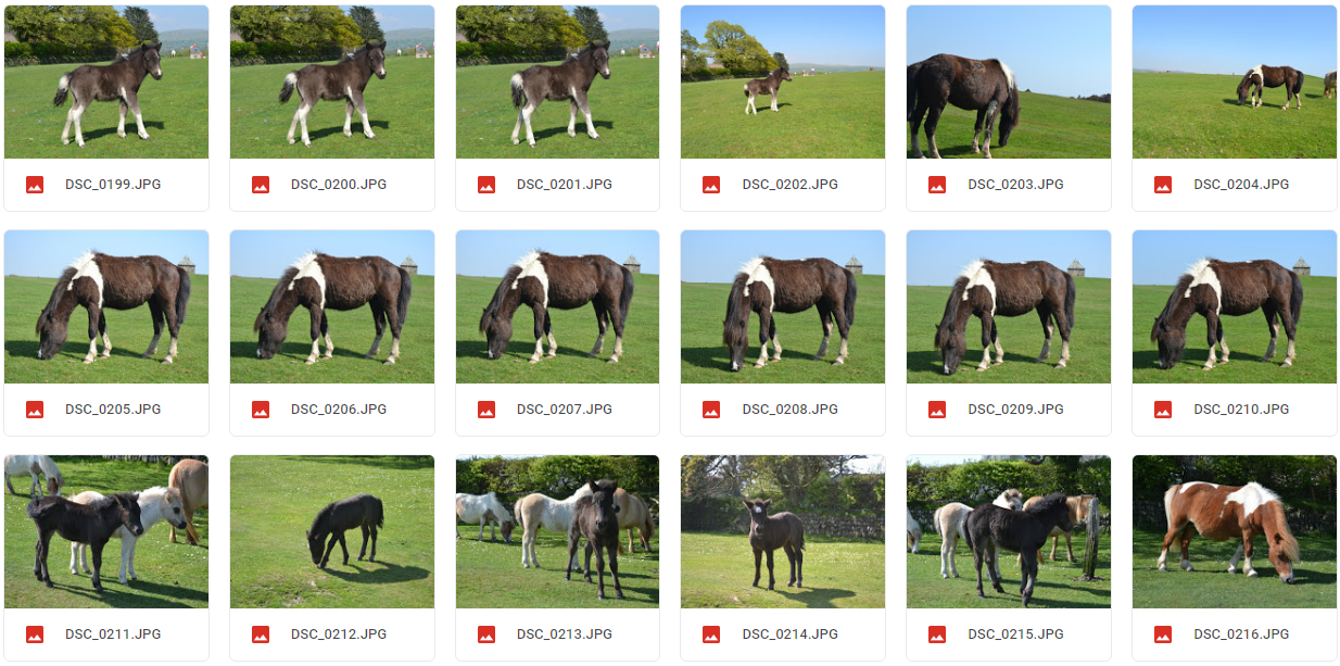
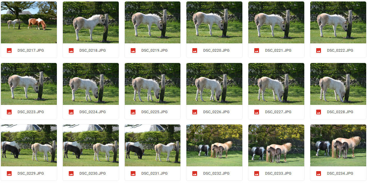
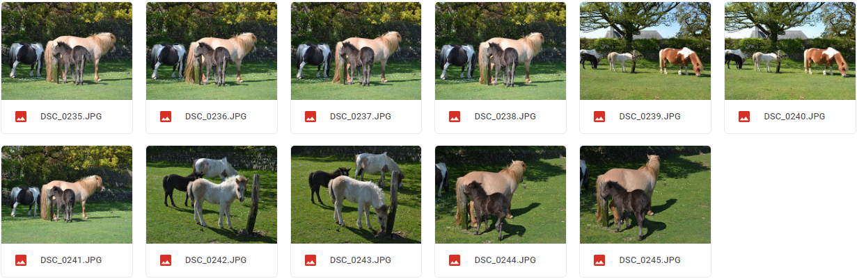
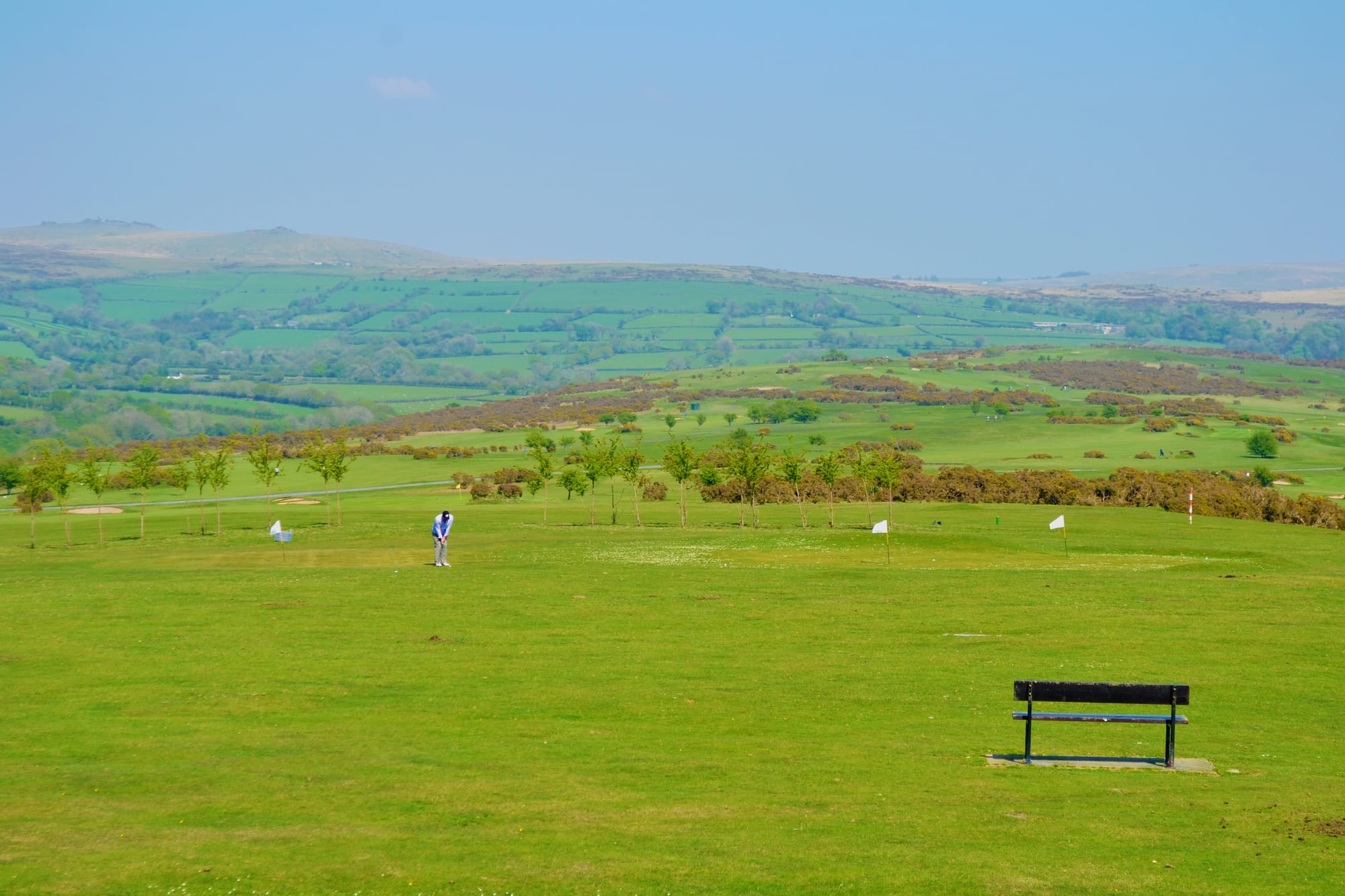
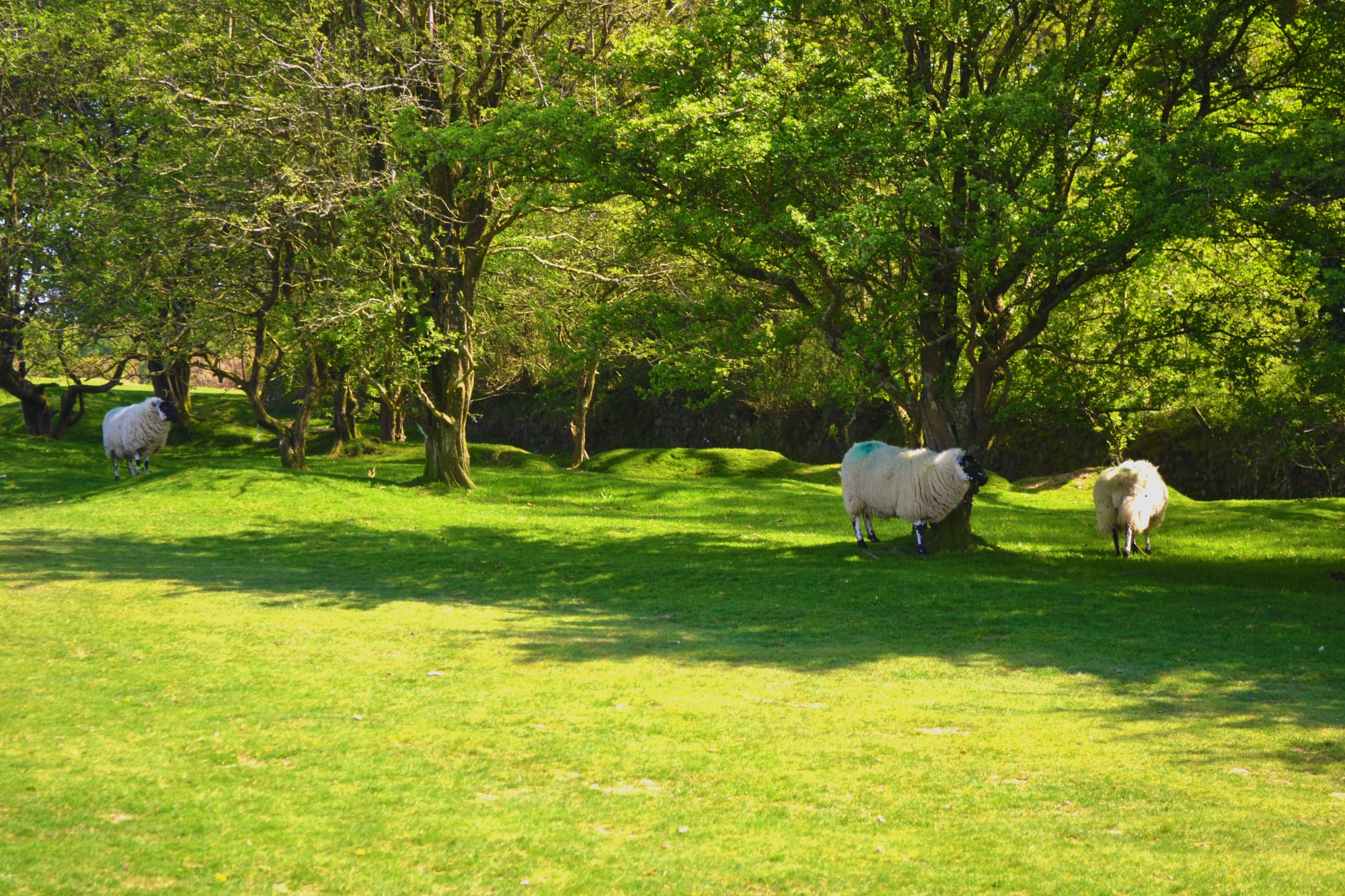
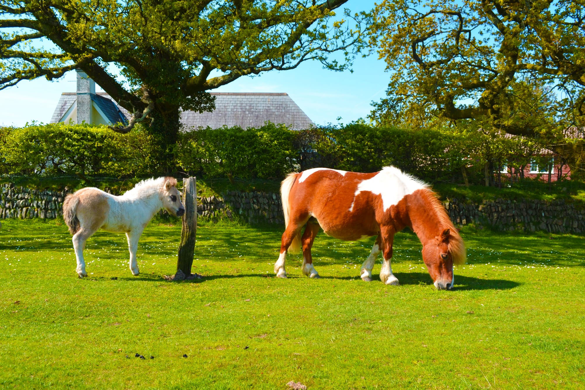
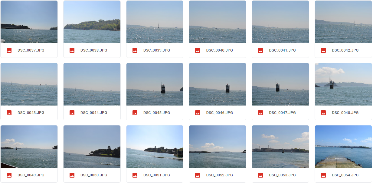
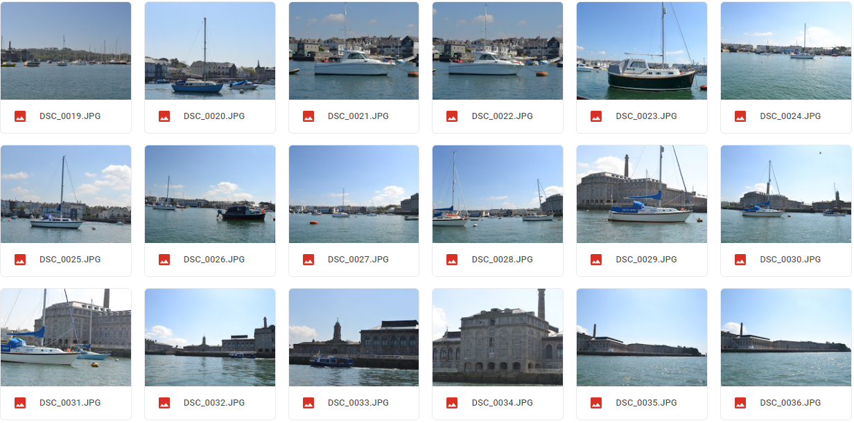
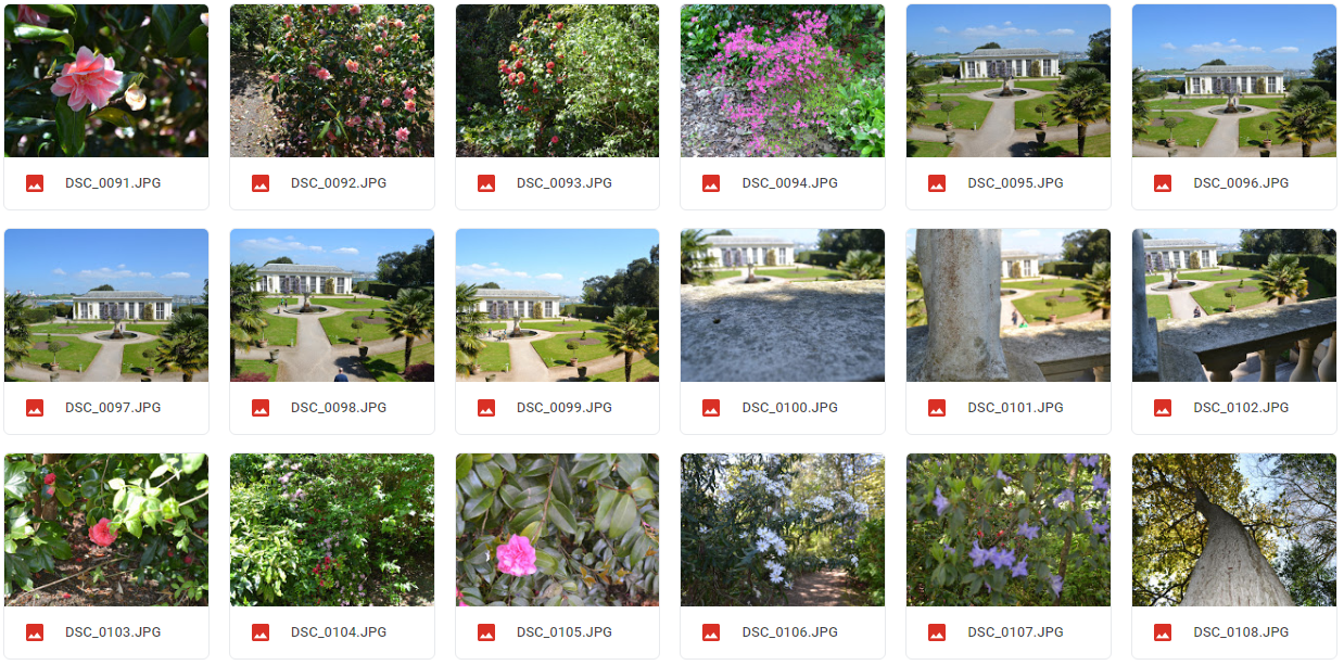
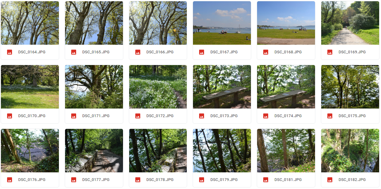
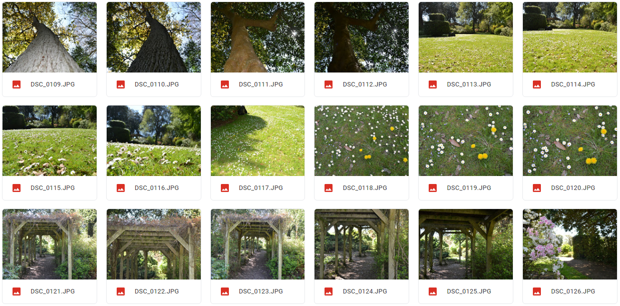
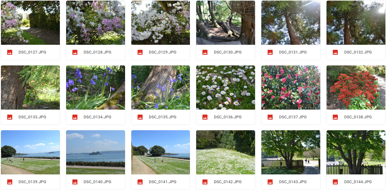
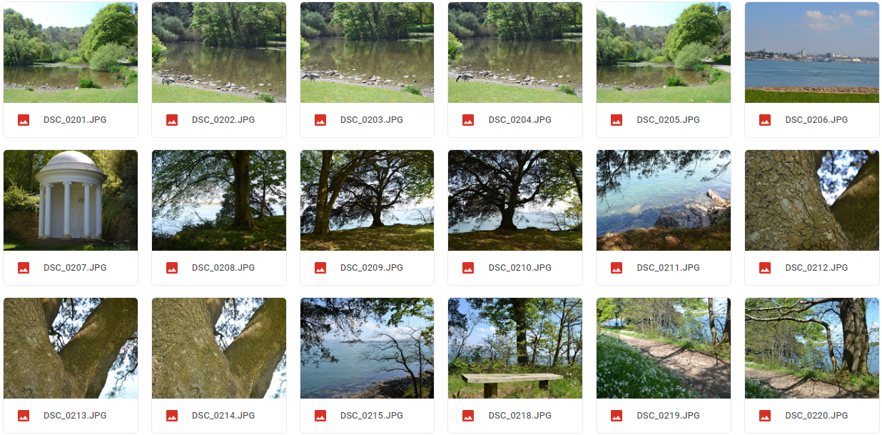
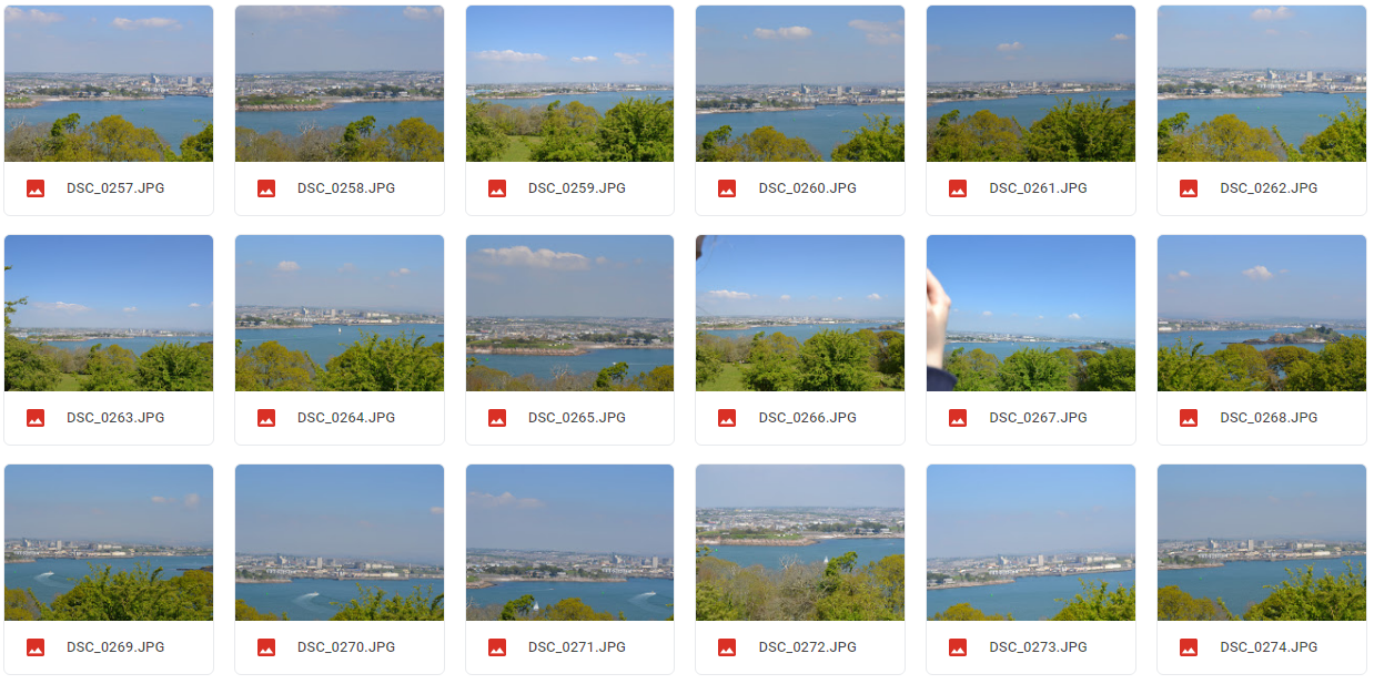
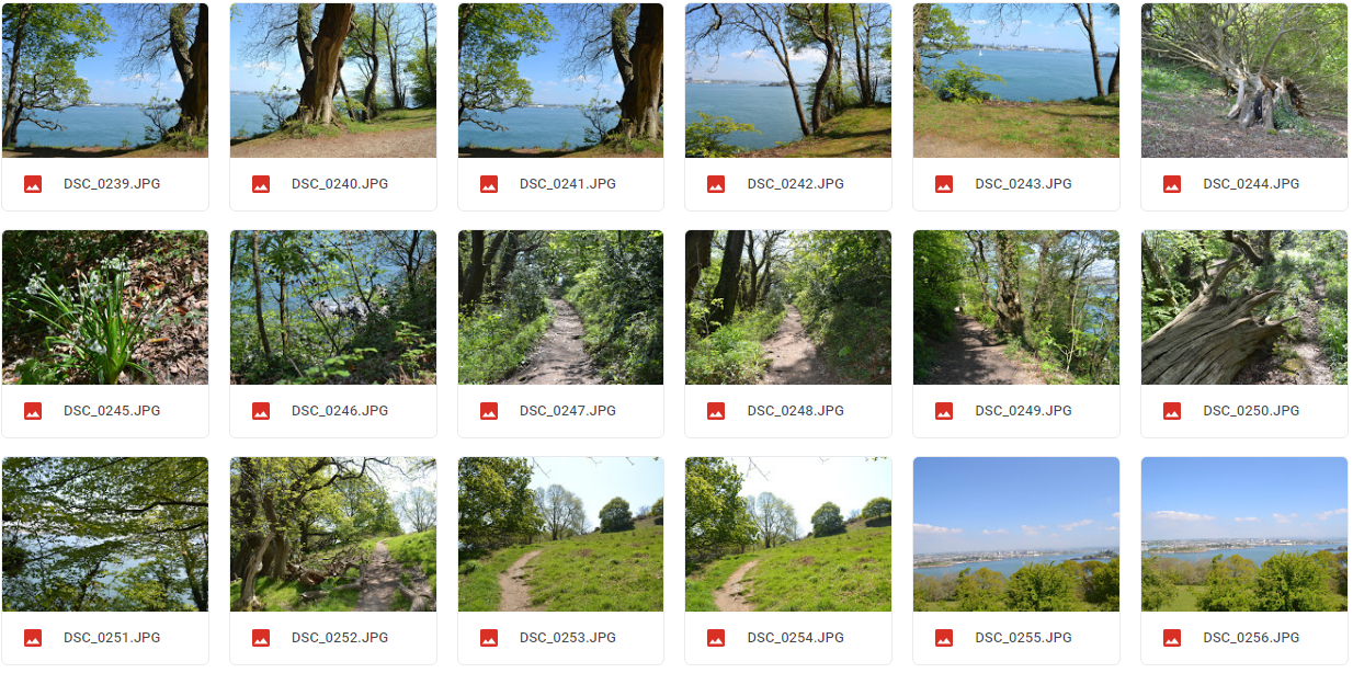
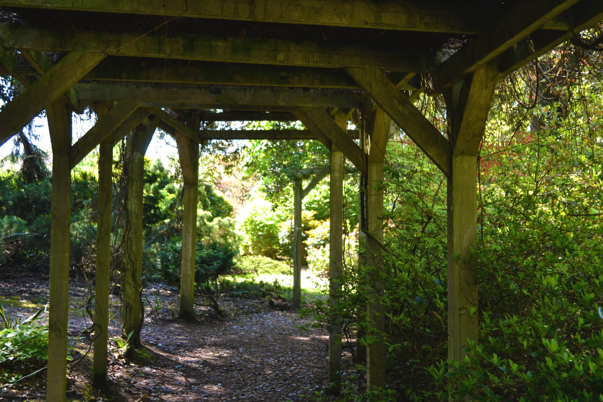
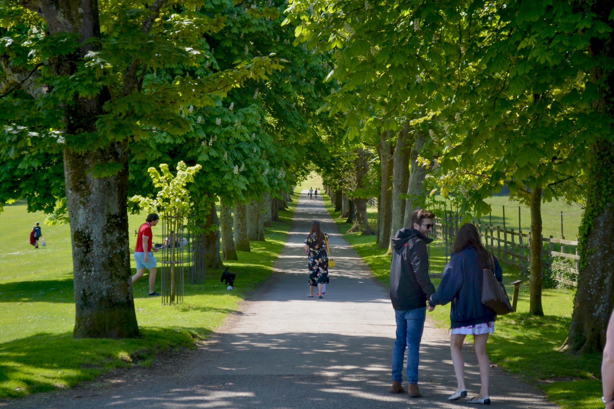
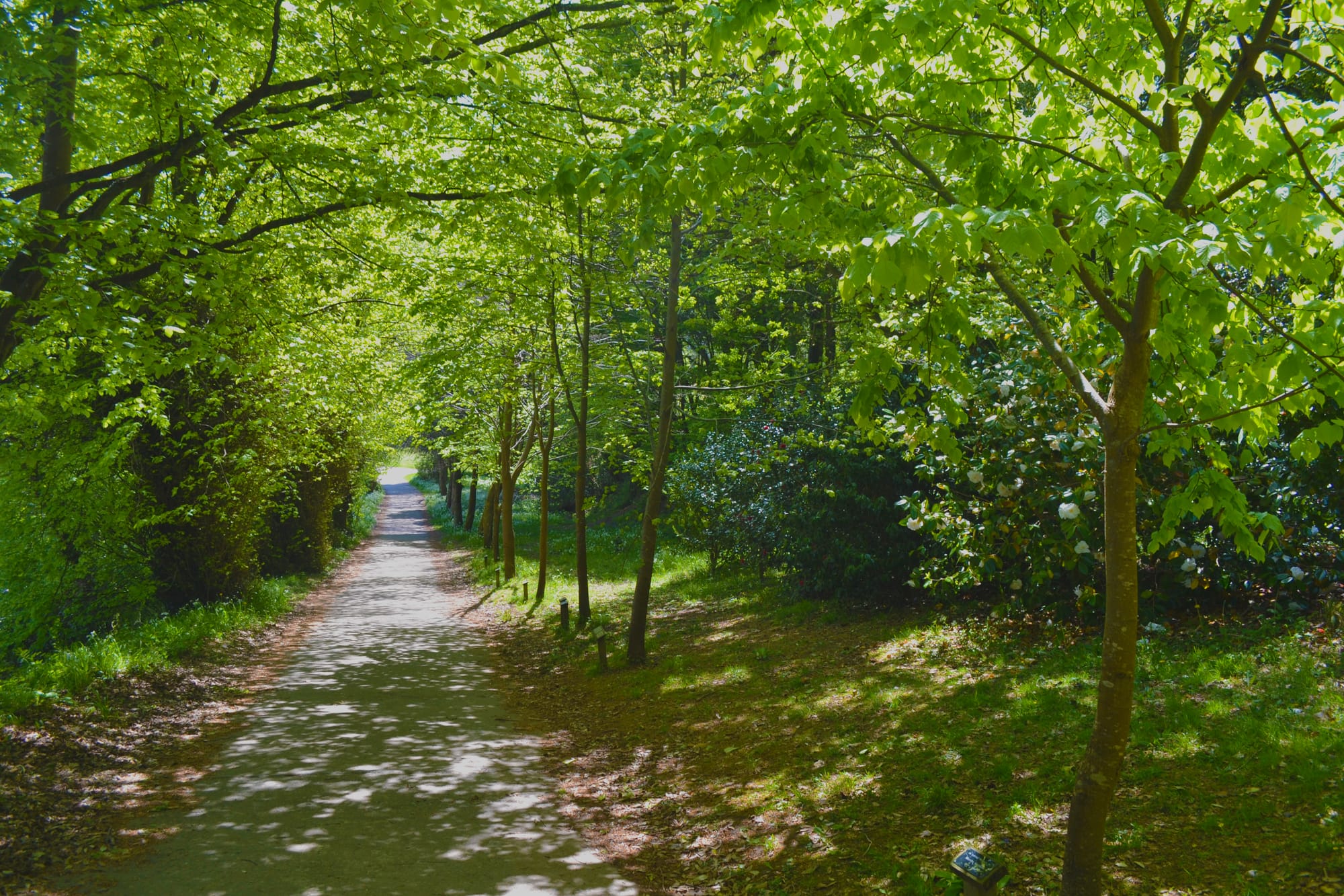
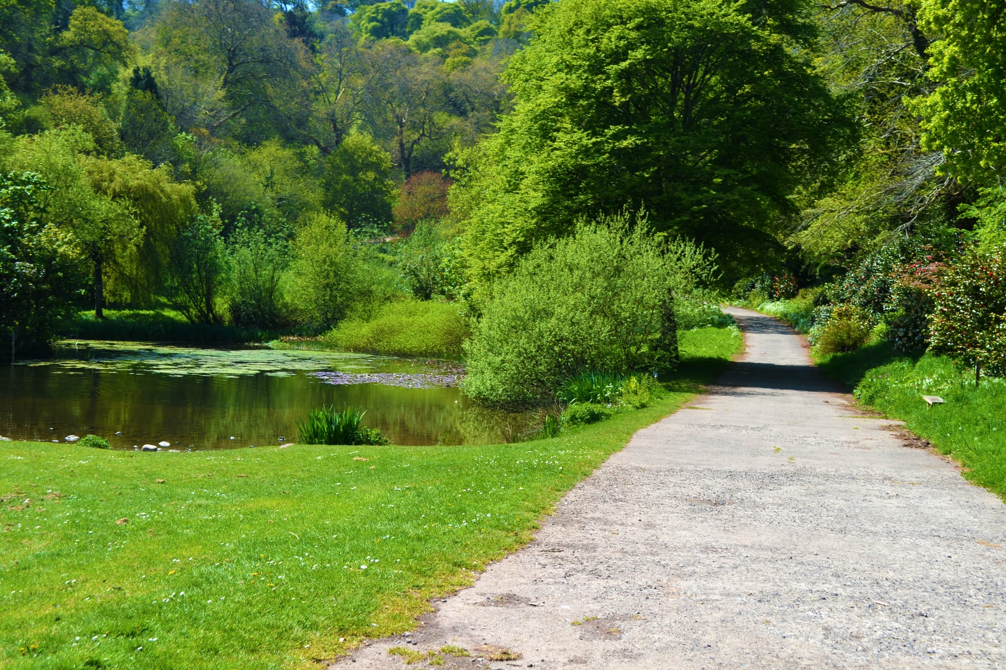
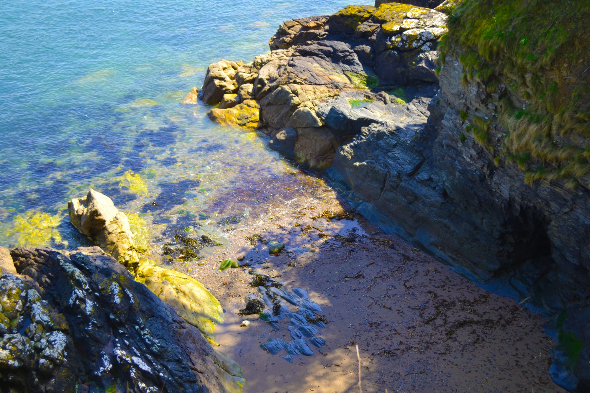
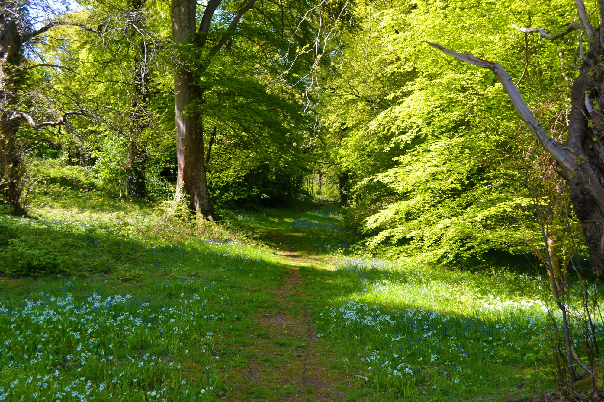
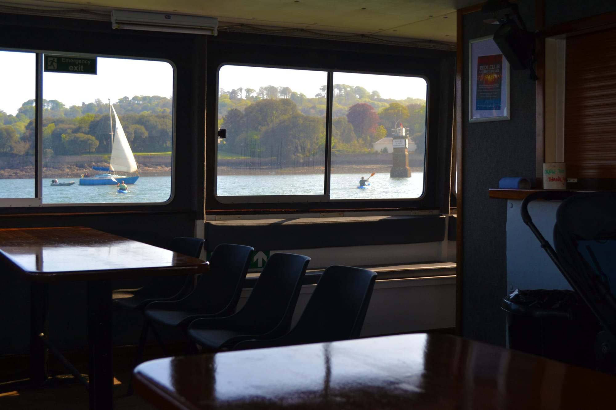
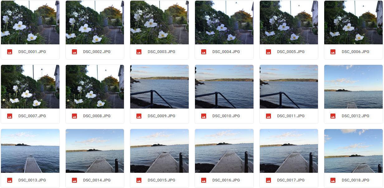
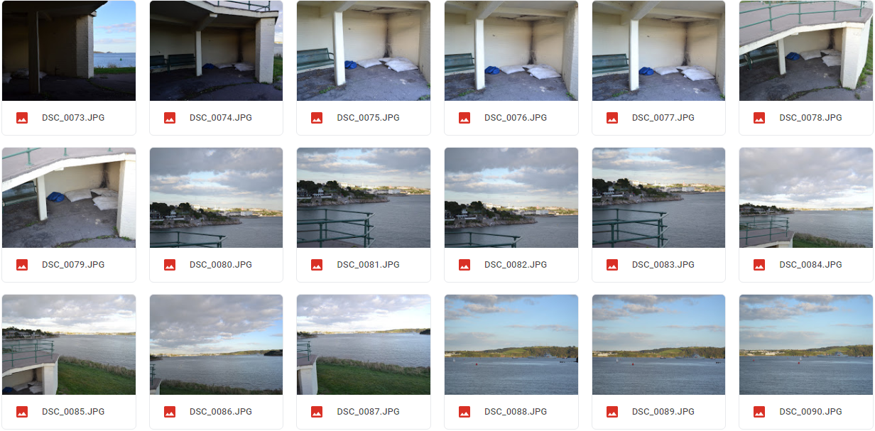
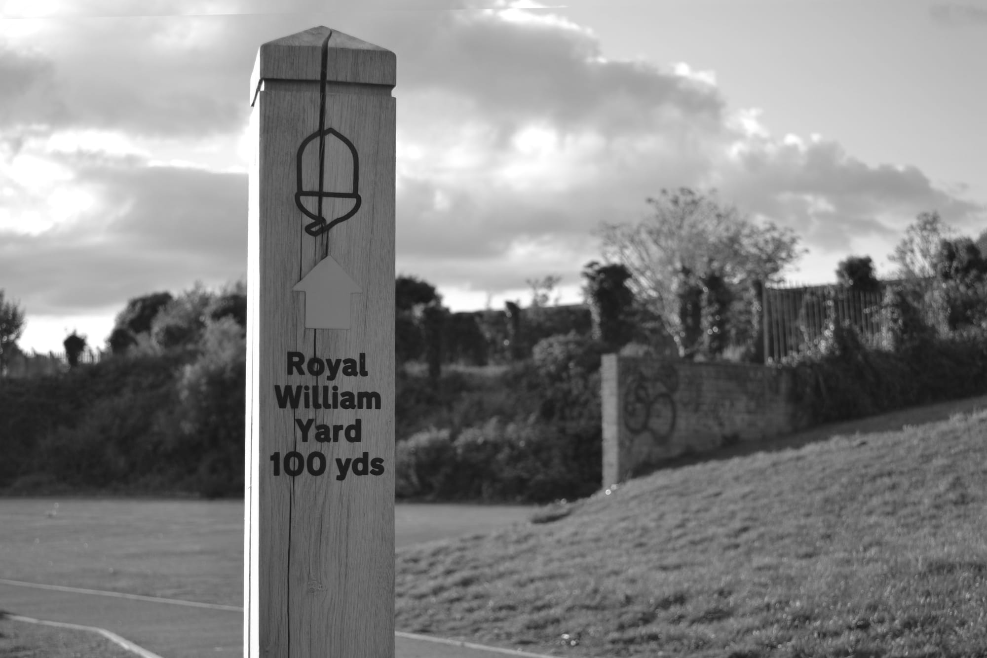
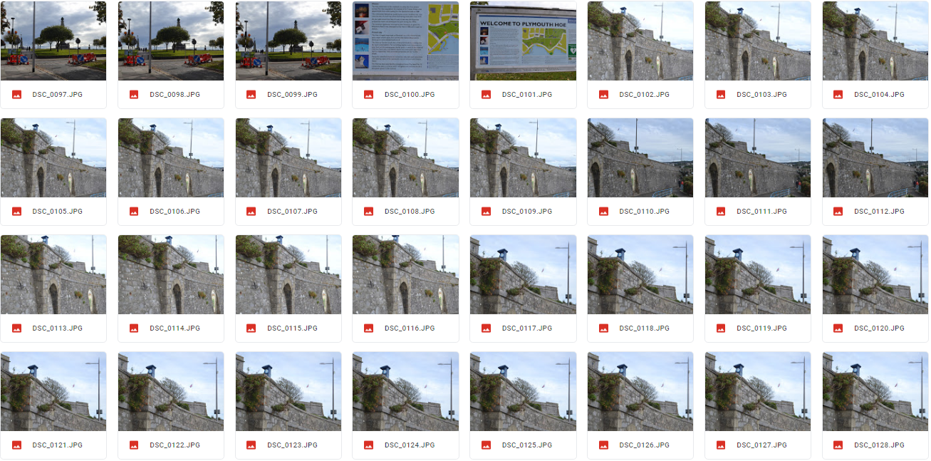
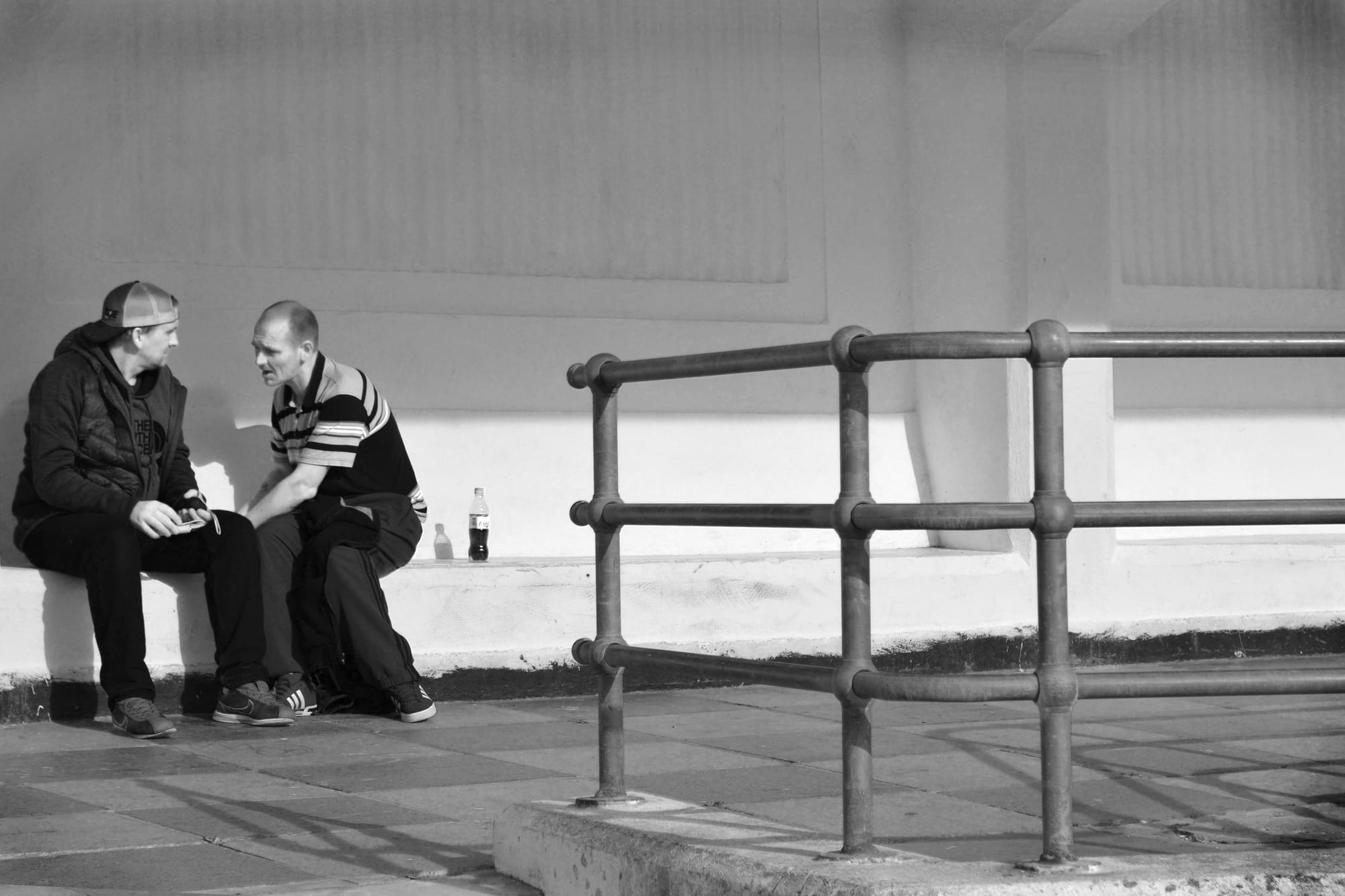
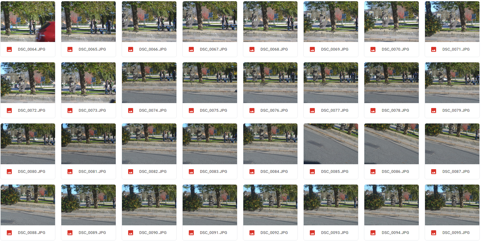
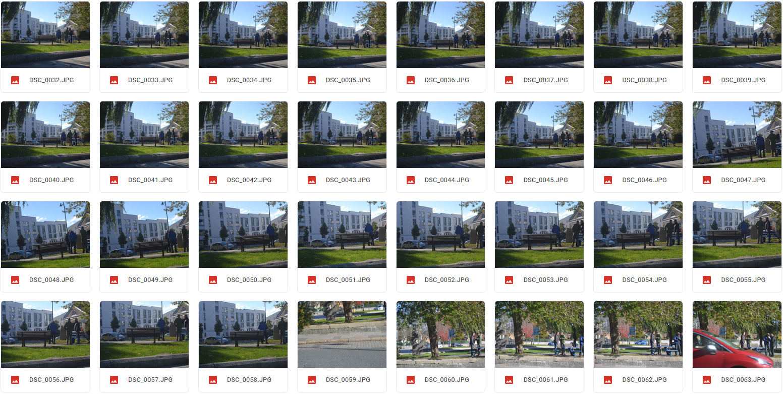
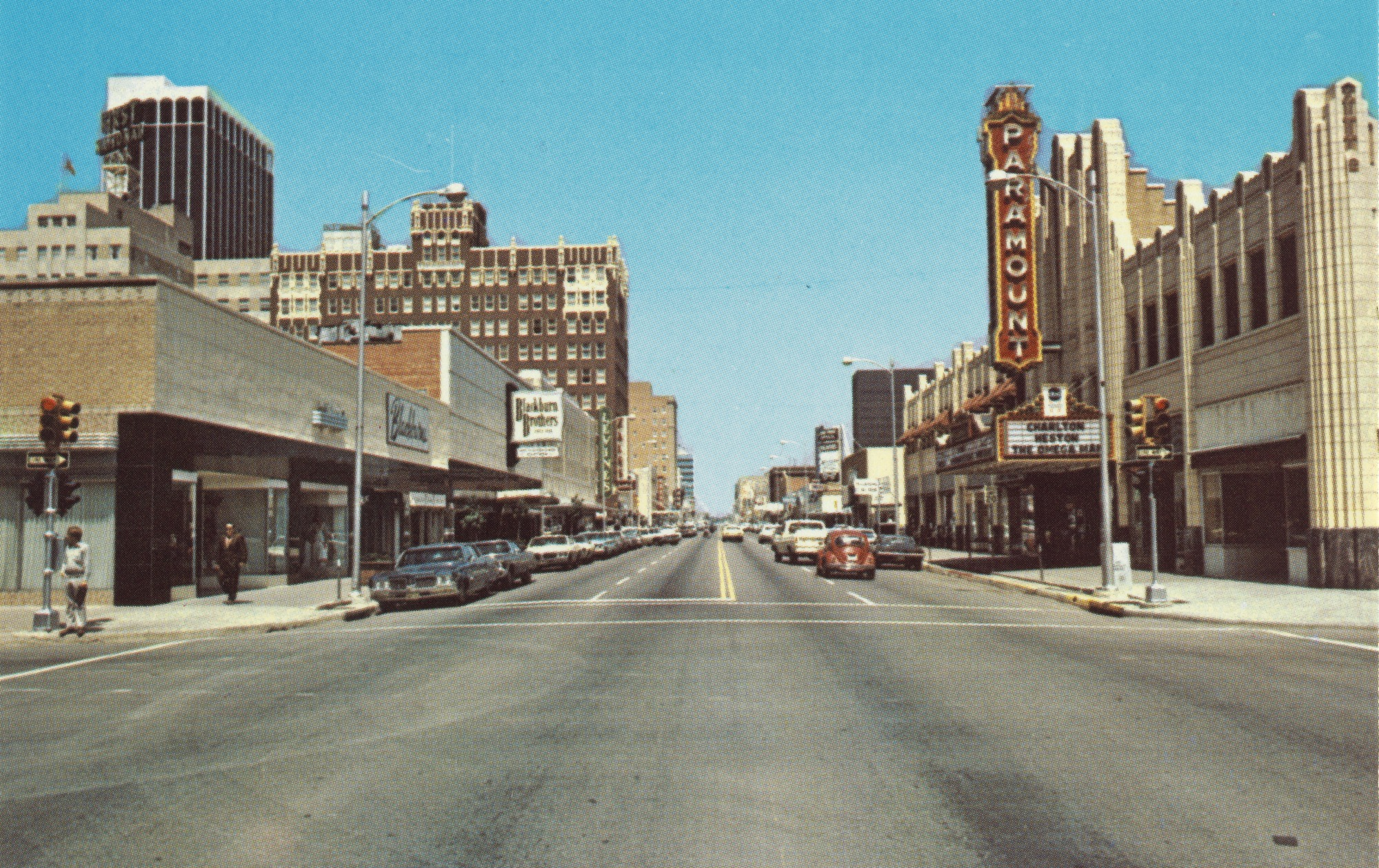
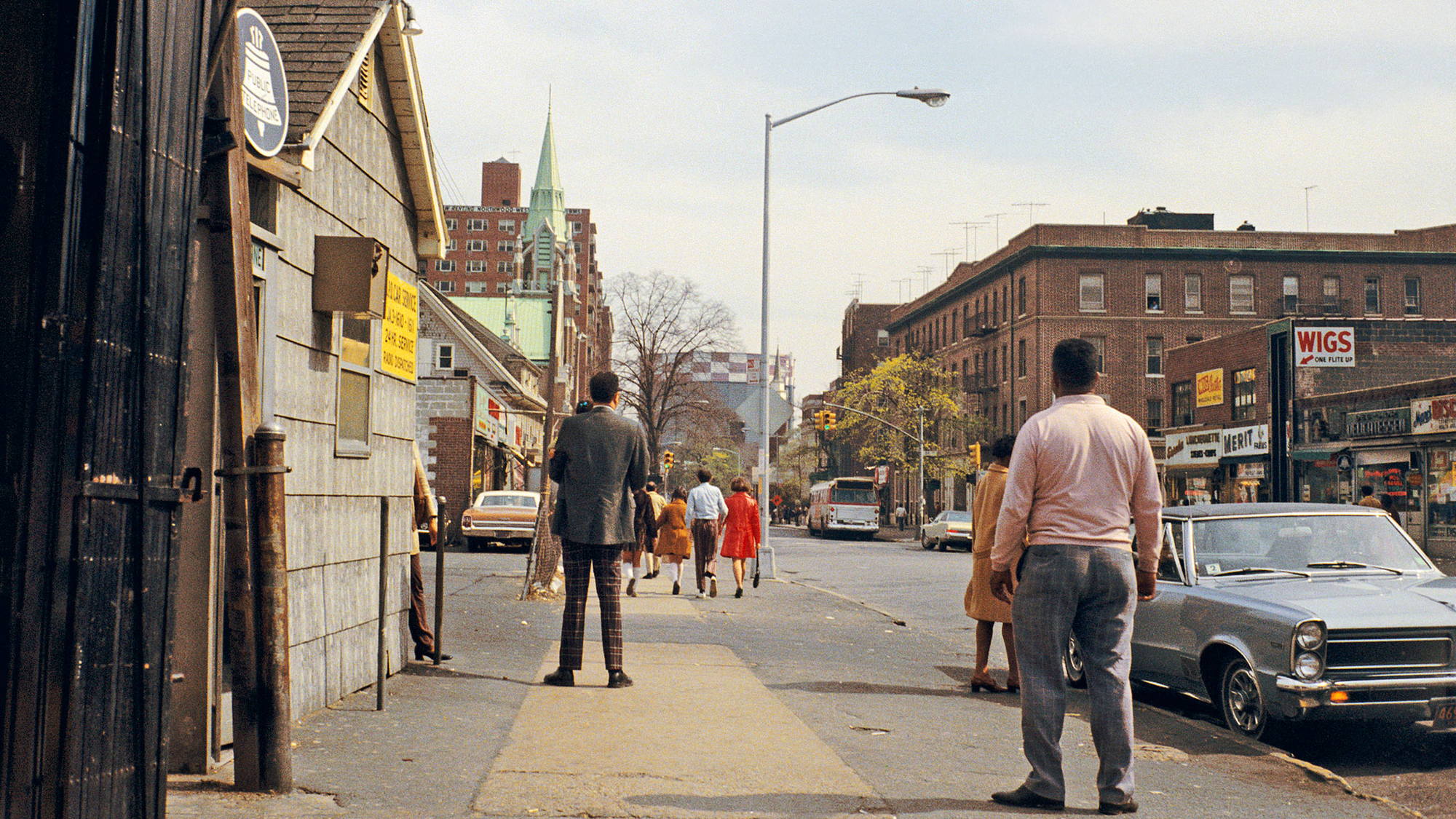
I would like to use both photographers as inspiration in my work by using black and white on the camera as well as shooting with colour. In my first shoot I plan to do this to see if editing the colour images rather than shooting in black and white makes a difference to the overall piece. The majority of Ravilious’ work is candid photography  of the people and communities of the countryside whereas Cooper utilises the coastal regions to create dramatic landscape vistas. From this, i would like to experiment with candid photography and photograph the day running a farm in a rural community.

Read More  

Thomas Joshua Cooper

Thomas Joshua Cooper takes photos using an 10x8 large format camera."I hate the words "snap", "shoot" and "take" when it comes to making photographs. Everything I do is very seriously built up. They are 'made' pictures." He researches the location before he visits so he knows exactly his schedule for his shoot. These photos were taken with a negative camera and shows various textures and depth. I like the way Cooper incorporates the sea and rock face where the sea acts almost like a mirror. The research he claims to do previously seems to pay off as the images have a real depth and integrity.

Read More  

James Ravilious

James Ravilious was born August 1939 in Eastbourne, England . He moved to Devon in the 1970’s where he took up photography inspired by Henri Cartier-Bresson. They both predominantly focused on candid photography and Ravilious shows the daily tasks in a rural village.
In Ravilious’ most well known work he turns his camera on a small farming community, a developed story occurs in every photo. For example, the photos here are examples of the typical day in Devon during the 1970’s and was inspired by the work of the French photographer Henri Cartier-Bresson. Ravilious uses candid photography to depict what the reality of daily life was like. As a member of the community,Ravilious was not simply an outsider, it is as if the photos were a perspective of his routines.

This gives the photos more intimacy with a variety of meanings and depth. In that time James took over 80,000 black and white images of all aspects of local life including farming and housing interiors. From these photos, you can see various shots of candid photography. At this time, only a small percentage of people took photos of the british countryside. He shows a real honesty of the time period. Ravilious shows the positives and negative times, I believe he did this effectively. In 1997 he was given Honorary Membership of the Royal Photographic Society.

Read More  

Before the Shoot

After researching both of my chosen photographers, I plan to further my knowledge of black and white photography using the manual mode on the camera. I will attempt my first shoot using this technique and then review these images to determine whether I continue to shoot in manual or otherwise. 

If I were to shoot in automatic mode I would be limited my technical and therefore creative choices.One of my main rationals for shooting in manual is to give me a greater degree of control when shooting. I can control how much light the camera allows to absorb and having that flexibility is crucial for my images to give the suitable tone in my work. Although both of my researched photographers used a traditional negative camera, I think shooting in colour can exceed what a negative could do. This hopefully will allow me to adjust the shadows and highlights in the image when editing (using the dodge and burn tools) as part of my post production to create a natural border to my images in a collective piece . 

Read More  

I decided to print out my contact sheet and annotate certain images I felt had similar themes and felt coherent. I had striven to work in a candid style as this is cornerstone of Ravillious practice. I began my shoot with a walk around the farm, a very familiar place- I had in my mind a series of locations that I wanted to include in my shoot- however it was also important that I remained as an observer open to chance and the unexpected. Like Ravillious I was aiming to be a neutral observer- not interacting with the scene and simply recording it. The one difficulty in this was working with the animals whose curiosity led to some of the images being more like portraiture. Although this was not the plan the portraits were consequently some of my most effective images. During the contact sheet stage, one of my initial decisions was to crop some of the images. For example, this image depicts two horses in a field. It has a larger depth of field and is slightly more exposed than I wanted it to be.  With regards to all of my images, I wanted them to be timeless, with little indication of when they were taken. 


After doing this I wanted to focus on the animals with some elements of machinery and I edited 27 images that I felt were complementary to Ravilious’s work. 


The majority of Ravilious’ work was taken in the 1970’s when the ability to edit images was not possible. I took my images in colour so i could have greater scope when editing, enhancing the individual colour balance. On an image, changing the colour balance can change the tone or atmosphere of a piece and intensify or lesson specific parts of an image. 


For example, when I first edited this image I experimented with the various colours to what I wanted the image to highlight as the centerpiece or fade into the landscape. Slighting adjusting the curve function also made the image have a rustic look to it. I edited the majority of my images with similar styles to give a coherent theme. By annotating my contact sheet I got a greater understanding on how I wanted my photos to look.


Using a documentary photography approach, I capture the images as they unfold. By not planning a set idea when doing a shoot, all of the images were spontaneous which i feel has a greater meaning than if they were 'set up'. I wanted to be parallel with the inspiration of Ravillious and his images by exploring how black and white can change the tone of a shoot. I wanted all of my images to feel coherent and as a collection of images, I feel like I have successfully achieved this. 

I wanted all of my images to be coherent therefore I put them in the same format by cropping them into squares. I eliminated any dead space I felt did not add to the image. I wanted to show the lives of the animals as Ravillious did.

Conclusion

My images above are what i believe to be my most refined and most impactful images. I decided to use the intimacy and facial expressions of each animal for the audience to see each characteristic and detail in the faces of the animals. Inspired by Ravilious, the black and white stills he took focused on the lives of mammals in the 1970’s. I wanted to make these images have no indication of when they were taken and the black and white encourages that these are ‘timeless’ images.


If I were to do my shoot again, I would predominantly focus on a wider contextual collection of images. I would like for there to seem to be a more storytelling perspective as these images are more focused on the animals. I would still incorporate these animals but with a greater intention to reveal an insight into their lives and their surroundings. I feel this would give the audience more of a story element. For a spectator in a gallery, I would want my work to give an impression of images that are timeless, with no indication of when they were taken. I intend my work to be in a series and viewed consecutively.  

As a series of images, I feel that they are a collective piece and have a common theme of the lives of animals. Candid photography has shown a different side of how any image can give a storytelling element. Overall, this project has given me an insight into how black and white photography can give an image a completely different atmosphere and tone.


Read More  
For all my work, I am using a digital camera. I have chosen to do this for ease of editing where the images are in a format that is Photoshop compatible. This allows me to edit various components of my work.

Film photography takes time to develop and I am limited by the amount of images I can take on a film roll. SD cards allows me to instantly review my images, deleting any photos that did not fit my aims for the shoot.

Although my work would be more suited to either a 10X8 large format photography or a film camera, I do believe using a digital camera is more efficient for my work.

After completing my related study , I want to explore with a new landscape approach within my work. I haven't yet decided on a set theme for my project; I decided to shoot without any set intentions. Before shooting, I want to research a landscape photographer.

I hope this gives me a direction to focus on within my work, potentially giving me new ideas for my project.


Framing Photography imageFraming Photography imageFraming Photography image
I decided to focus on Ansel Adams for framing photography as I enjoyed using black and white for my previous project and I believe framing images can add extra depth and a possible context to an image (for example, a window frame). I plan to experiment with the 'frame' being in the foreground with the main image being in the background. I hope this will give me a direction to focus on and possible a new theme to explore.

David Noton is a landscape and travel photographer who frequently travels the world. His work is sold across the globe commercially for companies such as the 'National trust' and 'Royal Mail' and as fine art photography.

His images have a mix of pastel colours and dramatic landscapes with various focal points. The colours in his work have a subtle feature in the overall image. He uses bodies of water to reflect different landscapes.

From researching David Norton, I would like to use the same pastel colours and although it is unlikely that i will have dramatic landscapes in Norton's work, I want to follow the same outcome of colours when editing. 

In my first album , I was travelling on a ferry and wanted to show the bold colours whilst at sea. Although there is a component of the ocean in all my images and this is fairly dull in colour, I planned to use other parts of the image to have a strong colour contrast. I wanted to have various points that stood out in my work, I found this easier when the sea was included in my images as there is a stronger colour variation within the foreground and background. I felt this was done successfully. I wanted the composition to be an integral part of the shoot with both the horizon and any other objects in the images. One thing I think worked well is the pastel colours that David Noton had in his work. 

Some of my images had a glare reflecting off the sea which caused some of the images to be overexposed. Another thing I found caused issues was using manual focus as some of the images came out blurry. Whilst shooting, I experimented with framing photography that I have previously researched. 

During my second shoot I experimented with manual focus and manual mode on the camera. I did not have a set idea in mind for this shoot so I experimented with various camera techniques.Whilst using manual mode, some images became overexposed when I was attempting to capture clouds in the background and a vehicle in the foreground. I found this difficult to get the correct levels of exposure without having glare.

I used inspiration from Noton with regards to his pastel colours. Although I did not have the same dramatic landscapes as he did, I wanted to achieve the same composition. I felt like my work did not have the same impact as Nortons work. In the future, I would try to incorporate greater vast spaces such as valleys , although this may be difficult to achieve.

During this shoot I particularly experimented with manual focus especially with the framing images. Similarly to Album 1, I wanted to have bright colours to contrast with the plain colour of the sea. By using objects on the beach, I felt I could have a colour contrast that would compliment each other without overshadowing either component of the image. I believe the most effective images were the ones that included the sea and again, like Noton, pastel colours.

This shoot I wanted to focus on composition and using mainly vertical objects I feel I successfully did this. Some of the images have shadows which I believe ruined the theme and tone of my album. I attempted to rectify this by using manual mode however, I could not achieve this with the various amounts of light being absorbed into the camera. For some images, I had a slower shutter speed . I did not have a tripod which caused some of the images to become blurry. 


Further on in the shoot, I returned on the boat, similarly to the first album shoot. The day was not as clear which resulted to having dull images. I attempted to rectify this in post- production.

Whilst experimenting with framing photography, I found it was important to use manual focus to control where I wanted the image to be in full detail. I want the framing to capture something as if it was an image in a frame. This was in my thought process when shooting. Looking into the composition of the images, I still wanted the outer 'frame' to be present. This was to give different textures and colours in the image, as well as given context to a viewer.

These four shoots were in quick succession of each other. They all had a similar feel which is why I decided to have them as one collective piece. I wanted to explore landscape and framing photography . When editing these images, I had a similar process for each, often using vibrance to bring out the pastel colours Noton successfully achieves in his work. Although I did not have similar landscapes, I feel as if I have created similar tones and atmospheres in my own work.

For this section of the project, I visited a gallery in Bristol. This gallery displayed the work of Grayson Perry, he is known for 'Ceramic vases, tapestries and cross-dressing'. His work is typically abstract, using pastel colours to tell stories in an unique way. The Story told in the tapestry involves the explicit aftermath of a car crash with various key points in the image. The detail in his work has been well thought out to tell a developed story. His work also shows various controversial topics including class and wealth.

I like the way Perry has topics of discussion in his work. I would like to incorporate this into my project and show controversial subjects that spark a conversation.
For this shoot, I focused on urban landscape in Bristol. I captured various eateries during lunchtime however, there aren't many subjects in my images. I would have liked to include more of the hustle and bustle. I enjoy the bright colours in the images. When editing, I often used vibrance, bringing out the rich colours. These particular images have a lot of repetition, for example the trees and the beams. I think that works well with regards to composition. The majority of these images have reflections from windows that I also think works well . 
Dartmoor shoot
Malcolm Snelgrove is a Devon based photographer who has a passion for outdoor sports where his enthusiasm is shown throughout his work. The documentary photography approach really interests me and I would like to continue with capturing


images of animals, similar to my related study piece. One thing I would like to steer away from is some of the images seem set up, I want mine to look spontaneous.


Before shooting I wanted to find a photographer that captured the tone of what I wanted to capture , more so than Snelgrove had. Chris steel perkins work has a better vibe I wanted to achieve. I want to capture the beautiful dartmoor landscape whilst capturing a scene, animals or otherwise.

In this shoot, I found it difficult to get the attention of the animals to capture their facial expressions. Instead, I took images that for me represented parts of Dartmoor. I particularly like the image for the golf as I think the composition works well. i used vibrance to enhance the greens in the background. On some of the images however, I felt the vibrance made the image look too artificial. In the future, I would limit the use of this tool. I felt I have captured the essence of Perkins work.

Shoot Review

In this shoot, the majority of images are all of similar textures and tones. I had the idea of having these images in a series as I think they work well together. I attempted to find any other colours to break the green carpet in the majority of images. I felt the leading lines worked well with the images, creating a sense of continuity through my work. My favorite image was the one that included several people. The various clothing colours helped diversity within the image.

Read More  
During this section of the project, I have found using manual on the camera can vastly improve the images produced by adjusting different settings to capture the image in the way you want. I found this is especially useful when capturing shadows . I have experimented with edited techniques and I am now more confident with my photoshop abilities. One thing I found by doing landscapes is the composition is crucial for the image to work, as well as the colours seeping through. Throughout my project thus far, my work has developed from each shoot. I want the viewer to feel like they are in the scene, acknowledging the things I once did before taking that shot. I feel like when I have been shooting, I have thought both of the positioning of objects and why there are there. Some images have been cropped if I felt the outer edges did not add anything to the image, as well as considering the composition rules I have felt are most effective - rule of thirds especially. 
After experimenting with framing , I have felt the importance of including context within my work , although sometimes this may not be relevant. I hope in my future work, the frames appear more seamless, for example a door frame. I feel like when my images are presented in a series, context is given more explicitly.
In the future, I hope to experiment more with manual mode and a topic that has a bigger resonance with a viewer.

Where Now?

With regards to my related study, I experimented with black and white photography inspired by James Ravilious. From this , I want to continue with the style of documentary photography whilst incorporating black and white to my work. I will still shoot in colour any edit them accordingly. 

My recent shoots saw me experiment with composition and various styles of landscape photography. When editing , I wanted to make my images have a different tone and more similar to my related study. Although I liked the way my previous work looked, I now want my work to have greater depth and meaning. I want my work to resonate with my viewers leaving questions about my work and what it represents. I have found the best photography that sticks with me are the ones that raises questions for the viewer.

I plan to use new techniques when shooting, including using more of the manual mode.


Read More  

Divide Within A City

From experimenting with black and white stills in my Related Study and my landscape work previously, I would like to incorporate elements from both projects and now focus on documentary photography in a city. This is something I am passionate to explore through a lense.

Tish Murtha was born in March 1956 and is best known for her work of documentary photography in the North East of England. Her style of work includes her being inside these communities and capturing various situations as they unfold.


Her work has great depth and meaning with the majority of her images including people, typically showing a still of an event occuring. I particularly like the way Murtha blends the setting with the characters to create one cohesive piece. Her work shows life as if you are seeing the communities from the inside. Her various projects all show the reality of life in the North and this sheds light into what happened during this time.

This particular image interests me as there are various points of focus in the foreground, mid-ground and background. In focus is a lone woman looking in the distance. She appears to be deep in thought. In the mid-ground, there seems to be a crowd of people playing or conversing. Each part of the image sets completely separate tones and without the other, I do not think this image would be as effective to the audience. I like the way in a single image,  there are various focal points. 


I particularly want to take inspiration from Murtha with regards to how she tells a story with the people in these images, just from one still.

These are my first edits for this shoot. I wanted to highlight the main class divide in Plymouth by incorporating various different subjects in an image . I wanted to make my images have meaning and depth by tackling serious topics such as deprivation. Whilst editing , i wanted to alter minor details to still keep the heart of the image intact. My main focus of my shoots are to document the reality of class division so by editing excessively, it loses the main focus of my work. 

With this particular image , I wanted to show the diversity with the homeless tent with the people casually walking past with their dog. I felt this had a sense of irony. I found the homeless tent and the people walking their dog within the space of a couple of metres really interesting as an image


With this shoot, I wanted to capture the ‘class divide and gentrification of Stonehouse’ .

During this shoot I found various graffiti spots ( find graffiti spots real name ) and used them as an element of the majority of my images . Continuing with my documentary photography, I wanted all of my images to be ‘in the moment‘ and not set up. This shoot differs from my related study as I decided to experiment with colour in my black and white. After editing, I felt that the colour was too interrupting with the focus of the shoot so I decided to strip them back to black. I felt like the tone was better for this particular piece.

When editing this particular shoot, I didn't want to lose my original idea of showing the 'Divide within a city'. I felt when adding colour it took away from my original concept and ideas. The images I did have section that were in colour were then changed into black and white.
From my artist research, shoots and editing I have understood in more depth how black and white can alter an image and give it an edge colour alone cannot achieve. With regards to the animals, I feel like I achieved the intimacy I wanted to and the tone I was trying to create.

I am looking to experiment with more bold colours in my work, with either subtle or significant changes when editing to highlight key points in an image. When editing, I focused previously on

When i typed in ‘Plymouth’ into Google, these were the first set of photos. The Hoe, Royal William Yard and the Barbican are the first main set of images. The Hoe is particularly an ‘Icon of Plymouth’ and these images are the ideal views of the city. I want to go into depth with the reality of these locations and show the whole truth with documentary photography. I want to explore the deprivation within Plymouth whilst showing the main highlights of the city.


My intent with this shoot is to continue with my ‘Divide within a city’ work but in a new location. I scouted possible shoot locations via google maps and I have chosen these locations as i believe they have the greatest amount of juxtaposition within the 


The images I chose to edit are the ones I felt linked to my previous shoot or had similar and coherent themes. I still edited with the same style as i did previously 


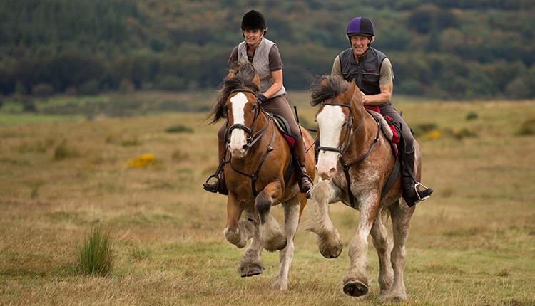
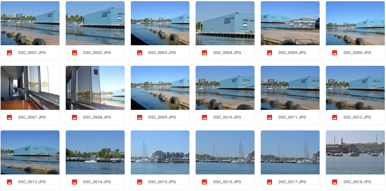
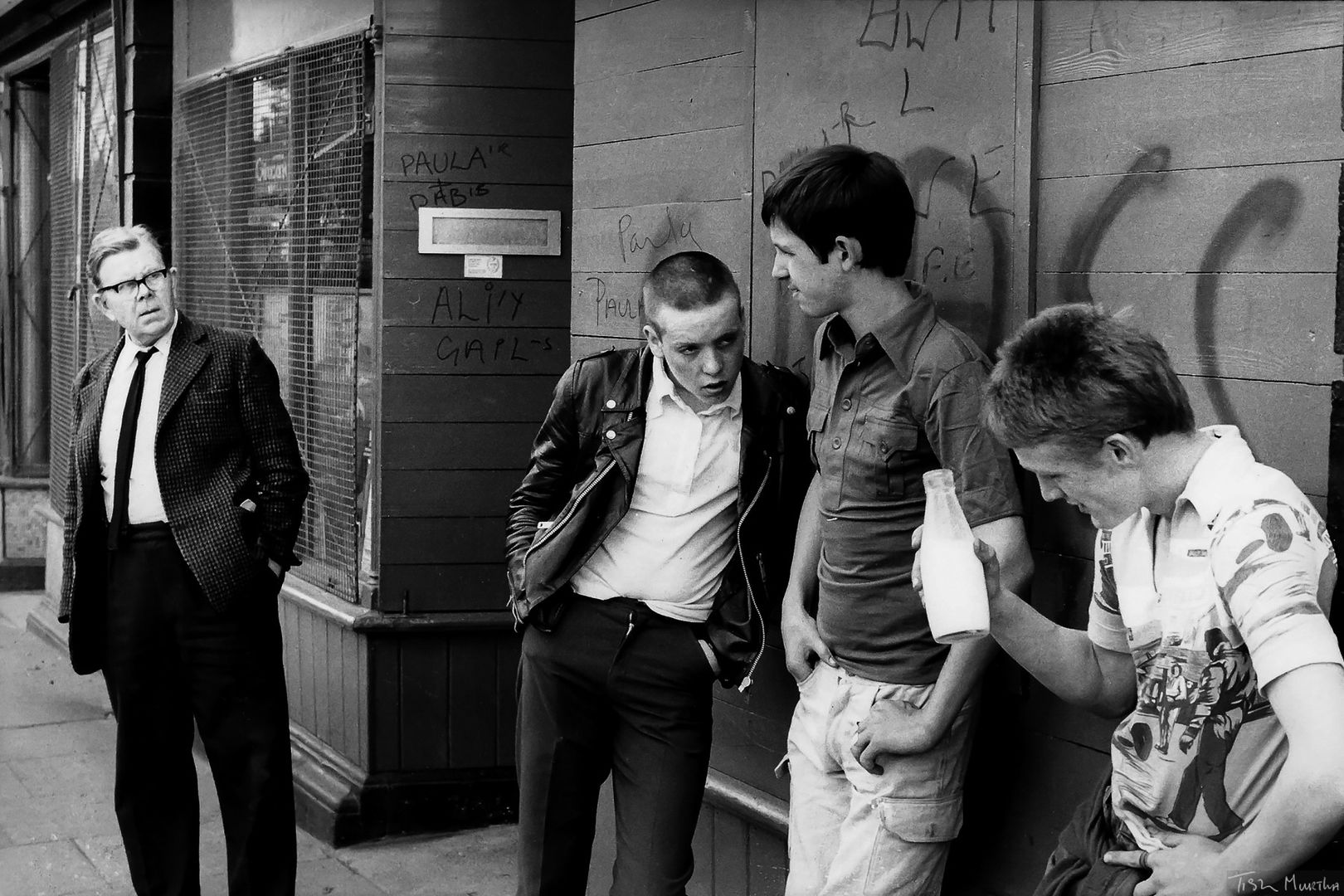
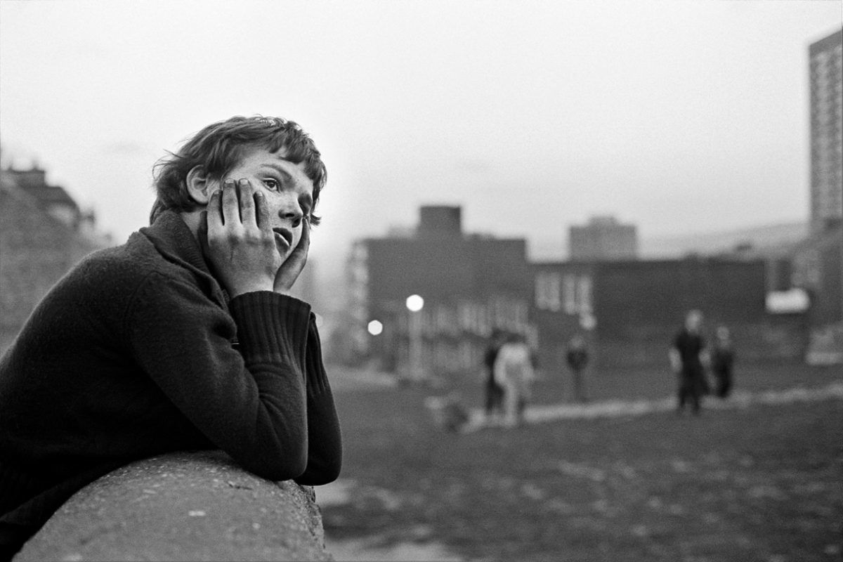
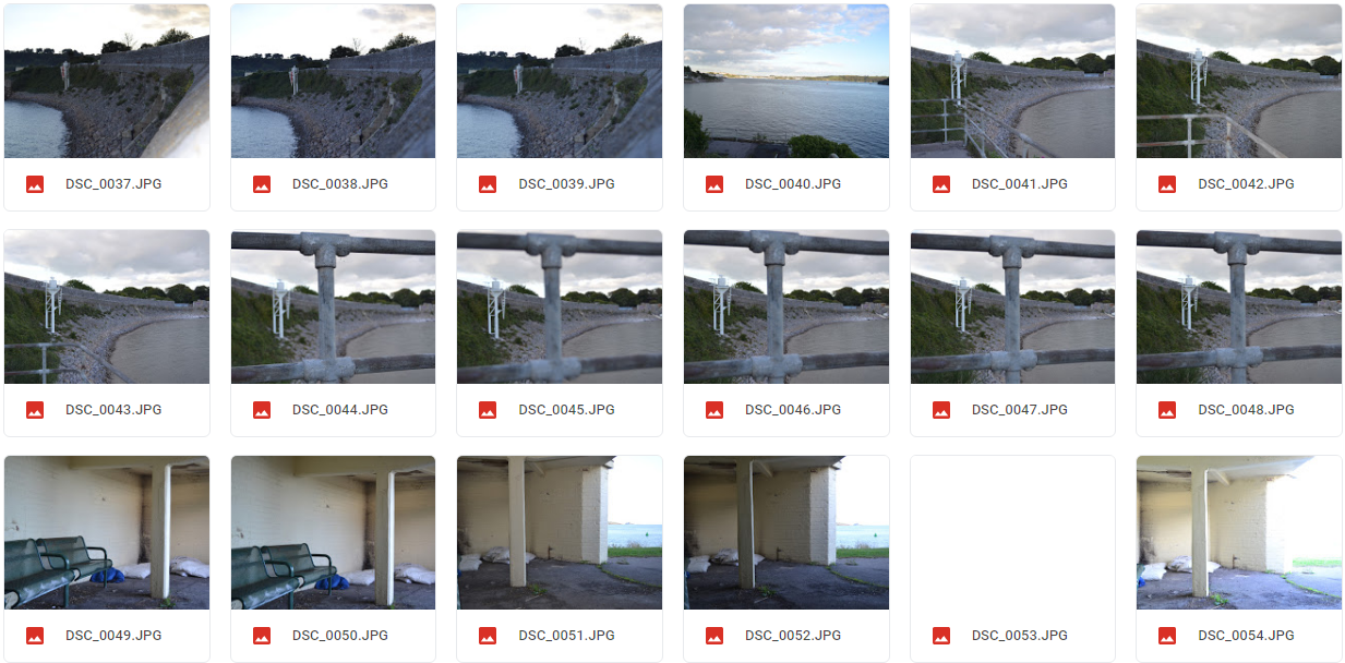
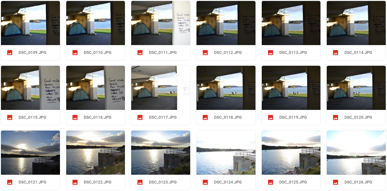
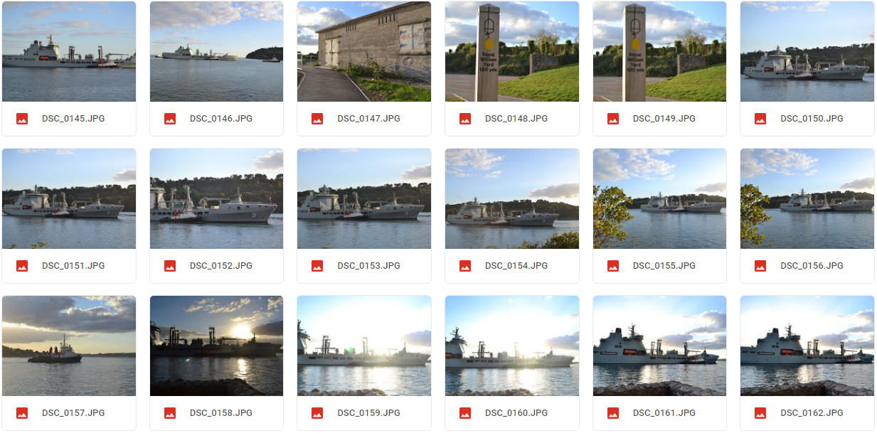
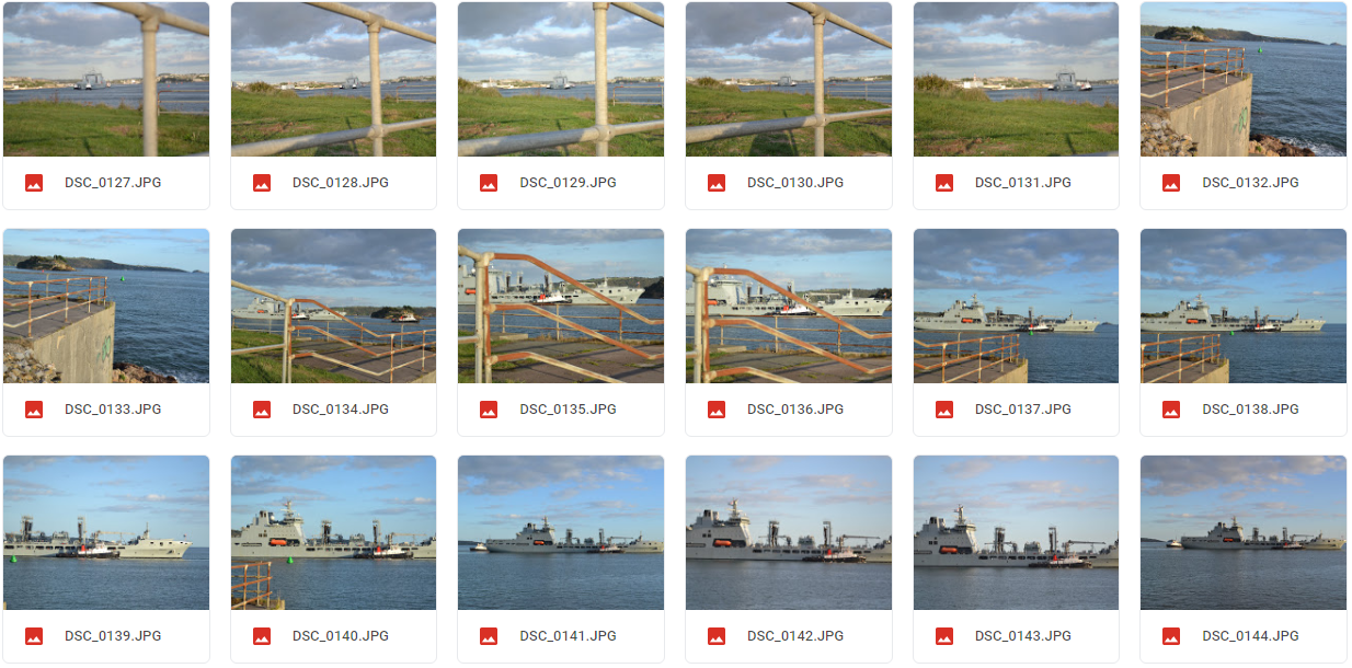
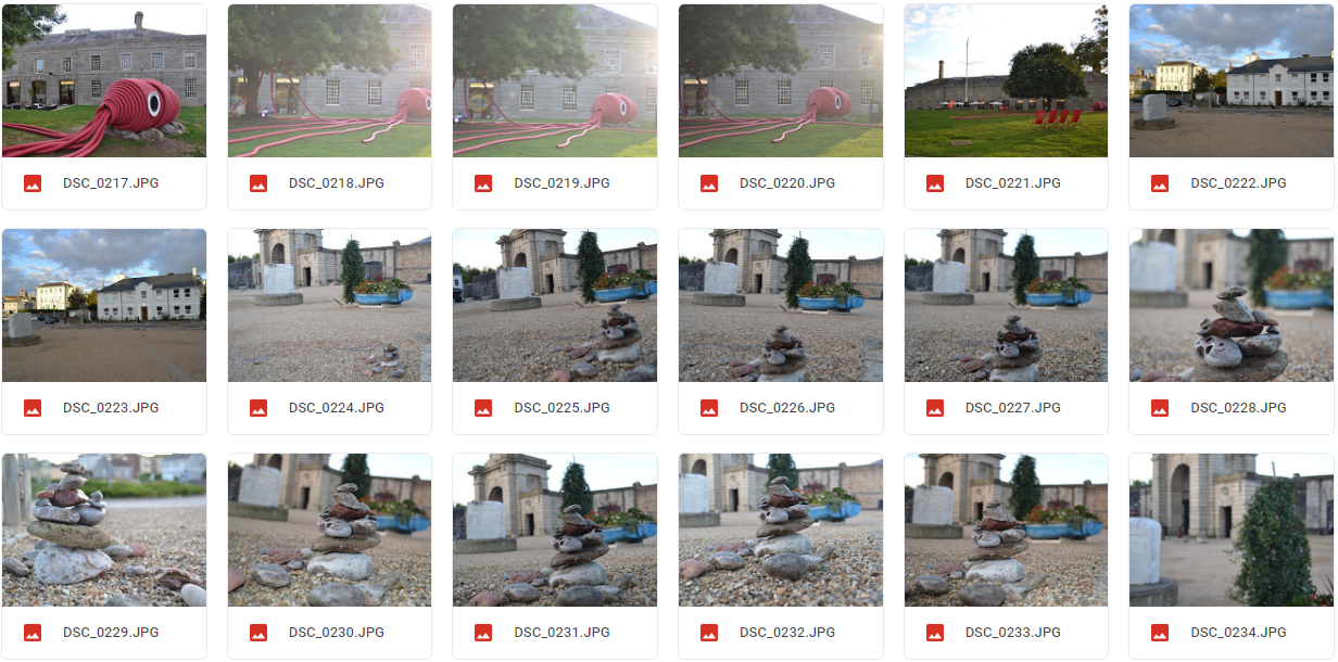
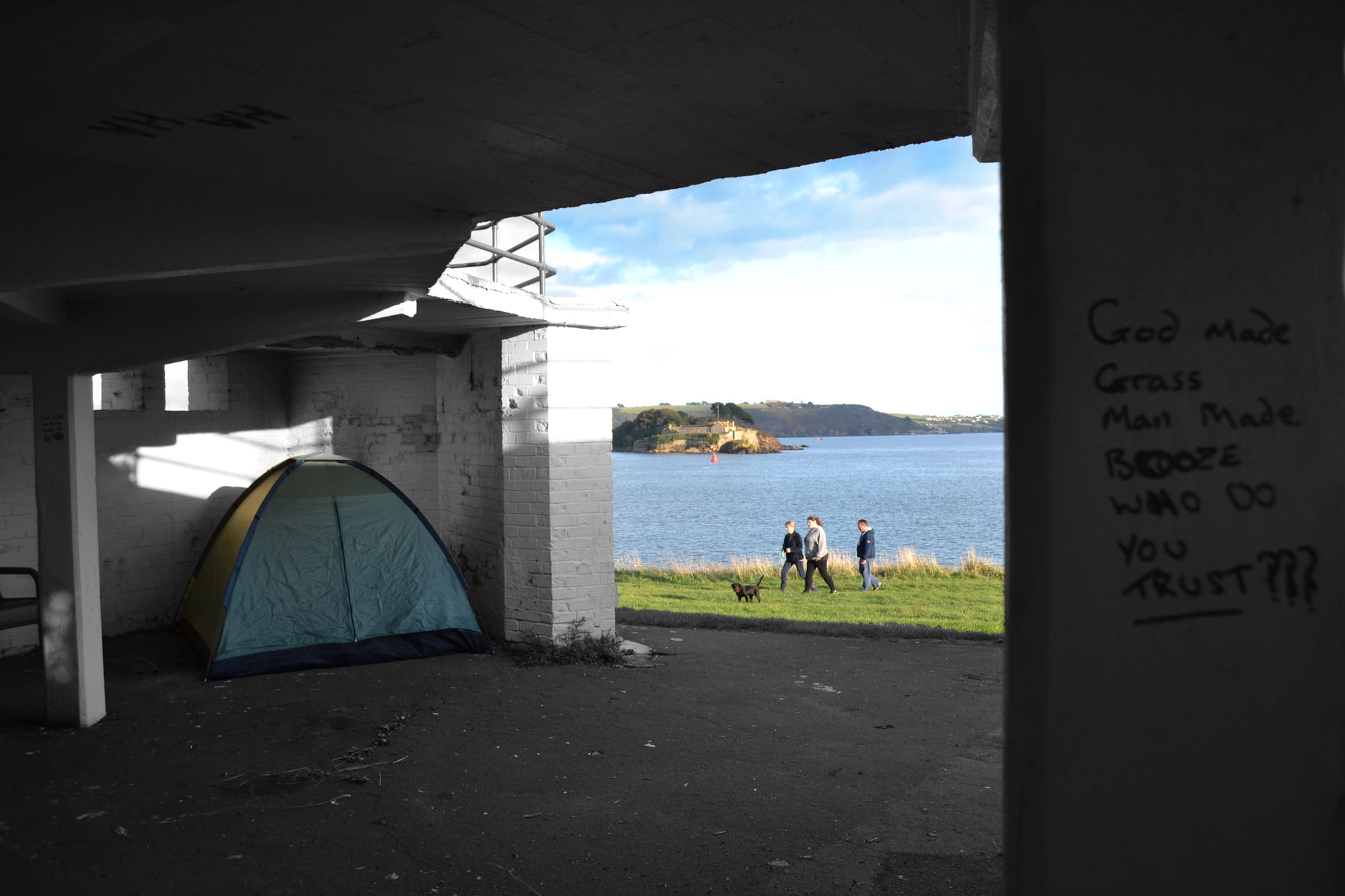
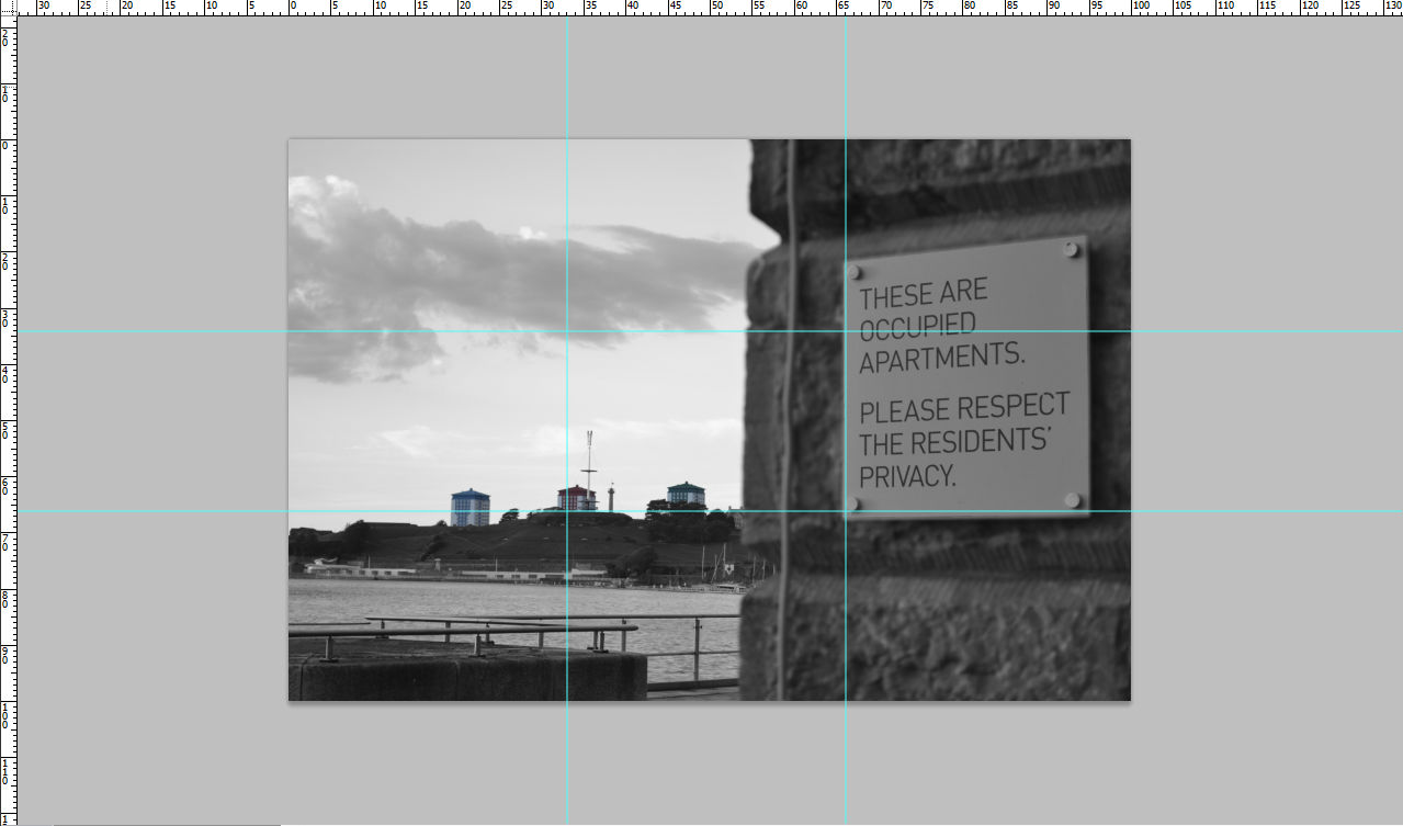
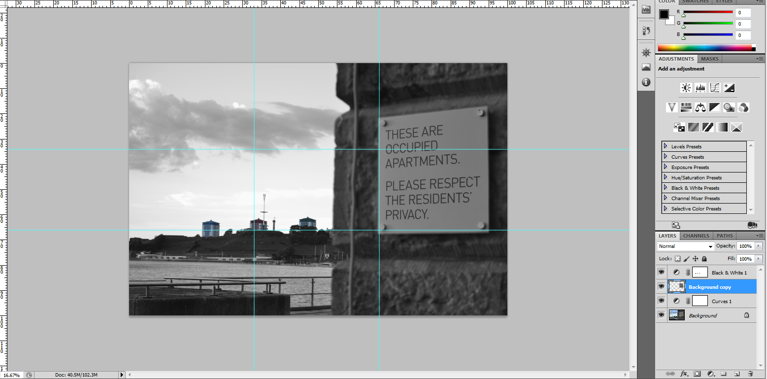
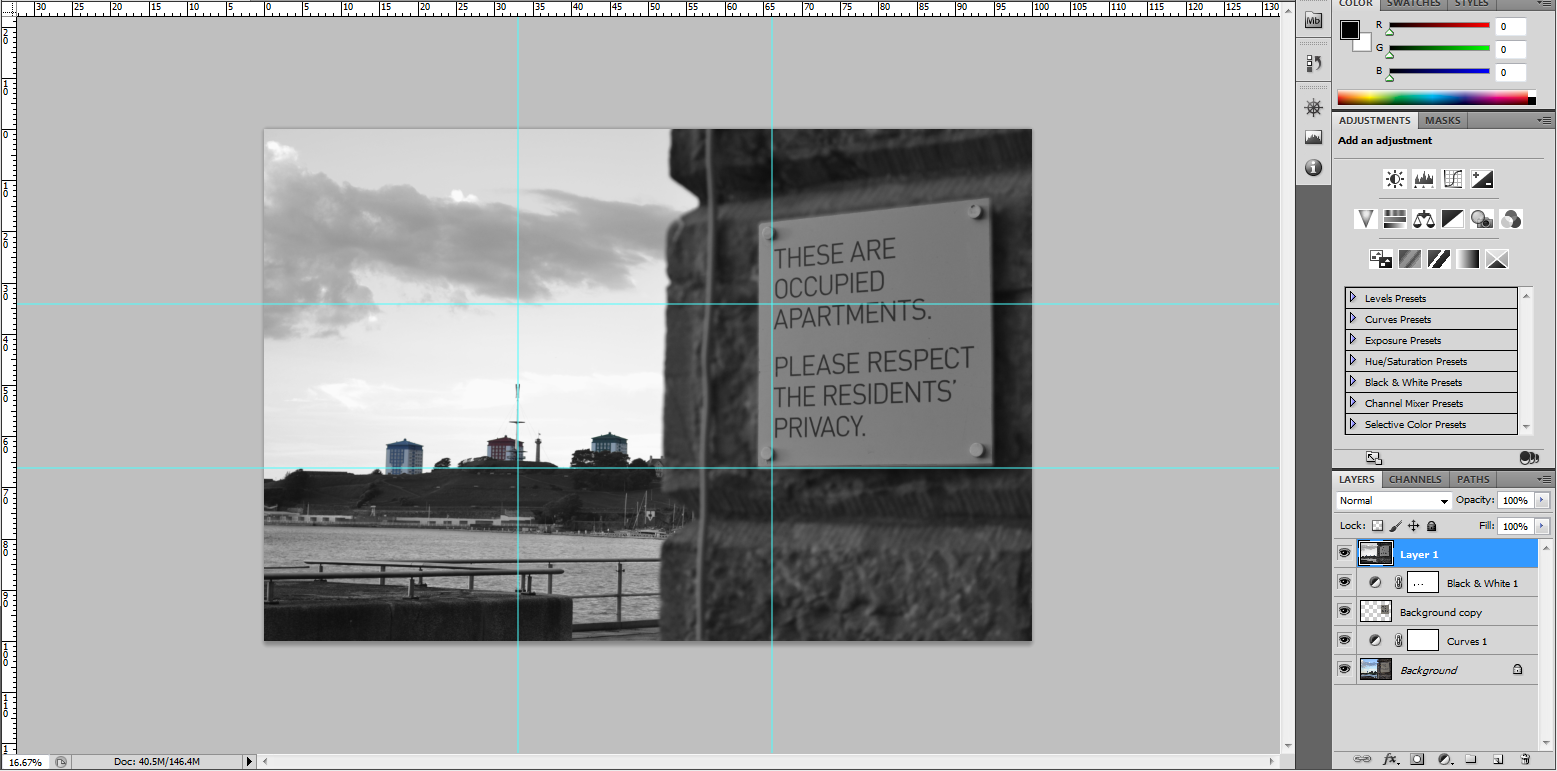
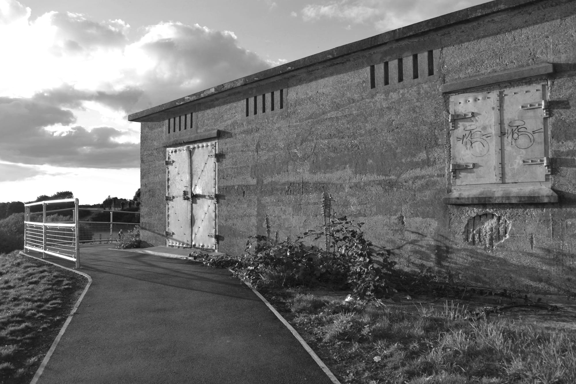
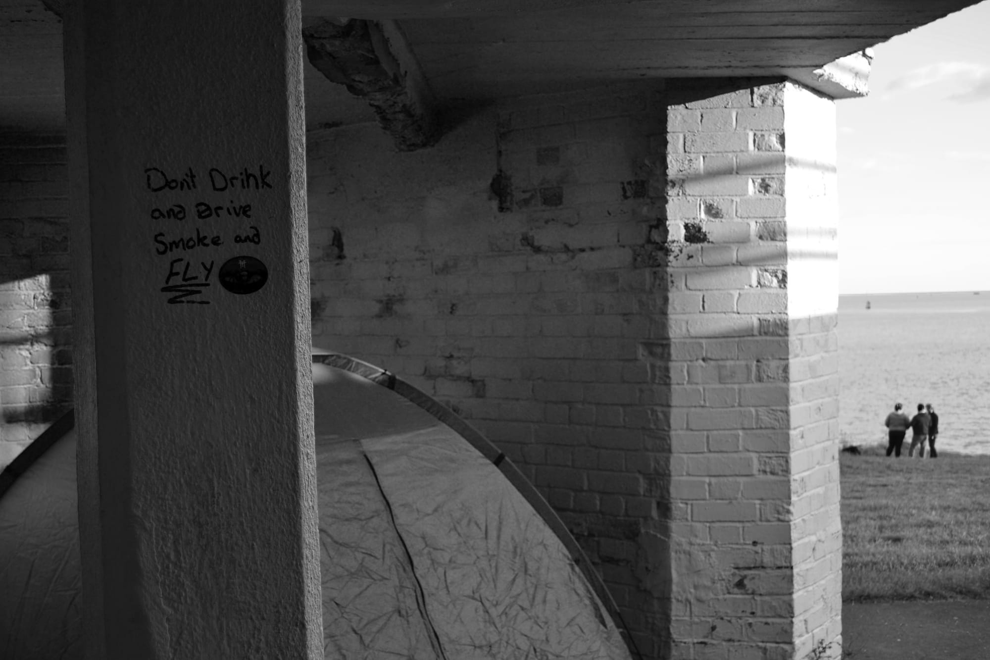
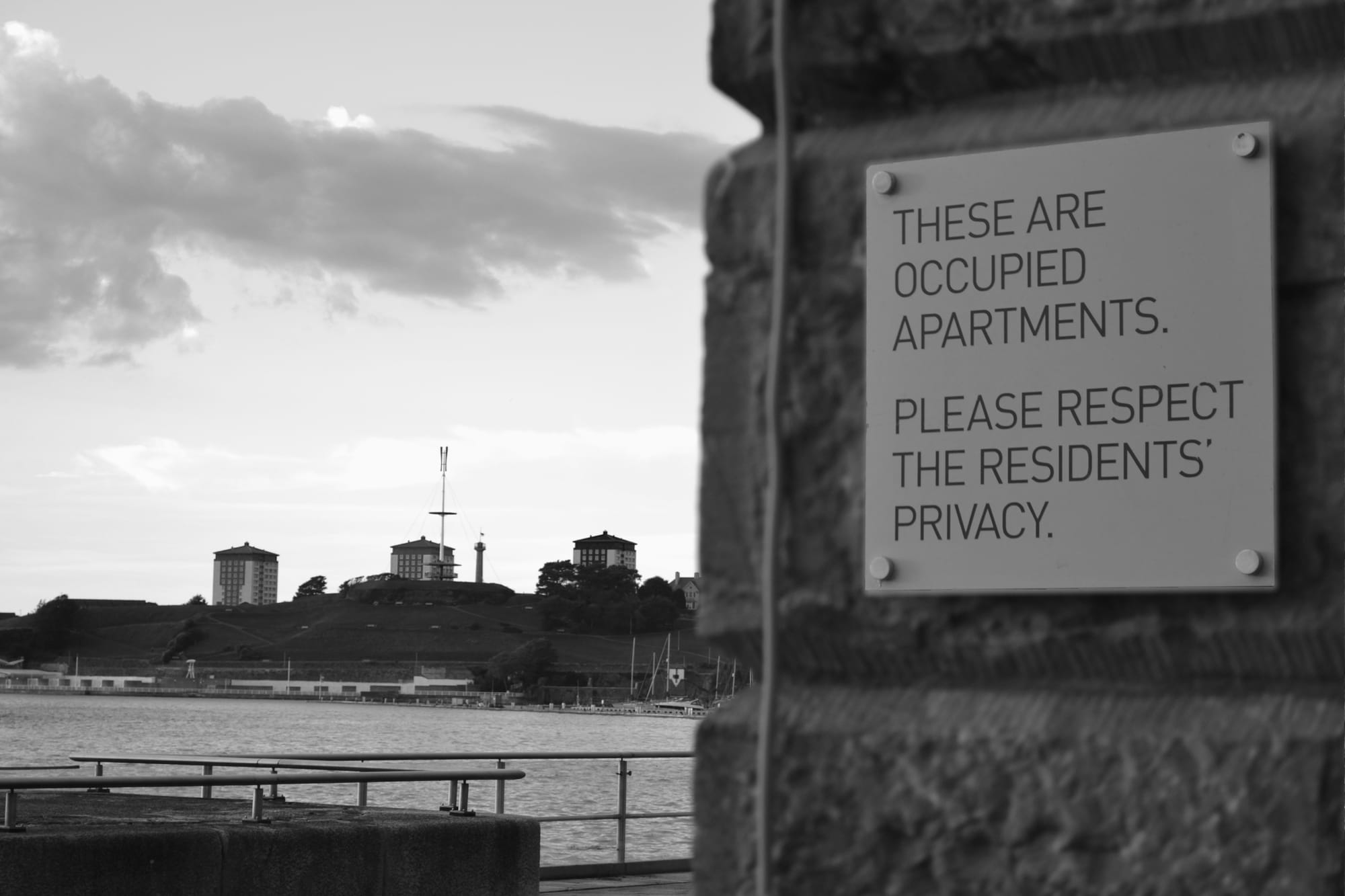
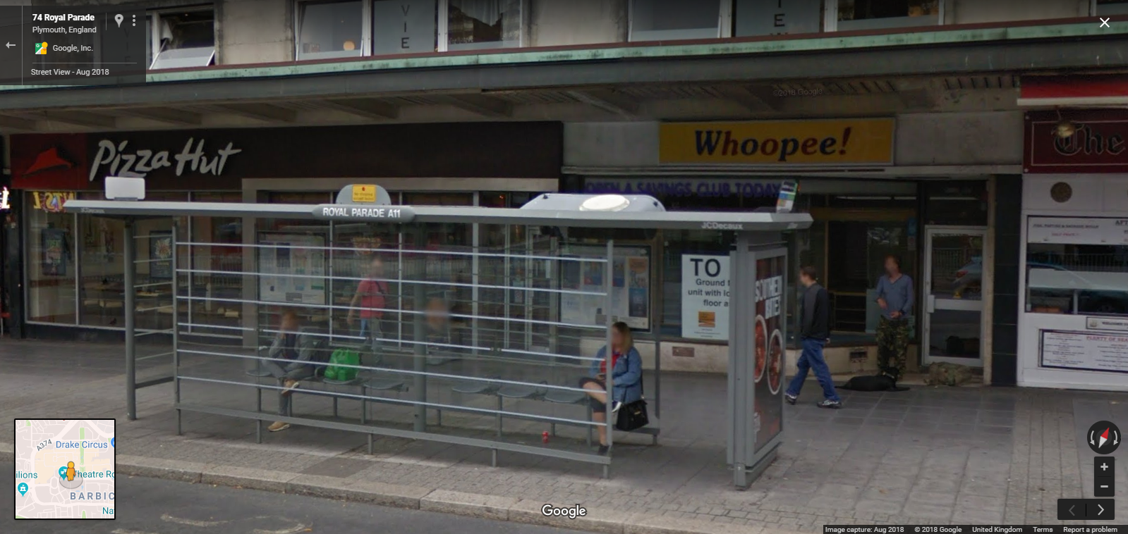
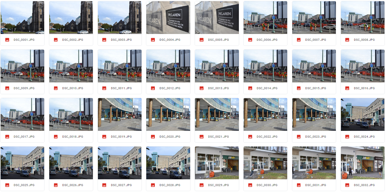
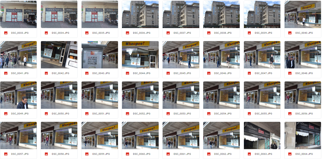
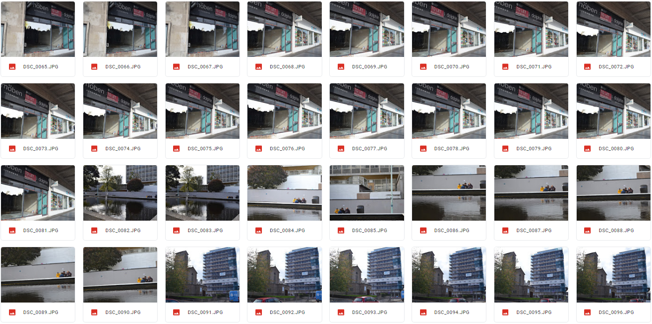
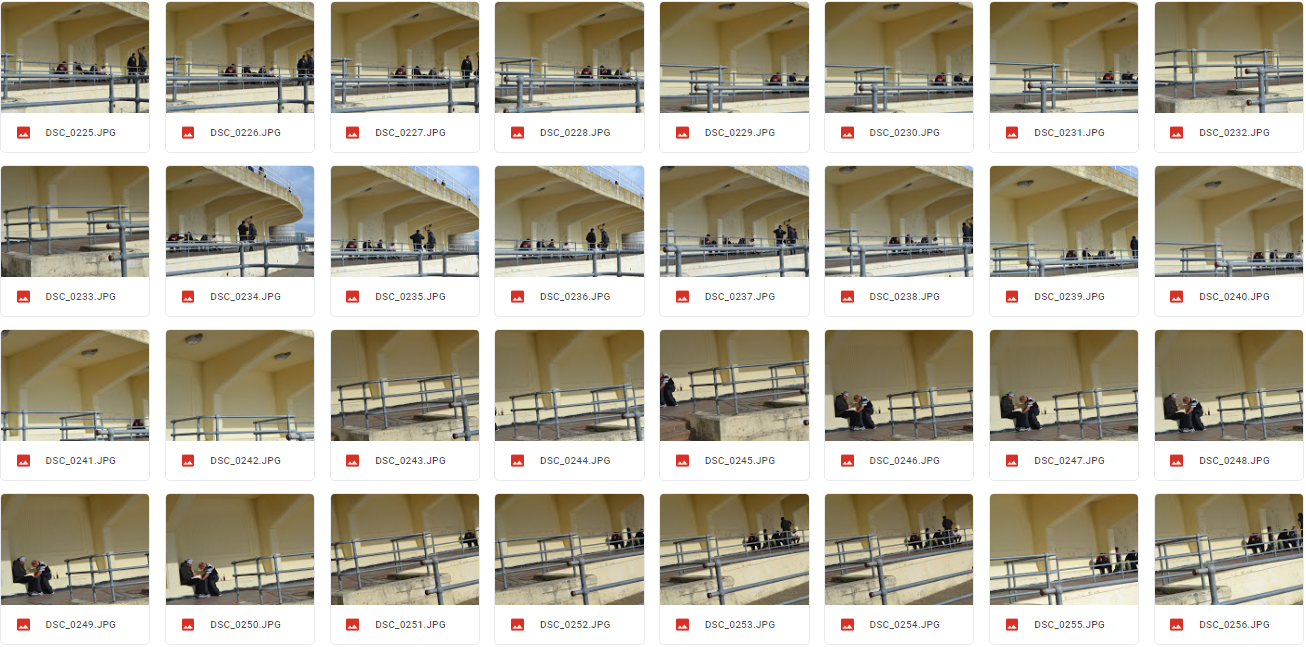
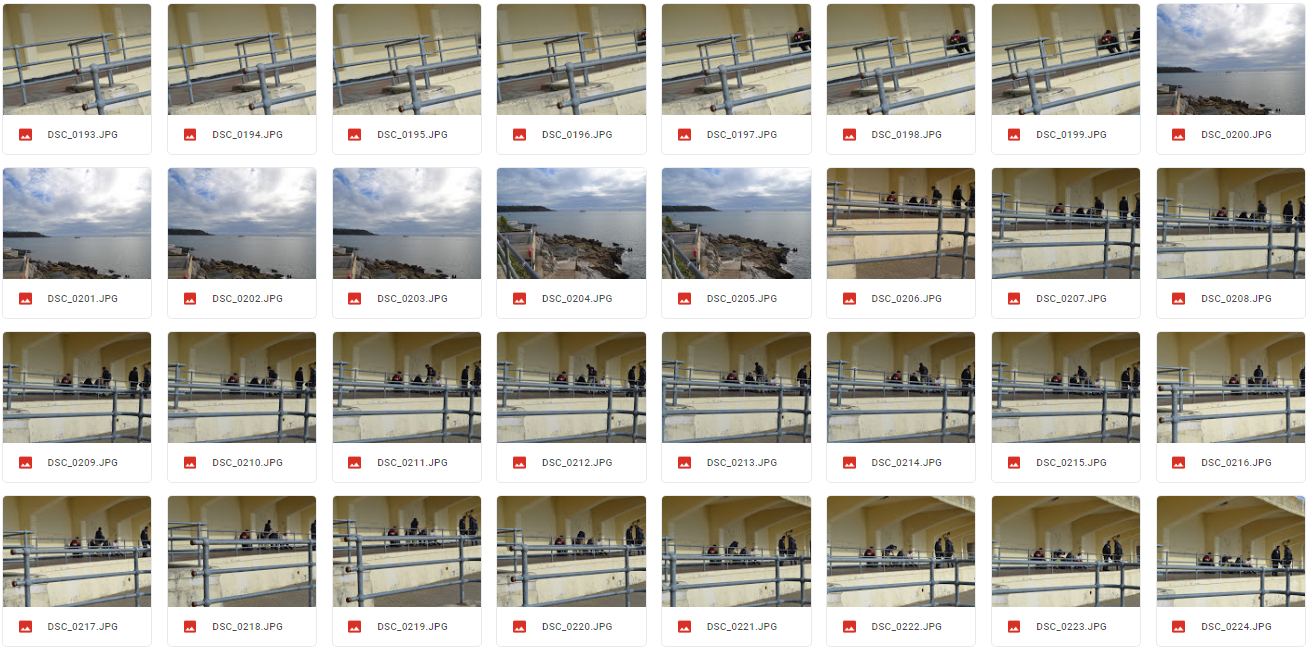
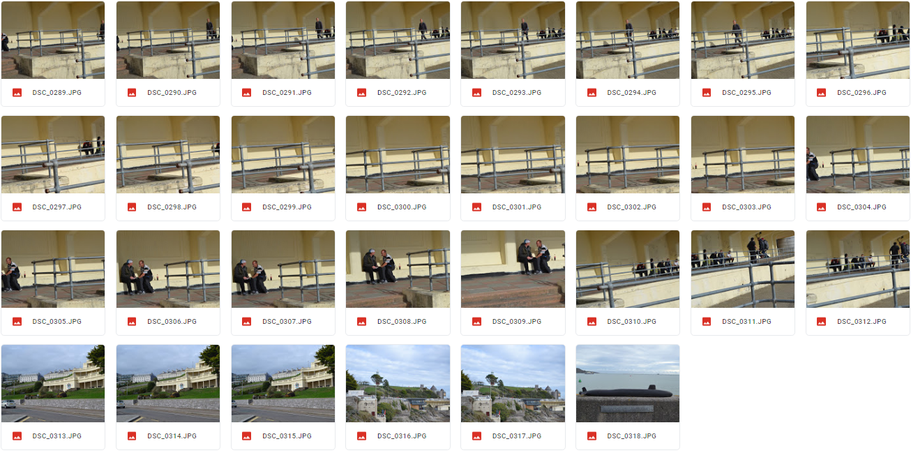
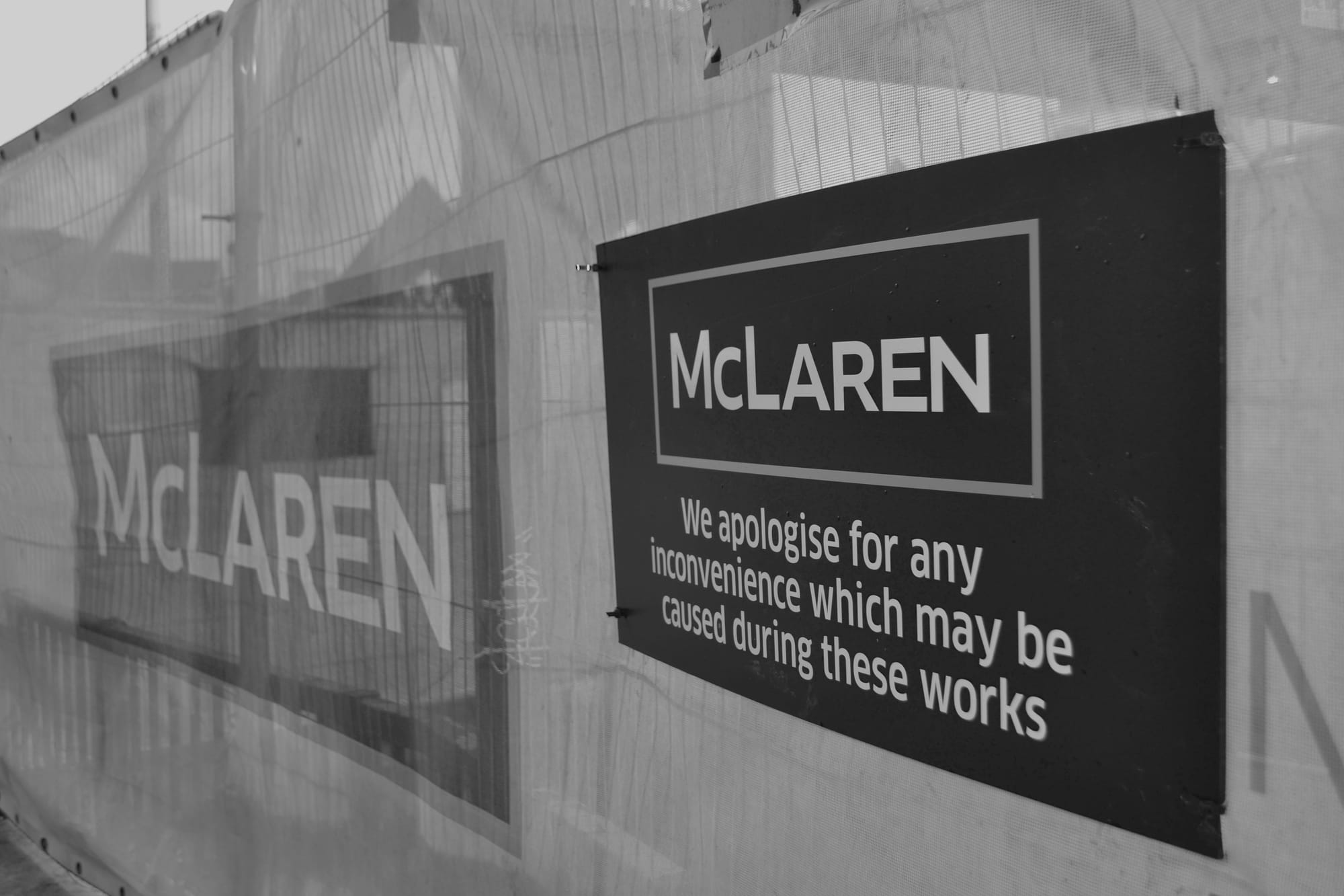
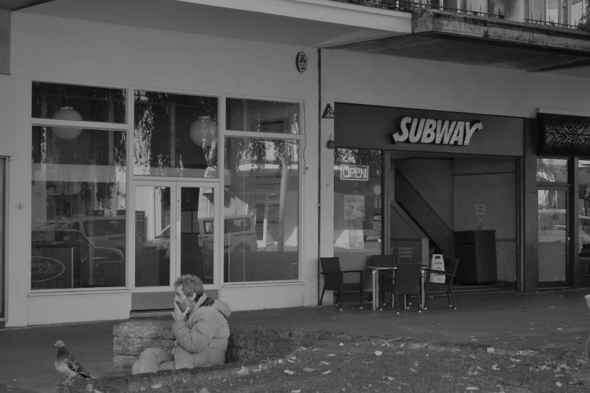
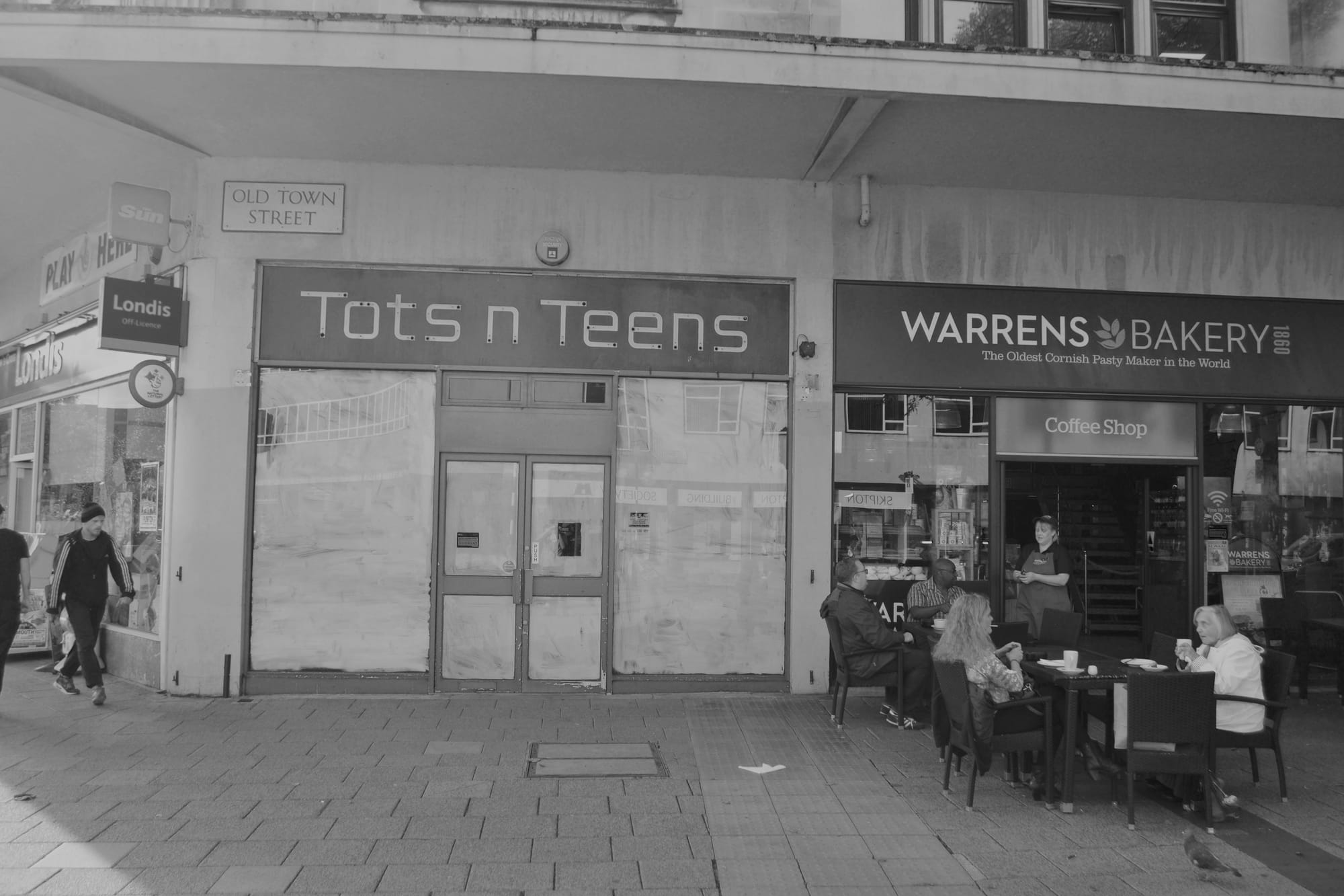
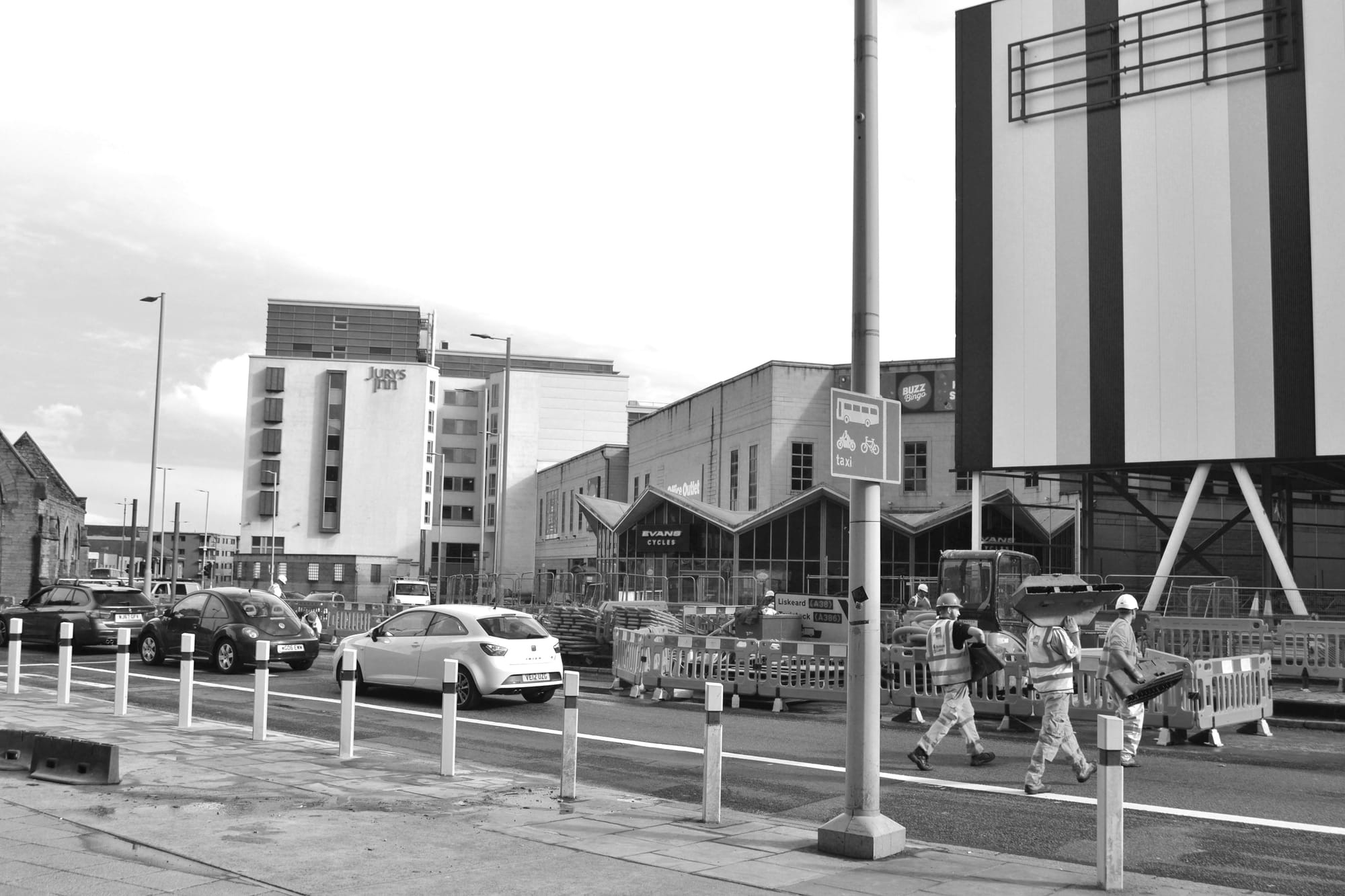
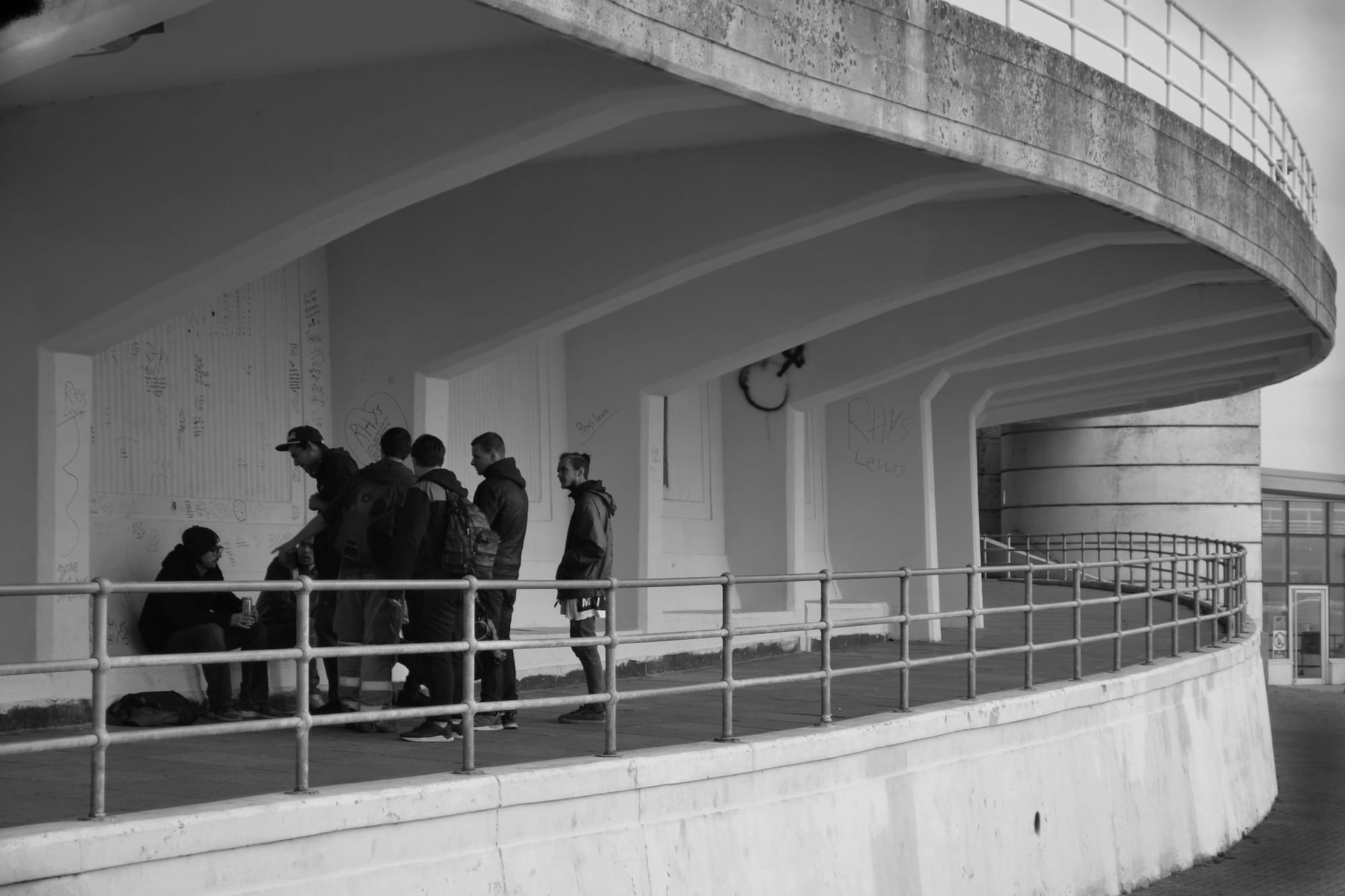
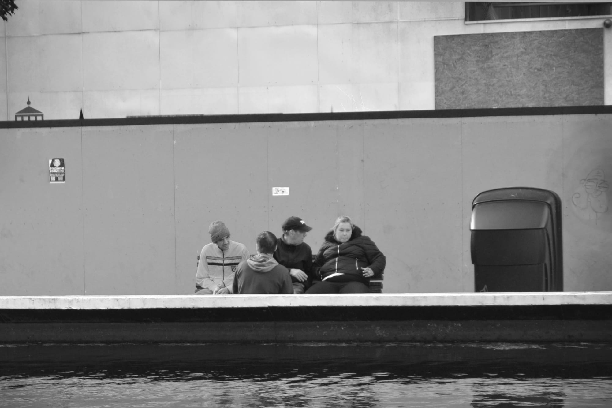
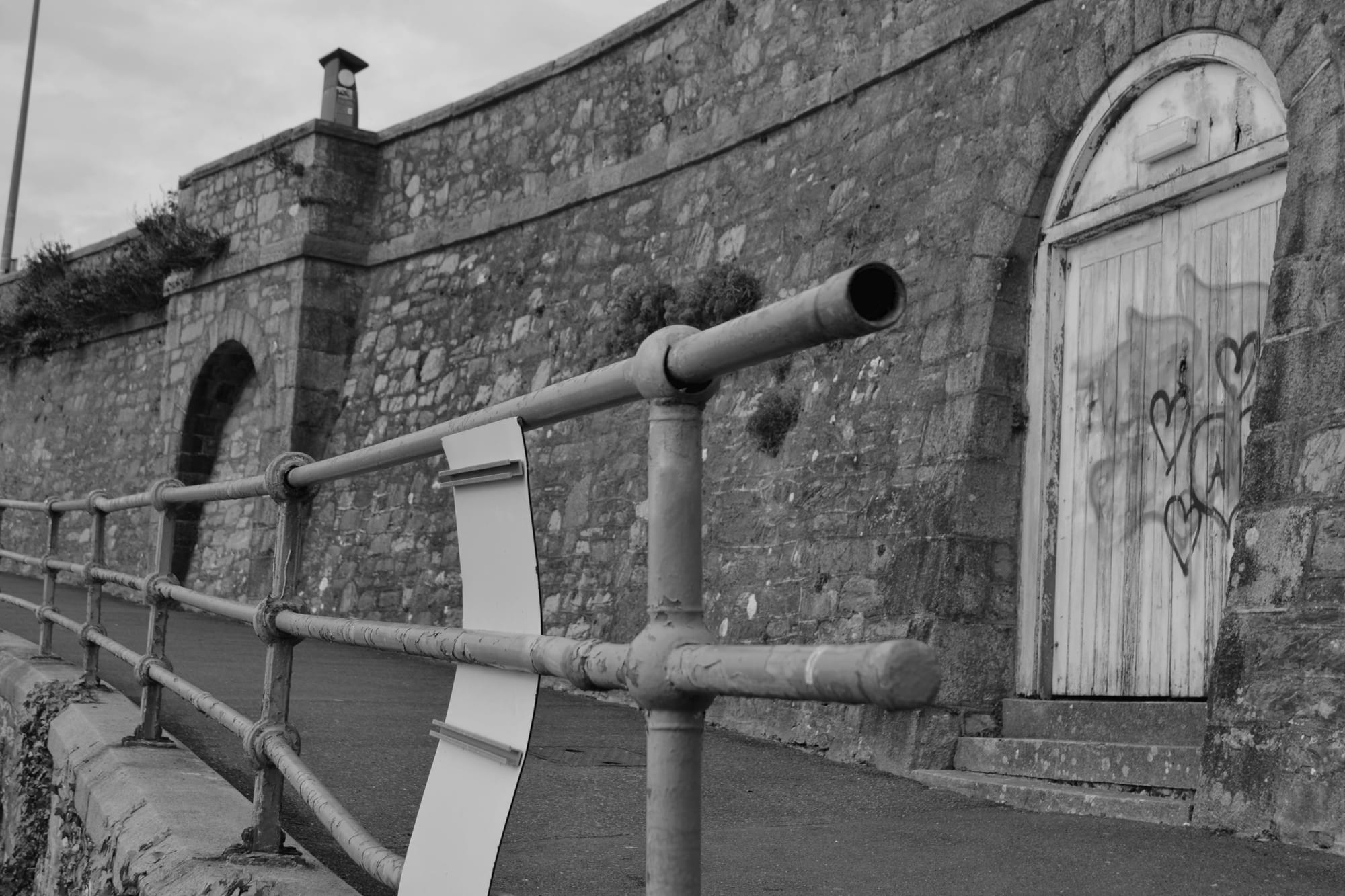
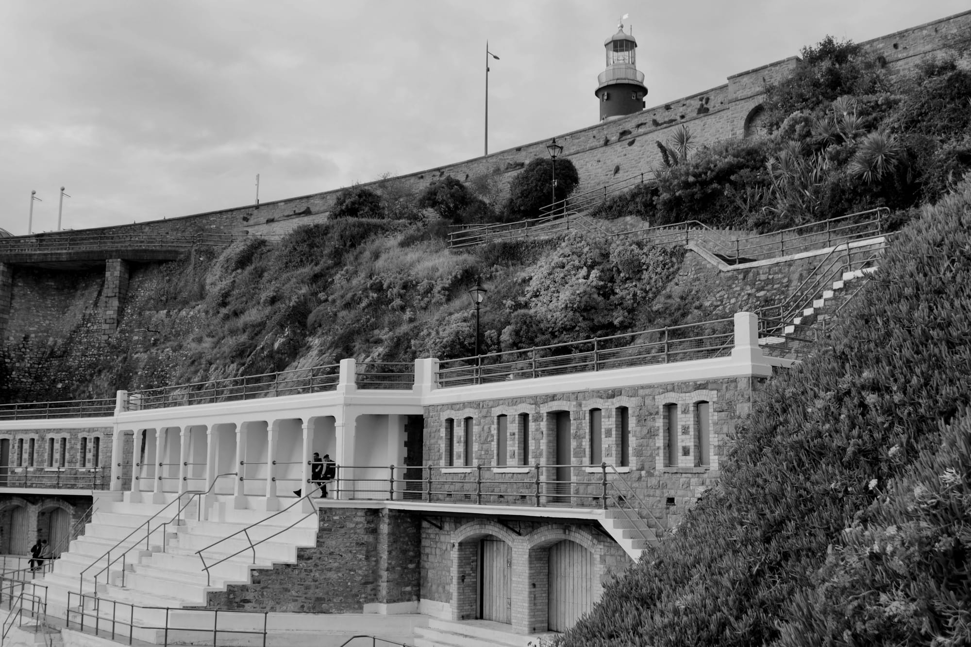
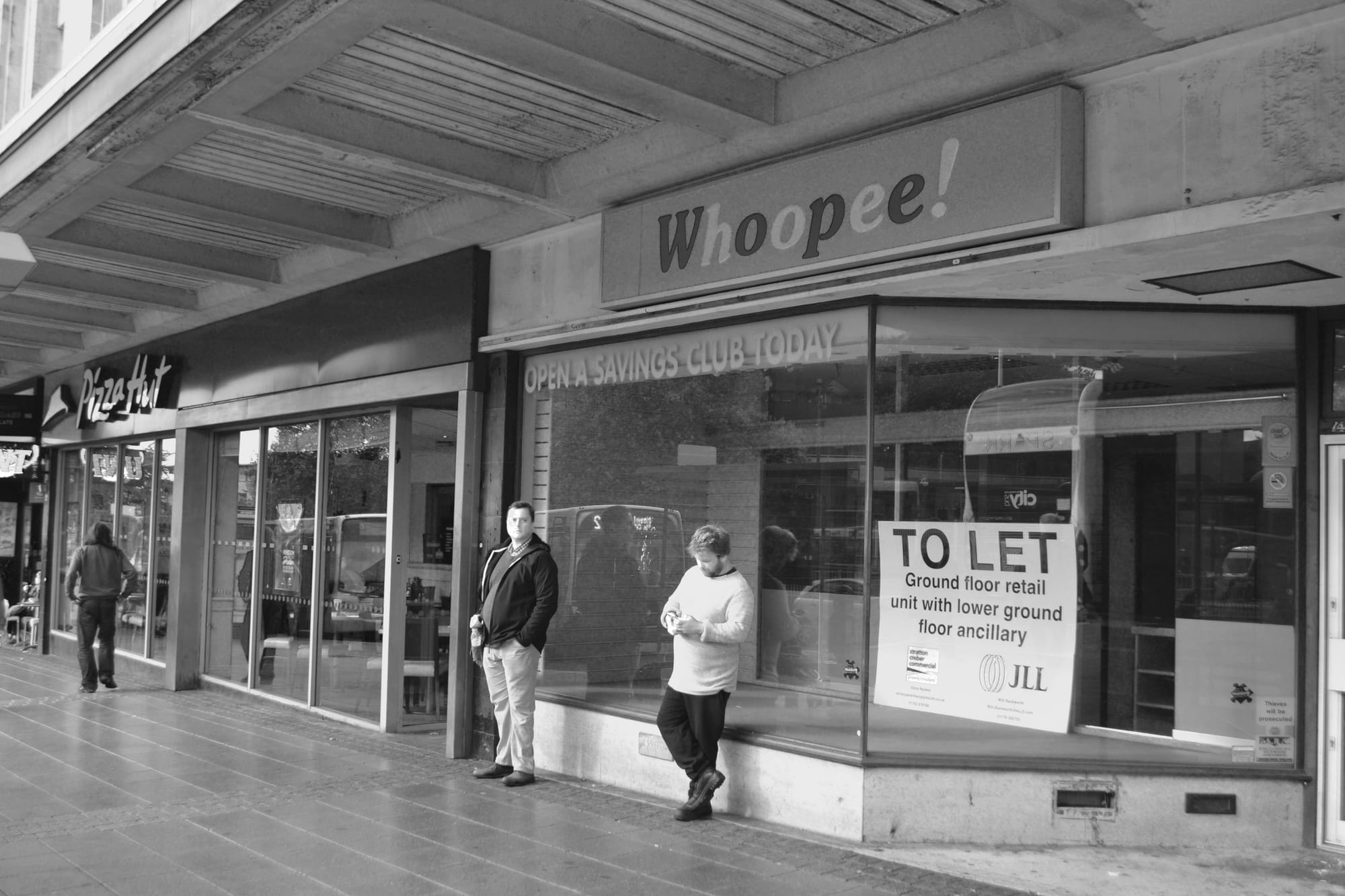
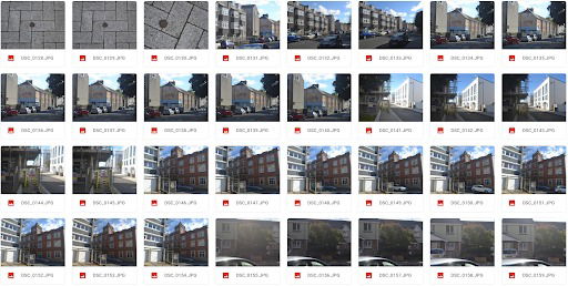
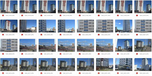
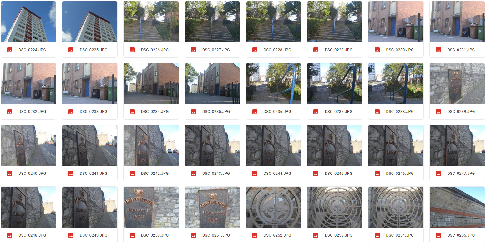
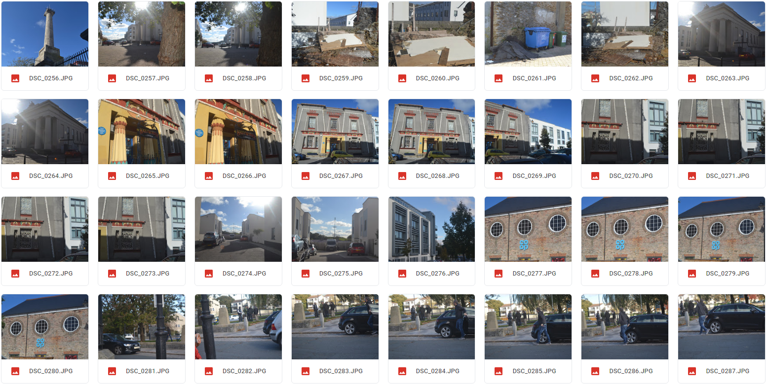
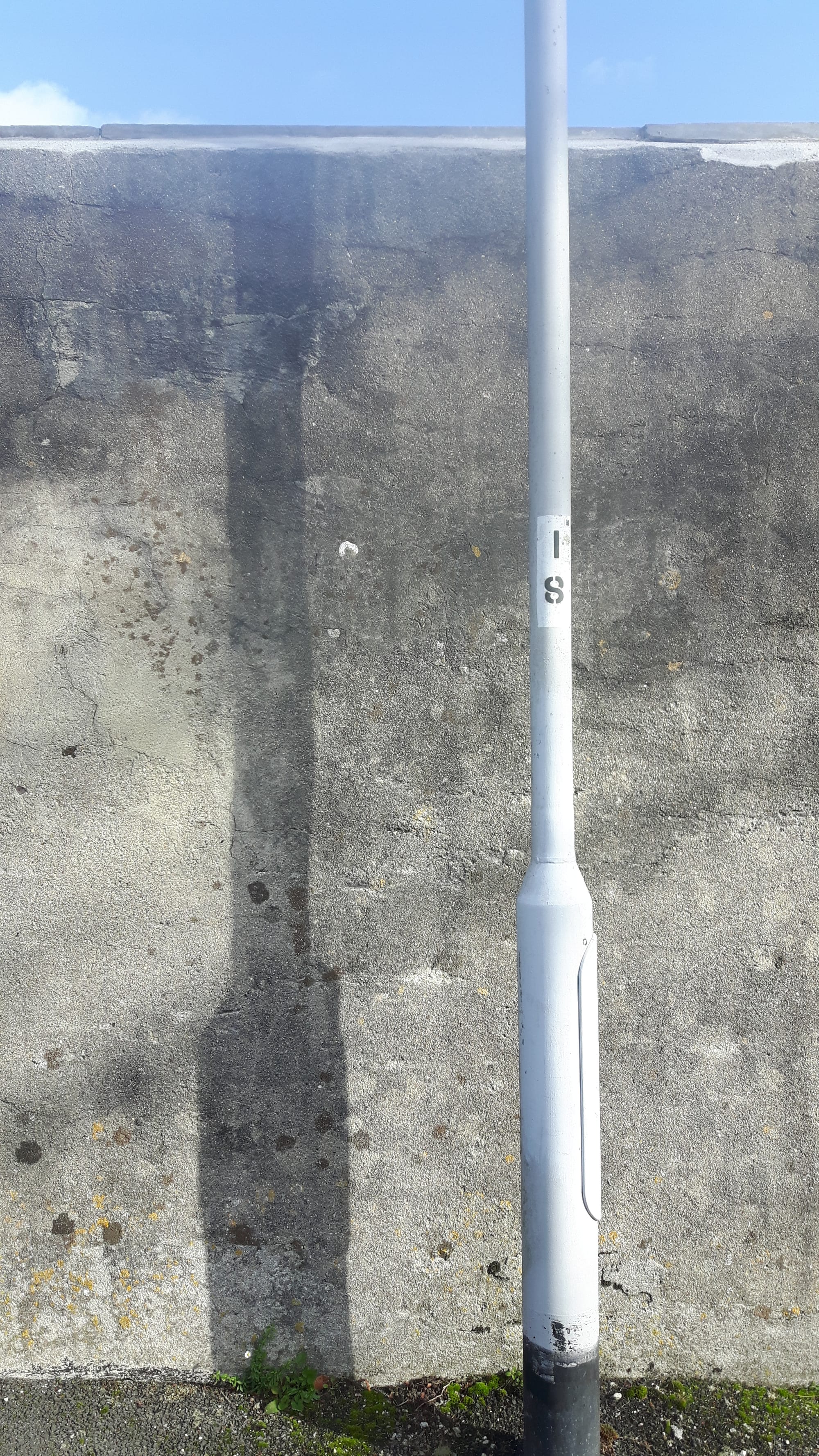
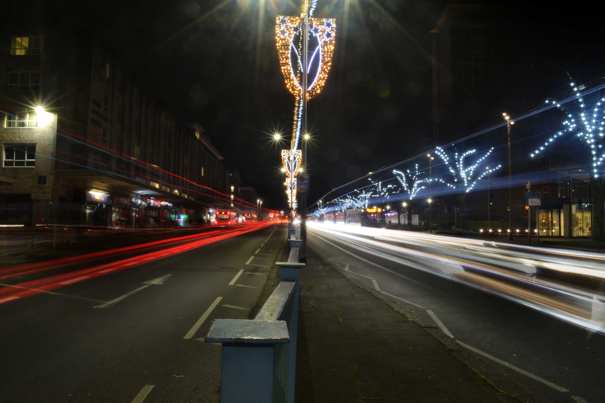
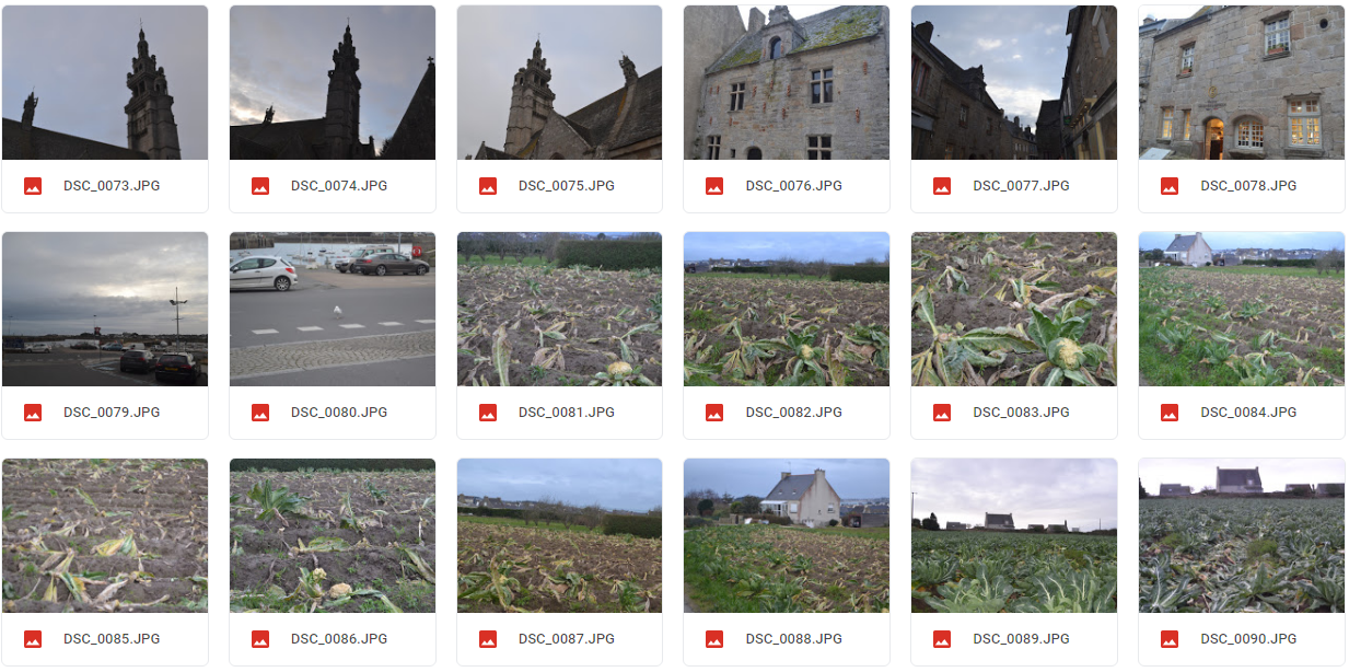
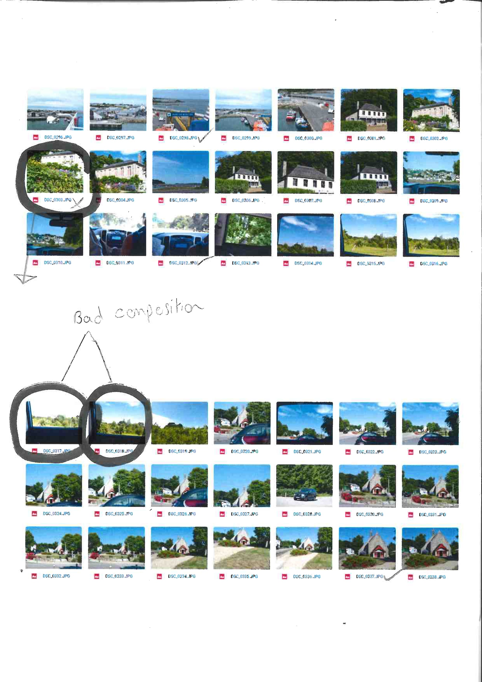
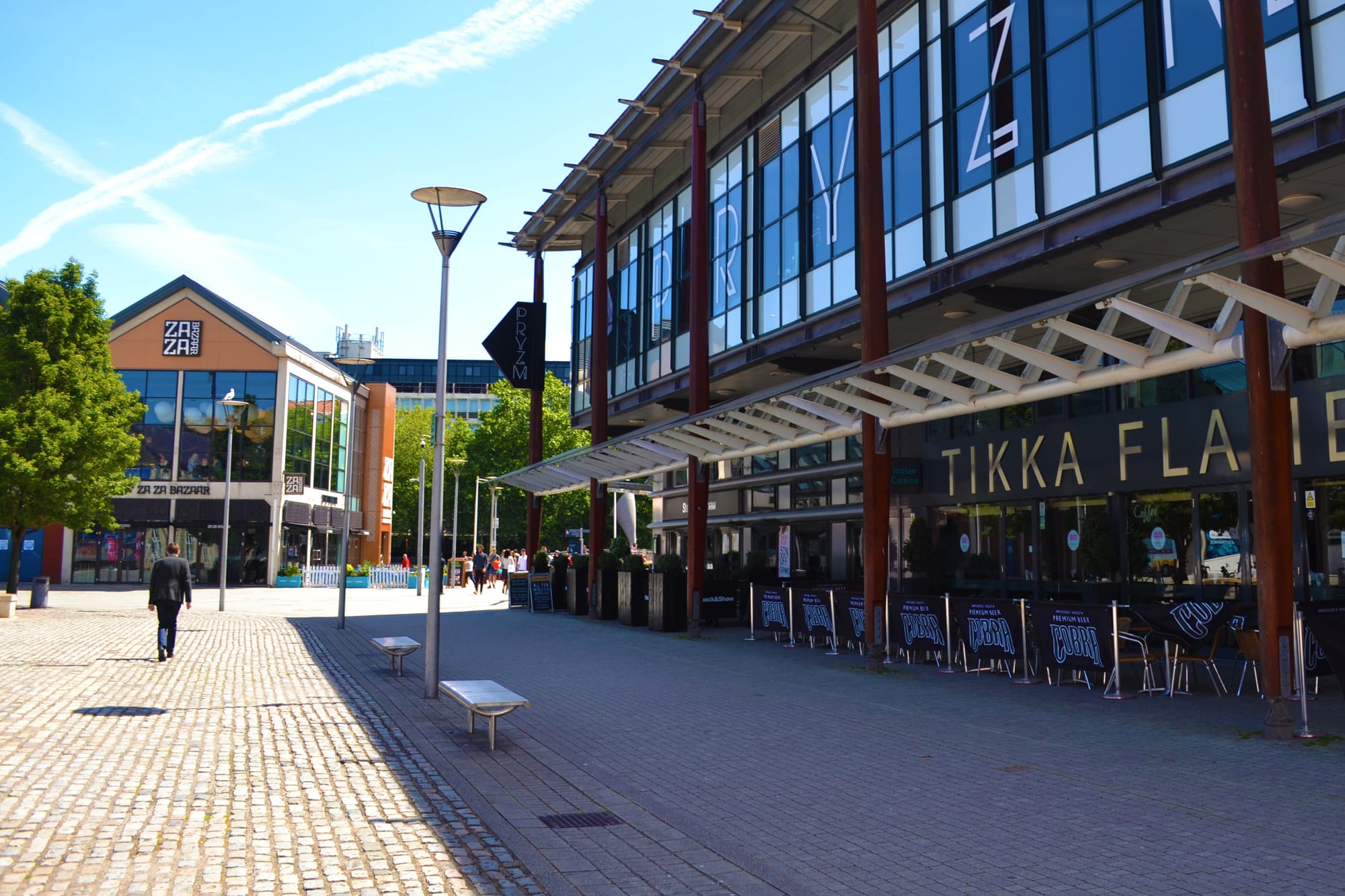
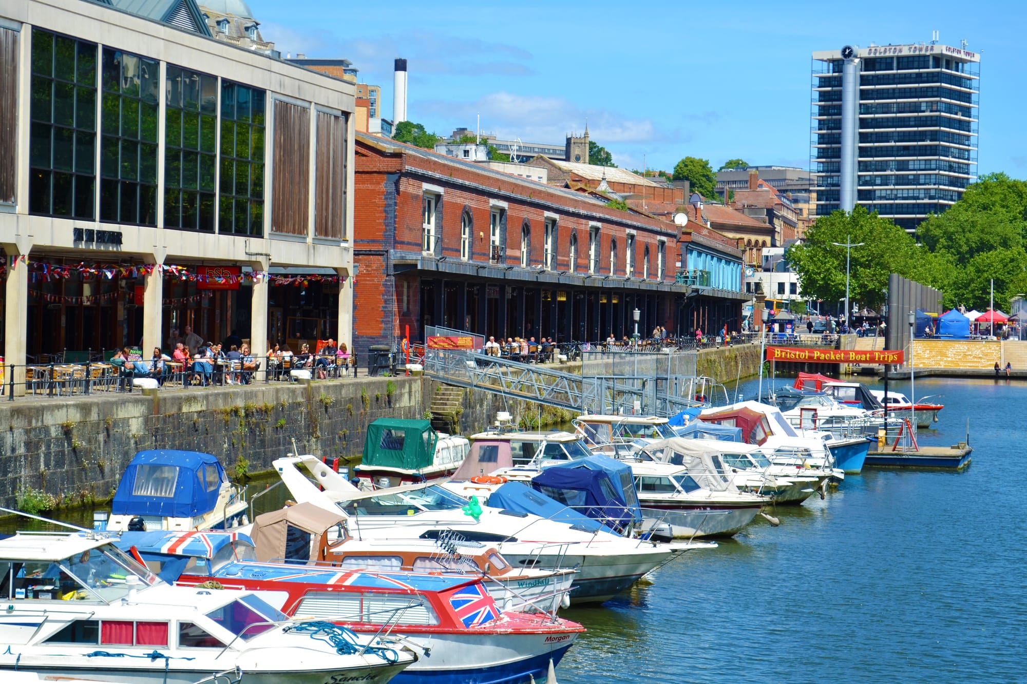
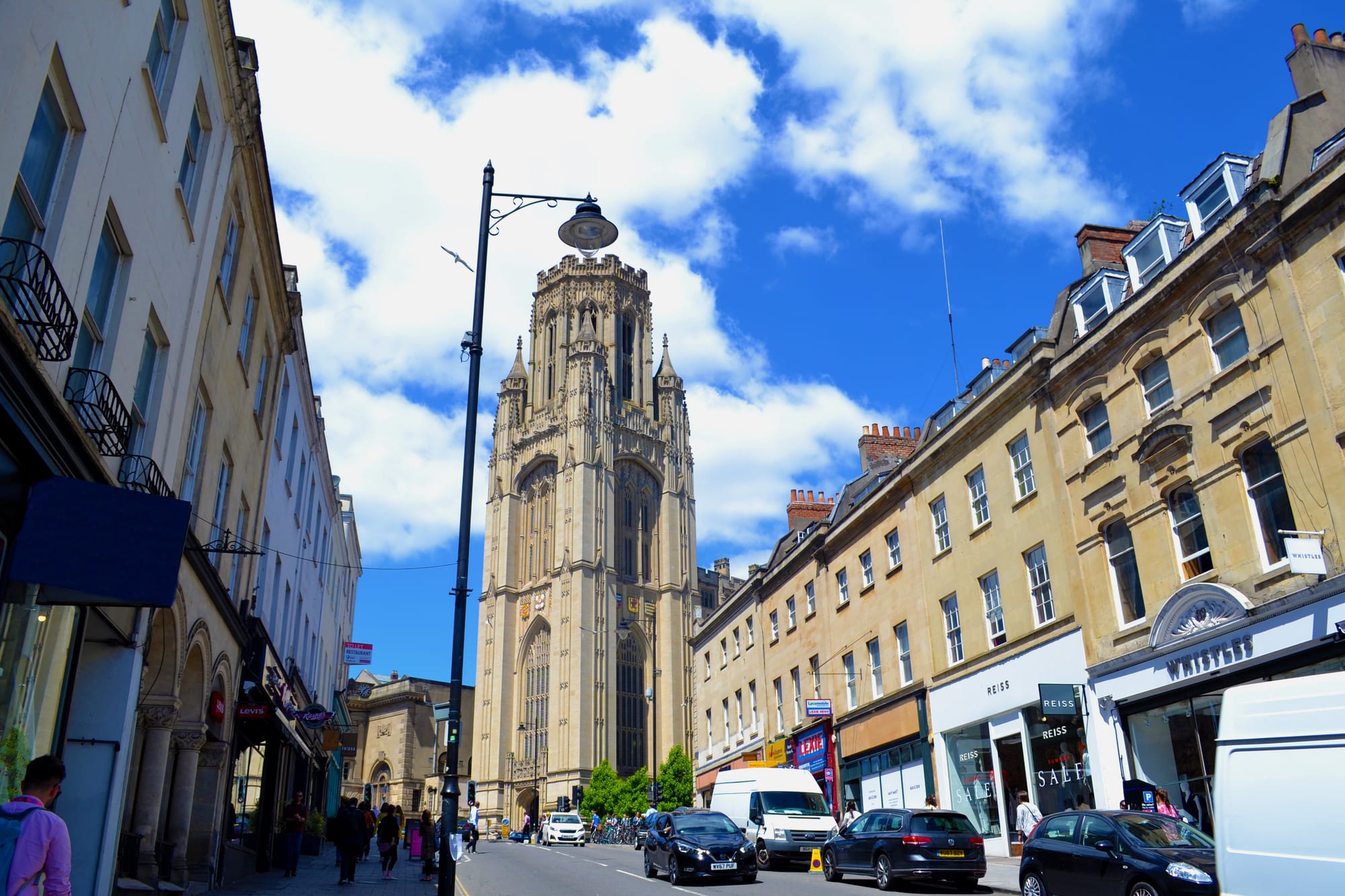
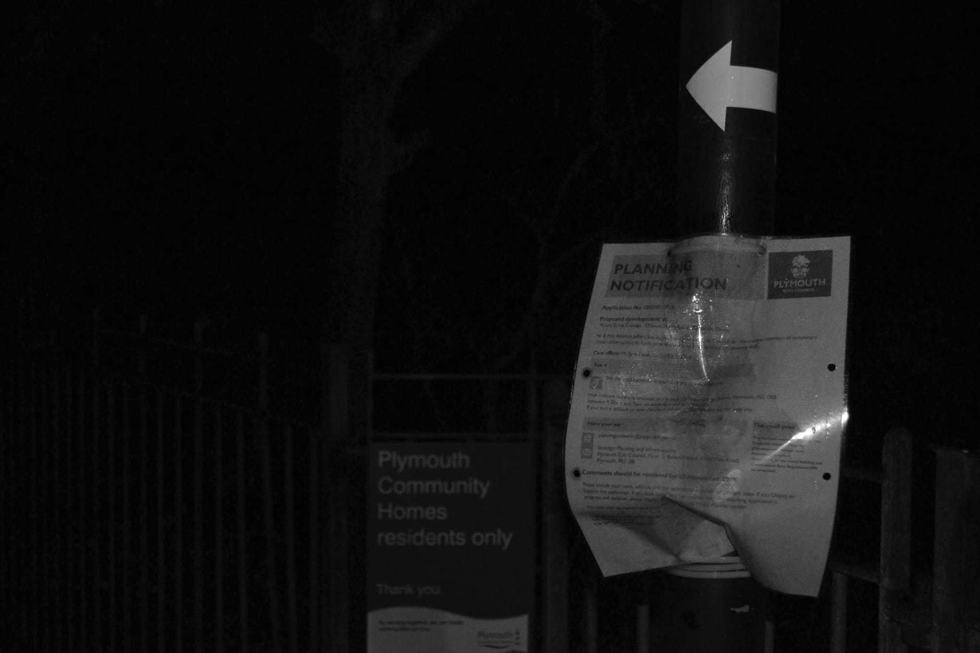
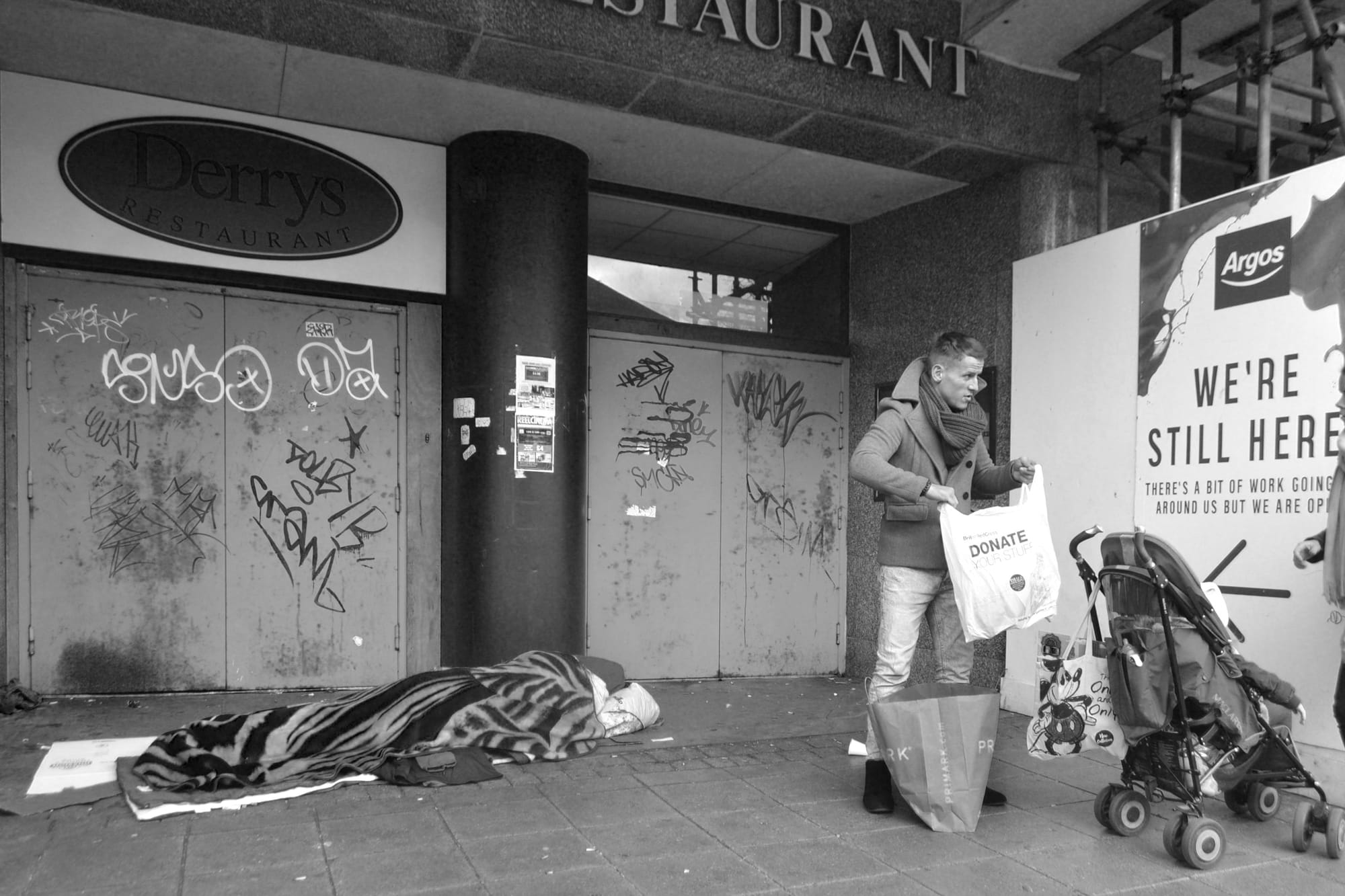
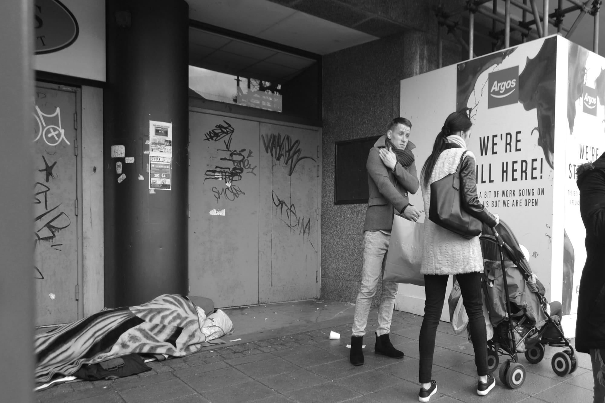
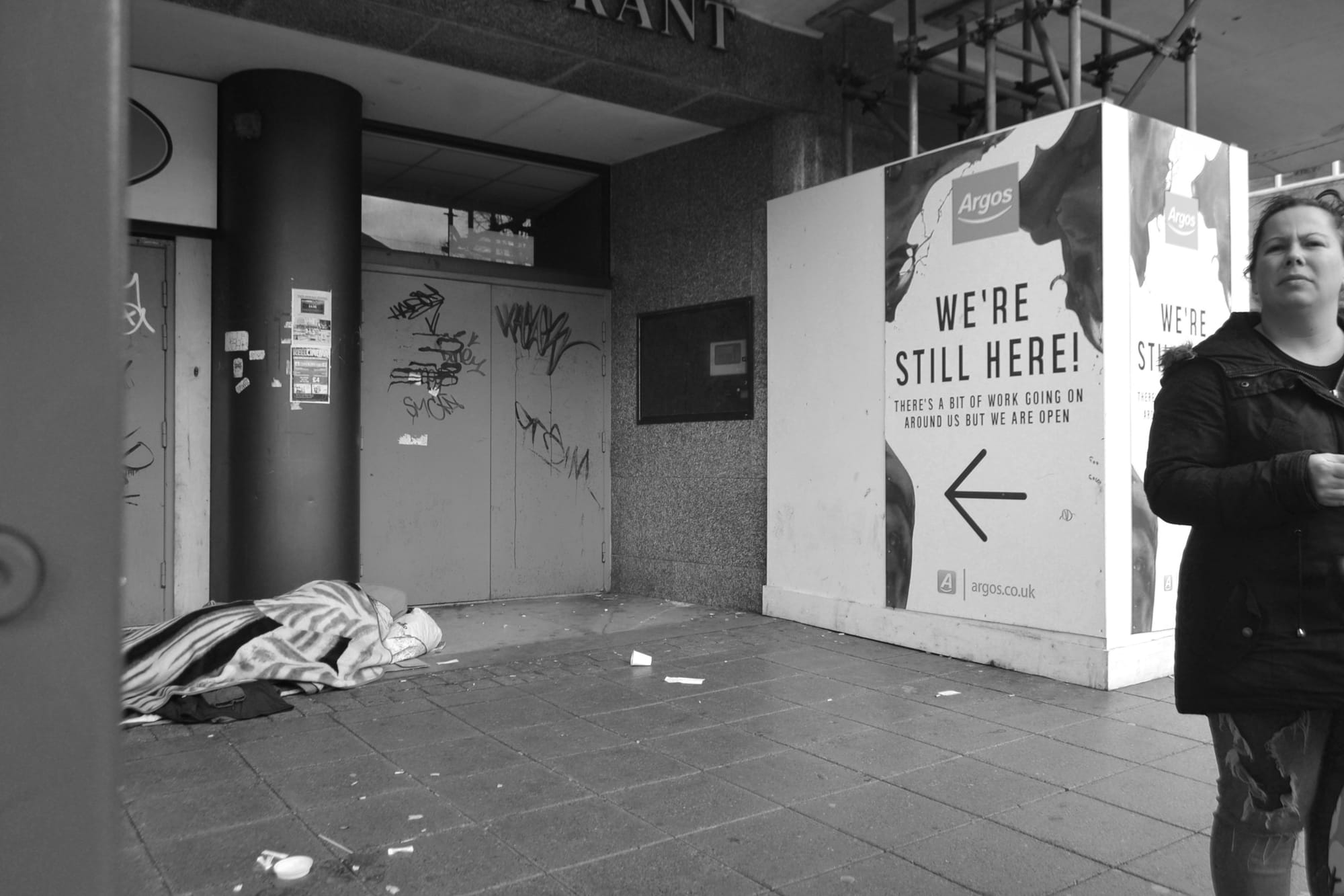
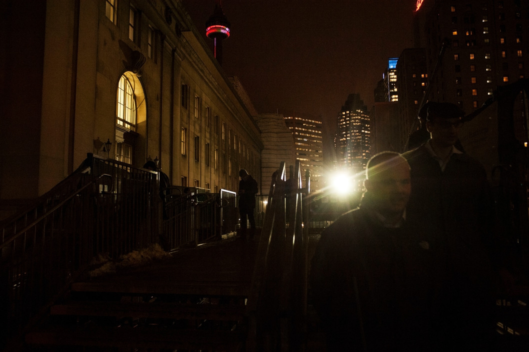
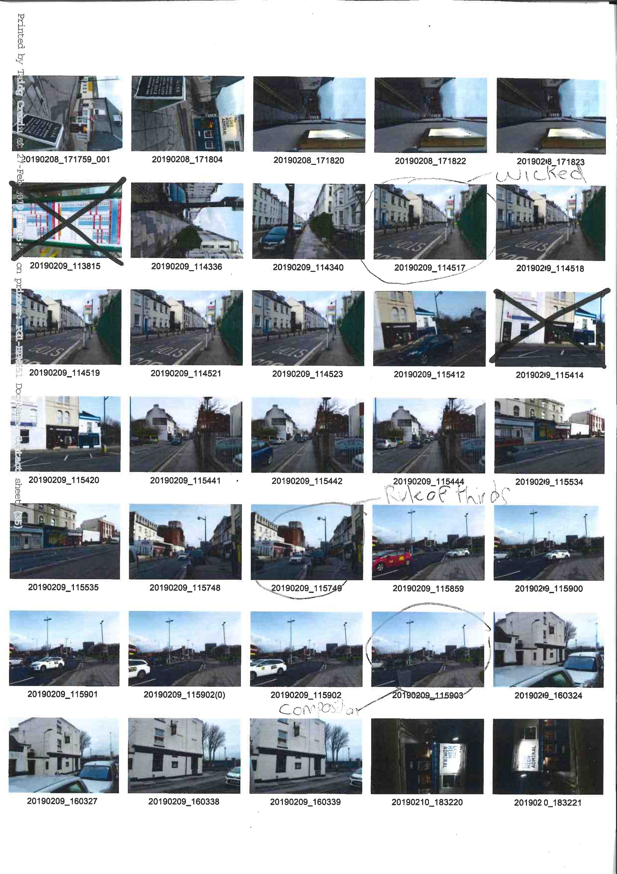
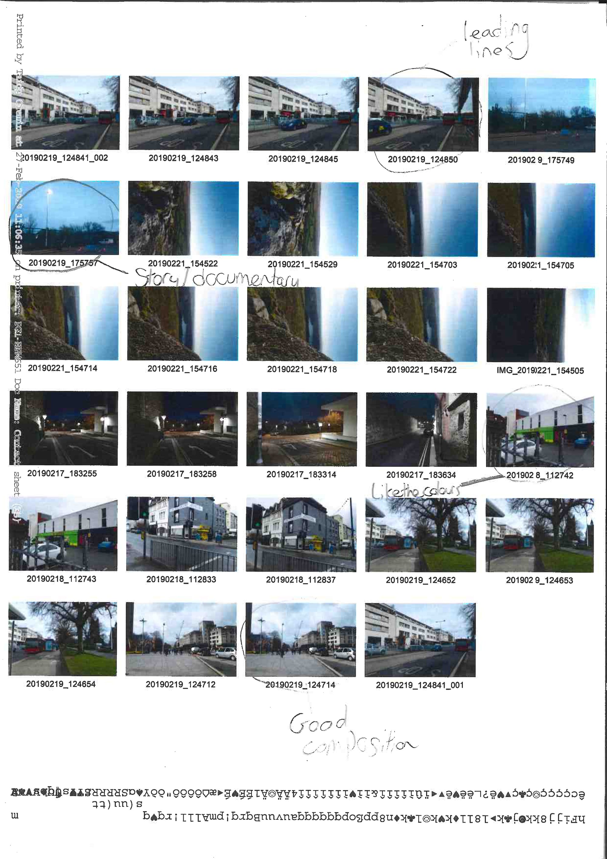
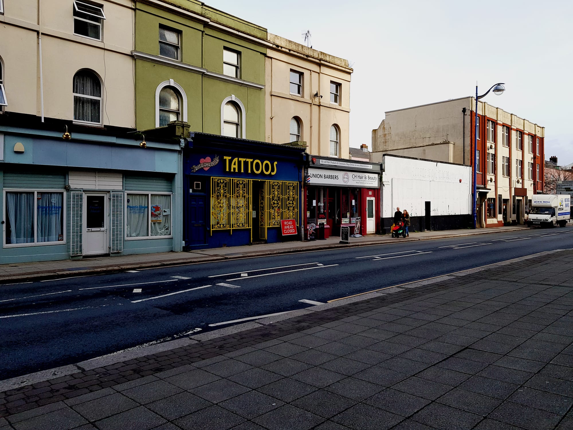
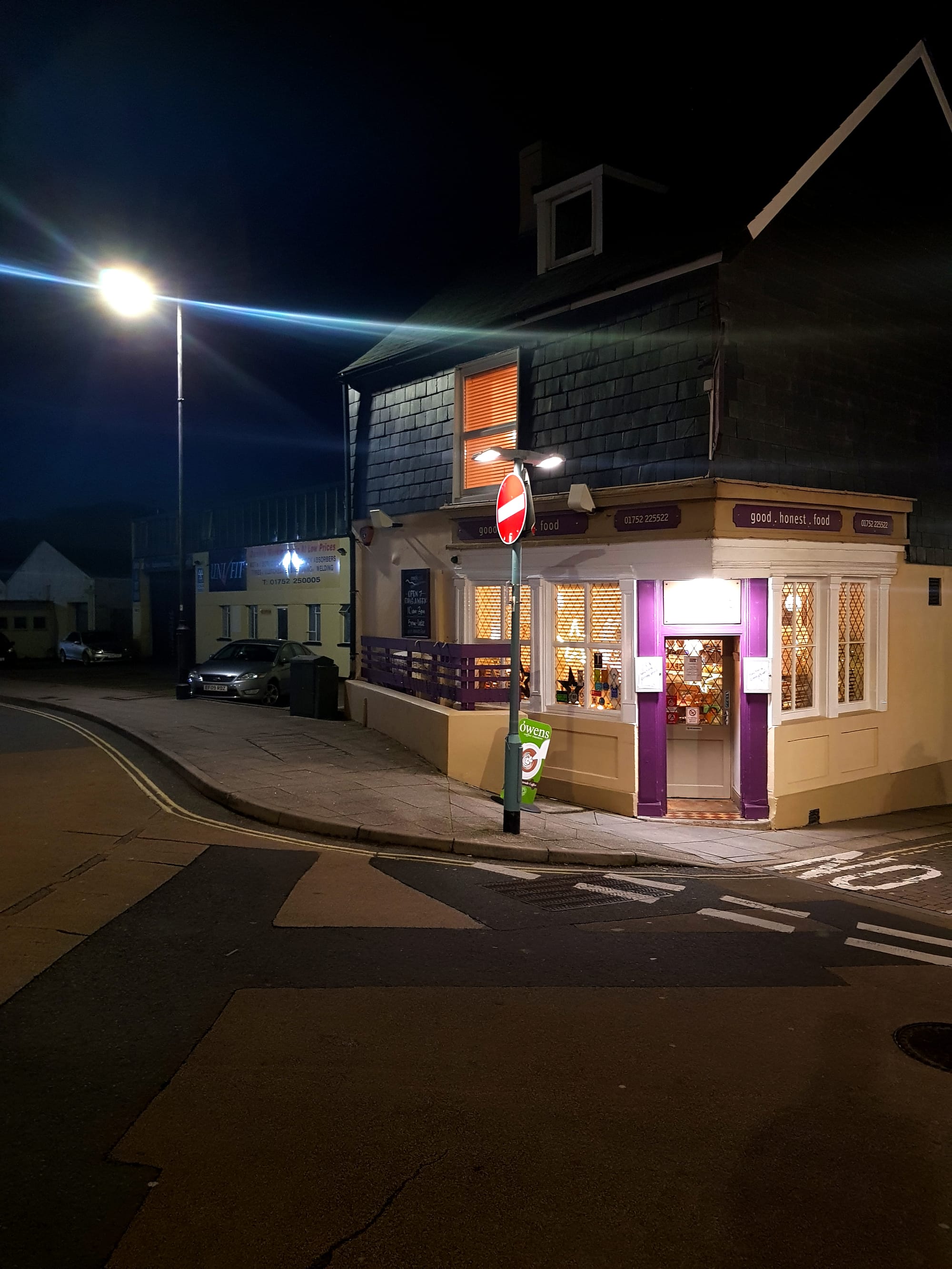
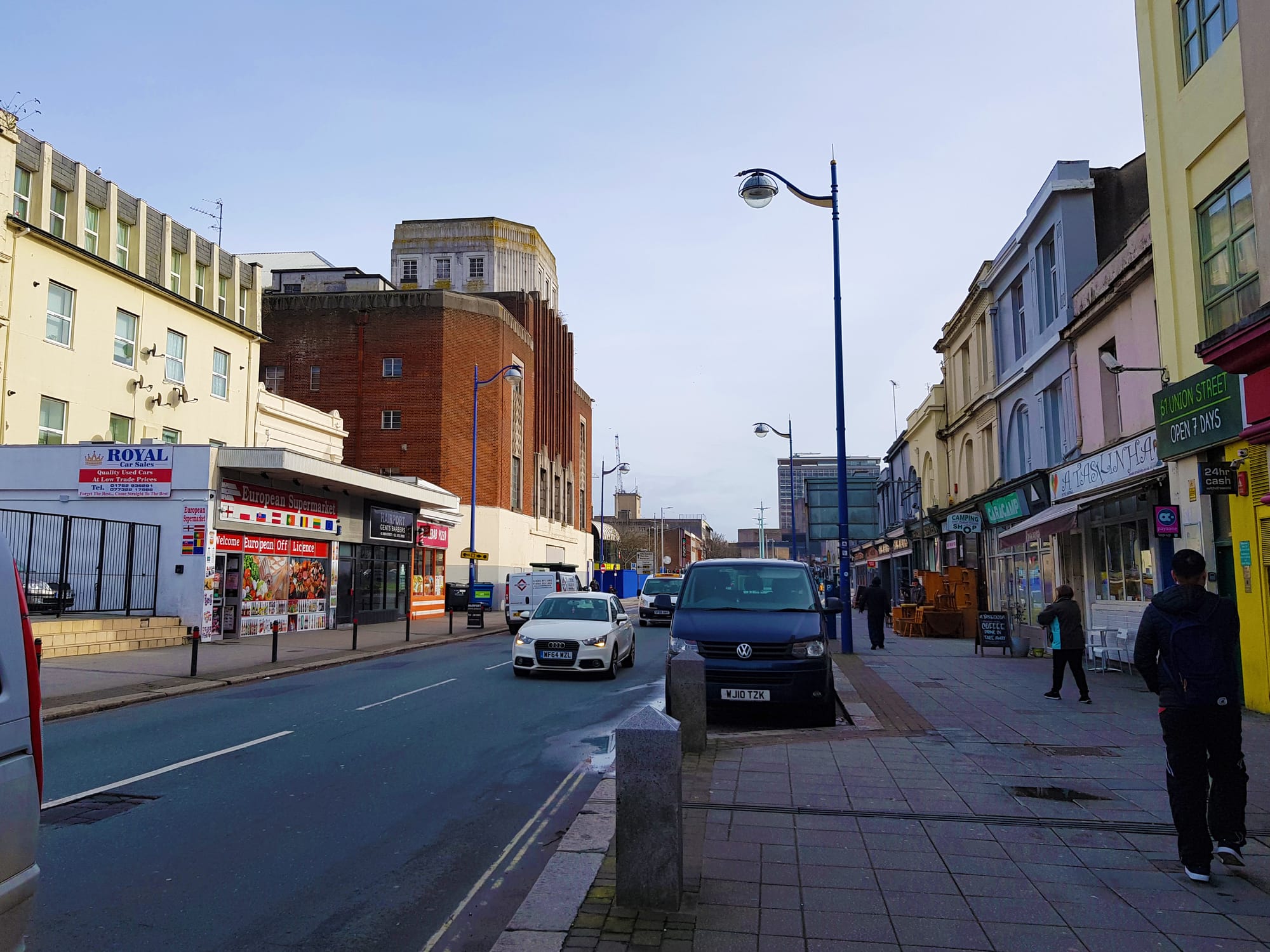
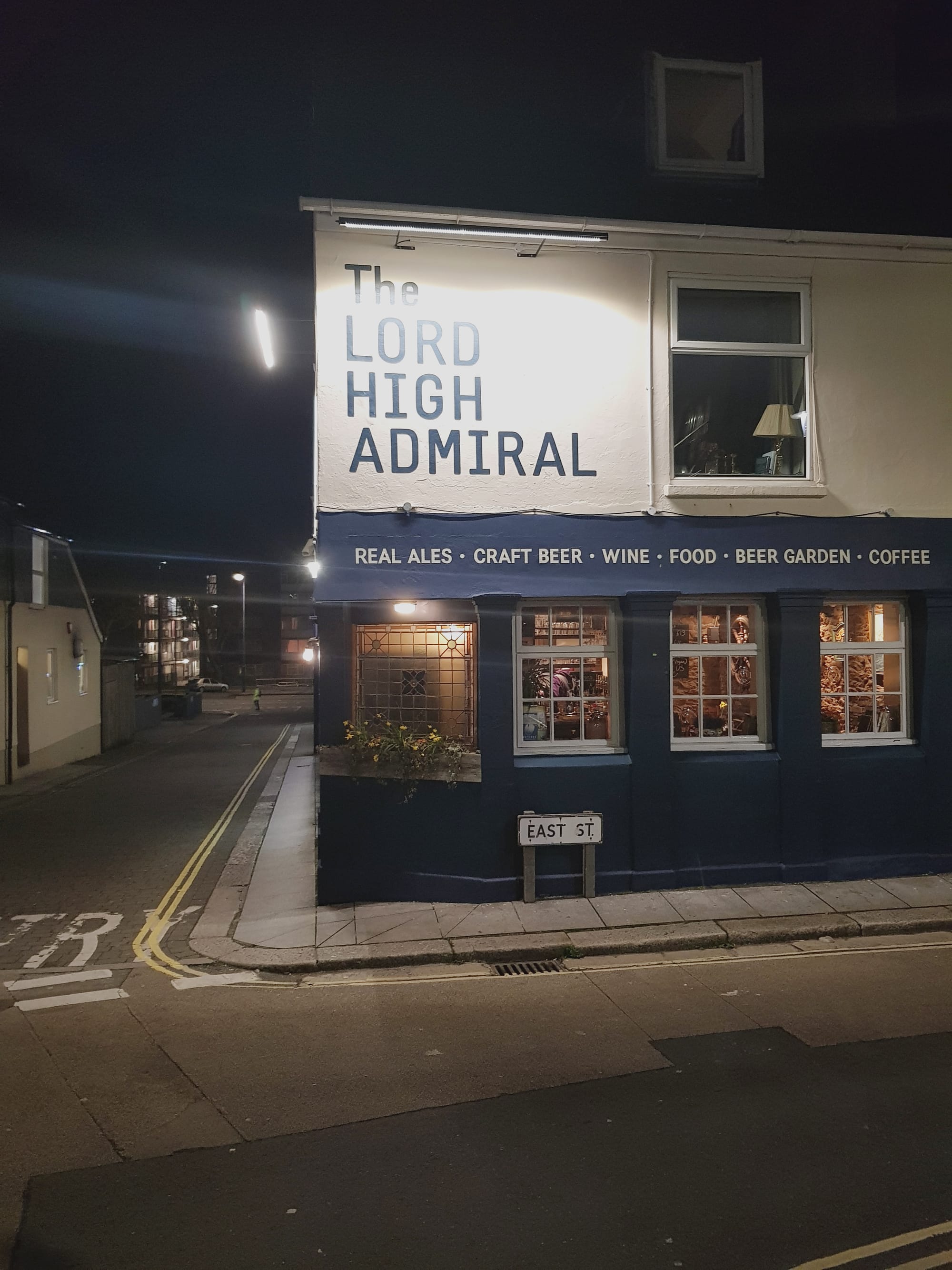
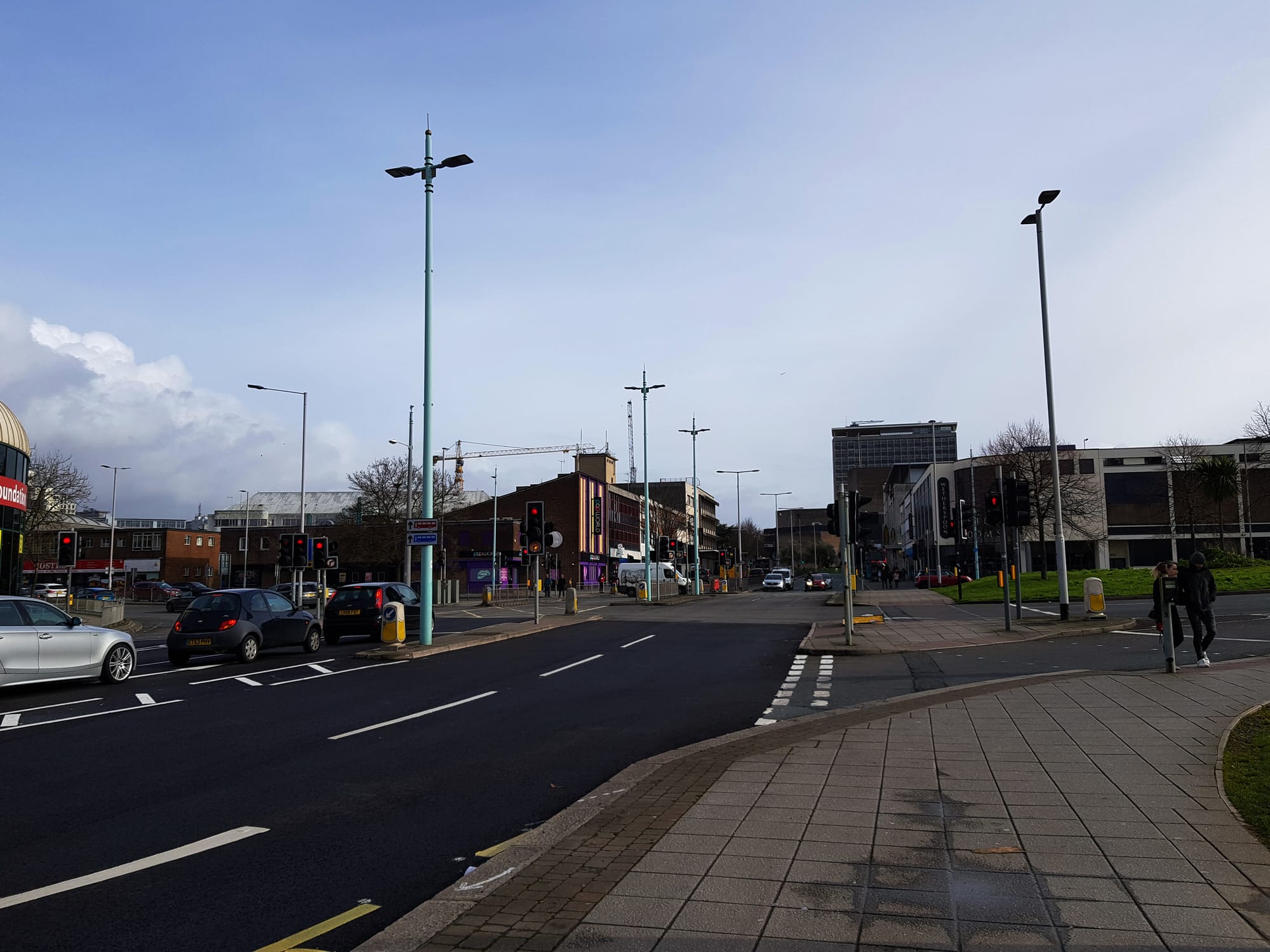
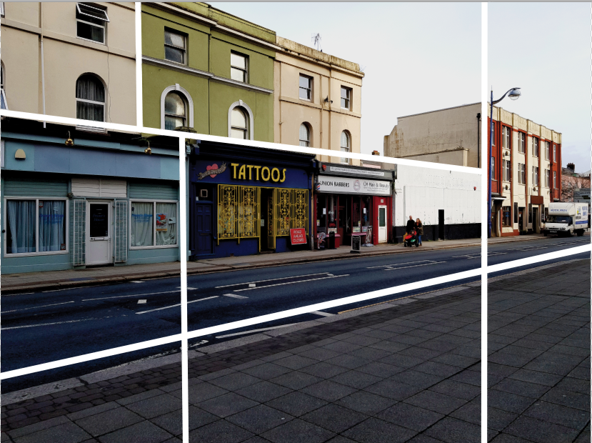
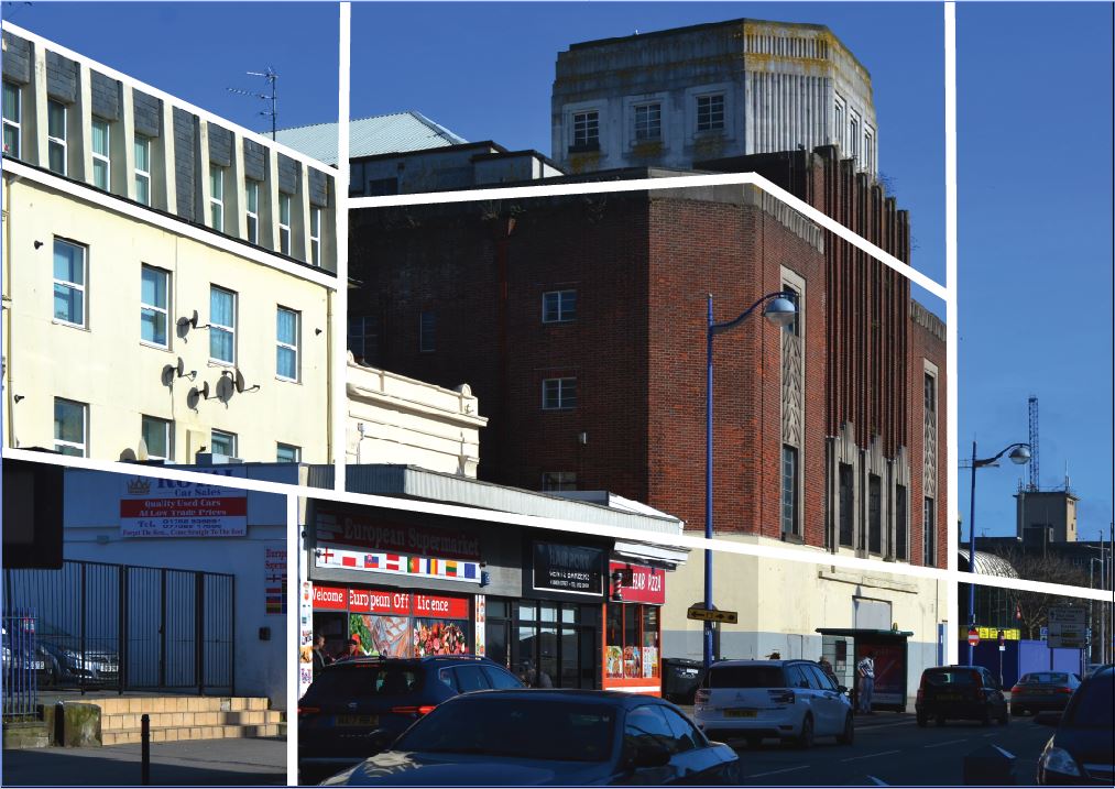
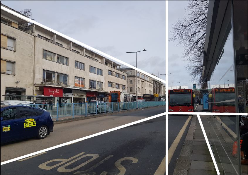
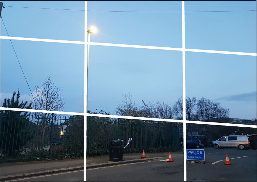
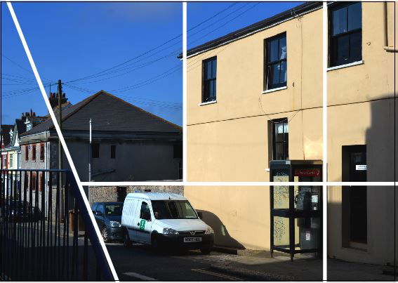
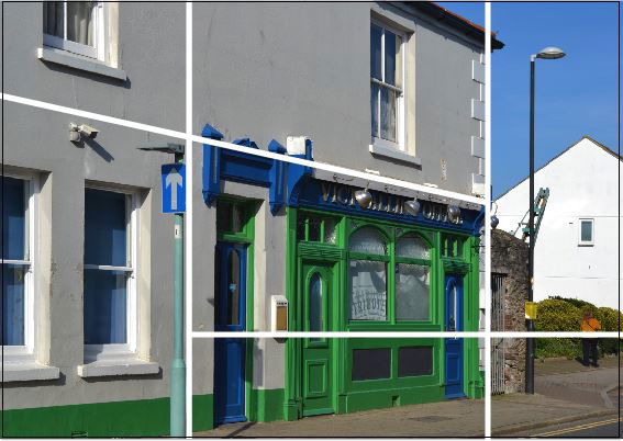
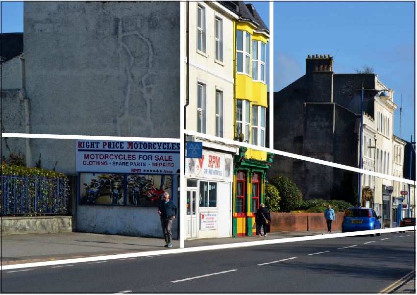
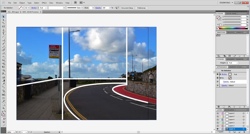
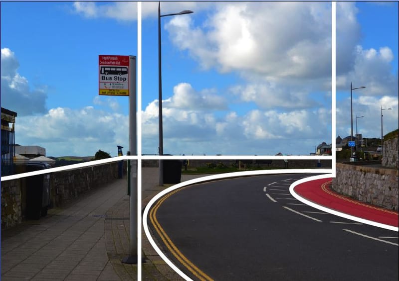
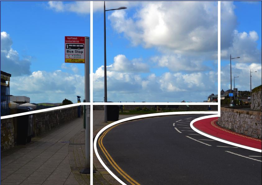
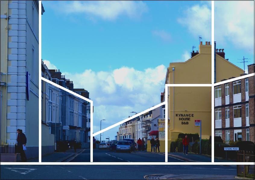
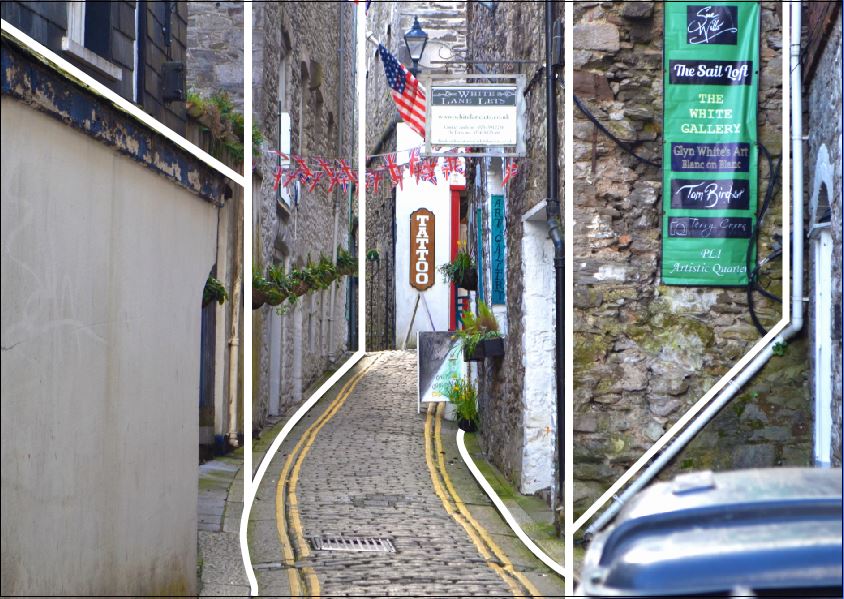
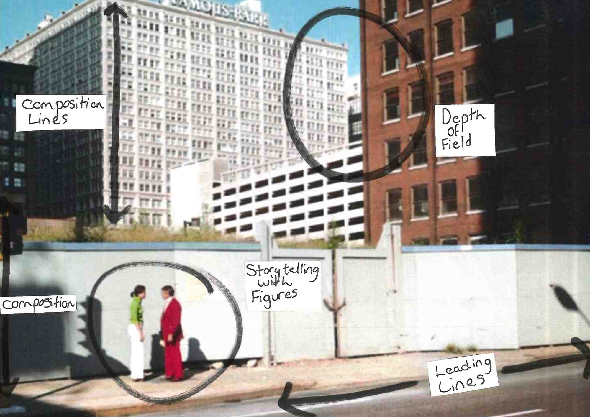
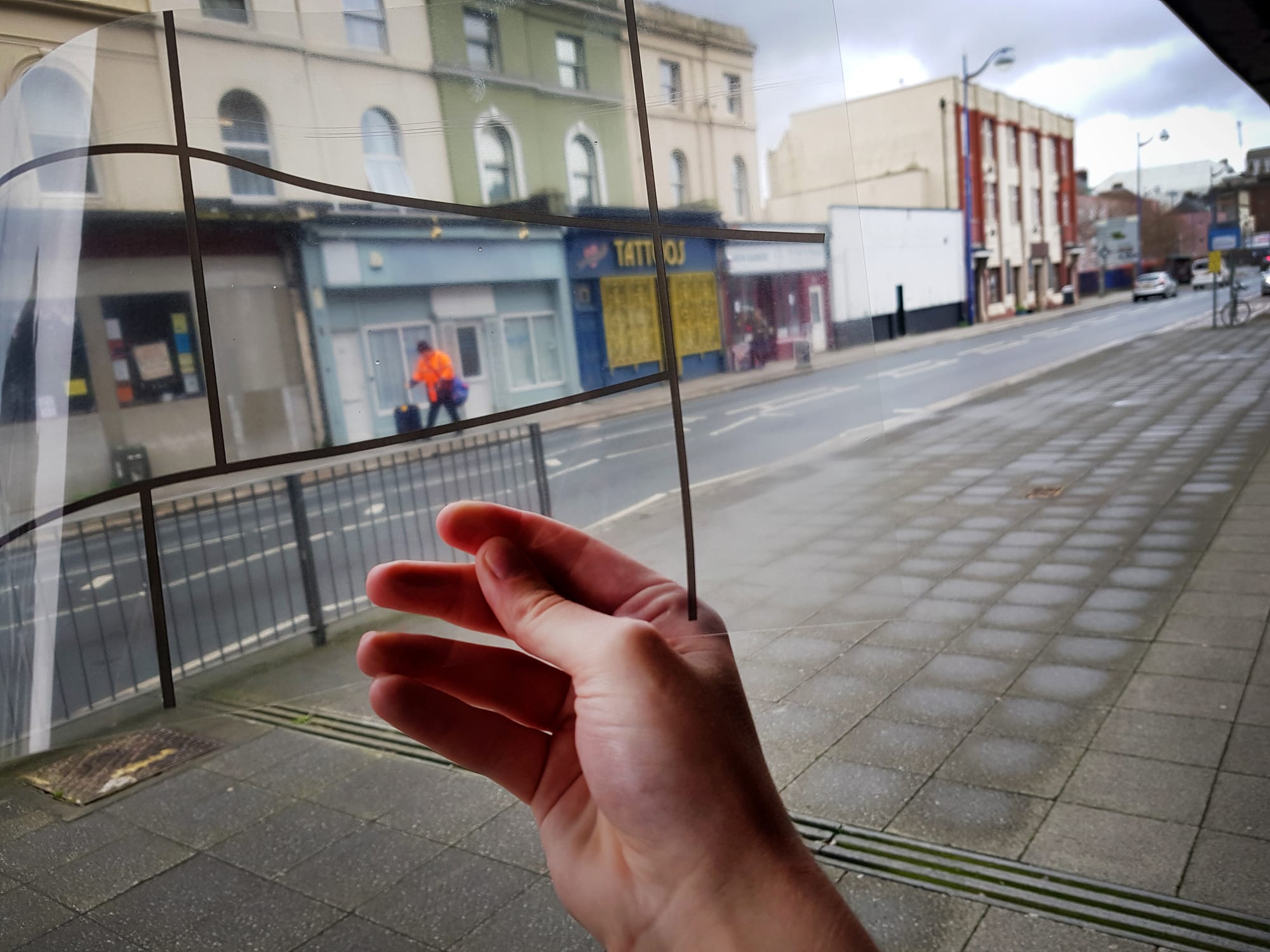
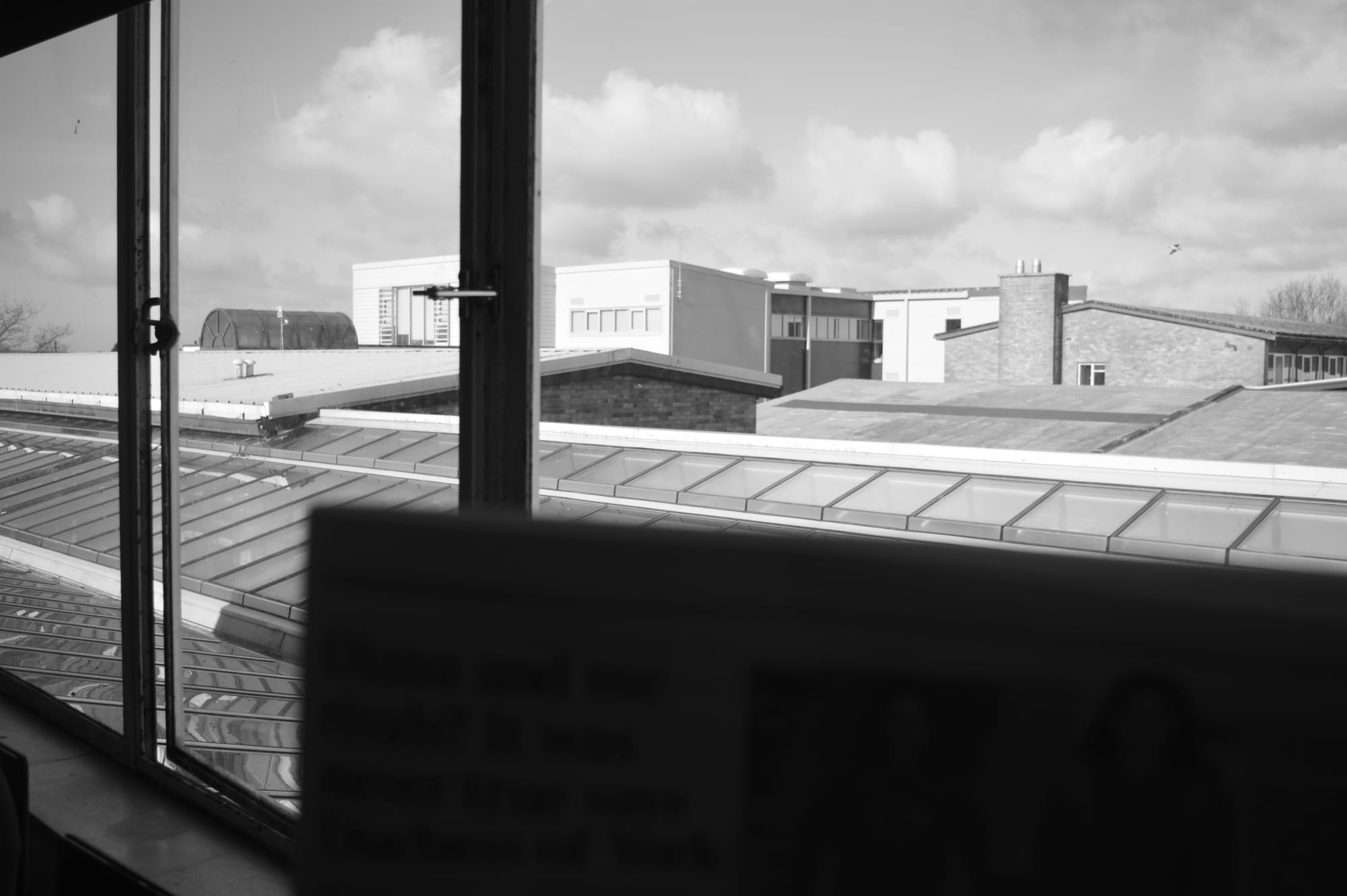
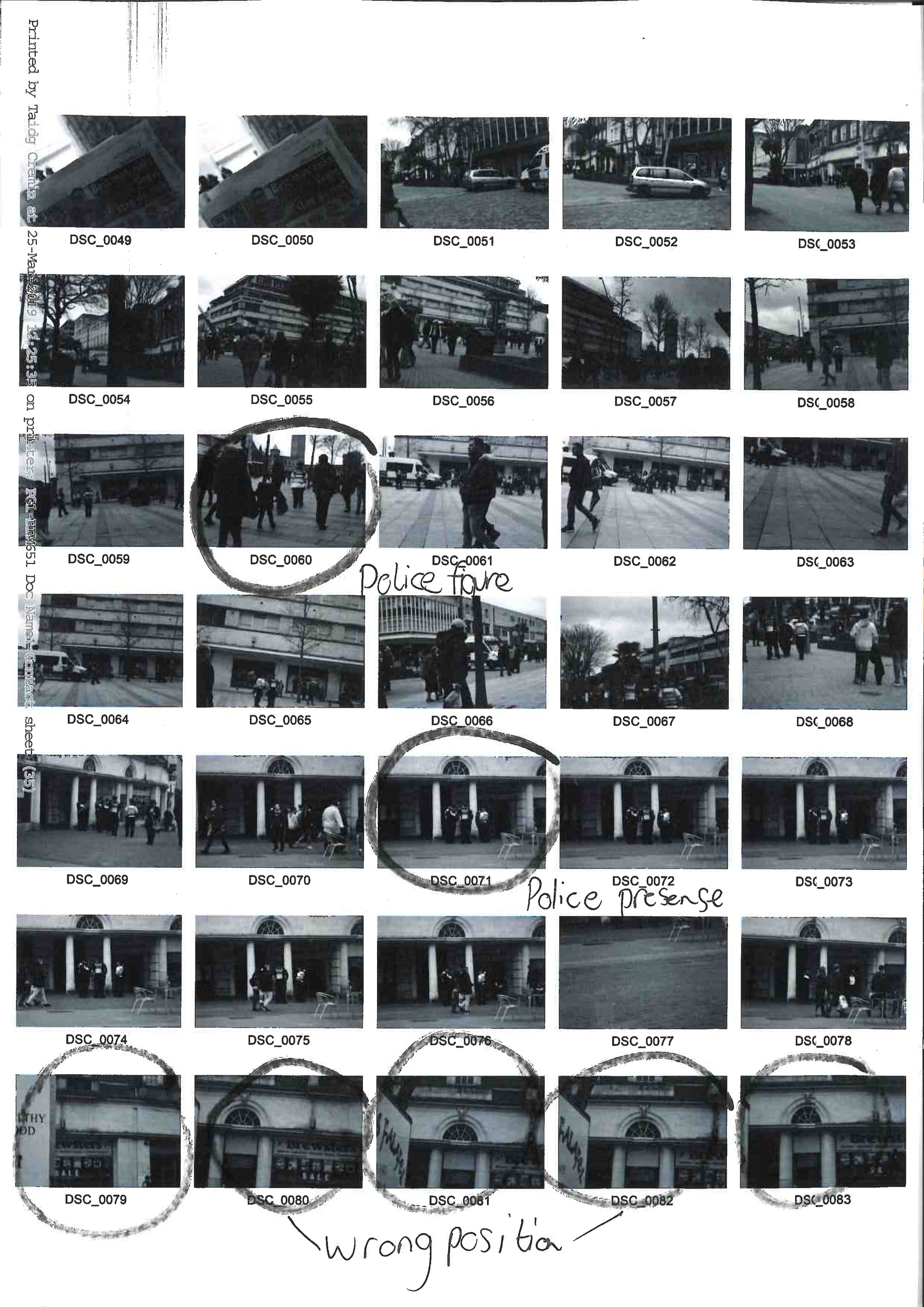
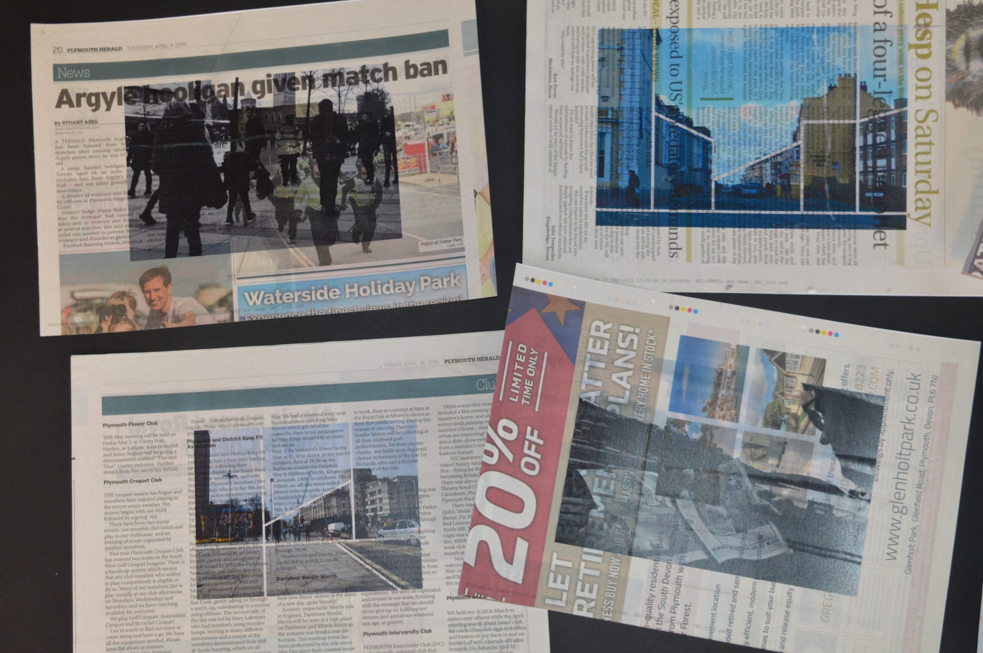
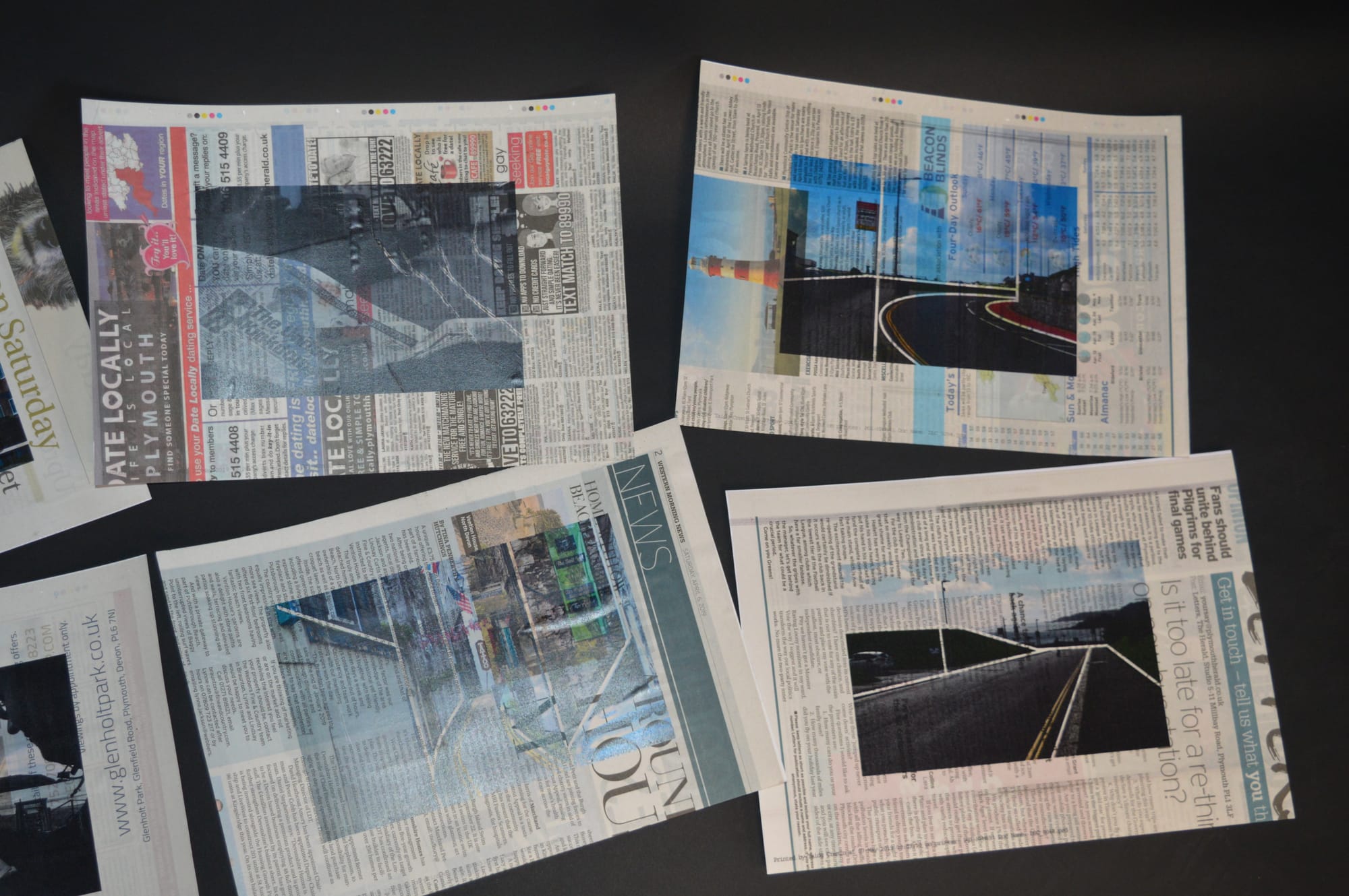
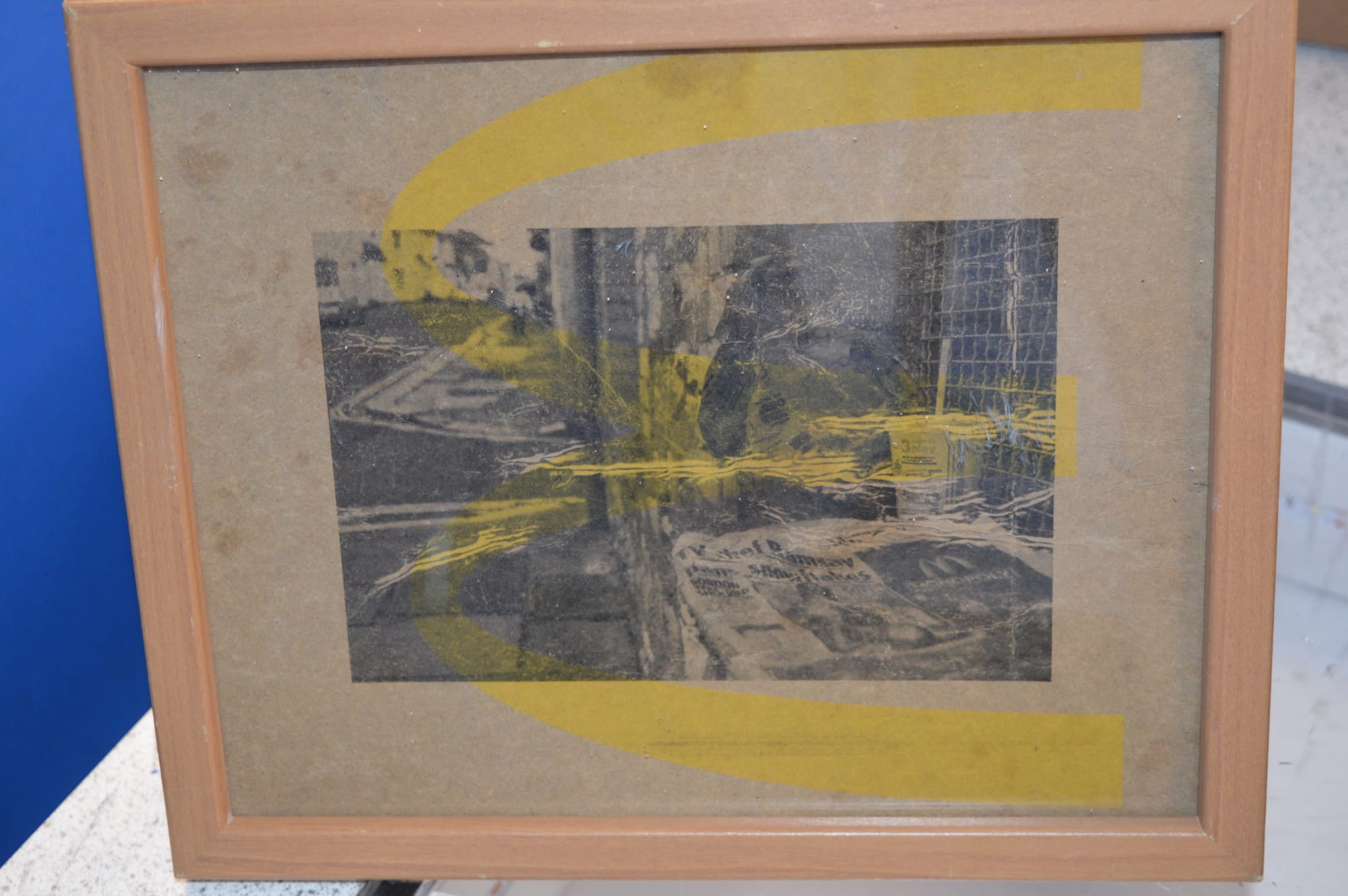
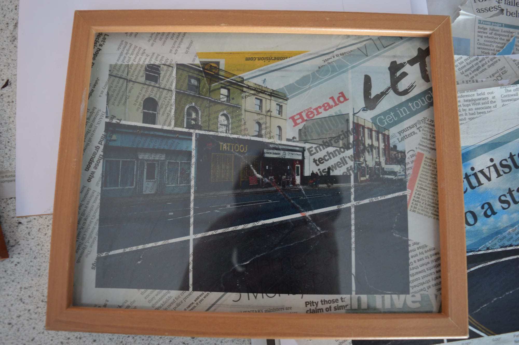
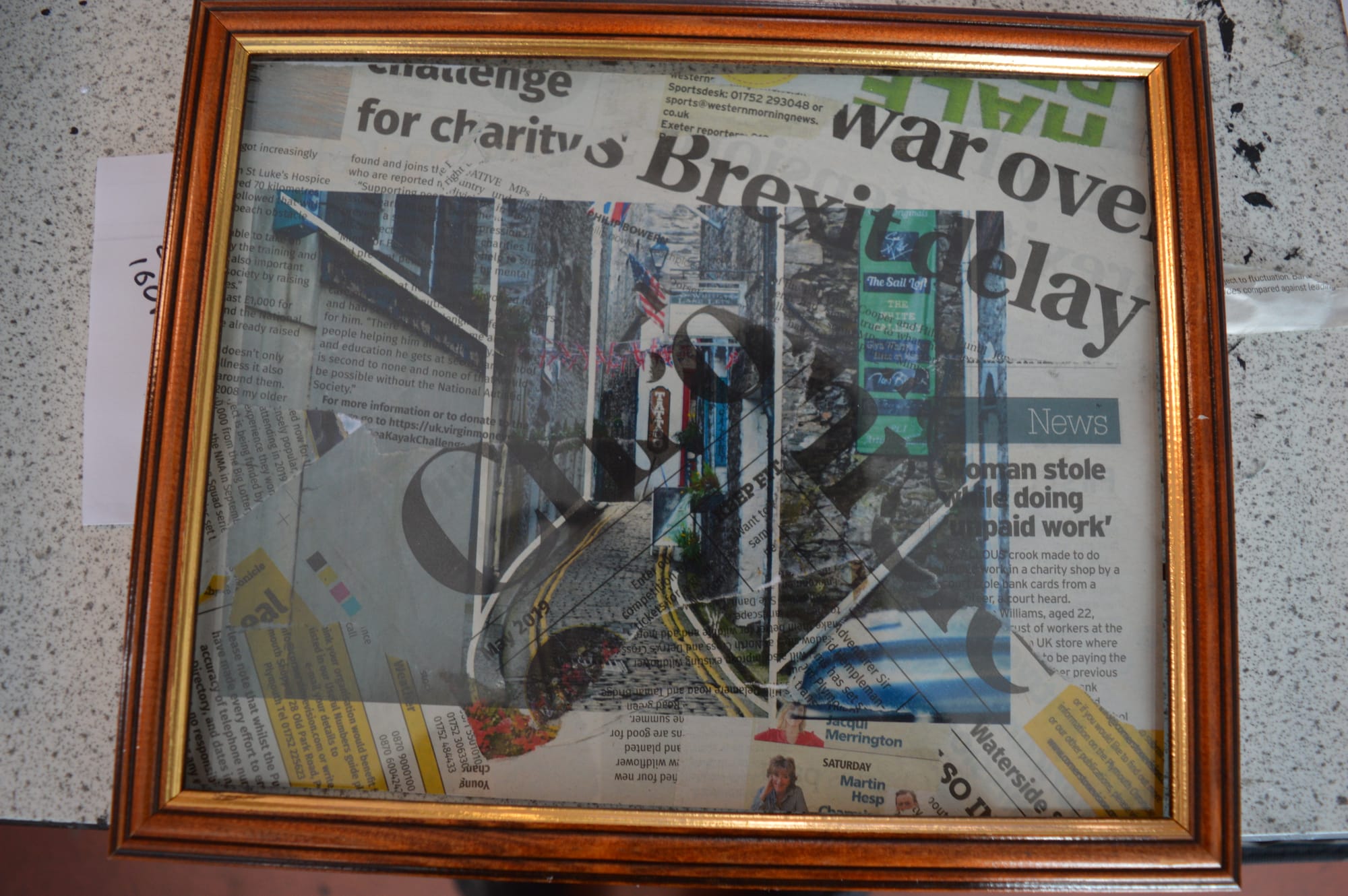
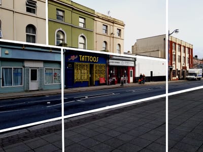
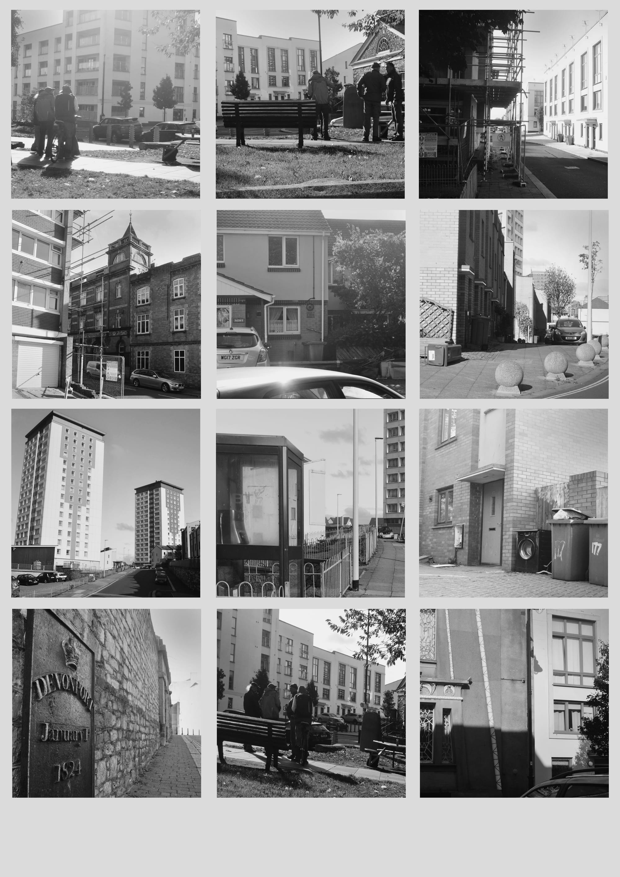
These images out of the shoot are the ones I felt best worked in a series, showing the life in Devonport. All of these images are taken from head height, mainly using natural light to capture various buildings. These particular images have varied composition techniques. With certain images,for example image 3 and 4, I attempted to capture the scaffolding with the safety signs in view to add context to the images. Similarly to my previous shoot, I captured scenes with individuals. Although their faces cannot be seen, i feel like the huddled crowd gives further context to the title 'Divide Within A City'. I would like all of my shoots to have a reminder of this title as this is what my main focus is for this piece of work.

When editing, I mainly used the dodge and burn tool to darken parts of the image that I felt were too bright and needed a darker border.

With this shoot I had various issues. The zoom lens kept jamming which restricted me whilst taking photos. Another issue I had was the automatic focus on the lens, due to the darkness, struggled finding a target to focus on. To overcome this, I used my phone torch with manual focus to attempt to capture my desired images.  A few of these images were still too dark which if possible, I would like to take these images at a different time of day to capture more of the landscape. 


James Ravillious
Thomas Joshua Cooper
^Analyse image each
Personal Project

France black and white contact sheet

Same layout as Personal Project Agriculture

Discuss reasoning for framing images

Conclusion

- - - - - - - - -

Framing photography

talk about manual focus

Ansel Adams and his framing
IN D DRIVE , FOLDERS NAMED '1' are new project photos

Basic Concepts

Like my divide within a city work, I want my final piece to be thought provoking. I have made plans of a few ideas I hope will display my work in a way that will create a discussion. 


Read More  

Step 1

I got two contrasting images that I felt had the greatest discord to each other.

Step 2

I then backed the images with card and cut them into two identical disks.

Step 3

I cut a radius into each circle and overlapped them to create one wheel.

Step 4

The photos can overlap ; I would aim to use an item such as a split pin to hold them in place.

Initial Ideas

I wanted to display my images on a map from where they were shot . I had a few ideas in mind how I wanted to achieve this . After exploring a few of these methods, the conclusion was made that I could use a laser etcher.

Read More  

Step 1

I searched for various maps I thought would have enough detail for the rough outline of the city.

Step 2

I converted the map into black and white so the program would be able to interpret the lines ready for the laser printer.

Step 3

I then made a thicker outline around the map by using the brush tool ; ensuring no gaps were present by using the fill tool.

Step 4

Once I inputted the map into 2D design, the issue occurred that the software could not interpret the detail on the map.

Step 5

To overcome this, I overlay-ed the map on the light box onto a piece of A4.

Step 6

I then traced a simplified version of the map in the hopes the software could interpret the image.

Step 7

The simplified map was then interpreted using software that is compatible with the laser etcher.

Step 8

As a trial, the etch was first attempted on A3 card, the trial came out very well and I thought the design was successful.

Step 9

For various materials , the laser has to go at different speeds to achieve the desired engraved look. These are the statistics on this particular project.

Step 10

As a precaution, the red button halts any further etches. This is used, for example, if I felt the material was getting too hot and the potential of being set alight occured.

Step 11

The laser etcher then set out to burn the specified sections at a predetermined depth.

Step 12

Once the trial was a success, I then scaled it up onto hardwood plywood. The dimensions of the wood were 420 x 594 mm (A2 paper size).

Step 13

This is the previous and current version of my project. There is a slight difference in size which is shown in the image.

Step 14

I printed out a font I felt fitted my work, however I found the size too big and the font wasn't quite right for my work.

Step 15

I then selected the images I wanted to use and cut them down to size.

Step 16

I found my images were too cramped to all face the same direction. To combat this, I faced each specific named location a different way.

Step 17

I placed the location tags slightly higher than the images to clearly show where the images were taken.

Step 18

This is my final piece.

Evaluation

Overall, the final piece came out how I wanted it to. It shows my images where they were taken. I did feel however that my images were cramped. This may be hard to view as a reader.

Exam

30May

This exam piece I will be exploring themes as a starting point. Looking into 'Nocturnal' , I found images from various artists I found interesting. 

All these images have various components I found interesting. The lighting in the images sometimes reveal something in the darkness. There are various compositional techniques used in the work all adding to the image. I like the way the lights are seeping through the windows, suggesting that there a busy ness and liveliness. Some of the images have figures that have various tones. The images that contain roads lead your eye to want to see more. The images that include lights use a slow shutter speed to capture the light. To restrict the blurriness, I would typically use my tripod.


My Work

I want my work to include features of these images, starting with roads. I will still aim to have a main focus of my image, using lights in some. My work has so far looked at areas of the city at both day and night. Darkness as it falls across the city brings huge change. A safe street becomes a red light district, a play park a crack den, a beauty spot a place for dogging. It is one of my works aims to show these two faces of Plymouth- without judgement. I will use classic photographic strategies of composition, colour and tone to create an intriguing image that will in turn draw a viewer in, asking them to question and conceptualise the work. This approach has been inspired by the likes of Stephen Shore- who’s American road trips used simple vernacular photography to discuss the complexities of 1970s American culture.    

This shoot I aimed to capture locations at both day and night. The nocturnal images were overexposed which results in mixed opinions where the main focus is. Although I like the ‘hustle and bustle’ of the interiors in the windows, the images seemed too bright. The images I took during the day were an attempt to explore the space during the day. I found these more effective and was more of what I wanted to capture. The colours had a better presence which I believe is not too harsh or bold. I want my work to be easy to view, not being overpowering or ''in your face''. Stephen Shore says this, having simple but effective pieces of work.

Stephen Shores work in the 70's of America particularly inspires me for my new project. I like the way leading lines hints at something more. The way he captures one street in a city but makes you want to see further really interests me.

The deliberate composition of these images is pleasing to the eye. The restriction Shore had with taking images with his 10x8 camera is really appreciated by the viewer. During the time, black and white was unconventional for photography pieces. The majority of the buildings are beige or brick, but the colours such as street signs really compensate for the plain buildings.


Experimentation

I first found an image I found interesting that had sufficient composition. On photoshop, I edited using curves, and vibrancy until I was happy with the outcome.

Composition

Reading into composition techniques, i found these images rather interesting and took them as inspiration for my work.

Manual Editing

After editing with Photoshop, I took inspiration from a composition website.

My Interpretation

Second Attempt

I decided to move to editing using software as it made the feel of my work more professional and thought out.

Third Attempt

My third attempt shows the evolution of where I placed the lines parallel or coherent to different sections of my image. I wanted the lines to break up the image visually, but keeping the image intact.

Exam Continued

During this shoot, I was limited to when I could shoot during the evening. I did however, take several images during the day which have a more 'Street' based focus. Similarly with the theme of nocturnal, I want to still focus on buildings within my work, but alter the theme to 'Street'. The photos I found on magnum really interested me with the composition, different shooting heights and lighting.

What did I take away from shoot one?

After experimenting with compositional lines, I want to progress with this idea. This first shoot was taken on my phone, having a rough idea where i wanted to shoot and capture images. I like having bold signs and various textures that i plan to carry forward. I will attempt to experiment with various subjects in the foreground and background. For my next shoot, I plan to use and camera and specifically look for interesting lines of composition I can use and alter in post production. 

A discussion with my classmates brought up that I could experiment with having different images in separate segments. I like this idea and I would like to experiment with this to see the outcome. 

When doing my second shoot, I plan to intentionally find intriguing composition lines when taking images for my work to have interesting division lines. I want to have interesting images by using the composition lines highlighted in harmony with the image. 

I found with these images were most effective when the lighting was highlighting the centre of the image. I wanted to segment with various shapes, connecting certain compositional lines. I like this way they connect without fully interrupting the image. Something I do want to continue with is the various colours in my work. I do not want them to be overly bold or 'in your face' , creating a soft atmosphere.

Stages


Joel Meyerowitz is a street photographer. He began shooting in colour in 1962 ; unusual for artists at the time to do so. Using a 35mm (colour film) camera, his images had a sense of real planning prior to his work , sometimes capturing ongoing events that seem more spontaneous. His images are my concept of street photography and I would like to shoot in a similar fashion. To do this, I want to walk a busy part of a street, capturing anything I see. Unlike Meyerowitz, I will be using digital camera. This will enable me to alter parts of the image.


This image particularly interests me. The foreground has figures that seem to be in a deep discussion while various buildings are in the background of the image. Various compositional lines give the image defining sections that are separated.  


He describes his images as "compressing feelings into a 1000th of a second". This particular quote resonates with me. 

This shoot I wanted to use roads as a main component in my work. After using Illustrator for some time, I am confident with using the pen tool and following the road around. The curves in my work have gotten smoother, therefore I can get a much more smooth line. Doing this makes my work look more refined, and I can capture more interesting lines. 

I had more bold colours this time which I found worked well with the lines. I tried to find more interesting lines to then add in. I tried to visualize where the eye is attracted to and use that to my advantage when placing lines onto my images.  

In my recent shoot, I planned to recreate one of my original photos, using acetate to create the composition lines as the image is taken, rather than digitally inserting them. One issue with this was the wind would not allow me to take the photos without distorting the acetate and the image. The rest of the shoot, I continued to shoot as I have previously, capturing streets with intentional compositional lines.


One positive from the previous shoot that particularly interested me was the way the acetate curled- it reminded me of newspapers which led me to think of how i could use newspapers in my street work. I experimented in class with a newspaper, capturing the newspaper in the foreground and the background out of focus but visible.


Whilst experimenting, I used both standard and monochrome in manual.  I did this to see the difference in lighting. Ultimately, the monochrome worked better to capture the bold titles and tone I was going for. I want this topic to be more developed than my previous shoots, showing the ridiculousness of how newspapers display 'news' ( typically celebrity drama and page 3 content rather than the genuine news around the world ) . I will try and incorporate the newspaper with the background - although this my be difficult to perform as I will use papers from the day of my shoot. I want to keep my work current by including key events of the news in my work.

Developing my previous idea, I purchased a newspaper that immediately drew interest to me with the title ‘1000 Days Wasted’. This title particularly interests me as I wanted it to be topical and related to the day. This is a feature that i want to include ( the date of the newspaper). This is to keep the date integral to the image, linking my work as it develops. At first I attempted to shoot by myself, although it was much easier to shoot while someone else was holding the newspaper. I experimented with the exposure levels which is why some of the images became overexposed. I wanted the font to be prominent in my work, with minor details in the background. I did find it difficult to find any links between the newspaper and the background ; I will attempt to do so in later shoots.


I believe the monochrome effect worked better with this shoot compared to the standard colour mode. I want the tone to be different to my previous work. I want more of a political stance with titles of red top newspapers, including the date of when the paper was published. I plan for these images to be viewed as a series.

Maier was born on the 1st February 1926 in New York. She took over 150,000 photos in her lifetime. In around 1956, Maier decided to switch to colour photography. This gave her photos a more refined look. At the beginning of her photography career , Maier took close up shots of New York civilians. As she began her  coloured work, objects such as newspapers and items in bins replaced the civilian photos. Her work shows a variety of thoughts and emotions , from joy to fear. Maier took various shots of a range of people. Upper class citizens to paupers.  

Maier was a nanny for around 4 decades while taking photos secretly. Her work varies from abstract to candid photography. From looking at Maier's contact sheet, it seems she was very conservative when taking photos, typically only taking one photo per scene. As camera reels were limited,only when she found something really interesting, she only took several photos of scenes that she thought was really interesting. 

Her portraiture shows the subjects emotions in one still and although I do not plan to capture characters thoughts and feelings, the buildings in the background is my focus for my work. I want to highlight the key composition lines as the focus in my work.

I went into town during this shoot, again finding a newspaper that had an intriguing title. using 'P' on the camera allowed for me to get the shadows and the lighting the way I wanted by experimenting with the shutter speed. Some images became too dark or over exposed until I adjusted the lense. I wanted the titles to be bold and although I shot in monochrome,  when editing I enhanced the boldness by using levels and curves. I wanted to continue by using the various pages in the newspaper to create depth. The background of the images are often various streets or figures. I like this background as there is another element rather than just having the image of the newspaper.

I decided to purchase a newspaper with a striking title for the focus of my new idea. I used 'P' for this shoot, adjusting the amount of light coming into the lens. I changed the exposure compensation when needed, using monochrome for the majority for the shoot. I used this primarily to capture the shadows which I found were effective to do so.                           

Looking into more newspaper artists, I found a few new ideas I would like to explore. Although this images have various people in it and I do not plan to take close ups of facial expressions, I do plan to incorporate people in some way. Having the outlines of people or partial parts of people holding the newspaper will hopefully bring a sense of realism and legitimacy to my work, compared to not seeing anyone holding the paper. I aim to also increase the amount of background in the image as i think it gives the image more.

I like the way there is repetition in some of the work, highlighting the importance of the title or time frame. Another thing I found interesting is the way the world seems to continue as they are reading, instead of using a phone or computer. When shooting, I am attempting to capturing this division with technology, hopefully with passers-by .

Step By Step

In this shoot, I used manual mode to have the tone I wanted to capture. To get the wanted tone, I wanted the colours in bold including the titles. I felt like progressing with the curves of the papers would show other parts of content within the paper. I continued to show the titles that interested me. I felt like the lighting did work really well in this shoot. I again used people to hold the paper which allowed me to get different angles and objects in the background.
Progressing my previous shoots, I purchased a new newspaper and followed a similar process but in a new location. Some images were over-exposed when I took them so I altered the camera setting to correct the exposure compensation. I used a model to capture context for the images- more so than previously. I felt like this was more fitting for my work. One image had a passer-by on their phone, as previously mentioned I wanted to capture the division between newspapers and how technology has seemed to overpower them. This would be difficult to capture organically.

After doing various shoots outdoors, I wanted to experiment with indoor lighting and close ups as well as shots. I did like the simplicity of the shots however they did not work as effectively in comparison to my previous shoots. One reason I found the images did not work so well was the lighting indoors was not consistent. This caused a lot of overexposure which lead to glare.

I wanted my final piece to include newspapers in some way as that is where my work has progressed and developed to. My initial idea was to create my own newspaper with my images . I looked into newspaper printing website but they were too expensive to be produced. Turning to a smaller scale, I attempted to create my own by scanning a few pages of newspaper and adding my own images. One thing that was important to me was the feel newspapers give - if I made a newspaper it would have feel similar to the real thing. My first attempt used the scanned page and inserted one of my images. I blurred the majority of text so my image was prominent in the work.
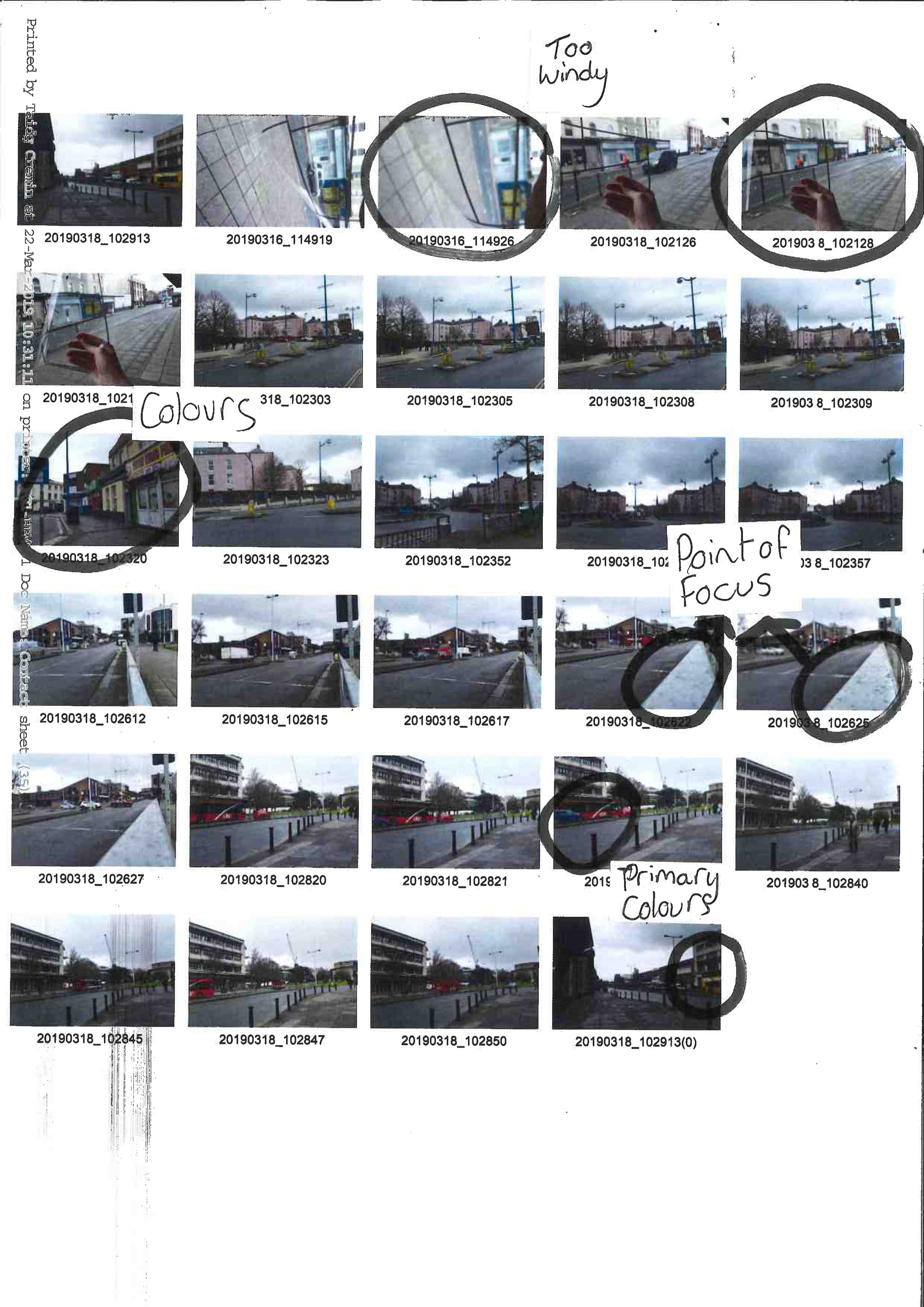
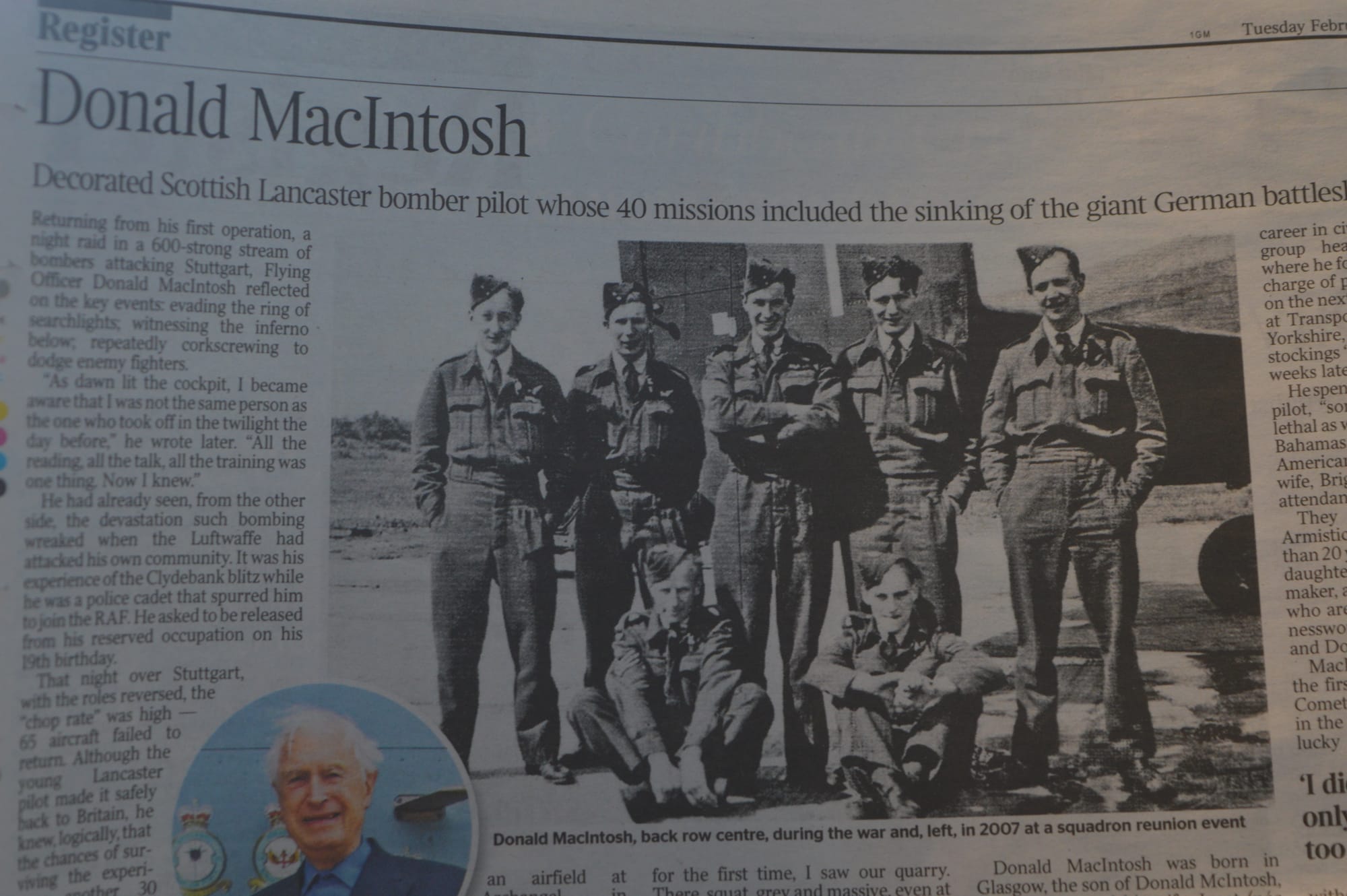
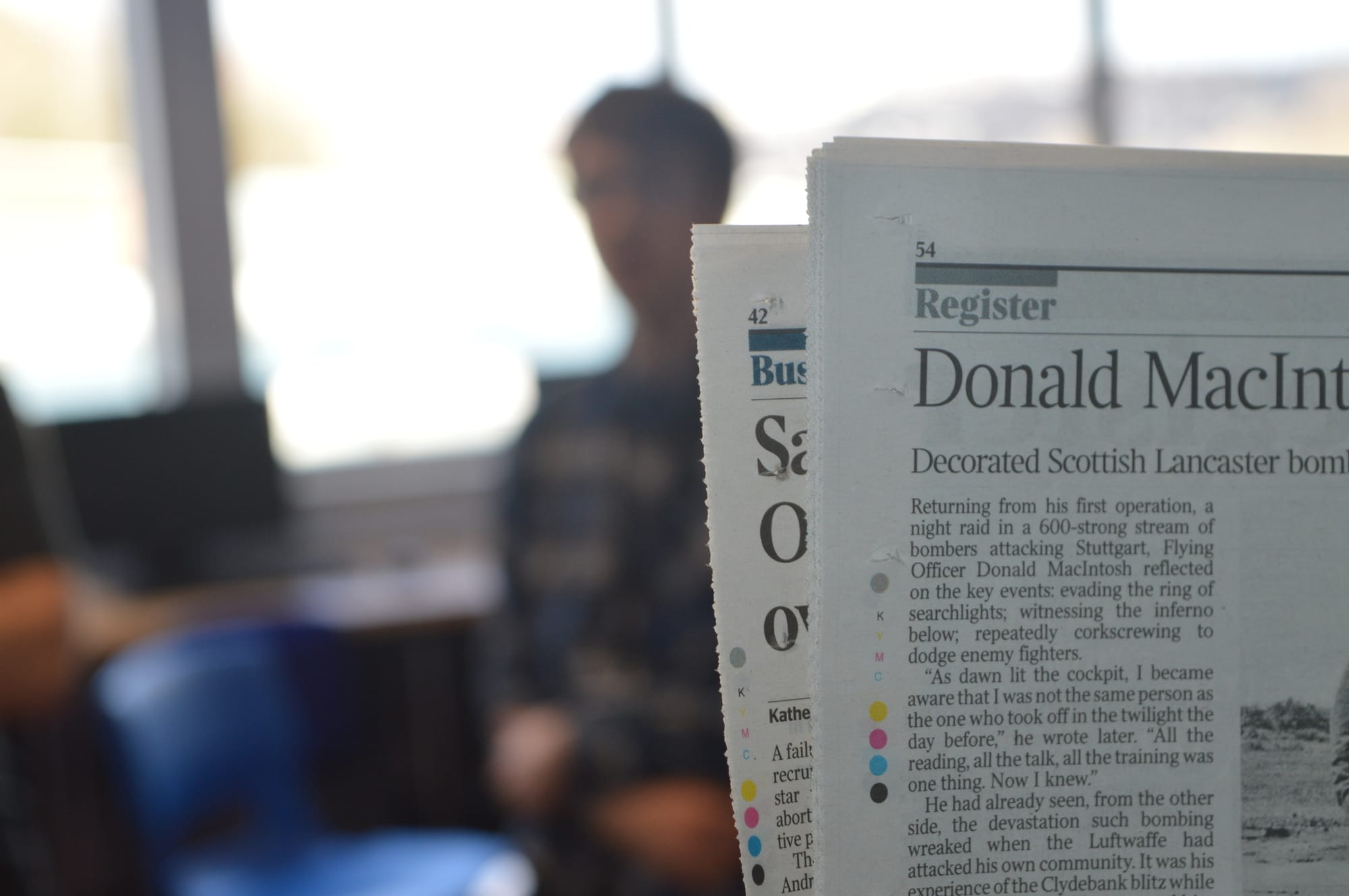
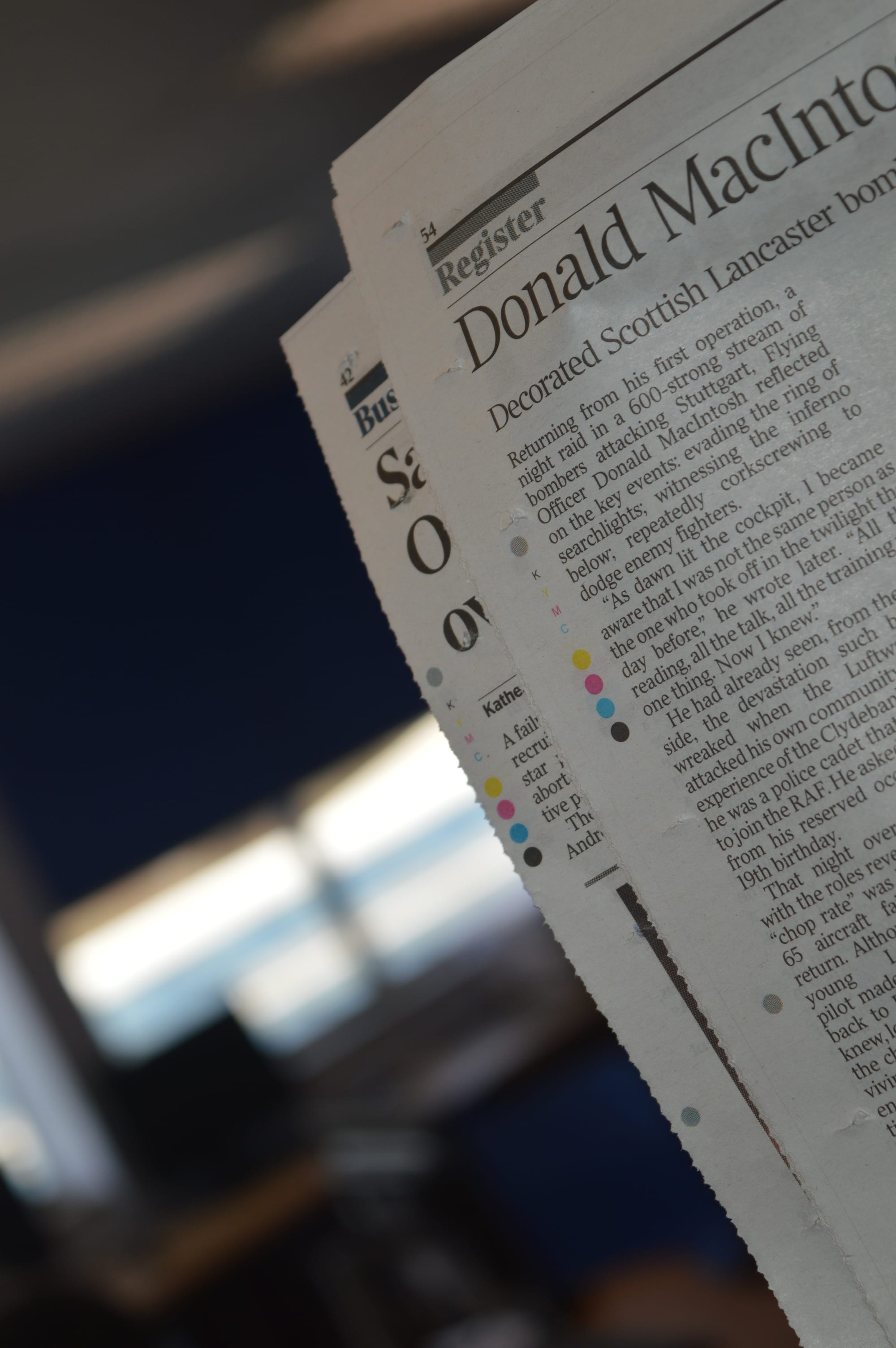
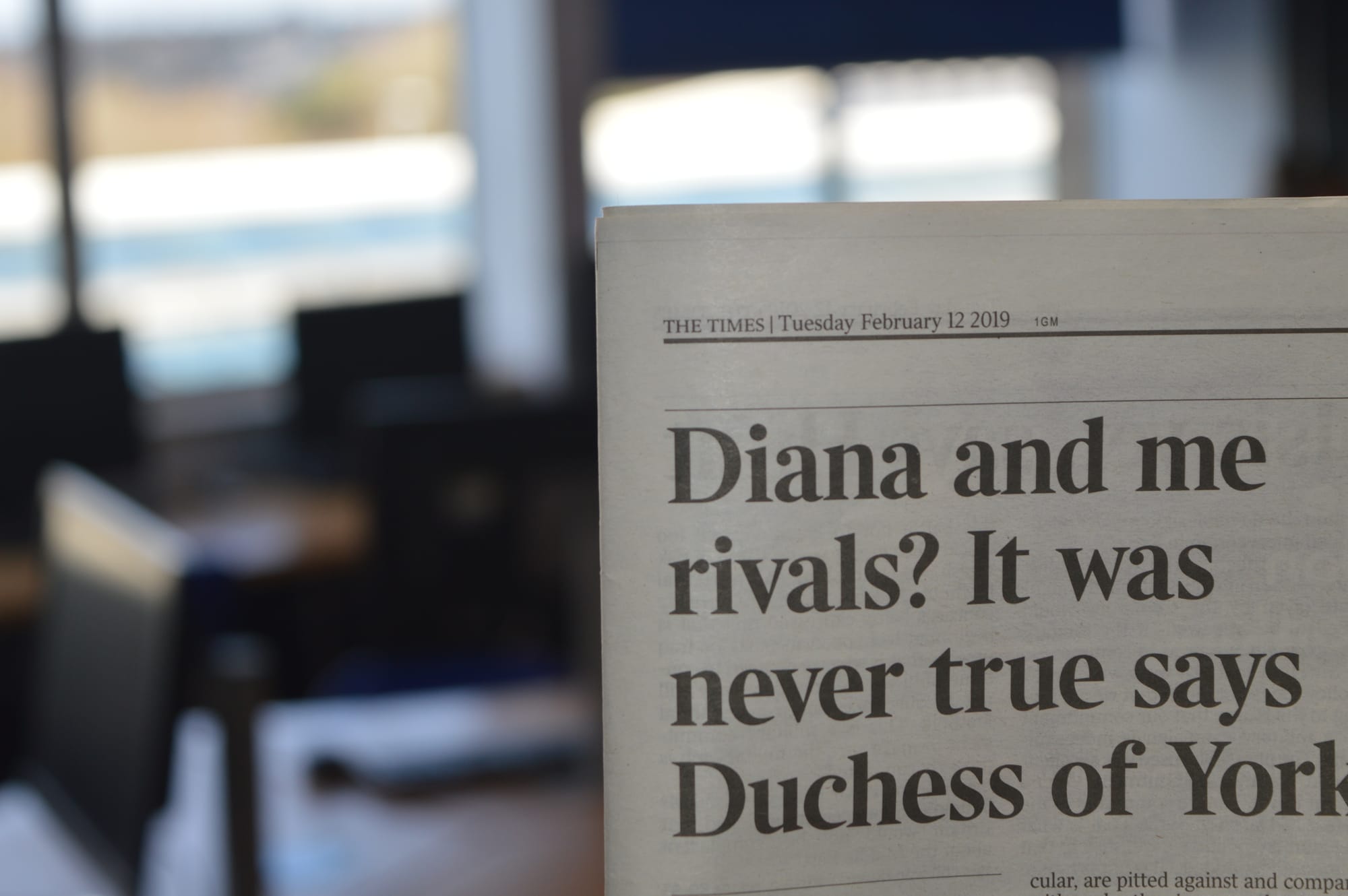
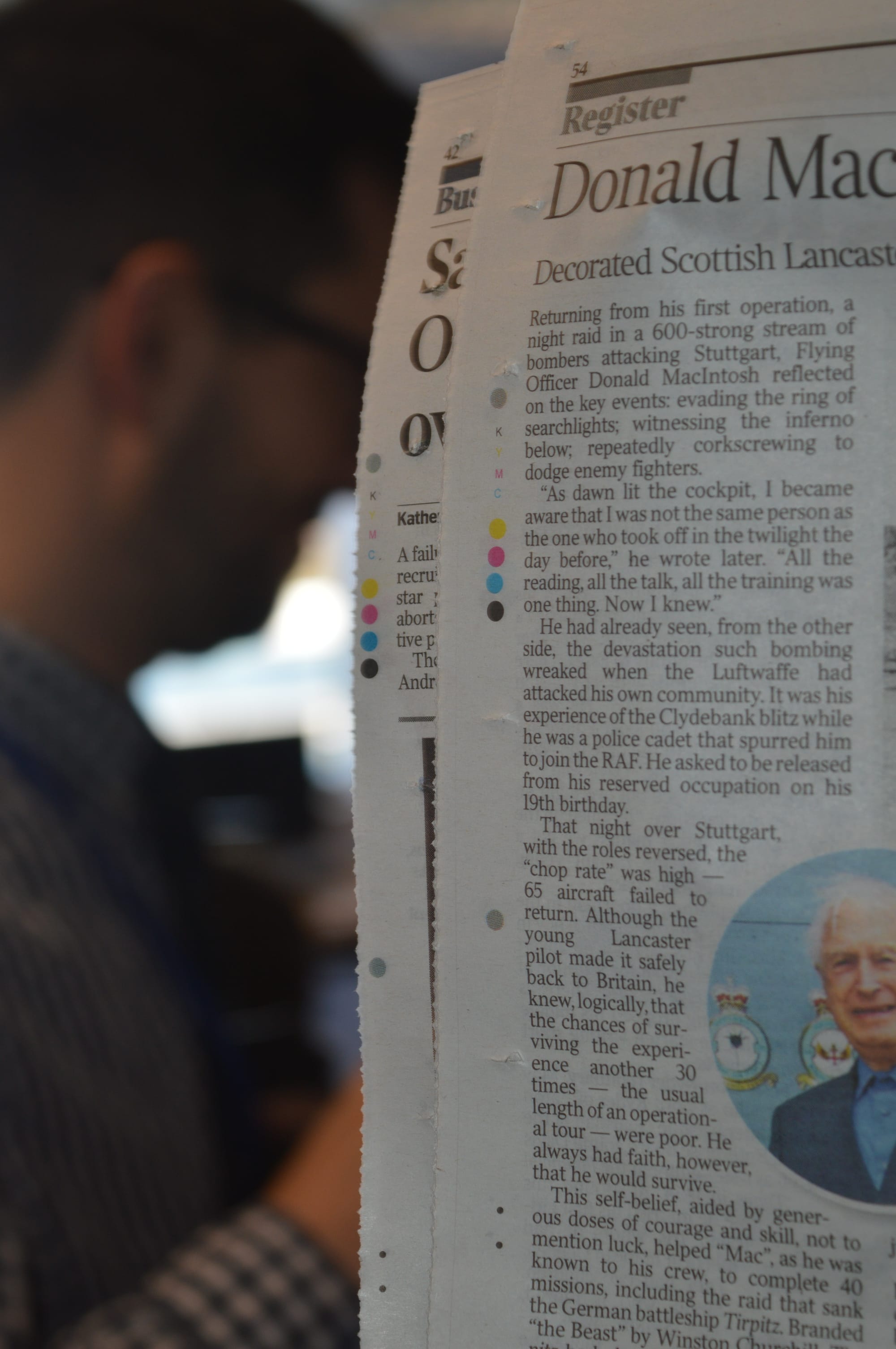
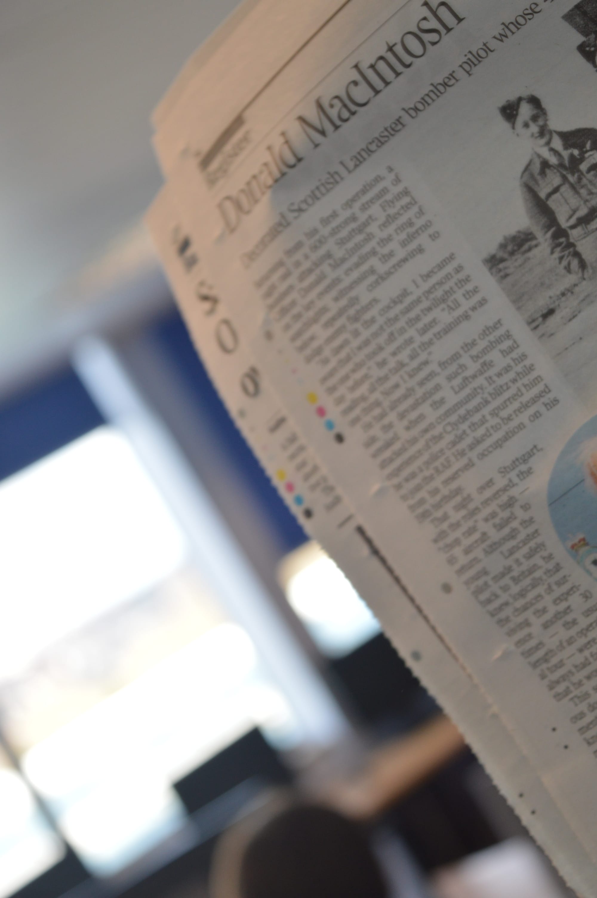
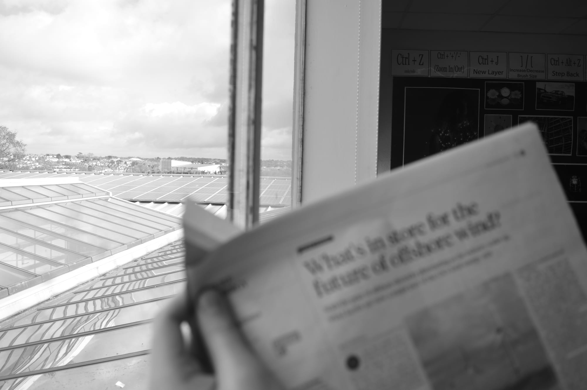
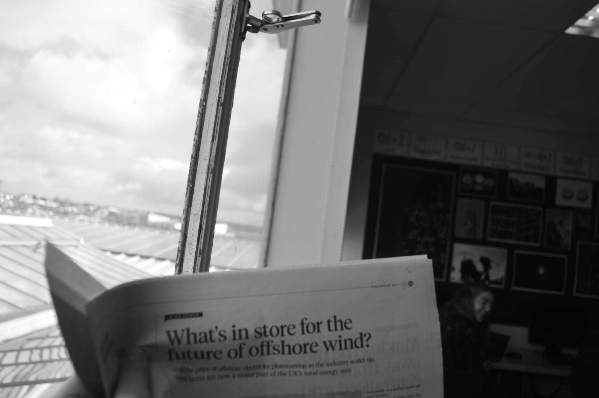
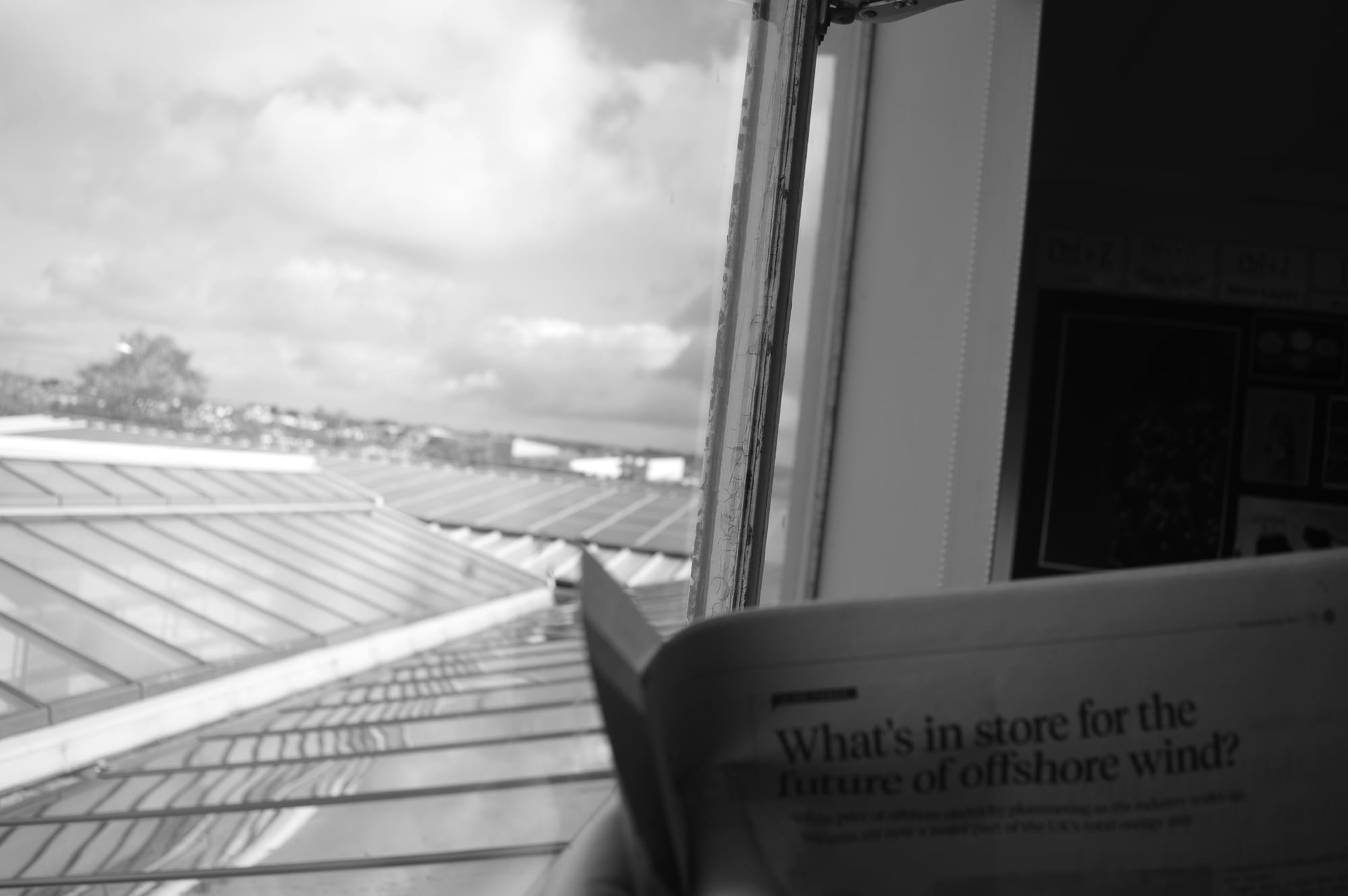
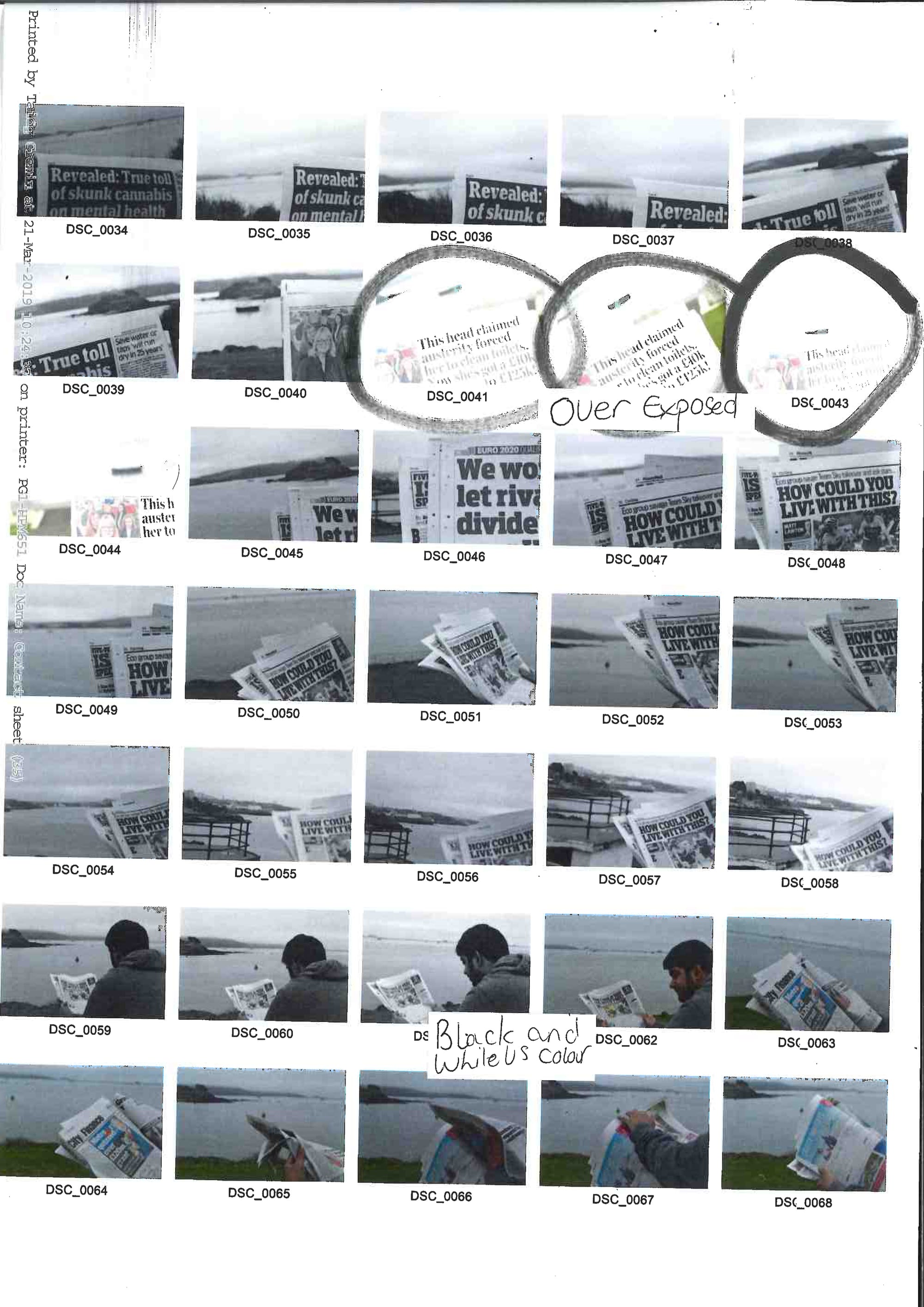
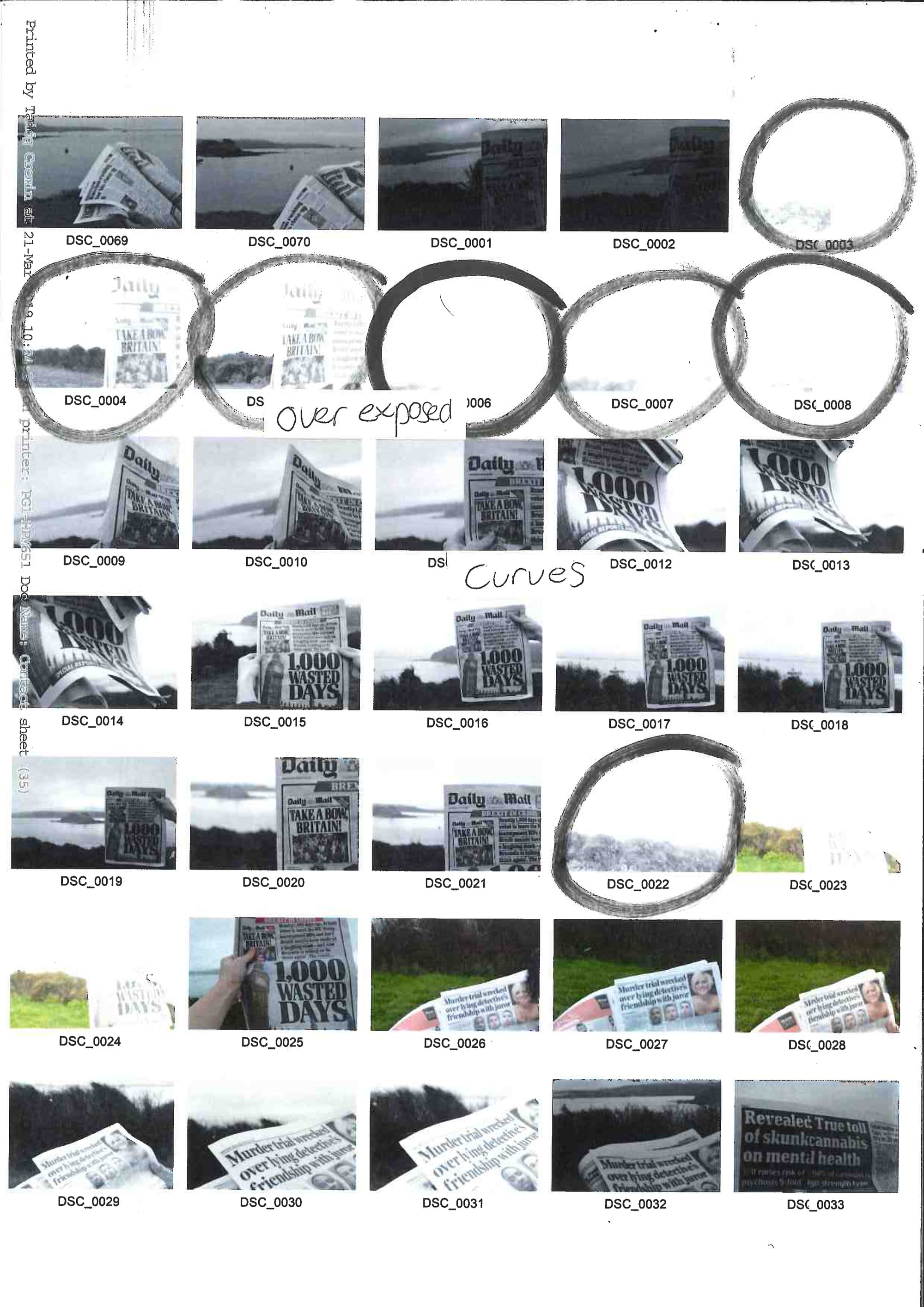
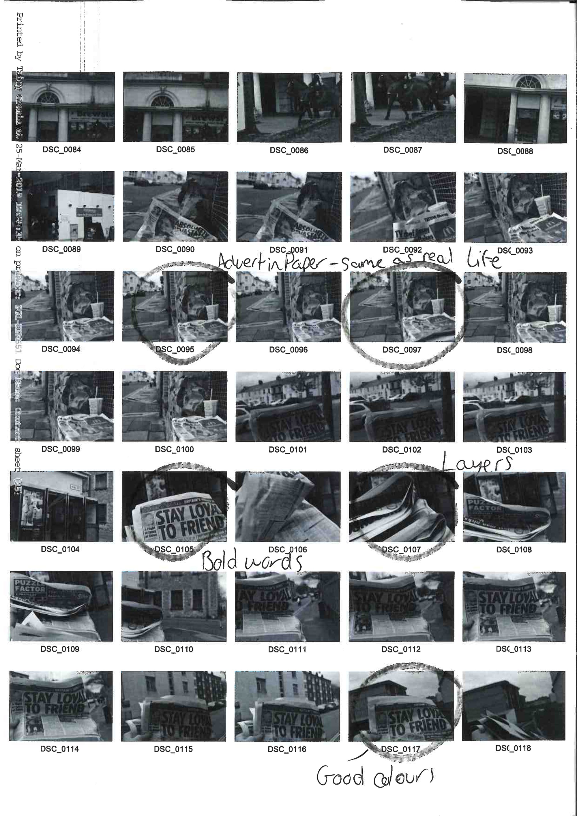
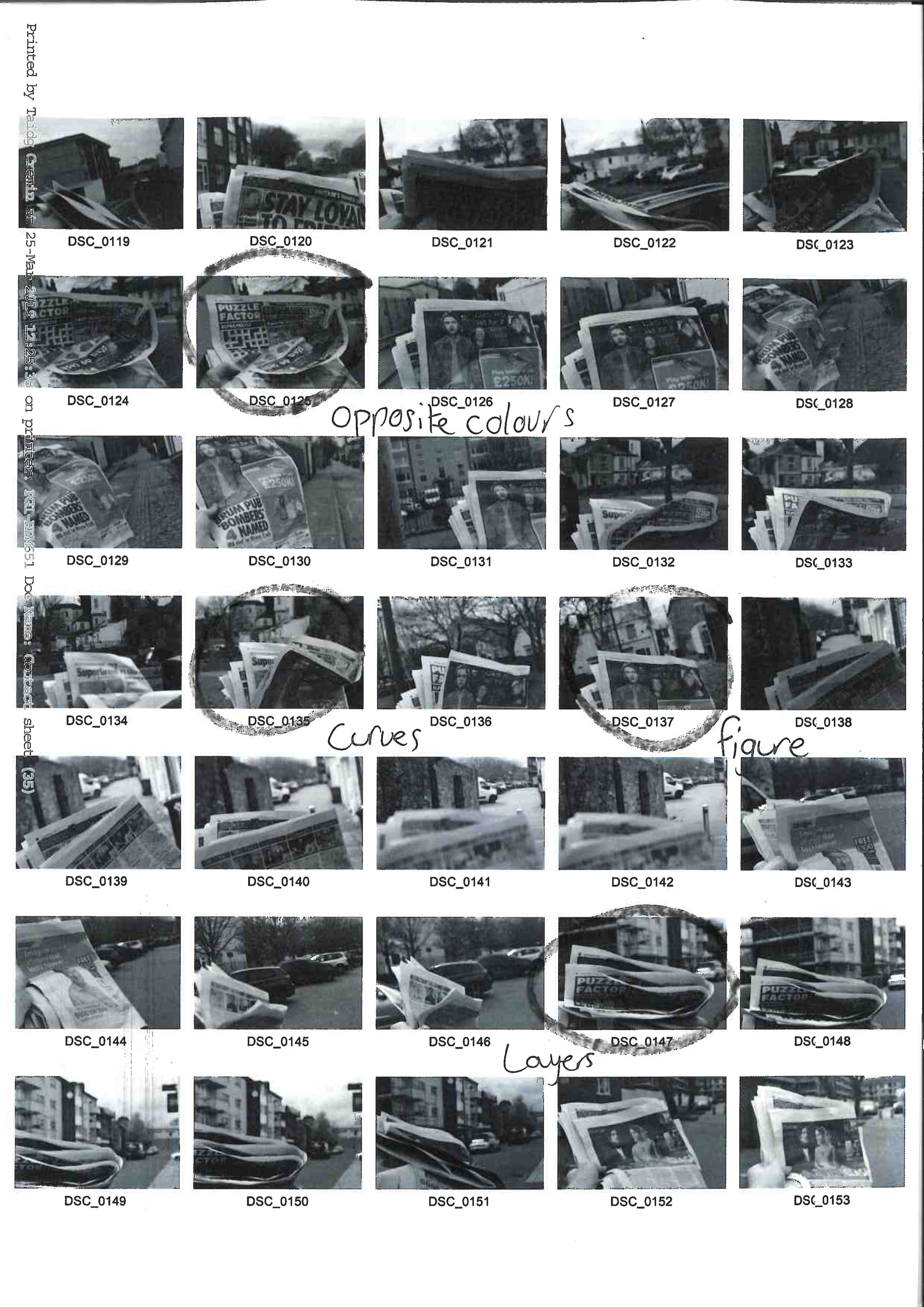
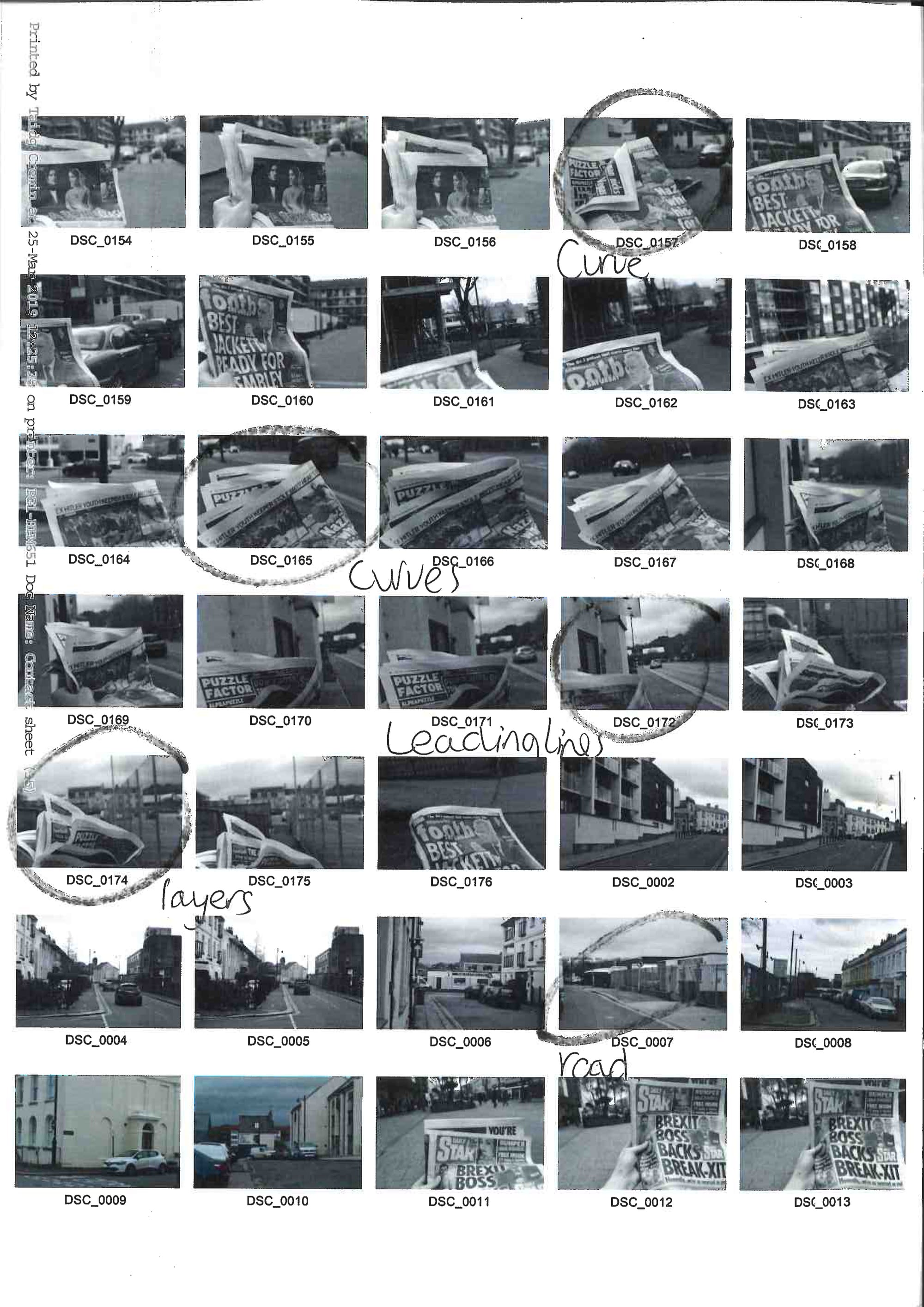
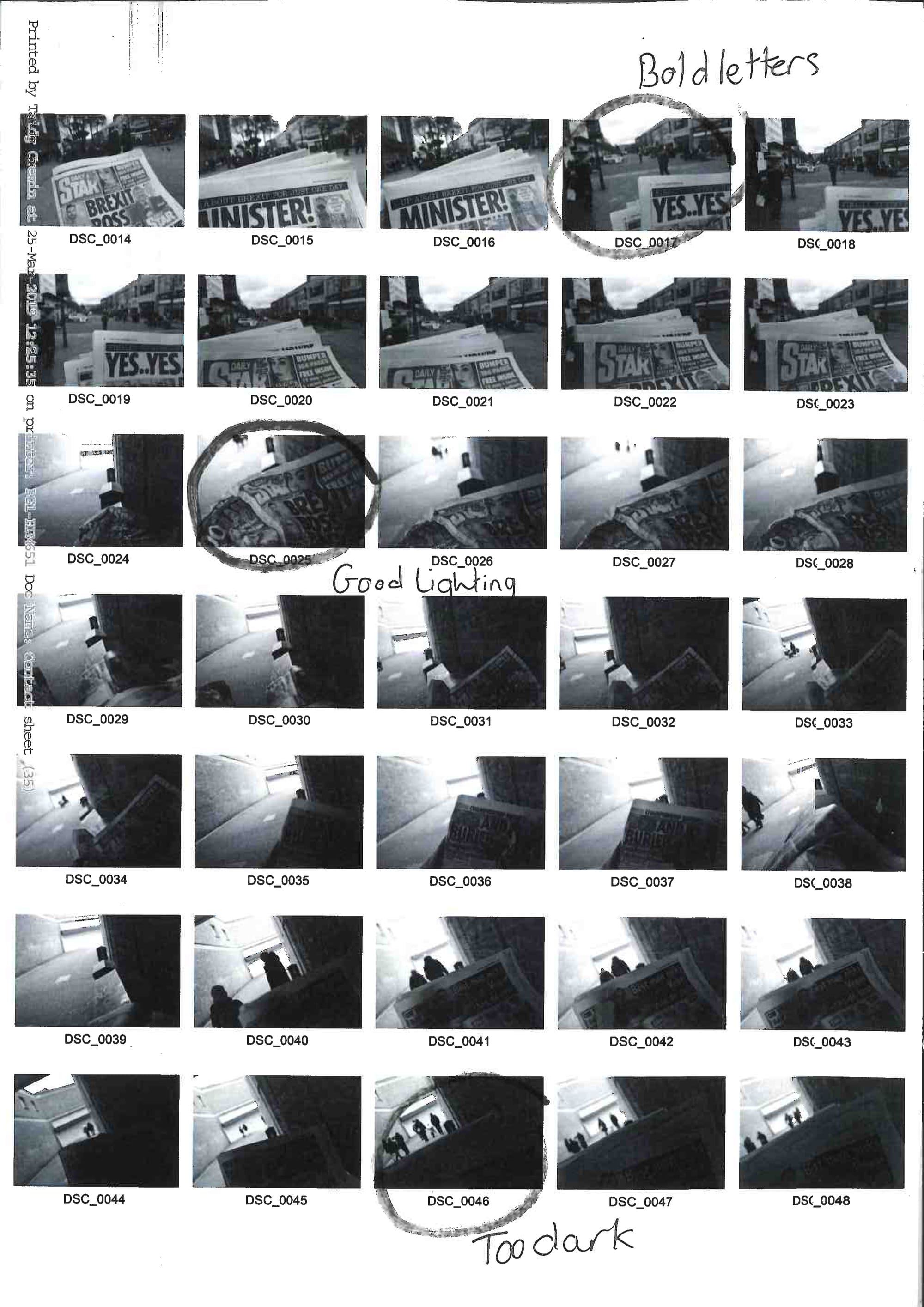
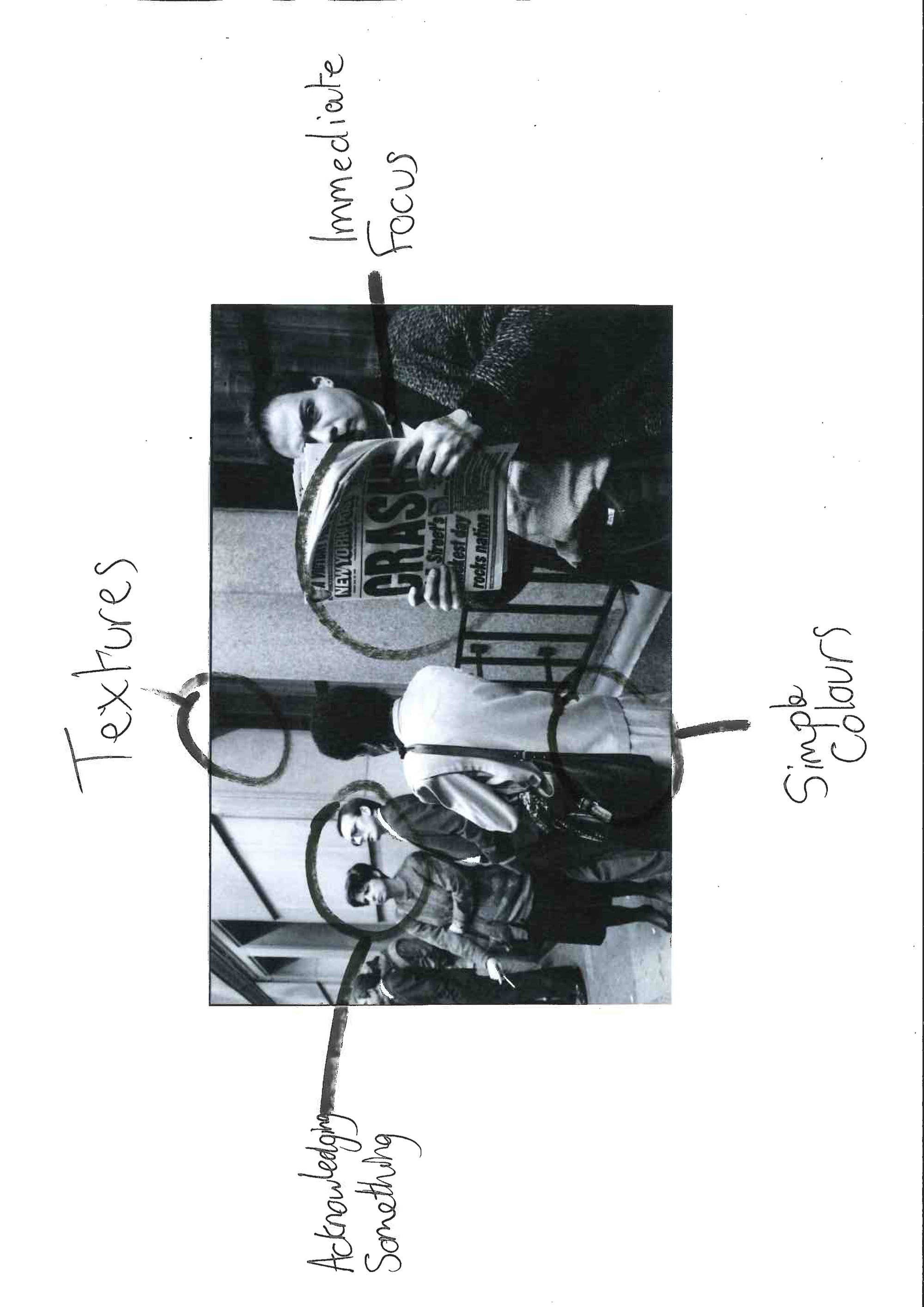
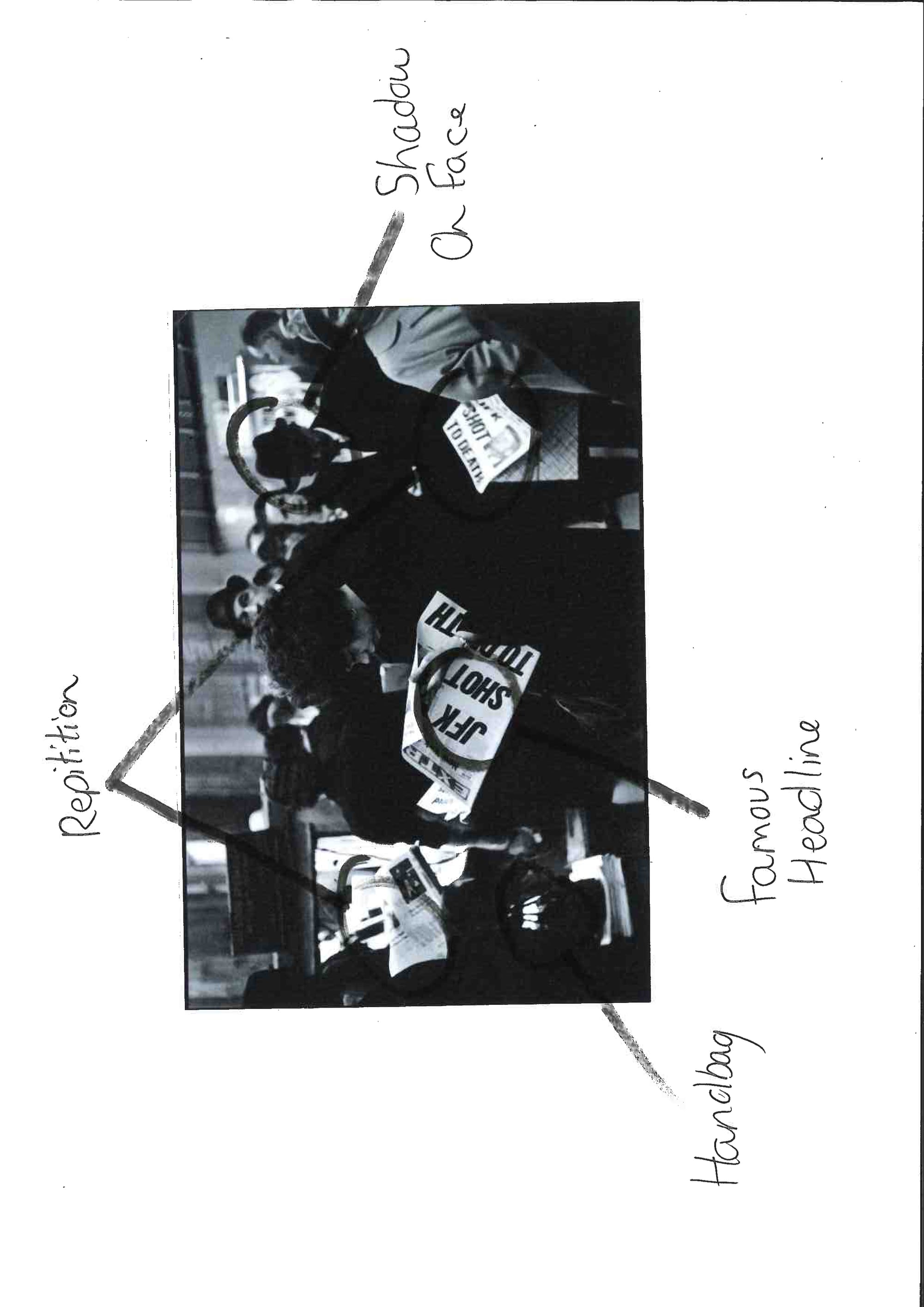
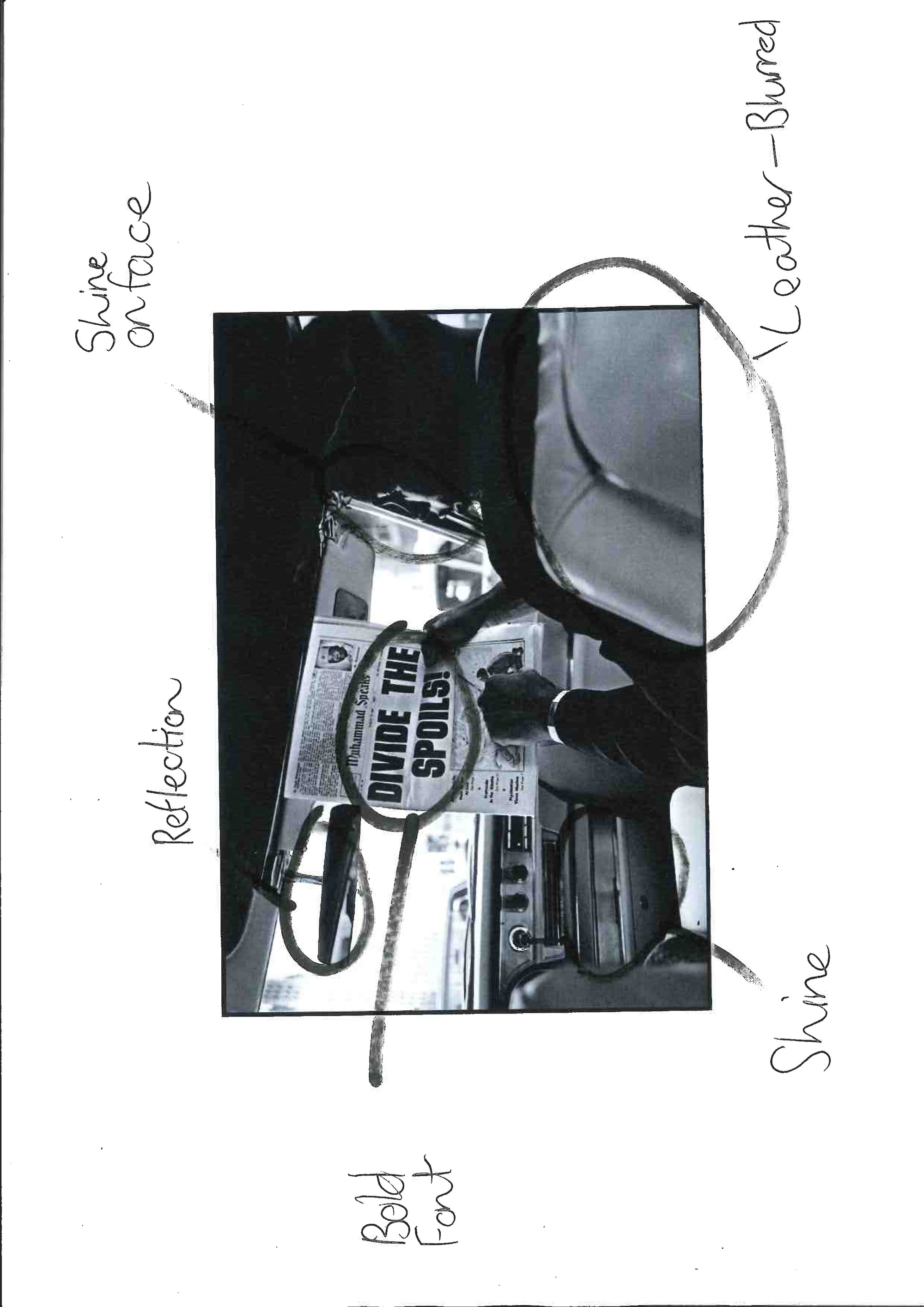
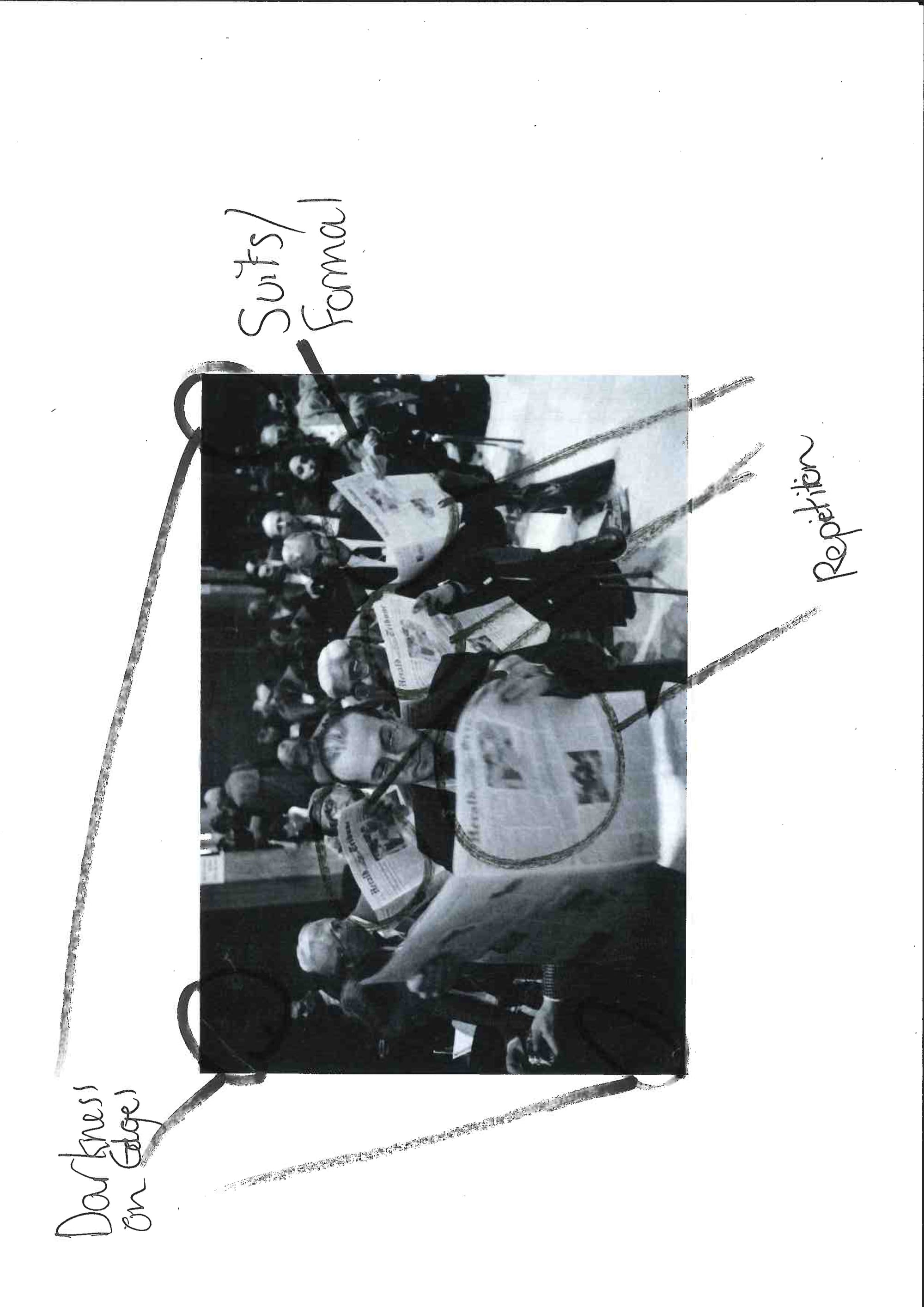
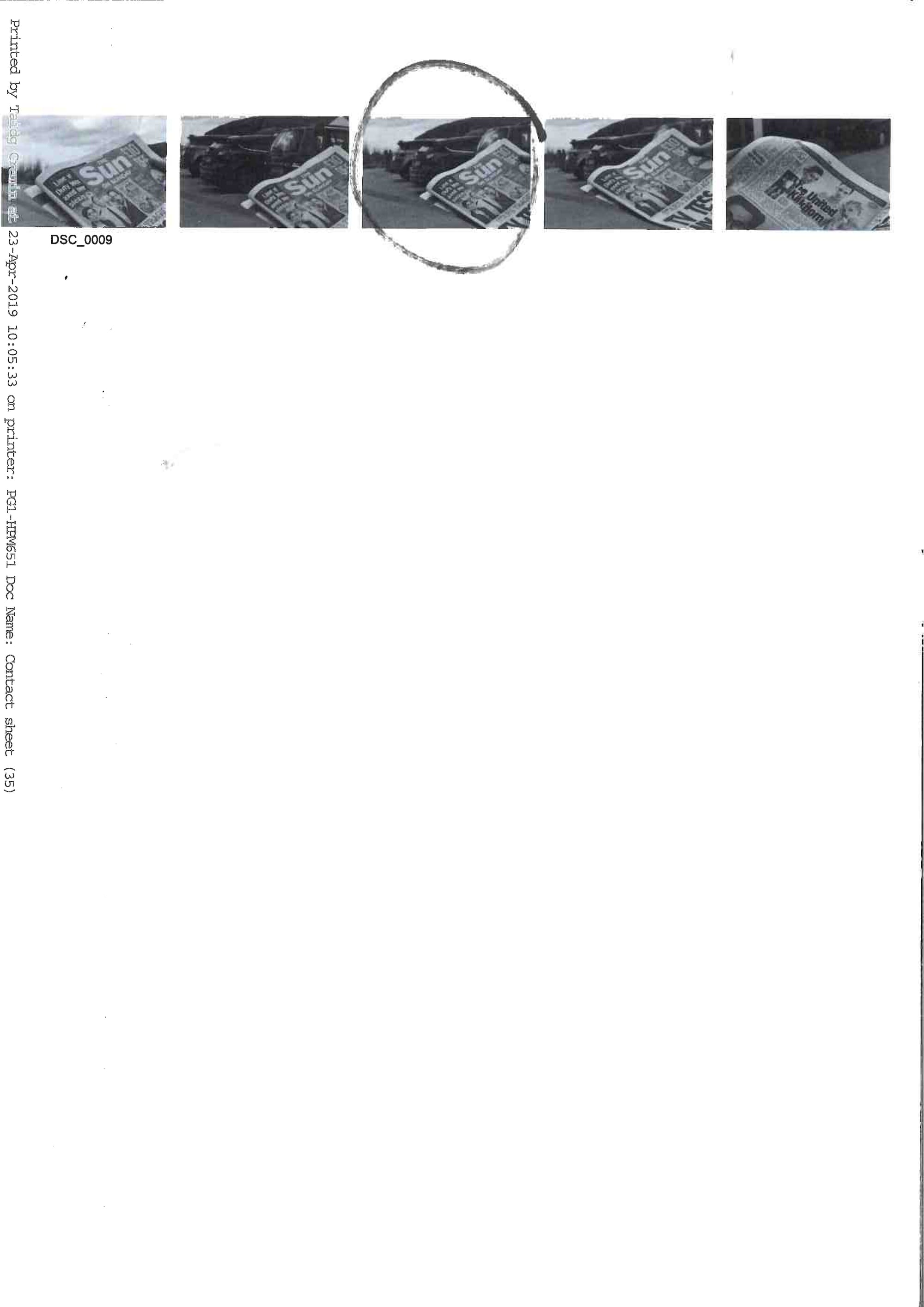
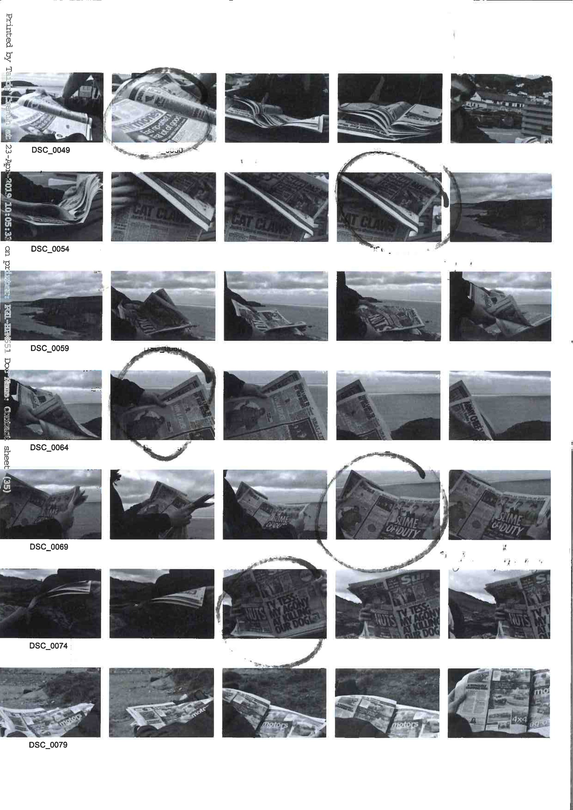
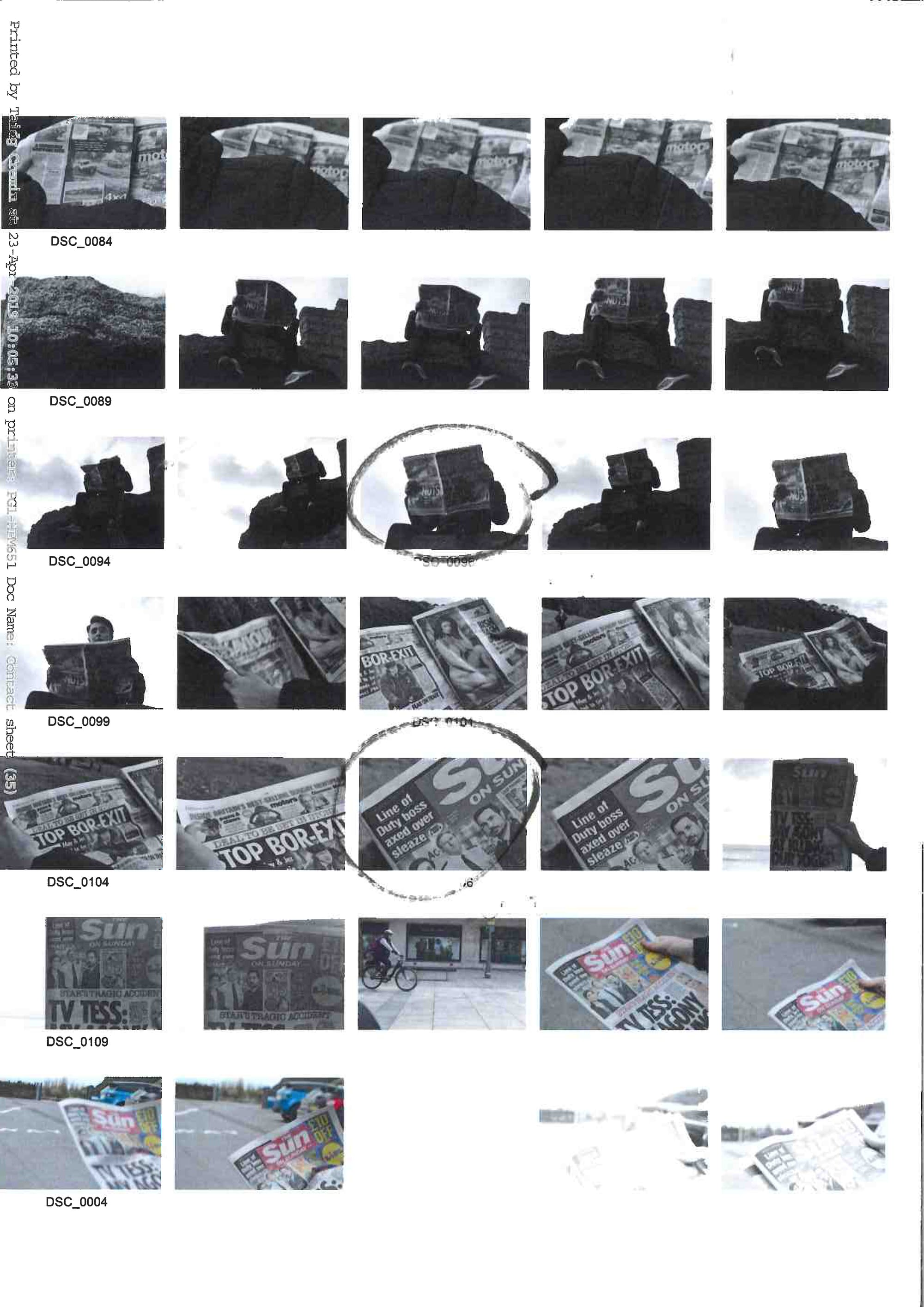
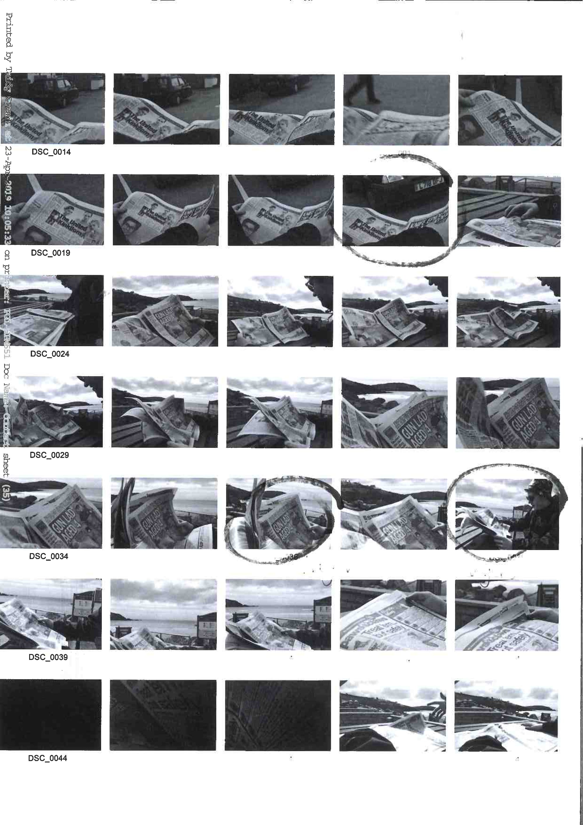
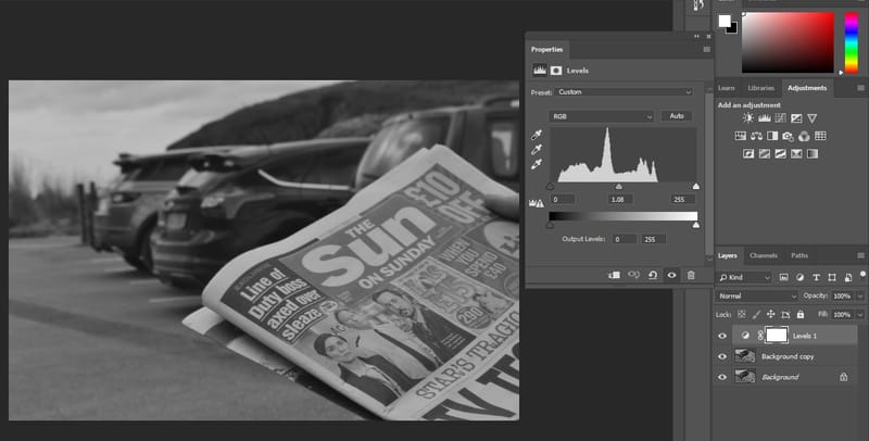
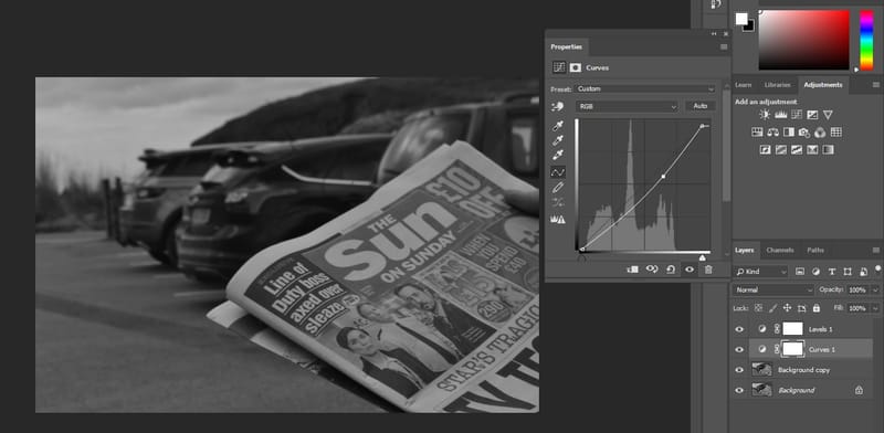
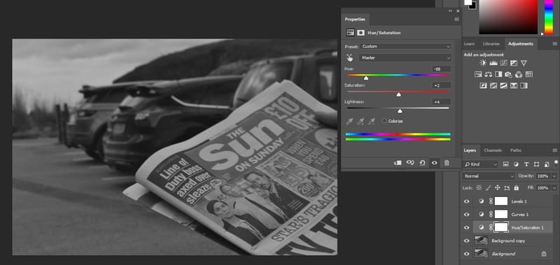
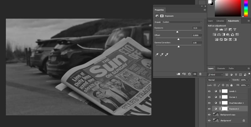
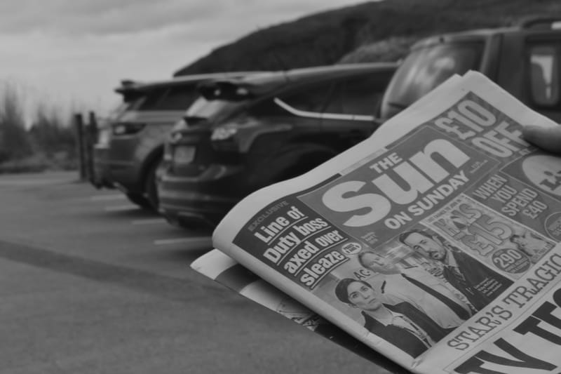
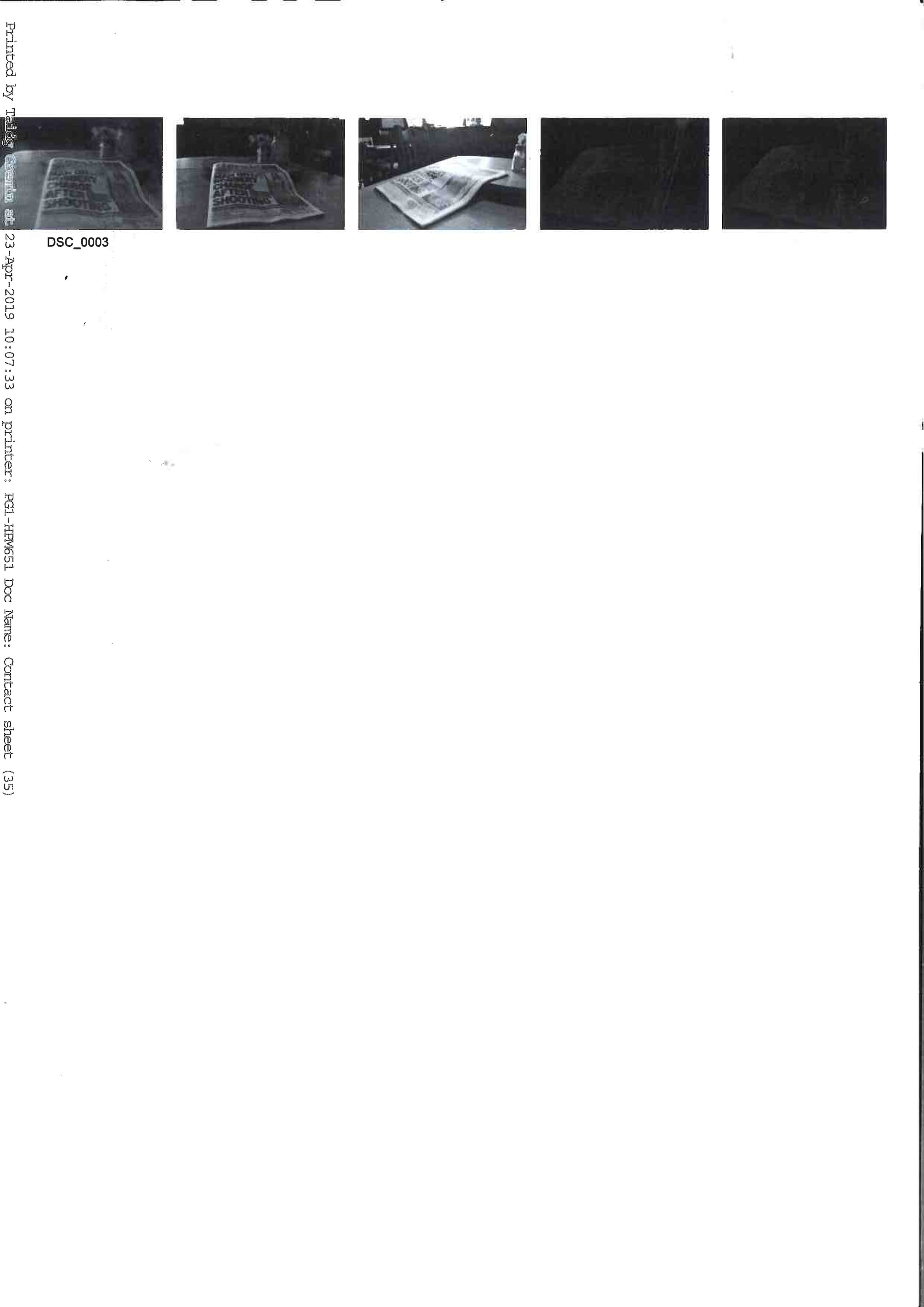
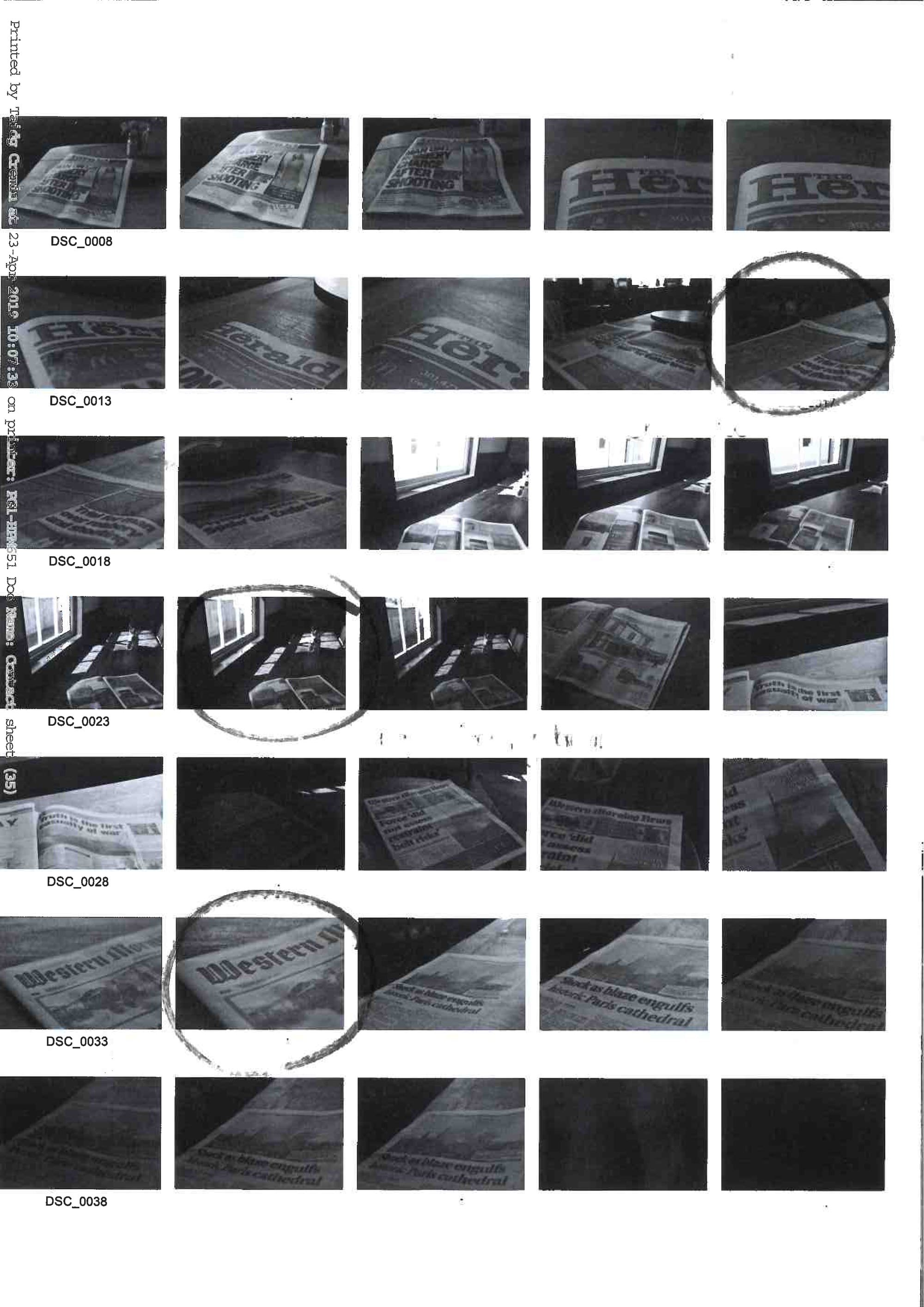
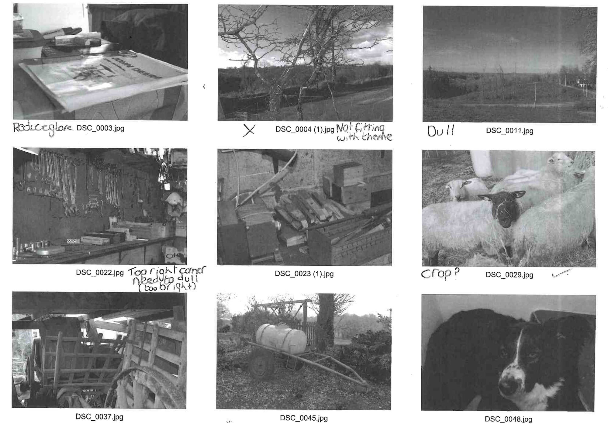
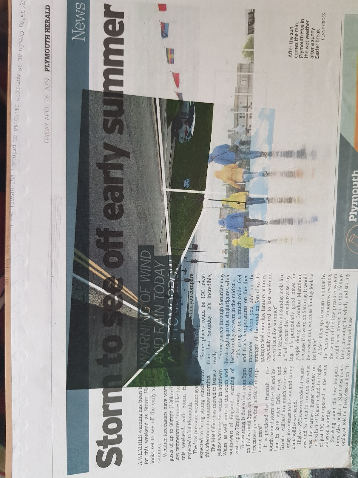
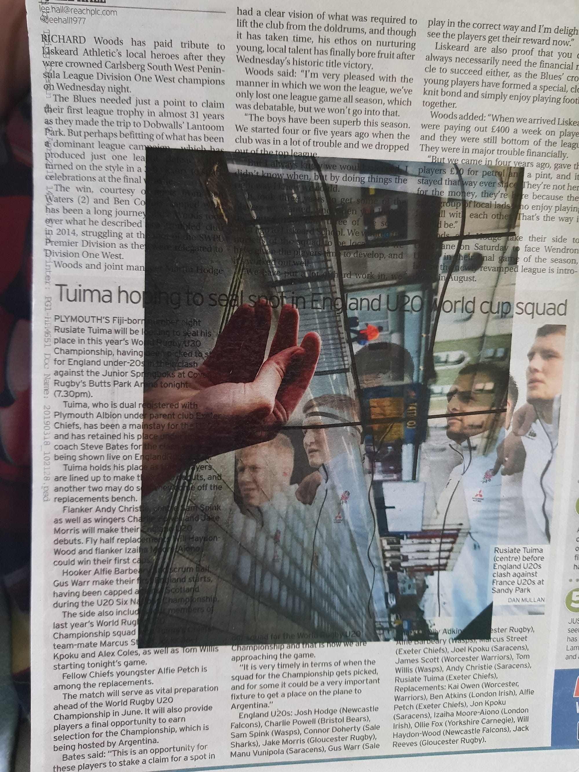
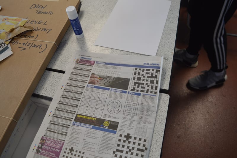
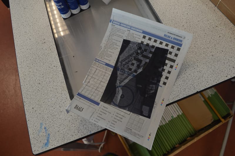
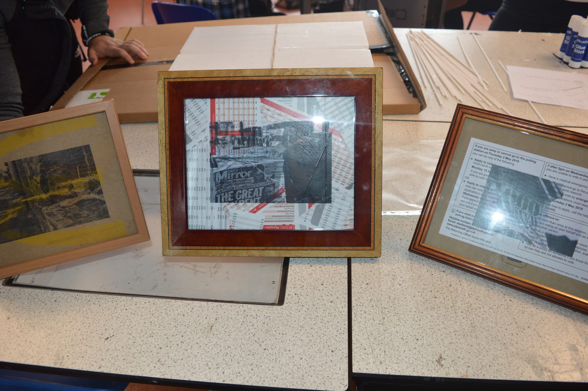
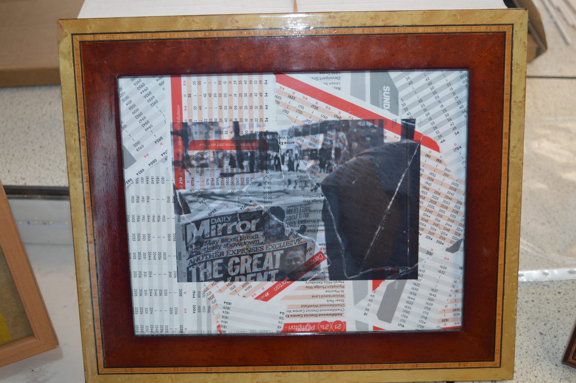
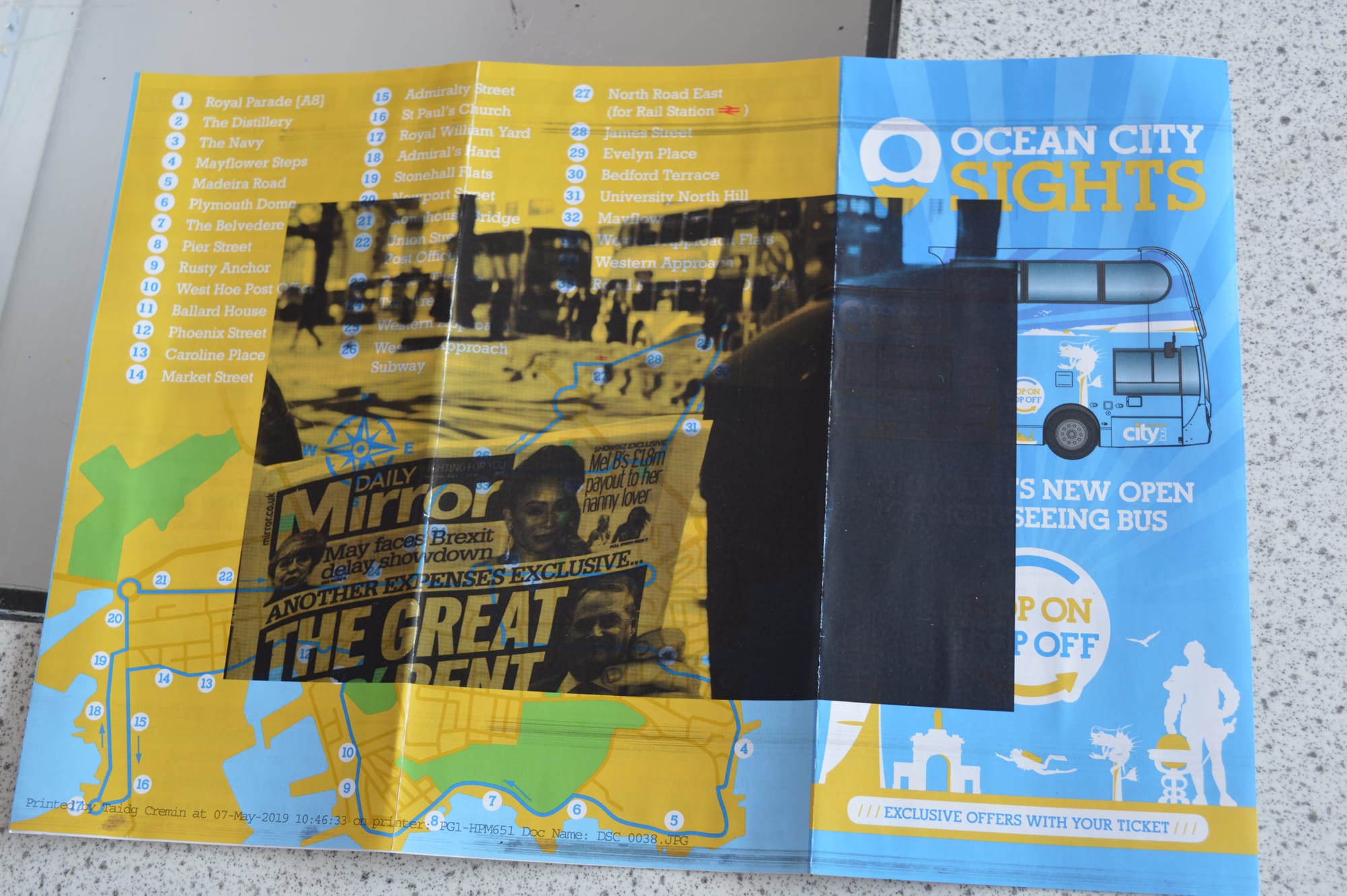
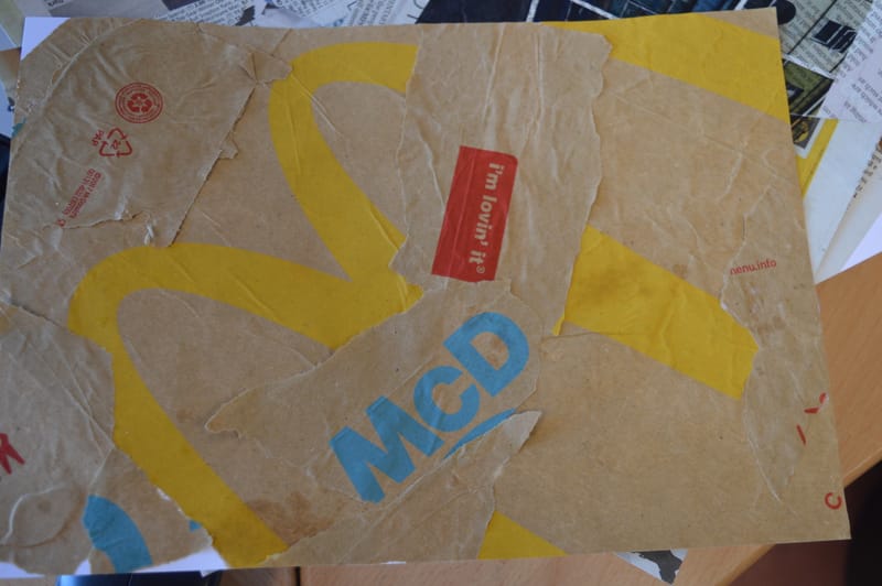
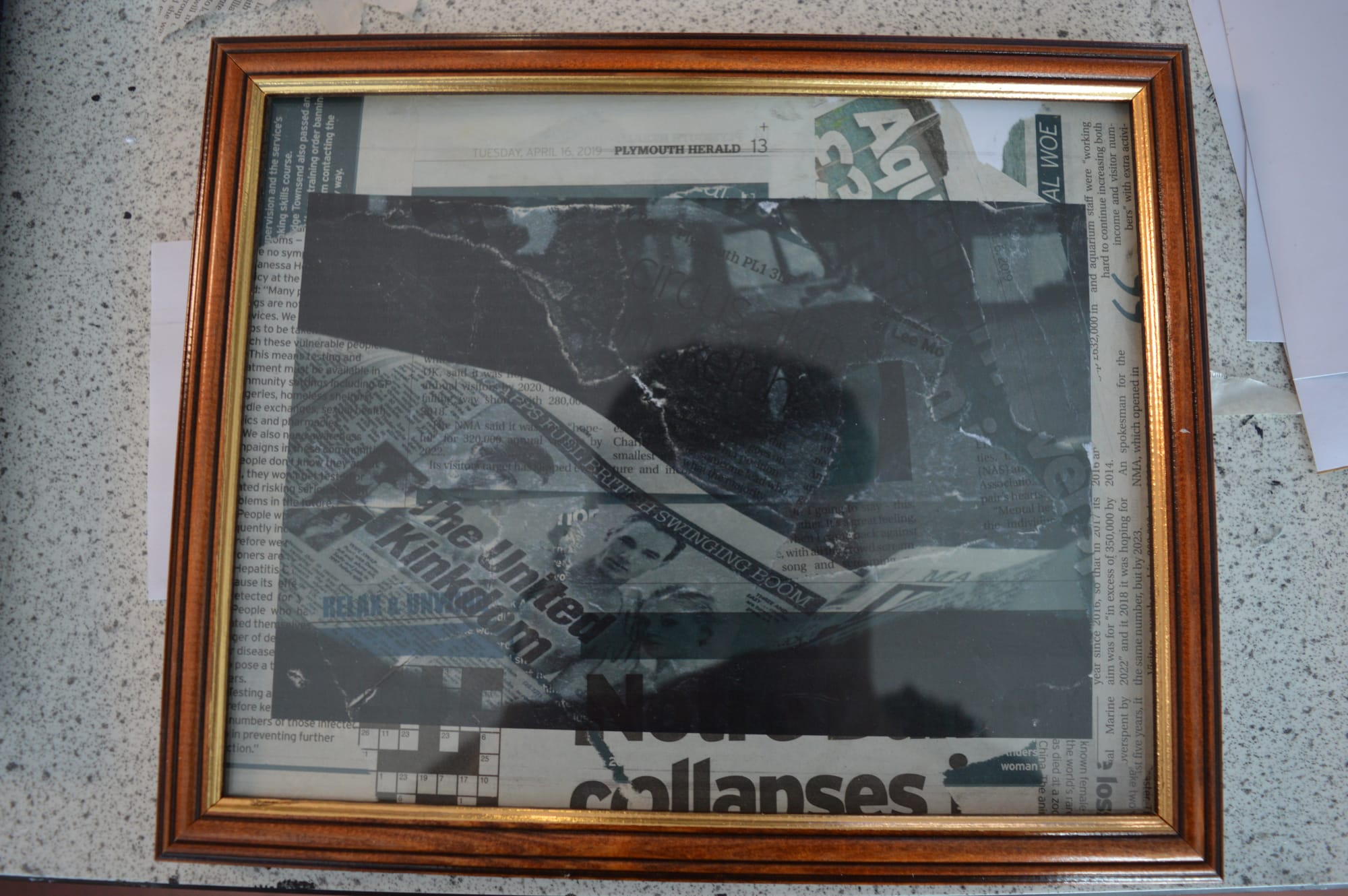
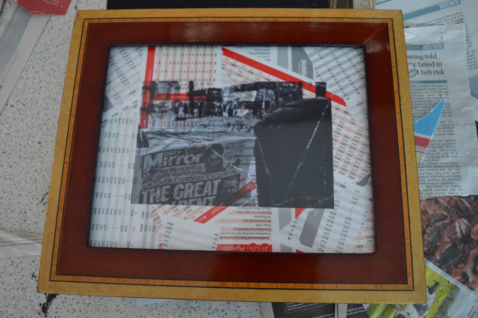
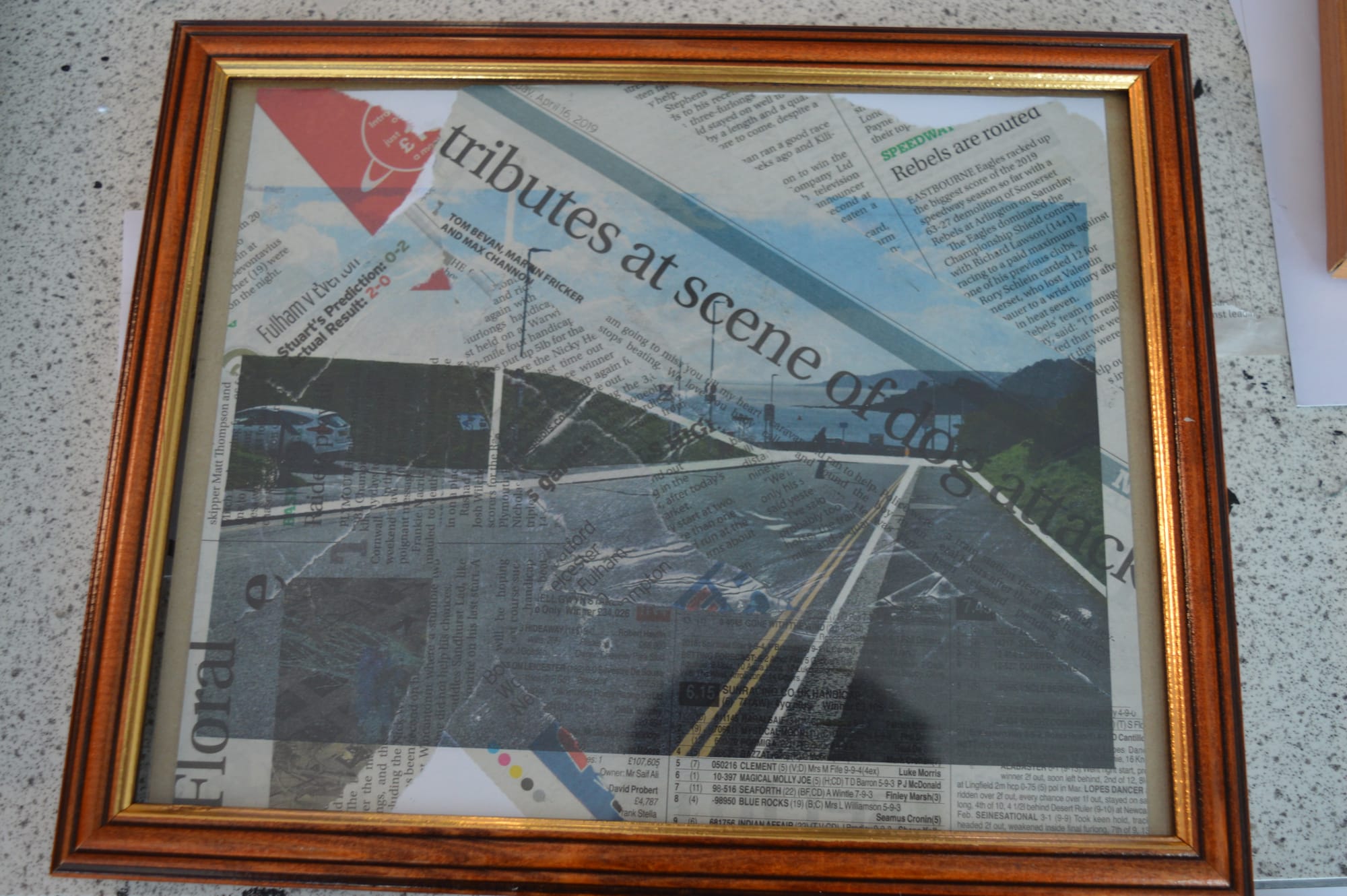
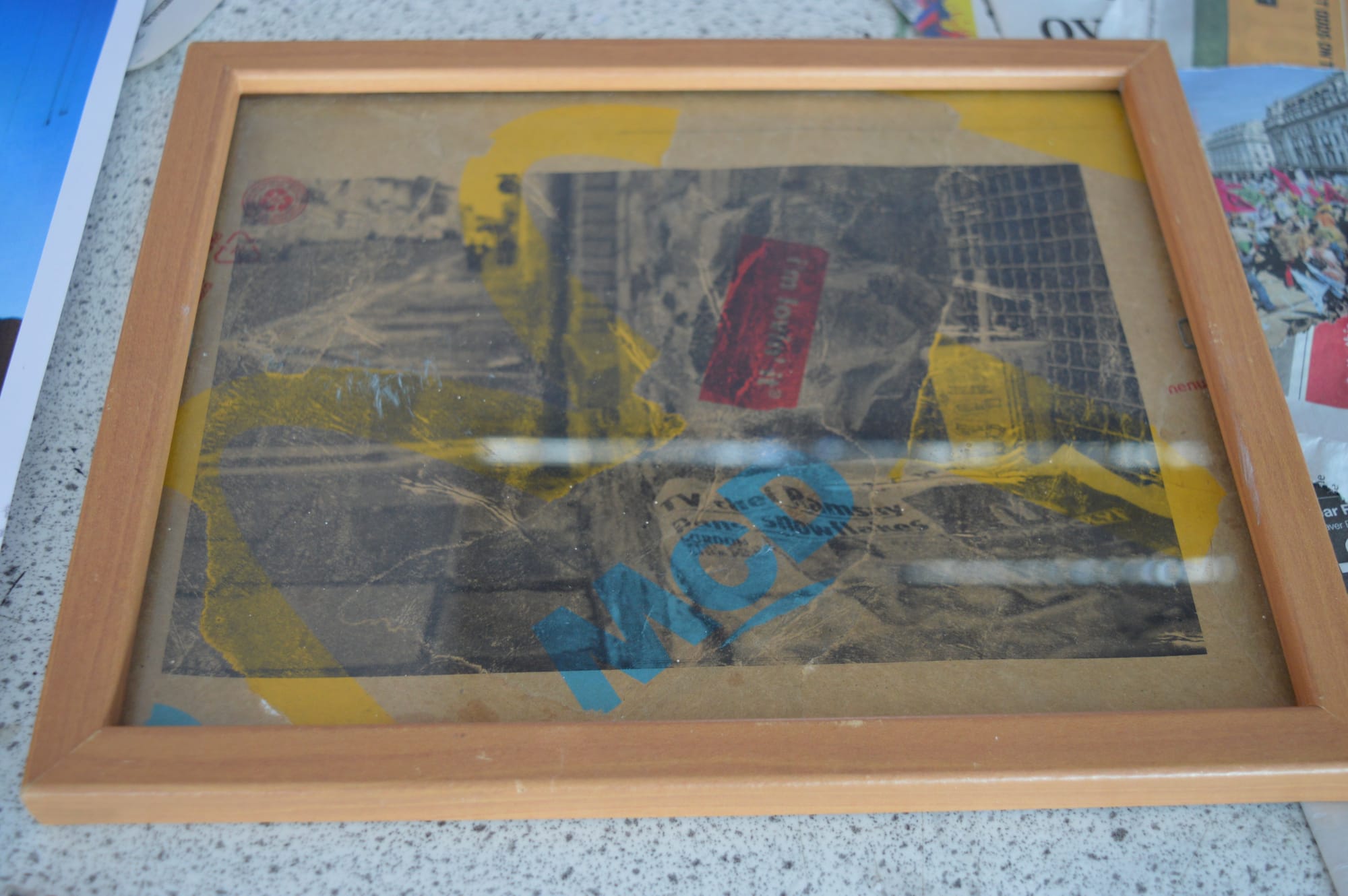
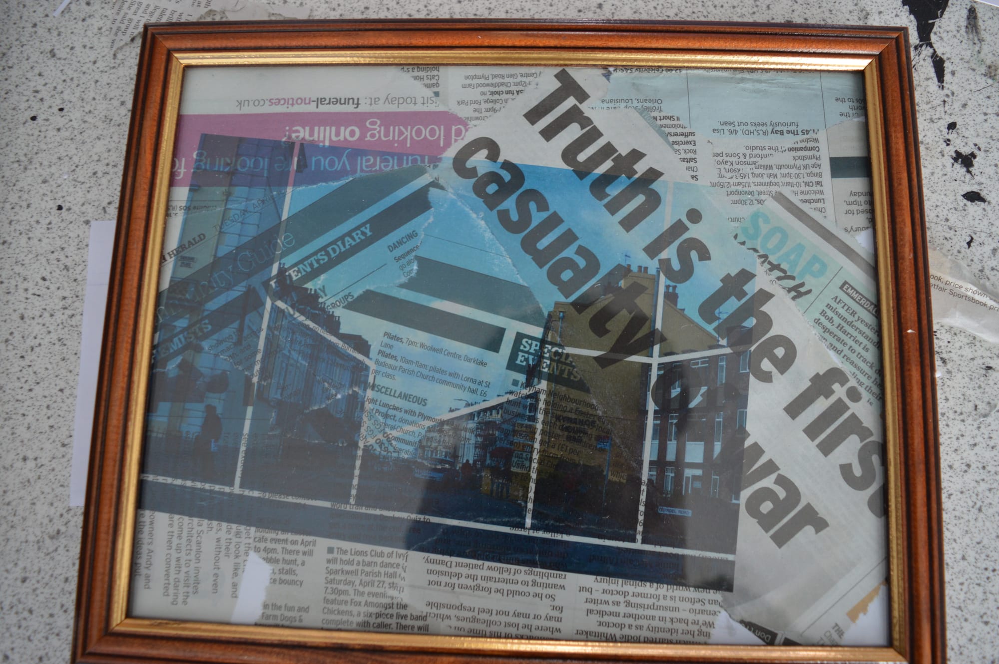
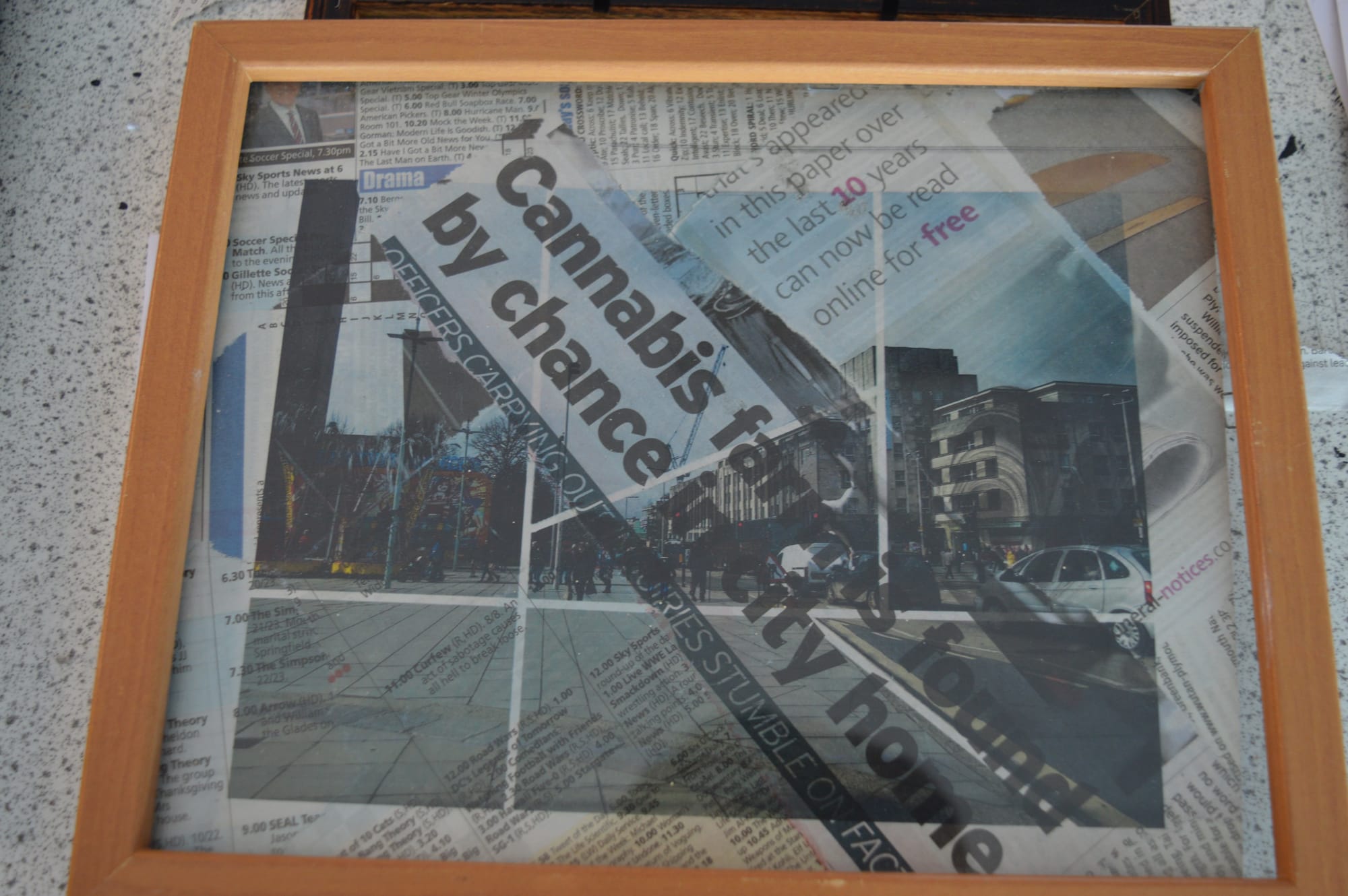
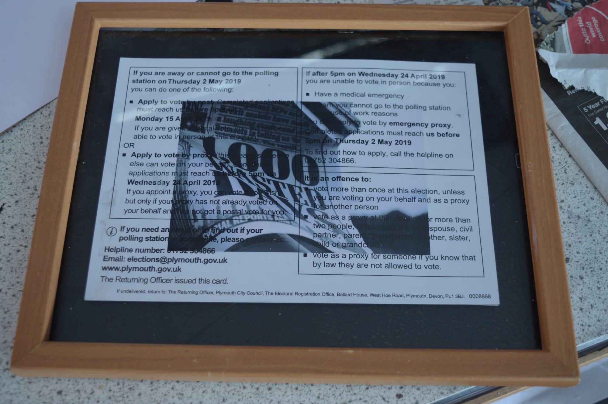
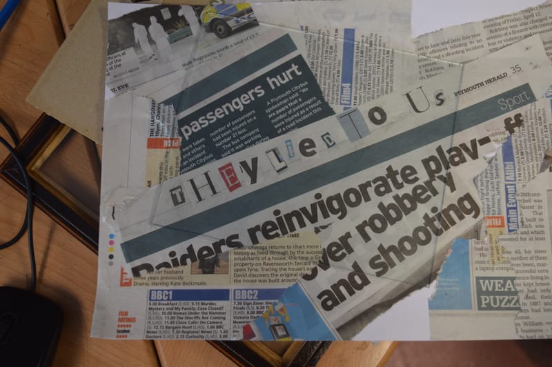
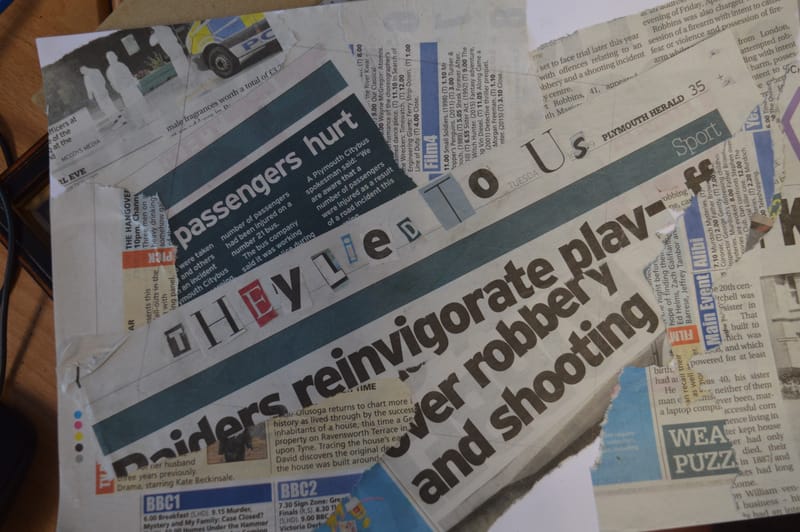
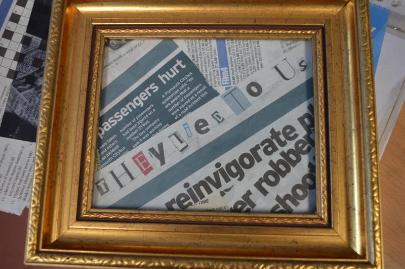
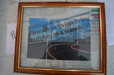
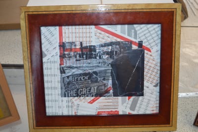
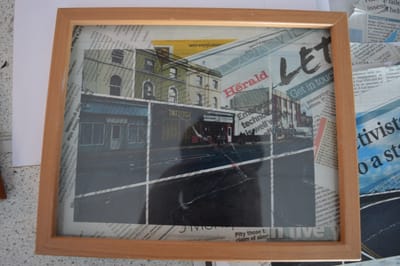
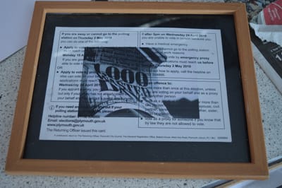
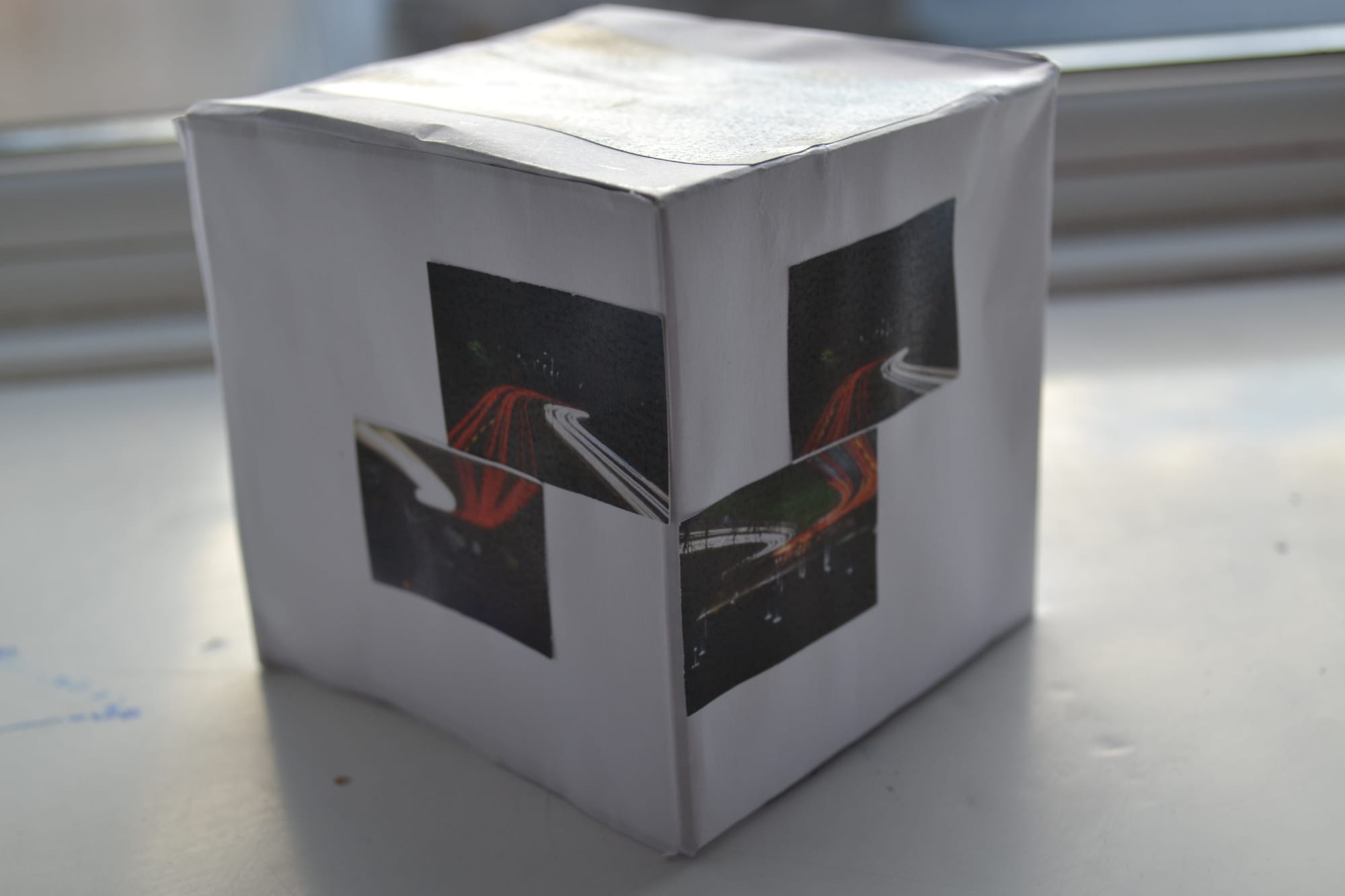
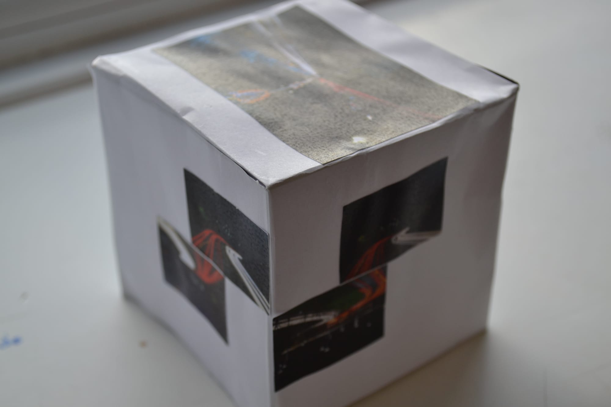
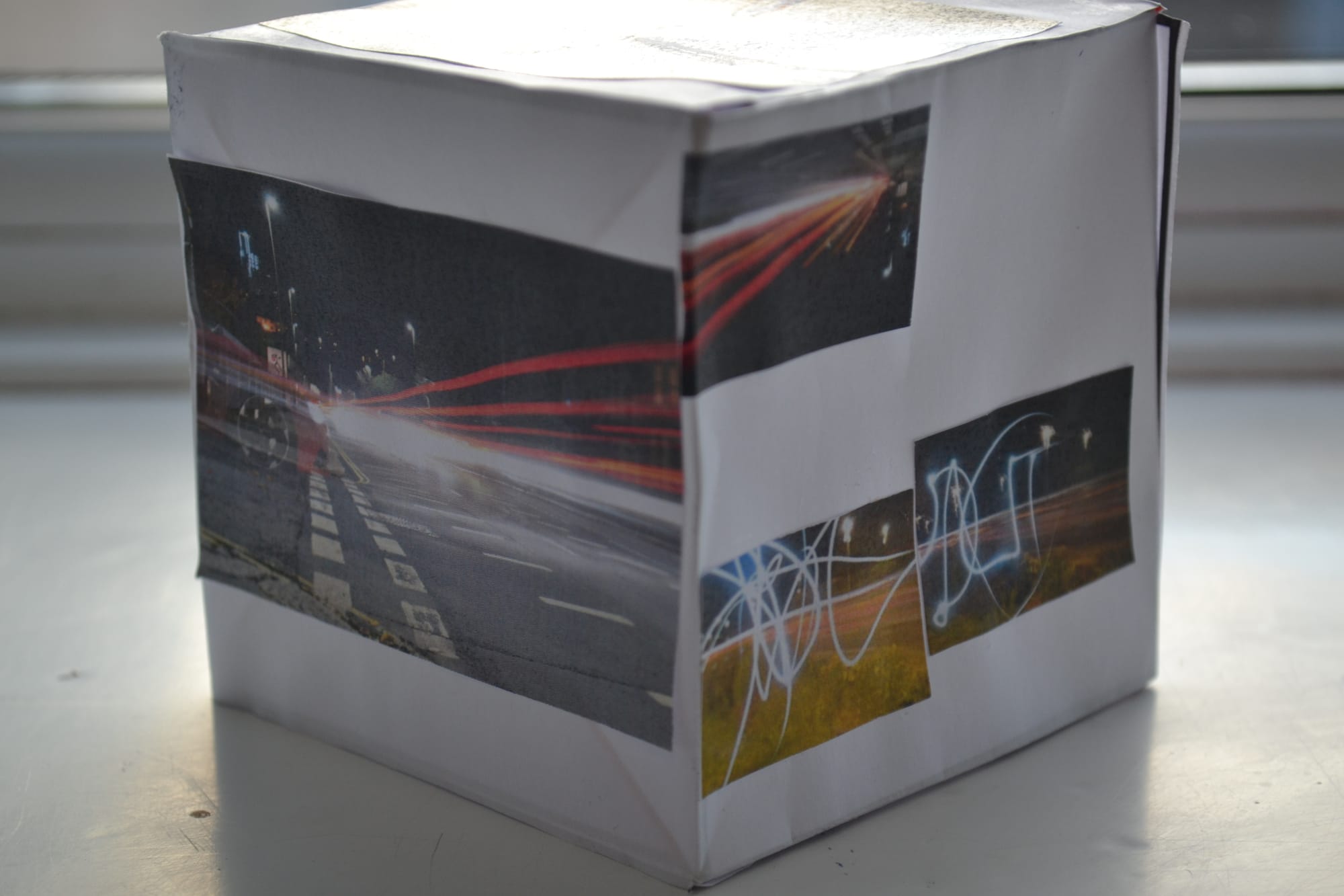
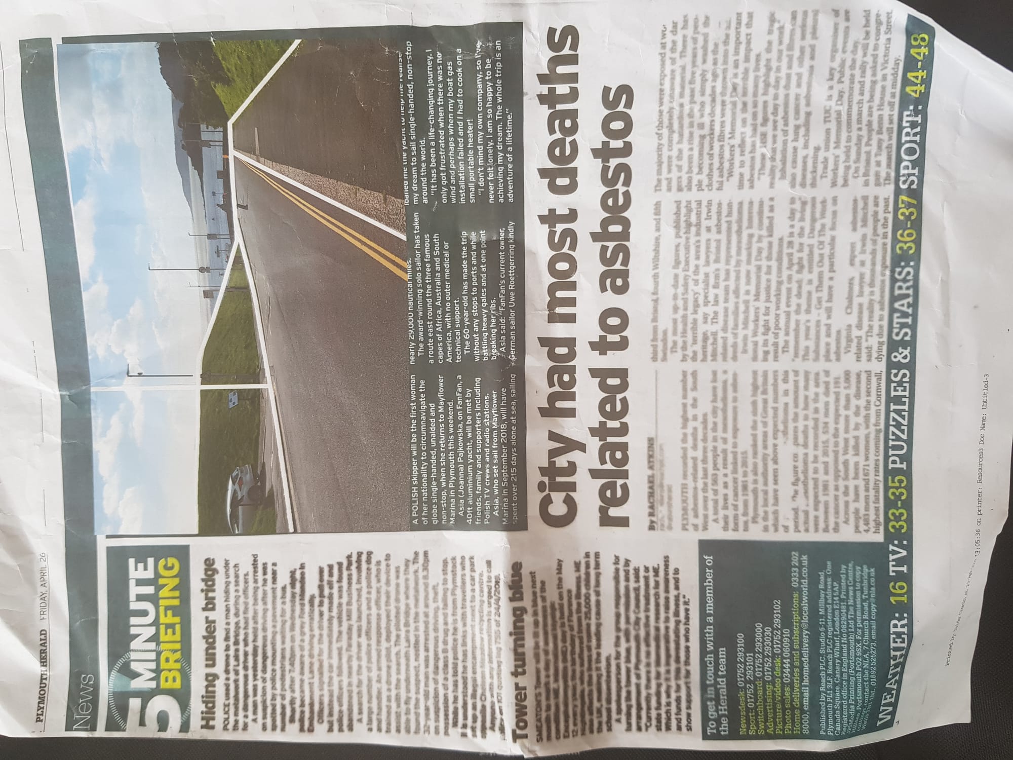
After this, I felt although this was the aim of my work, I did not like the final result. The texture was too dissimilar to a traditional paper. While trialling this, I also attempted printing onto newspaper by backing it with card. The results of this i was satisfied with and i continued to do so with other materials such as a McDonalds Paper bag. In the newspaper, I will attempt to find articles that relate to the image, such as geographical location.In my opinion, these images came out much better in comparison than my previous work. Some images unfortunately came out in the wrong orientation, However for my final edits, I have worked out the positioning with the printer by putting a test piece of paper into the printer. This allows me to work out which side i need to insert the paper to make the image the same way up as the text/ object that is being printed on.
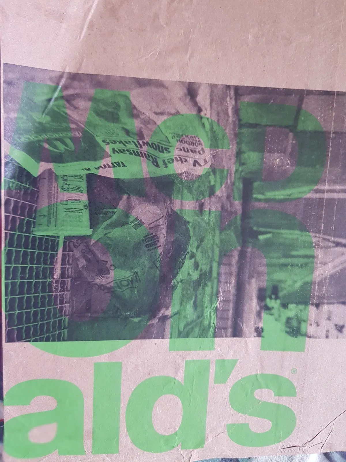

What did I learn from experimenting from the final piece?
Some of the images were compromised when the background had other images/ bright adverts . For my final piece I will attempt to use pages that are mainly text and increase the contrast so that the images are more visible when printed.

As well as printing on a Mcdonalds bag, I collected some bus timetables as in one image, buses can be seen in the background. I want to try and link a few images this way, using an article or otherwise. I plan to frame the images in various frames with some sort of title. I was thinking of using letters from left over pages to create a title such as:


For my final piece, I plan to:

  • Print my existing images with pages from real newspapers

  • Frame these images

  • Create a title for my work

Before I started printing, I found pages in the newspaper that has minimal images and colour as to create my ideal piece. I will use images that I think will work best as a series. From this, I will back the pages with card to allow the printer to print onto them. The articles from the newspaper will hopefully be related to the image.

Overall, I felt like the images came out well. However, I did find viewing the images difficult to follow. To overcome this, I will attempt to collage the newspaper with the majority being text and use headlines as a key part of each print. This will hopefully solve the issue of the images being too hard to view yet still keeping the theme of the newspapers integral to the work. I will rip sections of the paper and glue them onto card, a similar process to my previous edits but hopefully this will work more effectively.
Once all my images had been printed, I wanted to display them in frames of some form. To fit the images in, I often had to cut for them to get inside the frames. My most effective images were in my opinion the one that I collated a timetable for. I then created collages of newspapers to print on. I found these were much better in comparison to my previous outcomes. When layering the newspaper, I intentionally wanted headlines to be seen through the images but be obscured through various layers. Often the real news is obscured by the news that is headlining and I wanted to portray this in my work. 
Final Piece Review imageFinal Piece Review imageFinal Piece Review image

My aim with the newspaper section of my work was to create a discussion with regards to how newspapers display the news. I felt the most effective way to do so was printing my images onto newspaper. Although I was not happy with all of my original prints, Once I had created collages of pages and then printed my images onto them I found it was much more successful. I wanted for the images to be obscured with the various jumbled articles and I felt that this worked effectively. Some of the images were harder to see than others which is why I tried to use mainly text articles. The previous images ( printed onto a single page ) I felt were too obscured by the articles and I wanted the the text to be more of an importance in my work. I chose recent headlines and attempted to use at least one in each collage. One thing I think did worked well was the large font seeping through the images. I want the viewer to be somewhat in confusion on initial viewing, to be then aware of both the image and the text. My thoughts is that once your eyes focus, more will be exposed in the final piece. I felt this was done effectively and each image should have a loose connection to the article. In the future, I would like to have better links with the articles and the images. This would be hard to achieve without lots of pre-planning however I think it would be an interesting dynamic to my work. I would have also liked to experiment with other materials such as the McDonalds bag as I think it worked well as a background to the image.

I felt once I made the decision to collate the newspapers, my images and the text worked more effectively. The frames helped capture that '1000th of a second' Joel Meyerowitz and make my images feel more finalised in my opinion. I felt like I successfully completed my aims for the final piece and although some were altered to fit my plan, I feel like I still achieved what I set out to do.
Project Review imageProject Review imageProject Review image
The project has vastly differed from the initial shoot to my final images. I felt like my work has developed naturally. The beginning of my project saw me take images of various locations and then add compositional lines to them. The images I first took had a majority of pastel colours which I liked and I added lines where I felt the viewers eye would direct them.

I felt like editing them on illustrator was more effective than cutting them. I wanted the lines to be different to work I had done previously. I now feel confident using illustrator. I then attempted to use acetate and recreate the same lines from thew first edit. Weather conditions did not allow this ; it did however lead me on to my new focus of newspapers. I initially wanted to capture the curves in the paper as it folded as I thought it would be most effective in this way. Using monochrome on the camera aided the serious tone I wanted to capture as well as the bold fonts and shadows.

The titles and headings were something I wanted the viewer to be instantly drawn to and when I was shooting I intentionally focused the lens onto the titles. Using both manual mode and manual focus allowed me to achieve both the aesthetic and the shadows I wanted to capture. The images I felt were most successful were the ones that had layers in the papers. I liked the way the paper curled and I wanted to capture the various layers. I wanted to clearly portray how the press portray news as I think the news can mask the reality in the world. When shooting, I tried to capture this with context outside of the foreground, although this was difficult to put into practise. To improve, I would try and find scenarios where the newspaper relates more to the background. Something I wanted to highlight more in my work is the title pages and articles. I think this could have created an even greater bond between both the images and the text.

My images would be displayed in frames in a series as I believe they work better as a collective rather than standalone pieces. Overall, I feel like the final piece came out the way I wanted it to and I am happy with the result. I felt like I successfully displayed the newspaper in coherence with my images. I think the frames not being part of a set also worked well. This creates a visual inconsistency within the work which I think works well.
I BUILT MY SITE FOR FREE USING